-
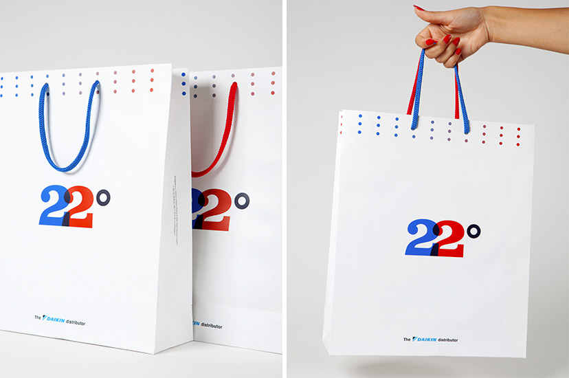
22 Degrees-Bag
Taking sides2012Even the handles receive the 22 treatment. -
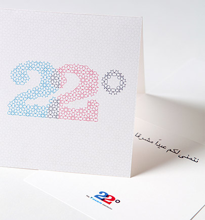
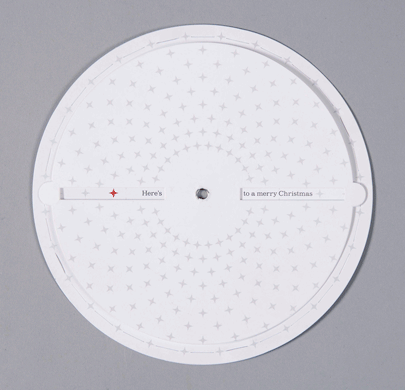
22 Degrees-Greeting Eid 2012
Careful ornamentation2012Eid-appropriate, a traditional arabesque maps the forms of the logomark. -
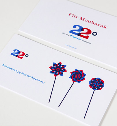
22 Degrees-Greeting Fitr 2010
A breezy greeting2010There’s nothing like toy windmills for a positive message. -
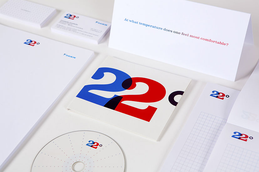
22 Degrees-Stationery
No catch-222010A simple question launches this identity which puts an end to the game of hot-and-cold. -
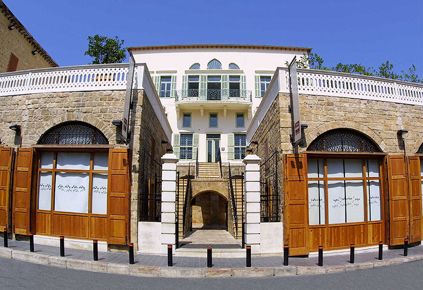
Audi Foundation-Entrance 03
Open doors2001Audi Foundation is open to the public, and hosts the soap shop and the café/kitchen with signage on their glass windows.Photography: Photo Raffi -
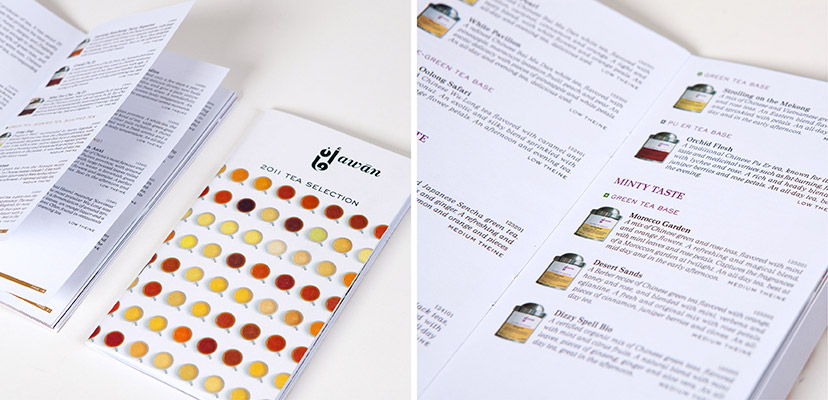
Awan-Catalog inside pages
The tea list2011Tea products are organized by type, country of origin and flavor. -
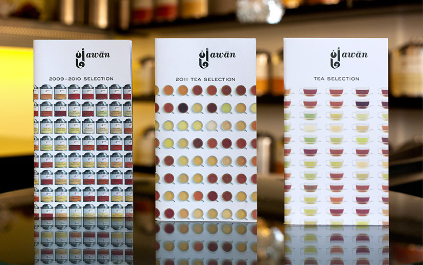
Awan-Catalog covers
What’s on offer2009 – 2012The regularly printed catalogues keep the customer up to speed. -
Biomass-At home
Keeping track2013At home, the completely transparent strip on the bags becomes a cue for “need to go shopping”. -
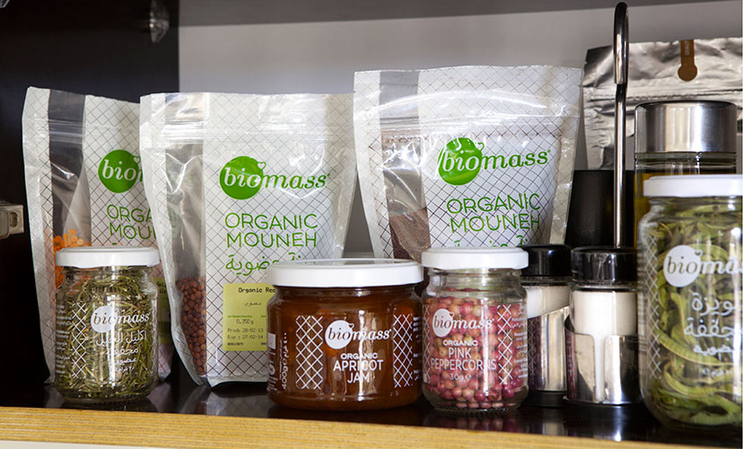
Biomass-Bag, box, jar
Look this way, talk this way2012 – 2013Visual and verbal elements unify the material and container-varied product lines. -
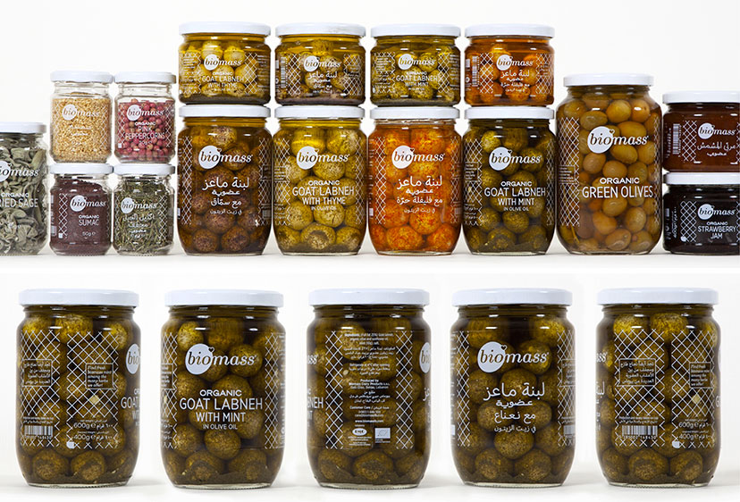
Biomass-Jars
On the surface2013The single color Biomass jars use every bit of the container surface for a fully bilingual set of information. -
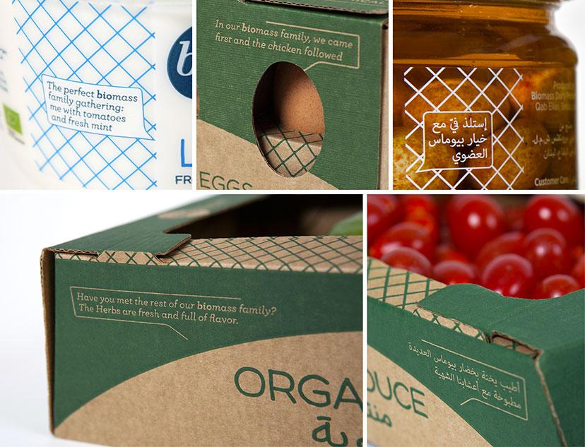
Biomass-Talkies
Having things to say2013All Biomass packages will introduce you to some other member of the Biomass family, benefitting from the popularity of some products to draw attention to others. -
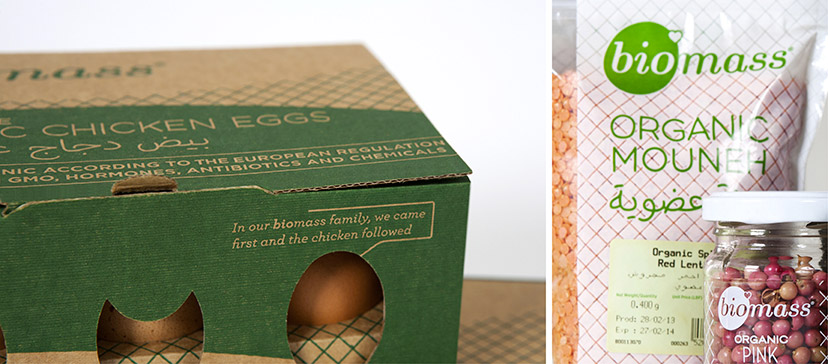
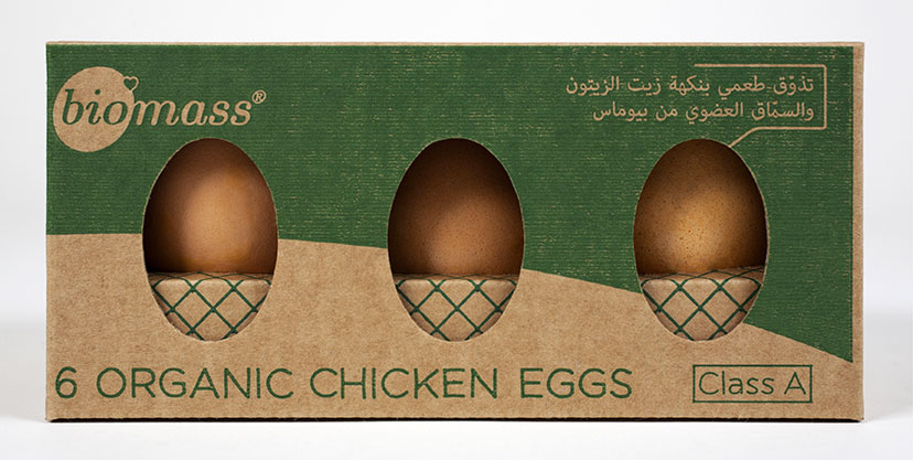
Biomass-Egg box
A good egg2013 -
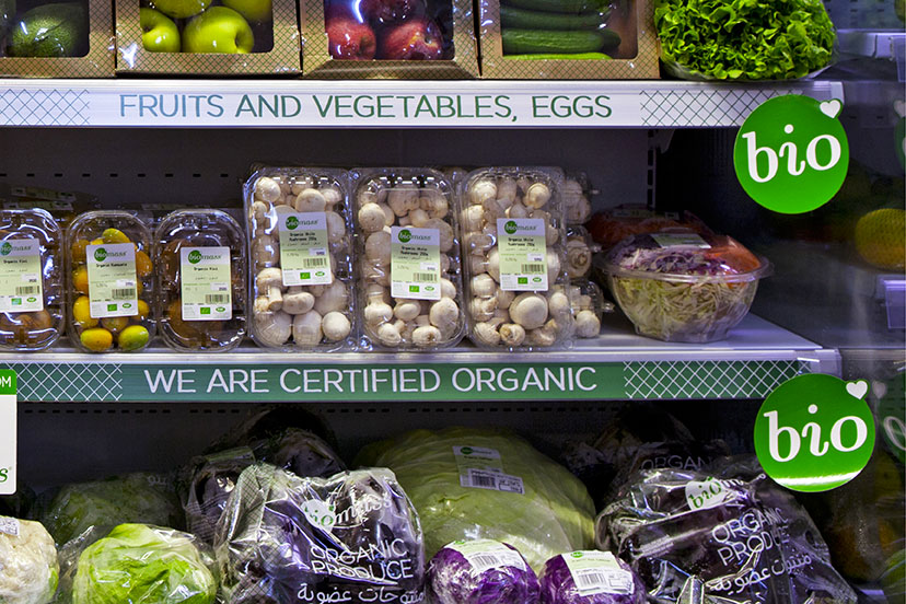
Biomass-Supermarket display 02
Logo as token2013The Biomass logo allows for the “bio” element to be used as a token for “organic”, expressing the brand as well as the category, and effectively owning it in the process. -
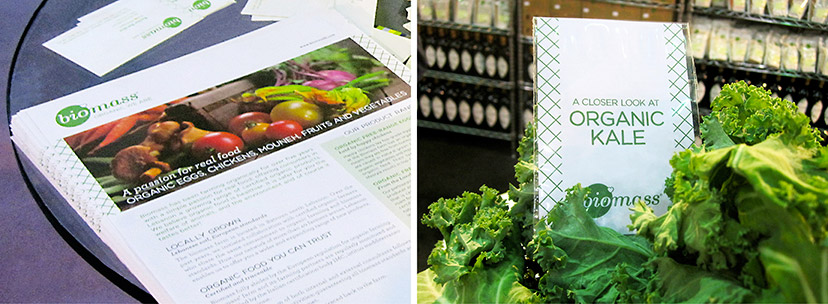
Biomass-Newsletter and kale bag
Stay informed2013Communication on the benefits of organic food, as well as products growing in popularity, furthers from the reach and influence of the Biomass brand. -
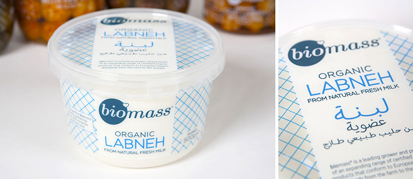
Biomass-Dairy
In the code2013Following product color conventions, the Biomass dairy line is the only one to diverge from the green and white color scheme. -
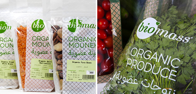
Biomass-Bags
In the bag2012The bagged products from biomass have a generic package with differentiating stickers and a clear exposure of contents. -
Biomass-Handwritten type
Form and friendliness2012Hand-drawn typography and a simple net pattern complete Biomass’s visual language. -
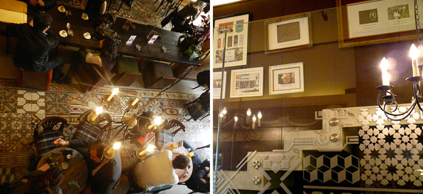
Café Younes-Abdel Aziz tiles and vinyl
Design synergy2011The vividness of the Younes space is the result of a tight rapport between graphics and interiors. The interior glass vinyl treatment clearly responds to the signature floor with its random geometric tiles and outlines the staircase along which framed fragments from Younes’s history lead the way. -
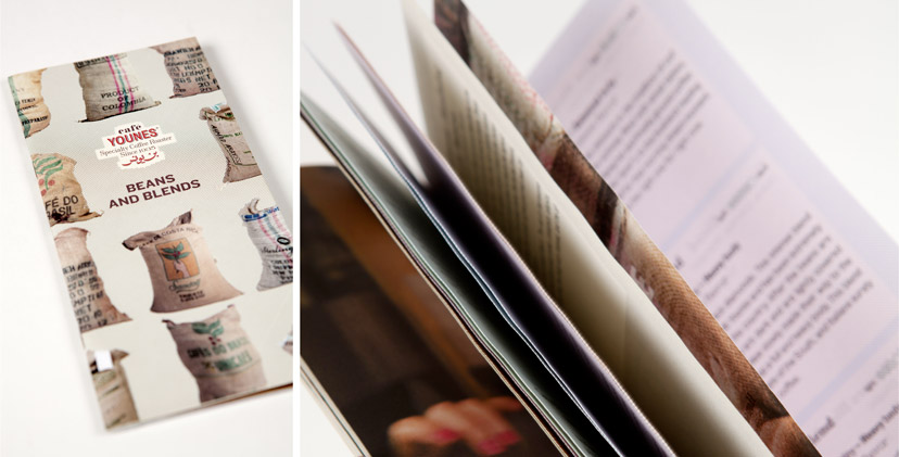
Café Younes-Coffee brochure cover
All about coffee2010The proposed coffee product catalog lists the beans and blends, but also explains grain origins, preparation methods and grading systems, making it a coffee reference document above everything else. -
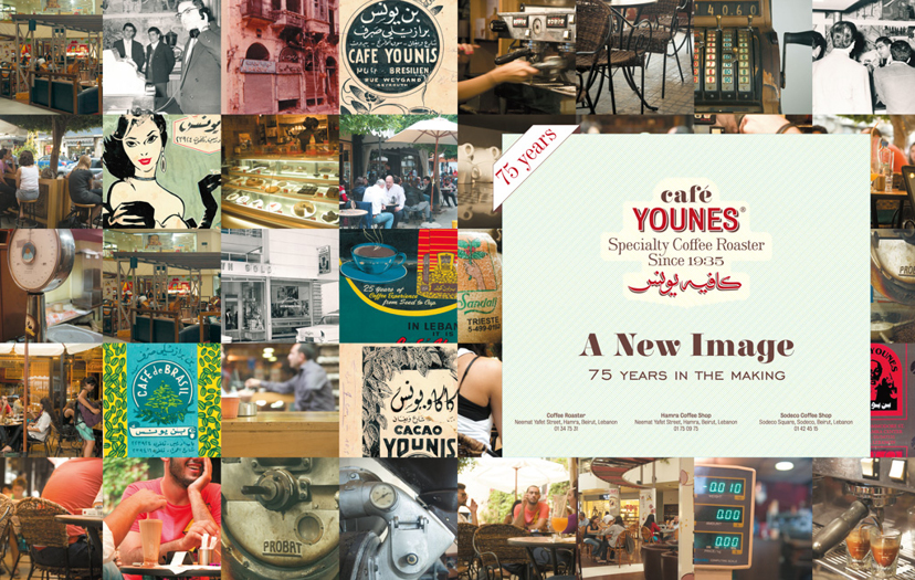
Café Younes-A new image ad
Change has come2010To announce the new branding on the occasion of Younes’s 75th anniversary, this double-page ad brings together snapshots from the past and present and gives a glimpse into the future of the new identity. -
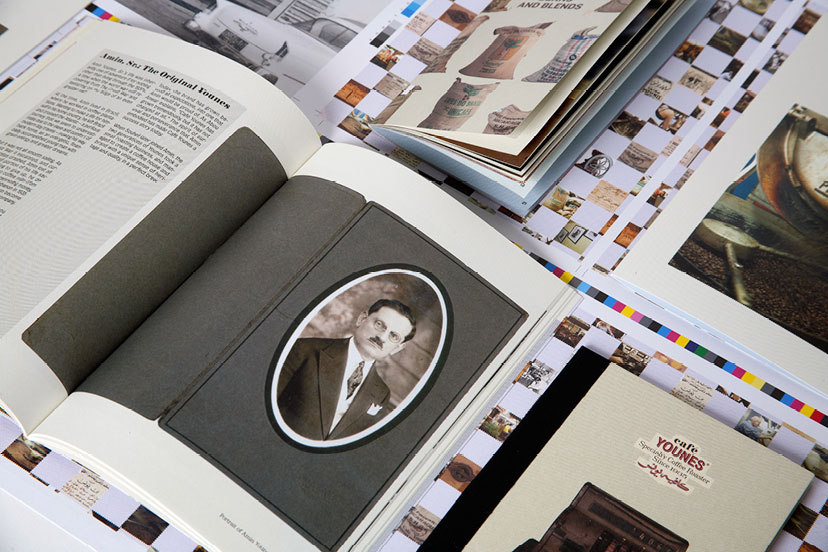
Café Younes-Printed items
Pictures and frames2010The integration of photography into the scheme takes place on many fronts and in many ways – framed, masked, patterned or simply reproduced – adding to the dynamism of the identity. -
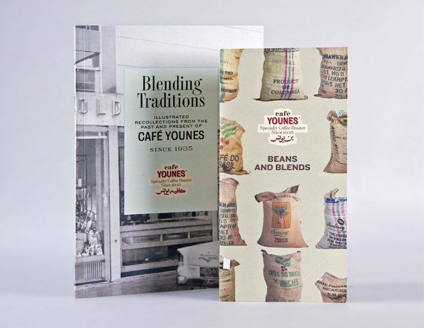
Café Younes-History book and coffee brochure
The extra mile2010The conception and creation of communication, marketing and operational tools – such as this history booklet and coffee product catalog for Café Younes – pushes the scope of branding recommendations beyond the typical identity scheme. -
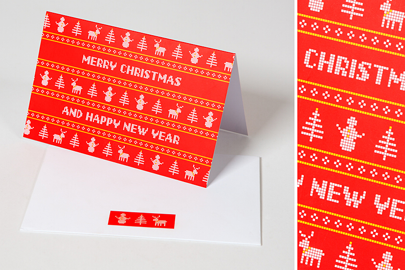
Cyberia-Greeting card 2015
Digi-knits2014In the spirit of the holidays, Cyberia's greeting card for 2015 mixes the pixel with seasonal knitwear. -
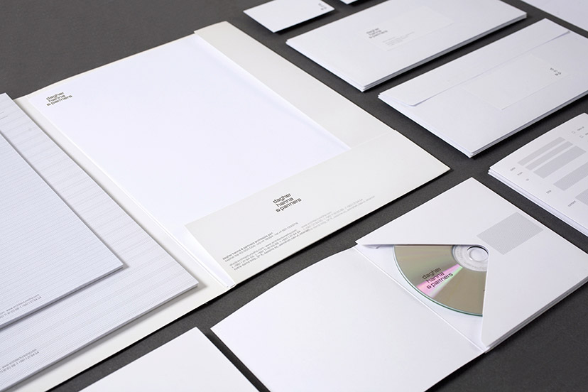
Dagher Hanna & Partners-Stationary 01
Less is more2011The clarity and simplicity of the DHP identity perfectly mirrors the architects’ design philosophy. -
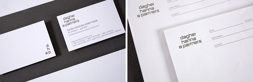
Dagher Hanna & Partners-Stationary 02
Falling into place2011Between the corner device initialism and the perfectly matched grids and typography, the visual elements of the DHP identity are all about sensible organization. -
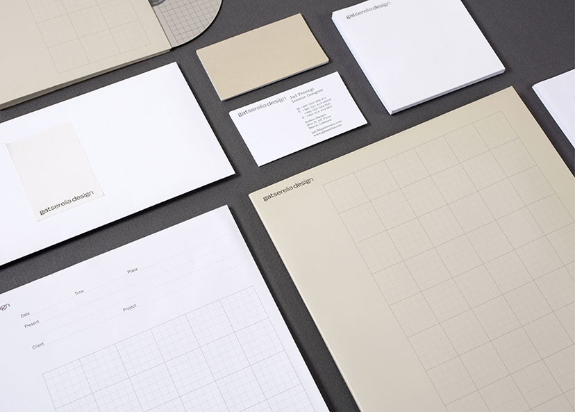
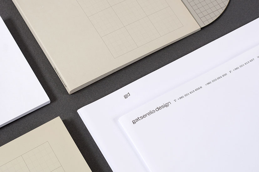
Gatserelia Design-Stationery 01
A few shades of grey2006Whites, warm greys and grid line variations constitute the elements of Gatserelia’s understated identity. -
Gatserelia Design-Stationery 02
Marking the page2006Used here on the letterhead following page, the same-weight initials are isolated and act as a clean and straightforward alternative mark. -
MTG-KCS-Gift card
Multiple choice2013With 13 messages to choose from, this gift card goes way beyond the conventional. -
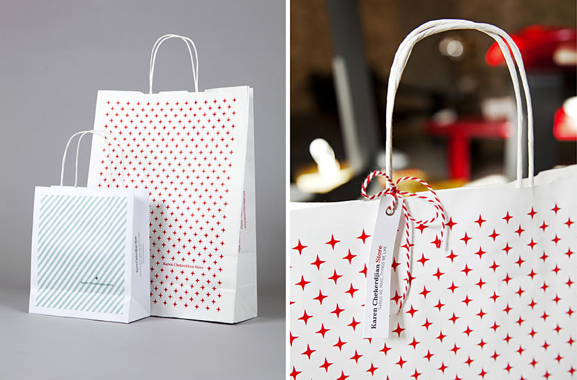
MTG-KCS-Bags
Depending on the occasion2011 – 2012 -
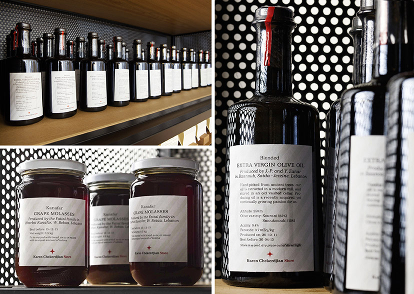
MTG-KCS-Food packaging
Farm to store2012 -
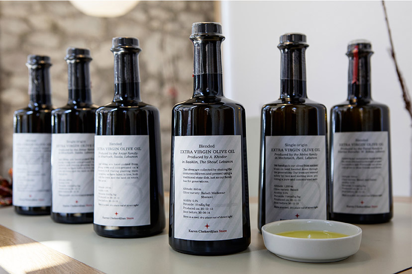
MTG-KCS-Olive oil bottles
Oil up2012The Store’s identity elements are found on developed food (and other) products such as these numbered olive oils from different producers across Lebanon. -
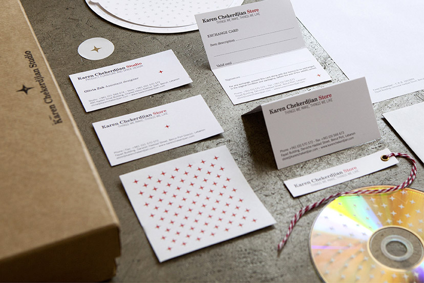
MTG-KCS-Printed items
Cards, stars and ribbons2010 -
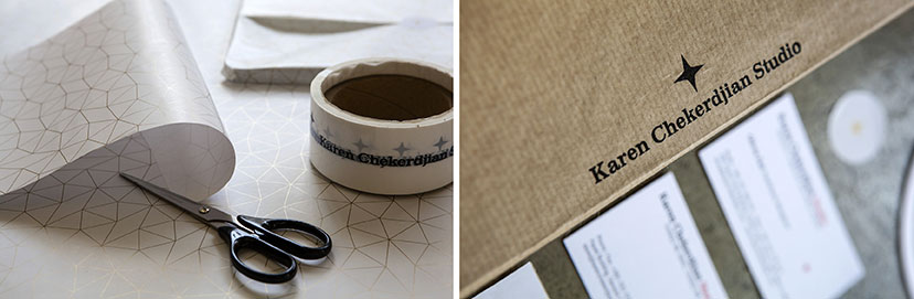
MTG-KCS-Wrapping and star
Wrap, seal, sign2010 -
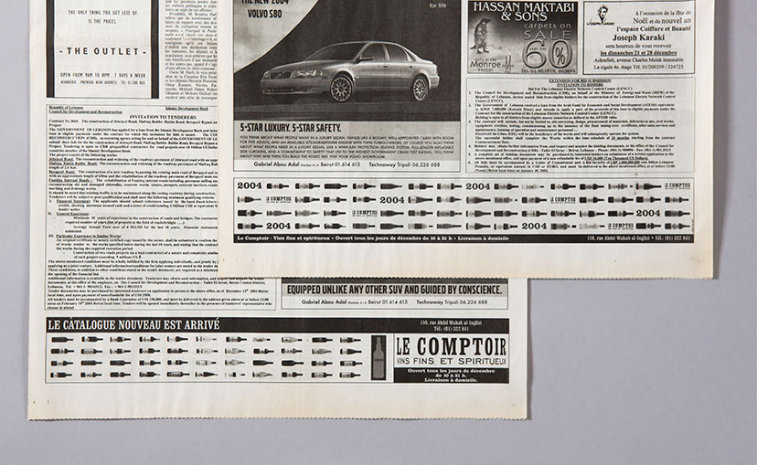
Le comptoir-Daily press ads 02
What’s your poison2012 -
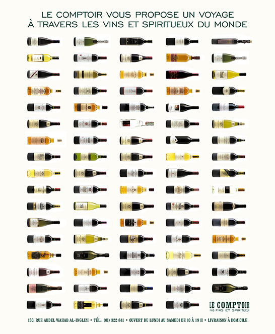
Le comptoir-Daily press ads 01
Bottles of choice2003The press announcements for new selections are all about the newly arrived bottles, and for the “new catalog” message, a little spin on “Le Beaujolais nouveau est arrivé !”. -
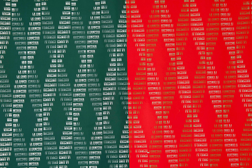
Le comptoir-Wrapping papers
Glass-green, Christmas-red2001-2004The design of the pattern for the wrapping paper did not have DNA in mind, but the double helix configuration spontaneously formed when the vertical steps simulating a rotating bottle were repeated horizontally. For Christmas, a red version was printed, with a little gold for magic. -
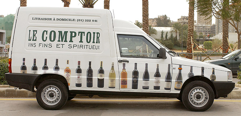
Le comptoir-Van
Drinks on the road2001Not an invitation to drink and drive, obviously. -
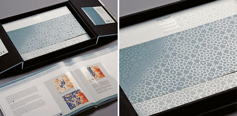
MTG-Makkah Western Gateway Competition-Box open
Shimmering through2002The pixel-based arabesque patterns represent a modern sense of tradition and, when reproduced in spot UV varnish, provide the object with an unmistakable richness.Photo: Nadim Asfar -
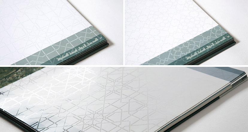
MTG-Makkah Western Gateway Competition-Patterns
Pattern variations2002 -
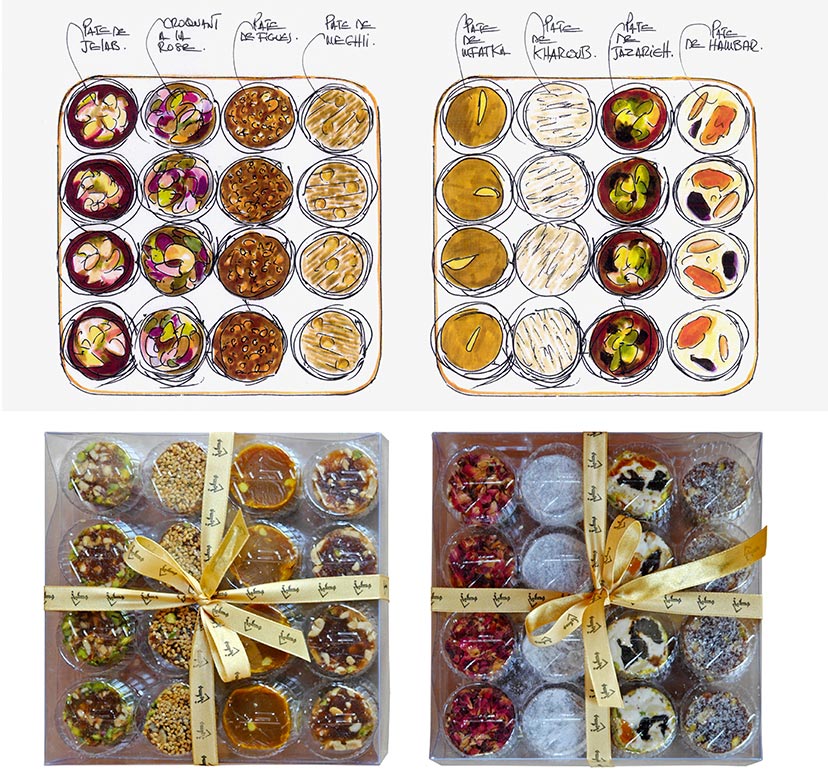
Matbakh and Maqha-Sweets and illustrations
The chef as designer2007Chef Nicolas Audi’s background in design shines through his gorgeous sketches for planning the sweets arrangements.Photography: Elie Semaan -
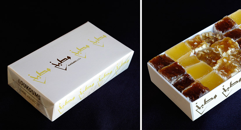
Matbakh and Maqha-Loukoums box
Main caption2003Photography: Elie Semaan -
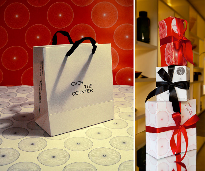
Over the Counter-Bag and wrapping papers
Keep the balls rolling2007Originally invented for calculating an area delimited by curves, the spirograph’s circular motifs are as much ornament as they are science. -
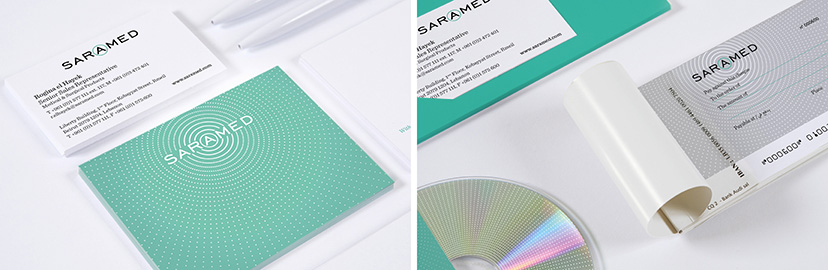
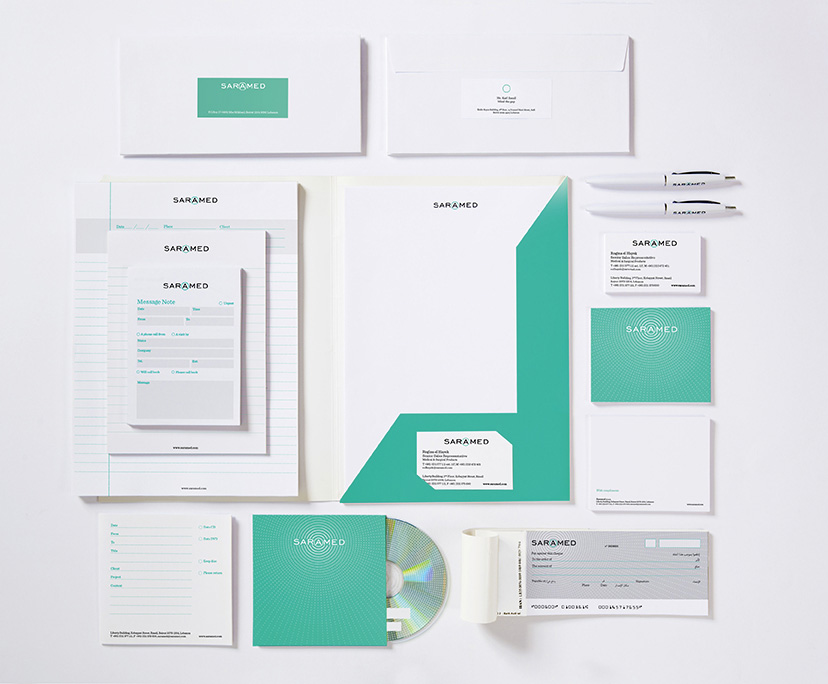
Saramed-Pattern
Focal point2014The vortex pattern is precise and absorbing, drawing the attention to the central and distinguished letter in the logotype. -
Saramed-Stationery
Sterile yet potent2014Clearly, the health and pharma visual code of whites and cool colors is not something to be recklessly messed with, but a particular shade of blue-green and a striking circular pattern derived from the letter framing provides this identity scheme with its differentiating attributes. -
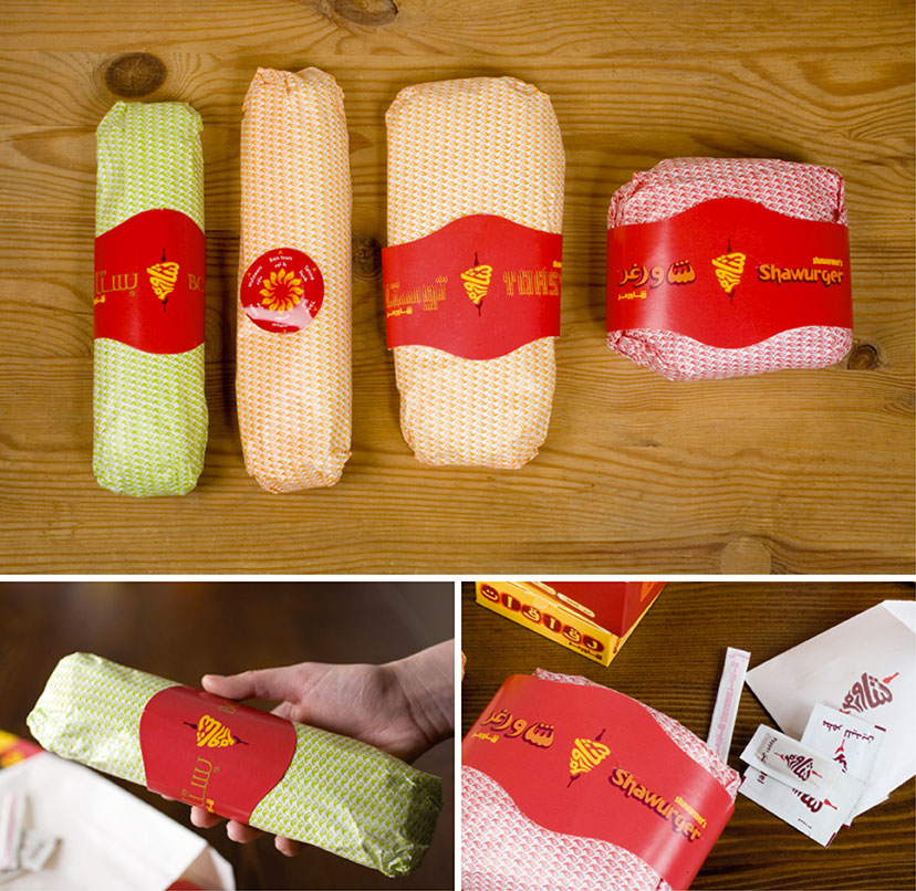
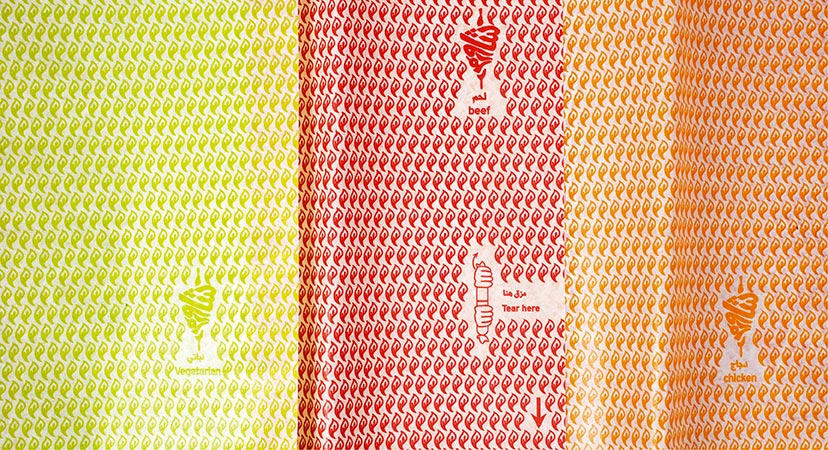
Shawarmer-Sandwich wrapping
Know your sandwich2007Along with the sandwich wrapping paper color, a series of rings and stickers completes the sandwich identification system. -
Shawarmer-Wrapping paper
Know your sandwich2007The wrapping papers are distinguished by color and include a small graphic device for quick access to the reward. -
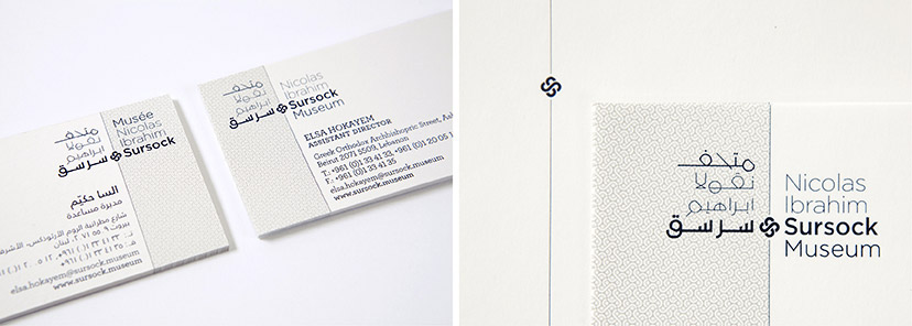
MTG-Sursock museum-stationery details
Rose without the prick10-2014 – 04-2015Fixed on the margin line, the Sursock floral emblem can appear on its own as an identity token, and is the basic module for the pattern construction. -
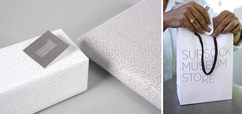
MTG-Sursock museum-Store box and bag
Packed with care2015 - 2016Between the finely detailed building illustration, the delicate pattern and the floral kiss at the end, it’s easy to see how preciously Sursock STORE treats its items on offer. -
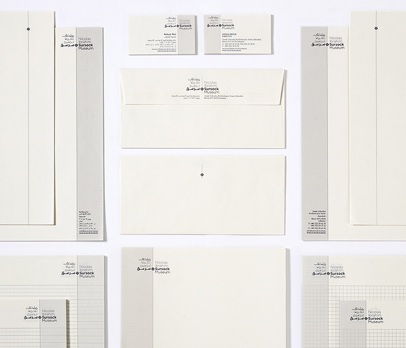
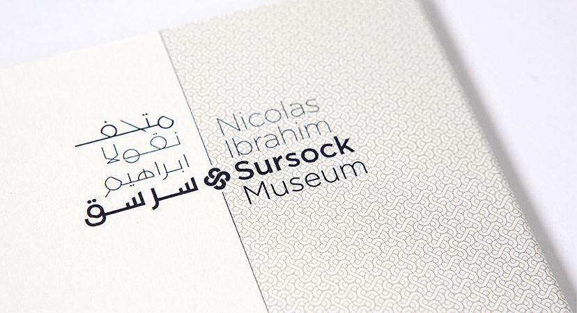
MTG-Sursock museum-stationery
Working margins05-2015The margins, alternating between left and right on the Sursock Museum stationery, indicate the alternation between Arabic and Latin scripts that flow in opposite directions. -
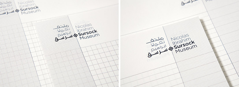
MTG-Sursock museum-notepads
Taking note04-2015Surock’s back-to-back notepads pay attention to the difference between the conventionally ruled Arabic note book and the gridded English one. -
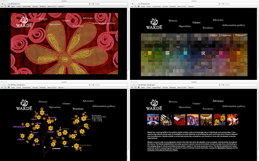
Sursock Museum-Letterhead closeup
Mind your language2014For an institution like Sursock Museum, with an audience reaching well beyond the city in which it dwells, the marriage between Arabic and English is consistently present on all levels. Here, the extension of the central line of the institutional mark and the introduction of a tightly knit pattern of the emblem provides a structural and visual distinction between the two languages. -
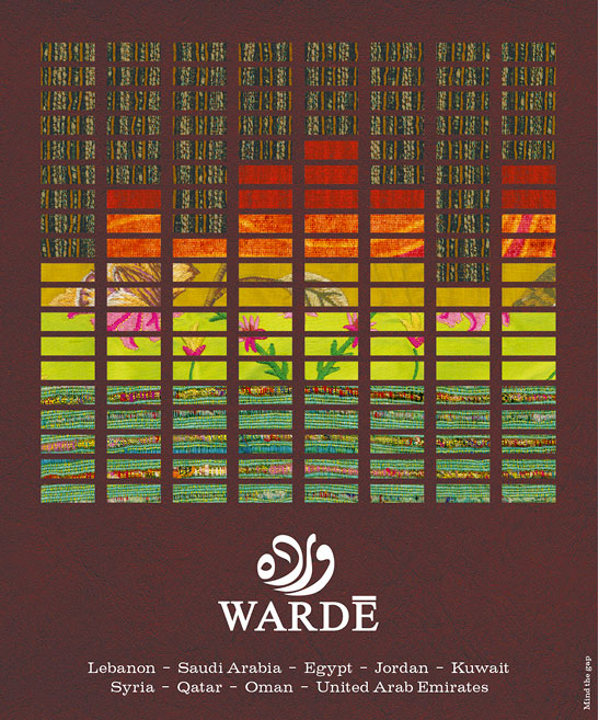
MTG-Wardé-Overview-Website
Wardé online2010 -
MTG-Wardé-Advertising-Byblos ad
For the music2009The theme of sound was adopted for an ad in the review published by Byblos Festival, Lebanon’s ultimate summer music event. -
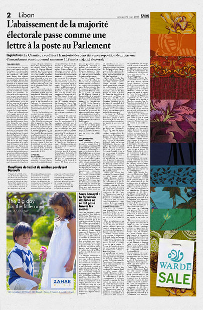
MTG-Wardé-Advertising-Newspaper ad vertical
-
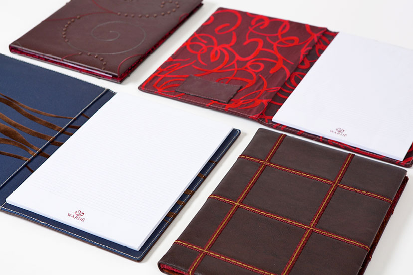
MTG-Wardé-Overview-Logo on leather
All about the fabric2008 -
MTG-Wardé-Greetings-Planner covers
Choice of dress2008 -
MTG-Wardé-Advertising-Newspaper ad two pages 01
Teasing through the pages2008 -
MTG-Wardé-Advertising-Newspaper ad two pages 02
Down to the thread2008 -
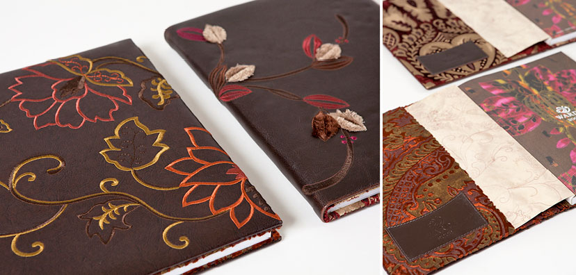
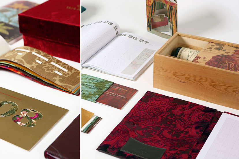
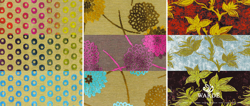
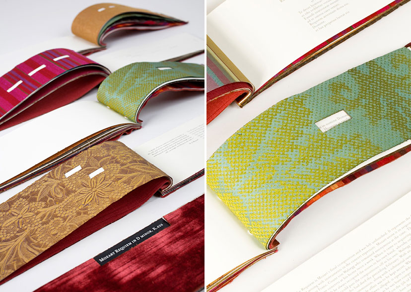
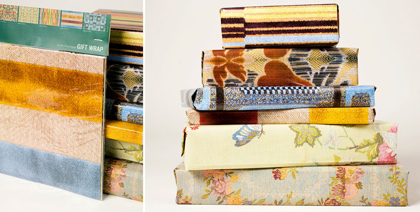
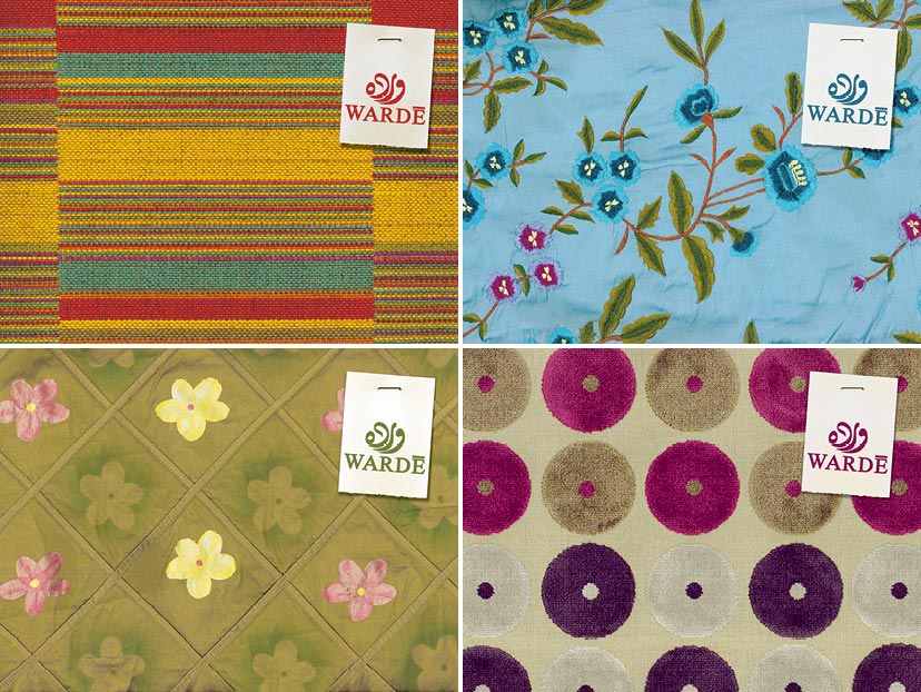
MTG-Wardé-Overview-Different objects
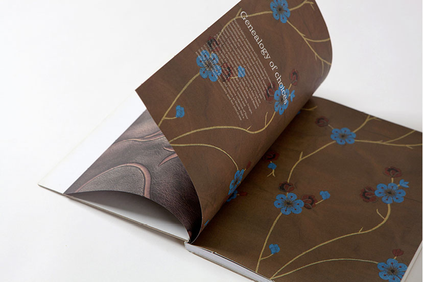
Crafted with care2006 – 2010Fabric, both actual and reproduced, is at the heart of Wardé’s range of greeting cards and promotional objects. -
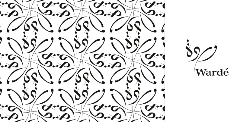
MTG-Wardé-Overview-Identity option 01
Potential identity2008Developed in collaboration with artist calligrapher Samir Sayegh, this calligraphic mark makes for a particularly intricate pattern. -
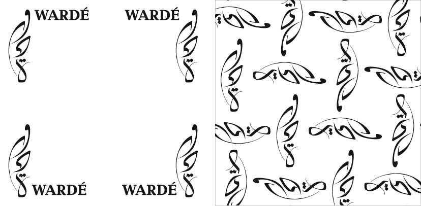
MTG-Wardé-Overview-Identity option 02
Potential identity2008Developed in collaboration with artist calligrapher Samir Sayegh, this calligraphic mark neatly acts as a dynamic corner device. -
MTG-Wardé-Greetings-Bustan 02
Compositions2008 -
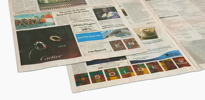
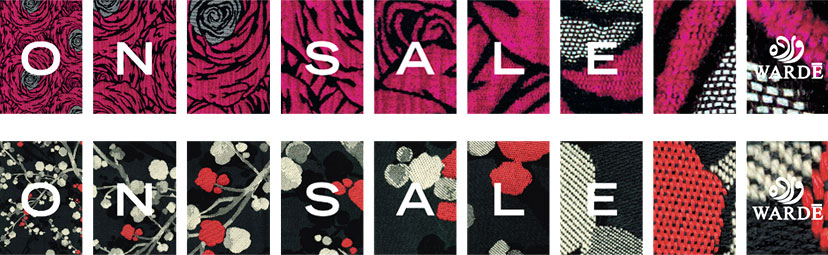
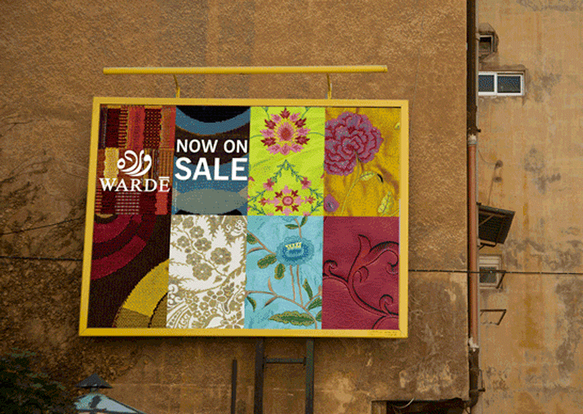
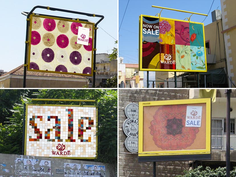
MTG-Wardé-Billboard chance campaign
Chance and choice2008Through a playful approach that creatively uses the way billboards are printed in pieces of 8, this award-winning campaign uses a network of 800 billboards with 800 distinct visuals within a reasonable production budget. 16 different fabrics (equivalent to 2 billboards) were reproduced and the assembly of each billboard was left to Pikasso’s installation team who had to choose 8 pieces as long as the Wardé logo and the sale message appeared on every billboard. The result is a rich multivisual campaign with more than 149 million combinations (149,022,720 to be exact) that was only revealed once posted! Even with 800 billboards to fill, the chance of a combination repeating itself was close to zero. -
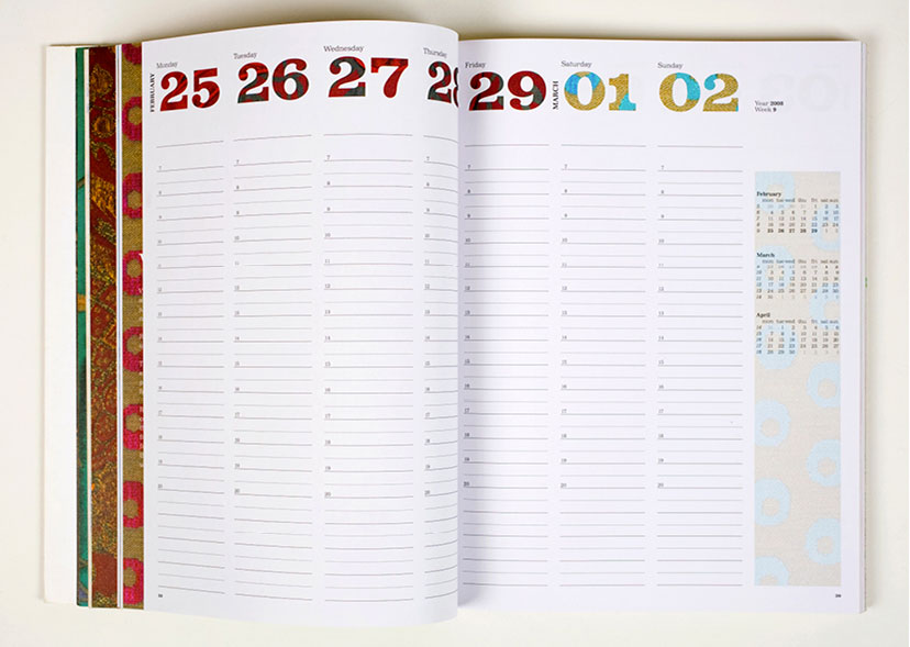
MTG-Wardé-Greetings-Planner inside 02
Plan your days with style2007 -
MTG-Wardé-Greetings-Planner inside 03
Plan your days with style2007 -
MTG-Wardé-Greetings-Planner inside 04
Plan your days with style2007 -
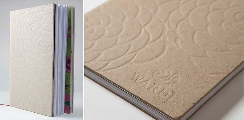
MTG-Wardé-Greetings-Tactile cover
Tactility2007 -
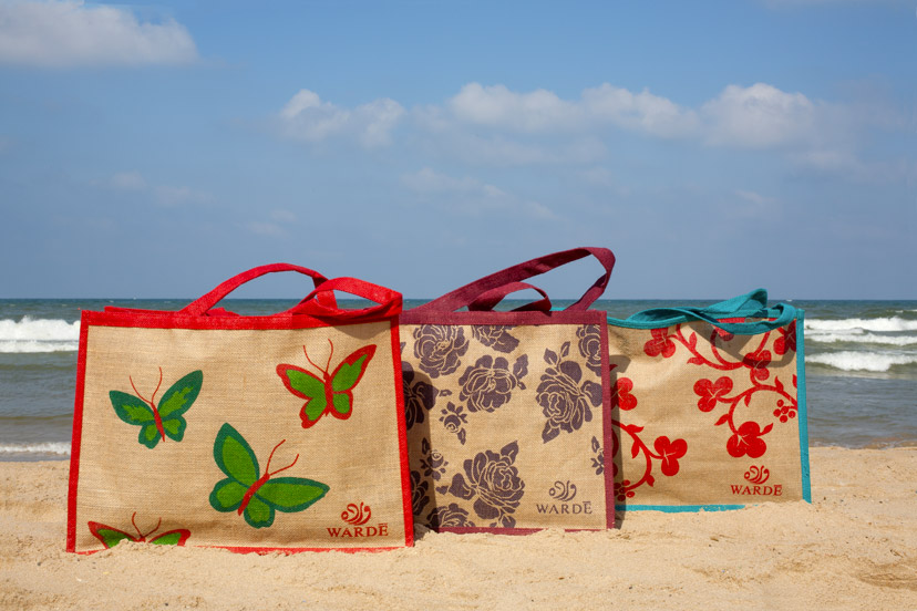
MTG-Wardé-Greetings-Beach bags
For the summer2007 -
MTG-Wardé-Advertising-Magazine ads three pages
3 by 32007A 3-page magazine ad multiplies the idea of choice visually and conceptually. -
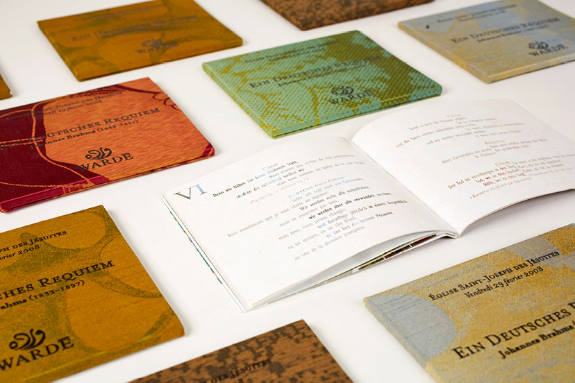
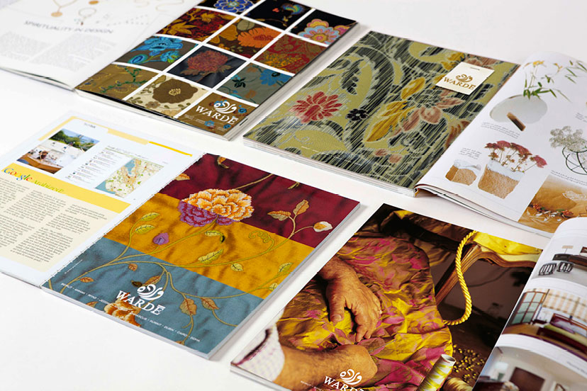
MTG-Wardé-Overview-Magazine ad campaigns
Variety, again and again2005 – 2008 -
MTG-Wardé-Greetings-Notepads
Choice of dress2006 -
MTG-Wardé-Overview-Bilboard ad campaigns
Draping the cityscape2005 – 2009 -
MTG-Wardé-Greetings-Bustan 01
Compositions2006In sponsorship of the Al-Bustan Festival for classical music, the lyrics of the recitals were presented to the audience in a delicately crafted fashion. -
MTG-Wardé-Greetings-Wrapping paper
Paper-as-fabric2005 -
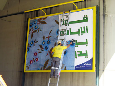
MTG-Wardé-Advertising-Billboard installed
Pikassoman at work2005 -
MTG-Wardé-Advertising-Billboard patterns
Cut from a different cloth2005 -
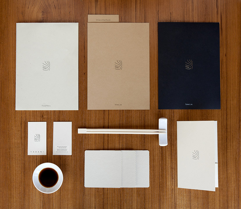
Yabani-Branded items
Pure and simple2014A changing paper scheme delivers just the right amount of nuances. -
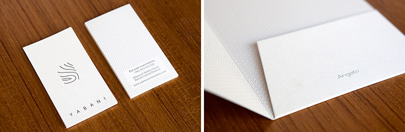
Yabani-Business card and bill holder
Form and language2014A set of Japanese-inspired delicate patterns, along with a Japanese "thank you", are some of the elements that punctuate the identity. -
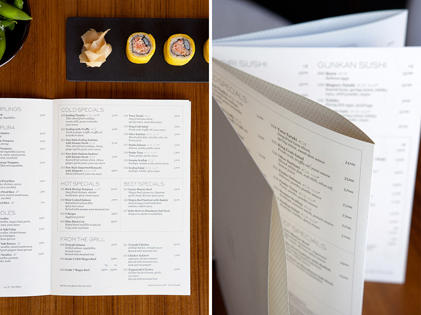
Yabani-Food menu
Origamenu2014A threadless, stapleless, glueless method using slits and folds allows for a multipage object to be formed out of a single sheet of paper. Patterns are printed on the inner folds of the menu which acquires a crafted quality. -
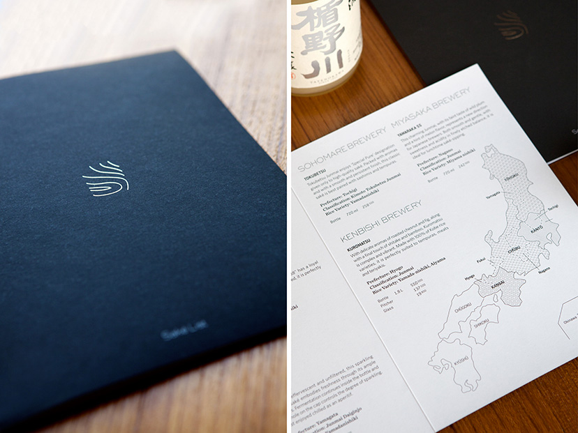
Yabani-Saké menu
For saké’s sake2014The drop of shiny silver on the cover is the first clue to how seriously the establishment takes its saké; prepare to be schooled.