There’s something notably irresistable about giving form to an idea so simple, so straight-to-the-point, that it merits nothing more than an equally unambiguous graphic interpretation. With a name formed of two identical characters and the concept of the “ideal” temperature for human comfort, this brand identity for the distributors of Daikin – a brand of upscale air-conditioning systems – almost designed itself.
-
-
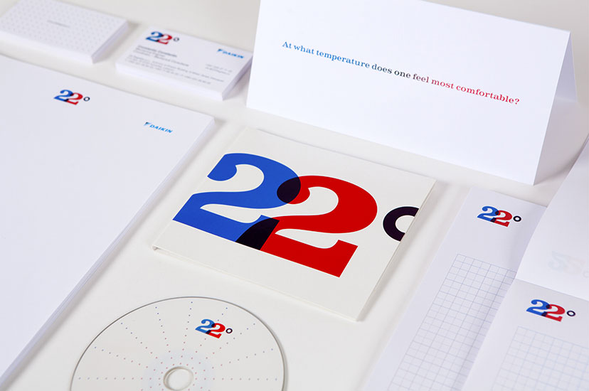
22 Degrees-Stationery
A simple question launches this identity which puts an end to the game of hot-and-cold.
-
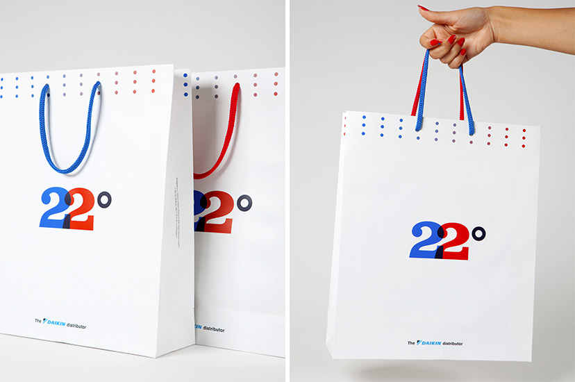
22 Degrees-Bag
Even the handles receive the 22 treatment.
-
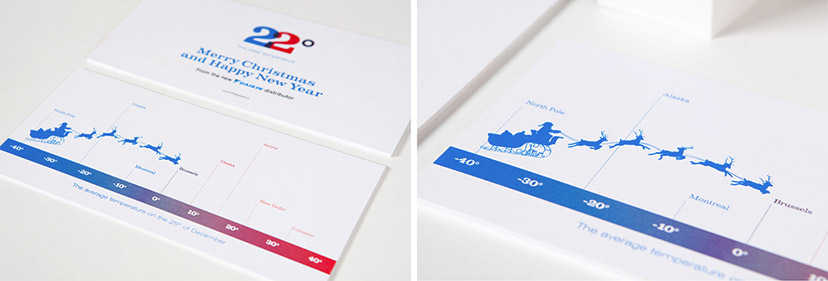
22 Degrees-Greeting card 2011
A scale of average temperatures on Christmas across the globe shows the ups and downs of Santa’s journey.
-
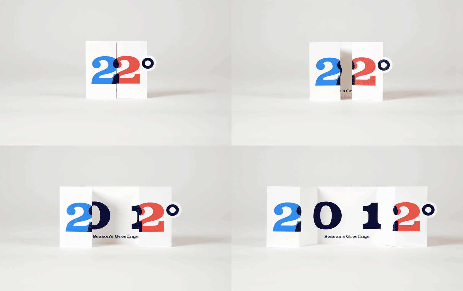
22 Degrees-Greeting card 2012
This idea of playing with numbers for the 2012 greeting card was just too good to be missed out on.
-
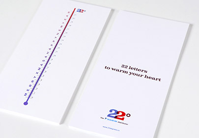
22 Degrees-Greeting card 2013
Something for the warm-hearted
The 2013 card includes a scale with the only 22 characters needed to greet.
-
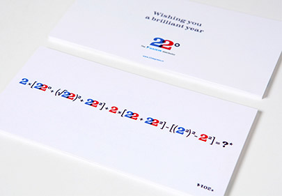
22 Degrees-Greeting card 2014
Something for the math whizz
A 2-only mathematical formula makes of “2014” a brilliant answer.
-
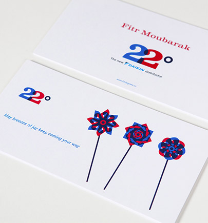
22 Degrees-Greeting Fitr 2010
There’s nothing like toy windmills for a positive message.
-
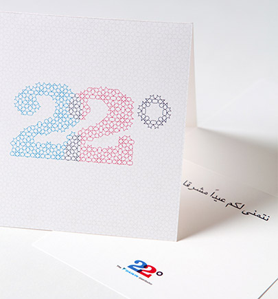
22 Degrees-Greeting Eid 2012
Eid-appropriate, a traditional arabesque maps the forms of the logomark.
-
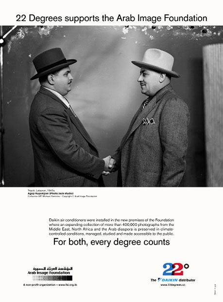
22 Degrees-AIF support ad
Temperature control is crucial for photographic preservation, and so 22 Degrees donated professional air-conditioning systems in support of the Arab Image Foundation. This ad was published on the occasion.

