Our original encounter with Yabani – a transliteration of the Arabic word for “Japanese” – occurred soon after the place first opened in Beirut. It had an existing identity: a simple Helvetica Neue typeface with a red and white color scheme designed by Nathalie Boustany Khoury. Our task was to redesign the menus. We compiled an exhaustive photographic index of the food items, in consideration of an audience with less than perfect sushi literacy. Twelve years (and an avalanche of sushi restaurants) later, we took on the rebranding of what had become one of the best Japanese restaurants in town as it moved location to the chic downtown district of Beirut. We refocused our attention on the restaurant’s growing reputation of perfection, the sophistication of an ultimate fine dining experience, and a much more sushi-savvy clientele.
-
Yabani-Logo
The simple abstraction of salmon flesh alludes to the context by referencing the purity of Japanese wood-cut prints, setting itself apart from the profusion of faux Japanese typefaces on the scene.
-
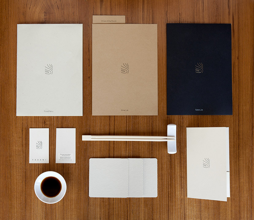
Yabani-Branded items
A changing paper scheme delivers just the right amount of nuances.
-
Yabani-Business card and bill holder
A set of Japanese-inspired delicate patterns, along with a Japanese "thank you", are some of the elements that punctuate the identity.
-
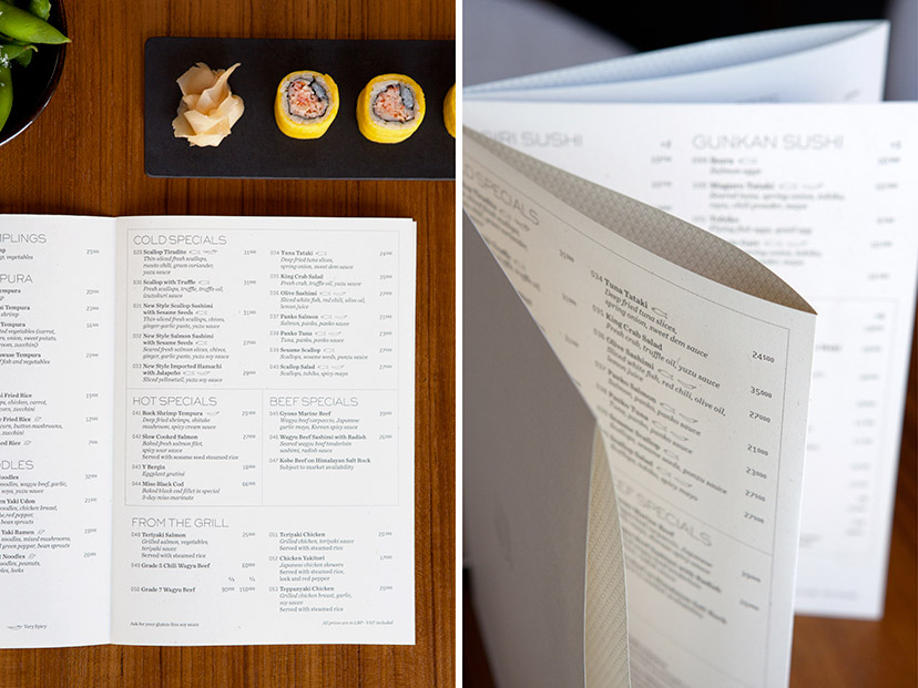
Yabani-Food menu
A threadless, stapleless, glueless method using slits and folds allows for a multipage object to be formed out of a single sheet of paper. Patterns are printed on the inner folds of the menu which acquires a crafted quality.
-
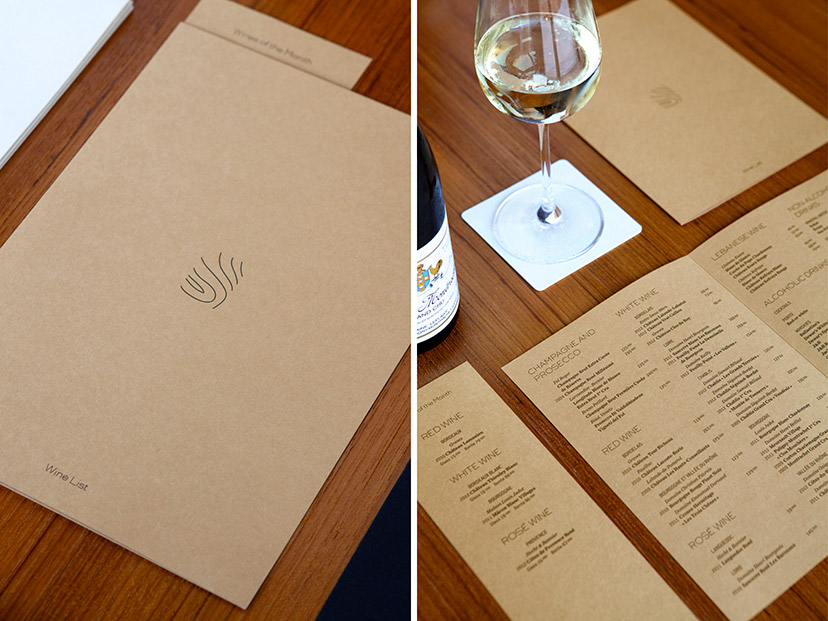
Yabani-Wine list
The wine list gets the warmest of the three paper shades.
-
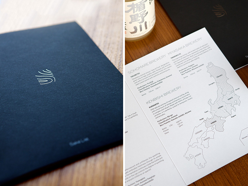
Yabani-Saké menu
The drop of shiny silver on the cover is the first clue to how seriously the establishment takes its saké; prepare to be schooled.
-
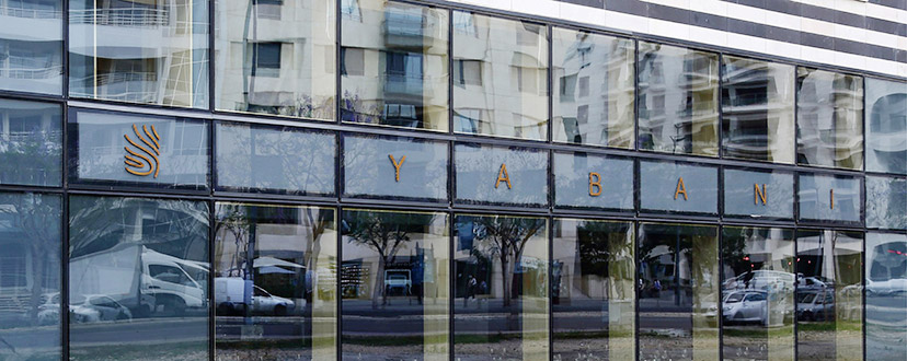
Yabani-Main sign
The façade glass structure is used to distribute the elements of the logo, accentuating the spaced-out configuration of the logotype.
-
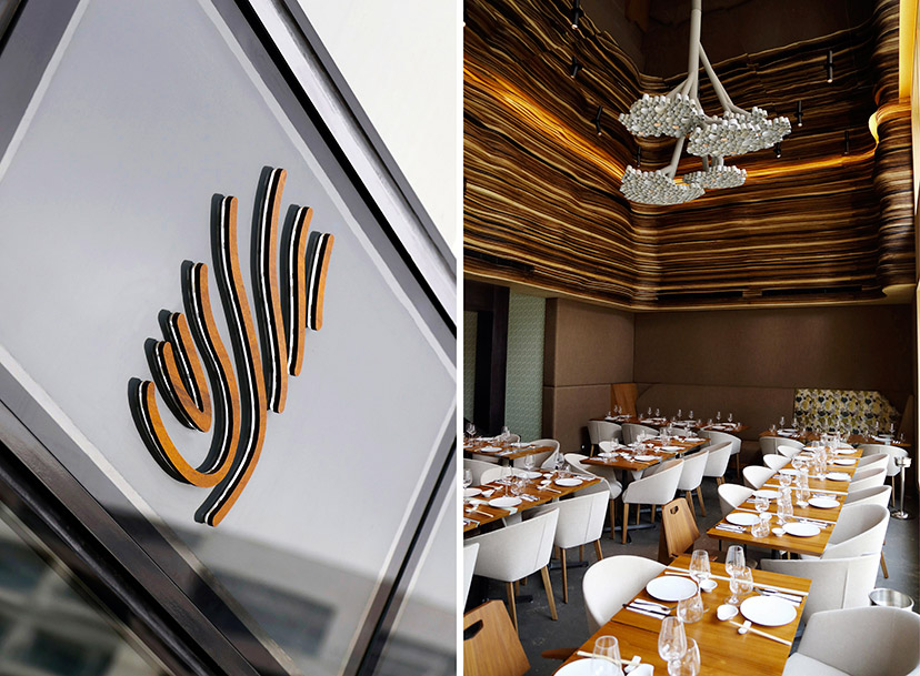
Yabani-Sign and interior
The surface treatment of the main sign backlit elements establishes a dialogue with the interiors scheme.
-
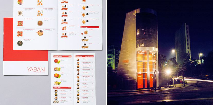
Yabani-Previous menu and building
Our photographic intervention on Yabani’s previous menus started a wave of copycatting as the sushi restaurant industry realized the benefits of familiarizing the customer with the product, especially at the time when the offering was new to the Lebanese scene. With the move from the original location – a building designed by architect Bernard Khoury – and the decision to rebrand, just as we were the first to include the food photography, we were also the first to take it away.
Food photography: Michel Esta – Building photography: Joseph Chartouni

