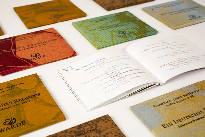
-
Awan-Catalog inside pages
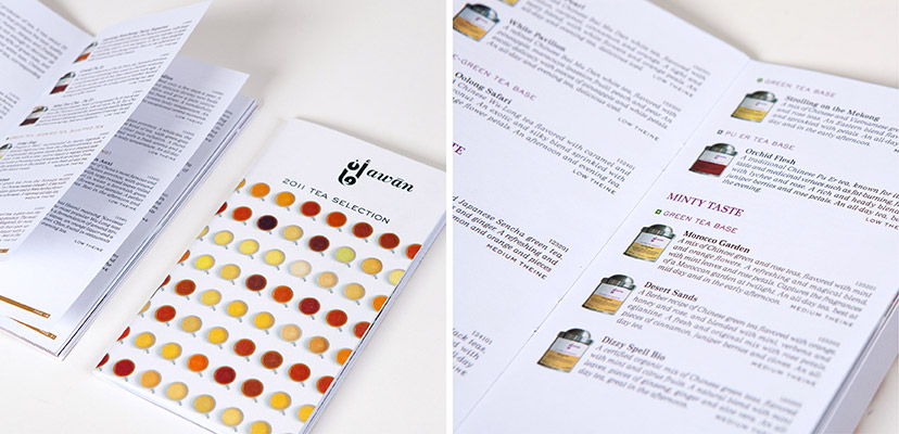
The tea list2011Tea products are organized by type, country of origin and flavor. -
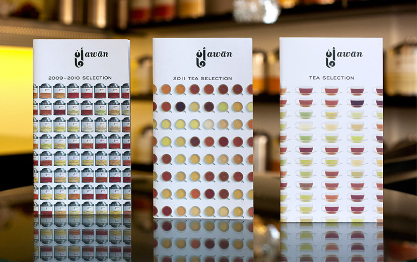
Awan-Catalog covers
What’s on offer2009 – 2012The regularly printed catalogues keep the customer up to speed. -
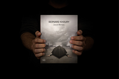
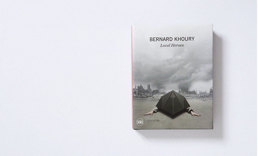
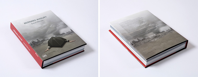
Bernard Khoury-Book cover
Not by the book2015Bernard Khoury’s “Local Heroes” is closer in format to a novel than it is to an architectural monograph: an appropriate form to an unconventional content. -
Bernard Khoury-Book pages 01
Turning a page2015The first part of “Local Heroes” is essentially a story of return, set in the consistently hopeful and deceptive post-war Beirut everyone seems to be incapable of leaving behind. -
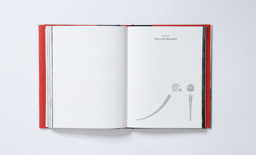
Bernard Khoury-Book pages 02
A page turner2015The second part of “Local Heroes” is a more classical project-by-project exposé, albeit informed by the narrative that precedes it. -
Bernard Khoury-Cover and back cover
Judged by its cover2015The dialectic between the cover and back cover is one of appearance and disappearance, themes that resonate well with the content of “Local Heroes”. -
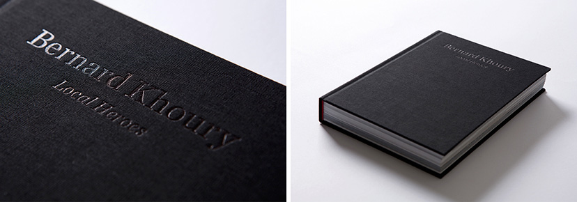
Bernard Khoury-Inside cover
Jackets off2015Black foil on black fabric reveals itself beneath the protective layer of full-color printing. -
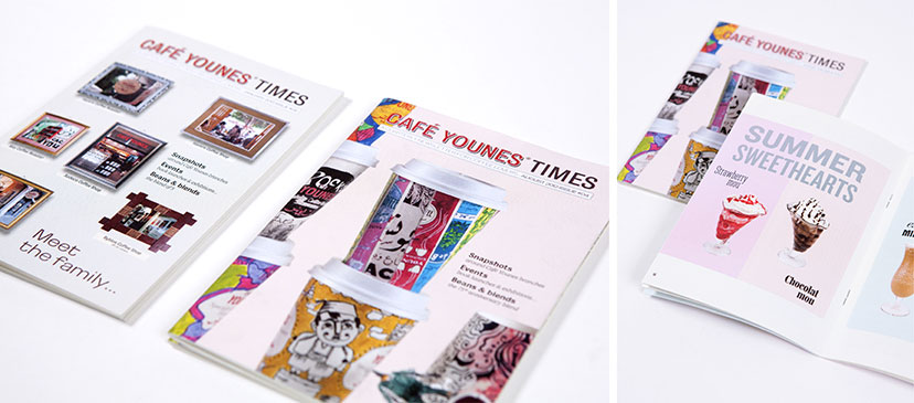
Café Younes-Newsletter
What’s happenin’2013A pocket sized newsletter keeps the visitors up to date with the going-ons of the coffee shop. -
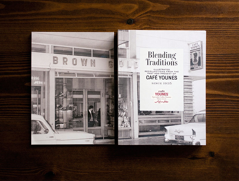
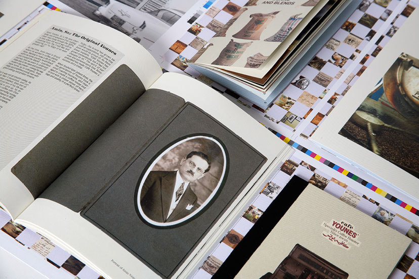
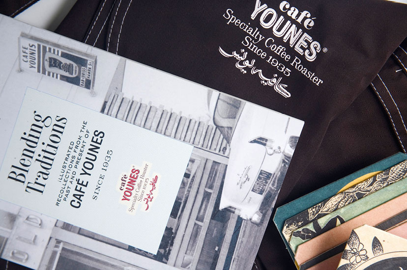
Café Younes-History book front and back
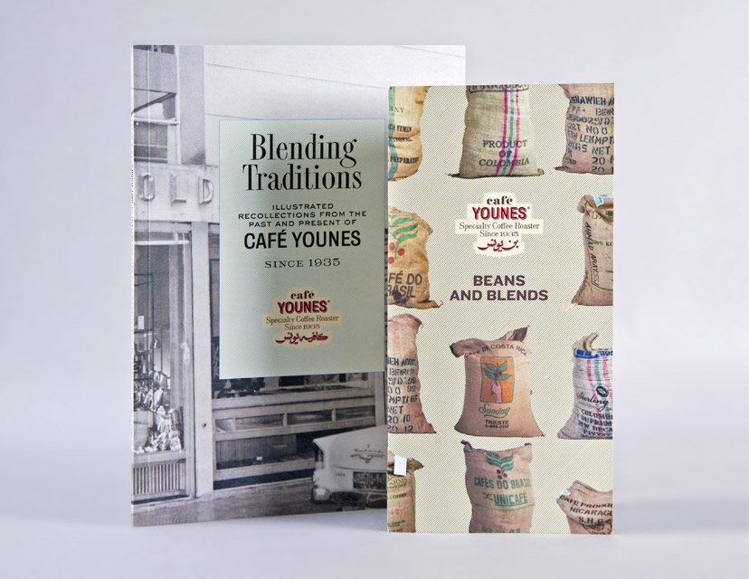
A new chapter2010The history booklet was the perfect document to celebrate the 75 years of the establishment, a record that marks a defining moment in Younes’s development. -
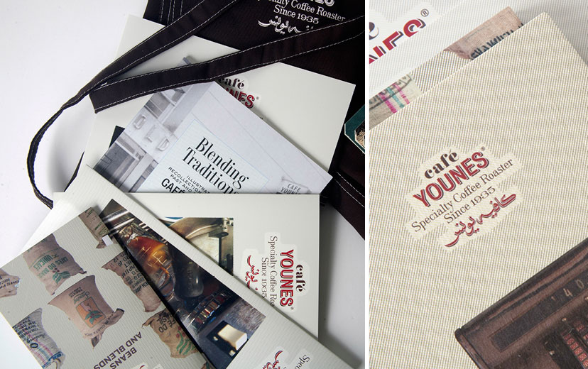
Café Younes-Branded items 03
Tone and detail2010Ultimately, the CMYK hatched separation makes for tonal variations, fine detail and a tactile resonance. -
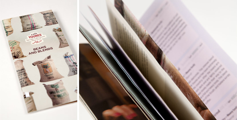
Café Younes-Coffee brochure cover
All about coffee2010The proposed coffee product catalog lists the beans and blends, but also explains grain origins, preparation methods and grading systems, making it a coffee reference document above everything else. -
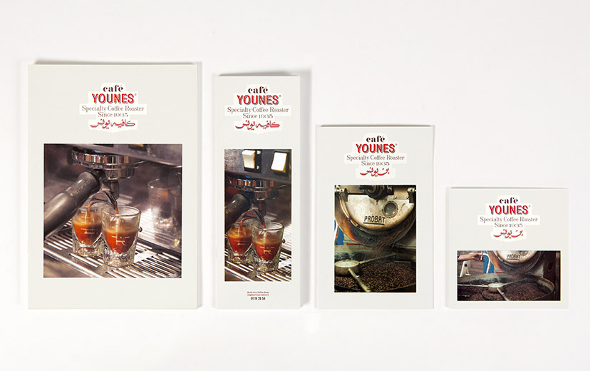
Café Younes-Menu covers
The hero on the cover2010The artisanal coffee and its careful preparation – pinnacles of what Younes is all about – are front-page news on the menu, so to speak. -
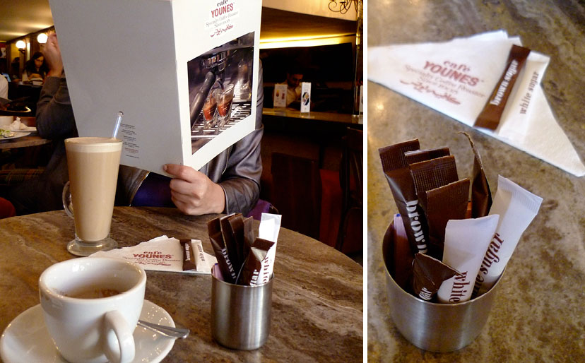
Café Younes-Printed items
Pictures and frames2010The integration of photography into the scheme takes place on many fronts and in many ways – framed, masked, patterned or simply reproduced – adding to the dynamism of the identity. -
Café Younes-At the coffee shop 01
At the coffee shop2010 -
Café Younes-Branded items 01
Dynamic, variable, adaptable2010The Younes identity is antipodal to the model of the “uniquely recognizable color”, “uniquely recognizable typeface”, “uniquely recognizable image”, and so on. Instead, consistency is established by way of basic visual, tactile and verbal elements coming together intricately. -
Café Younes-History book and coffee brochure
The extra mile2010The conception and creation of communication, marketing and operational tools – such as this history booklet and coffee product catalog for Café Younes – pushes the scope of branding recommendations beyond the typical identity scheme. -
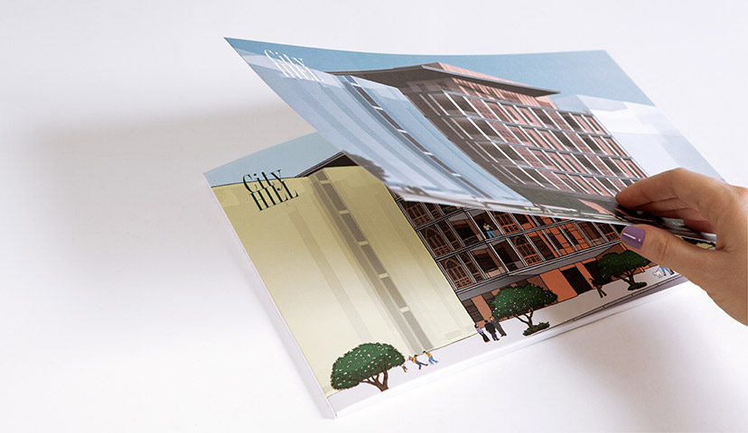
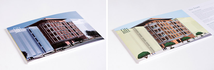
City Hill-Brochure cover opening
One at a time2012The City Hill sales brochure cover gives an option between a 3D rendering and the more interpretative illustration. -
City Hill-Brochure covers x 2
(Not so) identical twins2012 -
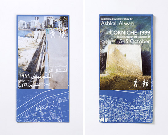
Corniche1999-Full map
Macro picture1999The full map, based on a scanned and treated cadastral, locates the projects and provides additional information about each. -
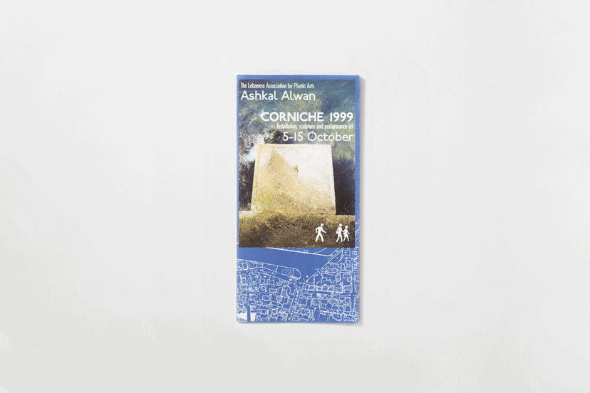
Corniche1999-Two covers
Viewpoints1999The two covers of the Corniche pamphlet are each reserved for a language, and while the Arabic gazes at the city scape, the English stares down at the sea. -
Febrik-Cover
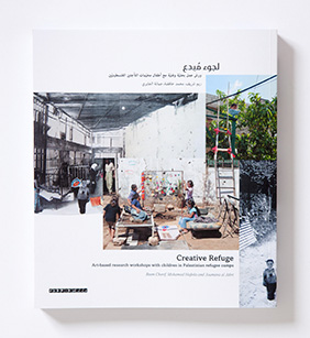
A collage of imaginations2014The “Creative Refuge” cover brings forward the coming together of children’s inventions and interventions. -
Febrik-Cover and back cover
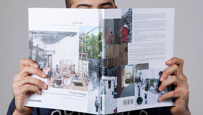
Constructed reality2014The continuation of the collage onto the back cover reveals an extended made-up world, where the space of the camp becomes the sum of bits and pieces of works by the participating children. -
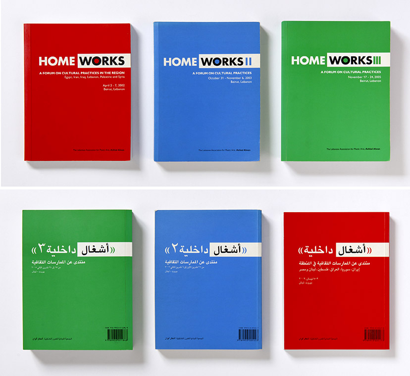
Homeworks-Book covers
Back to back2002 – 2005Each Home Works publication is bilingual with two operational covers, with the Arabic and English sections, which flow in opposite directions, meeting at the center of the book. -
Homeworks-Books
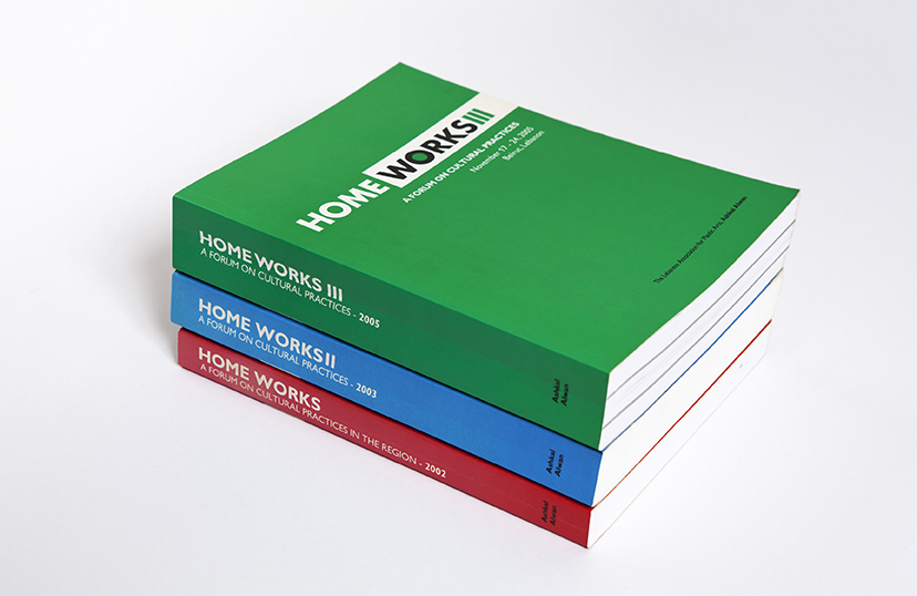
Changing hues2002 – 2005For every edition, the Home Works identity is dressed with a new bright and vibrant identifying color. -
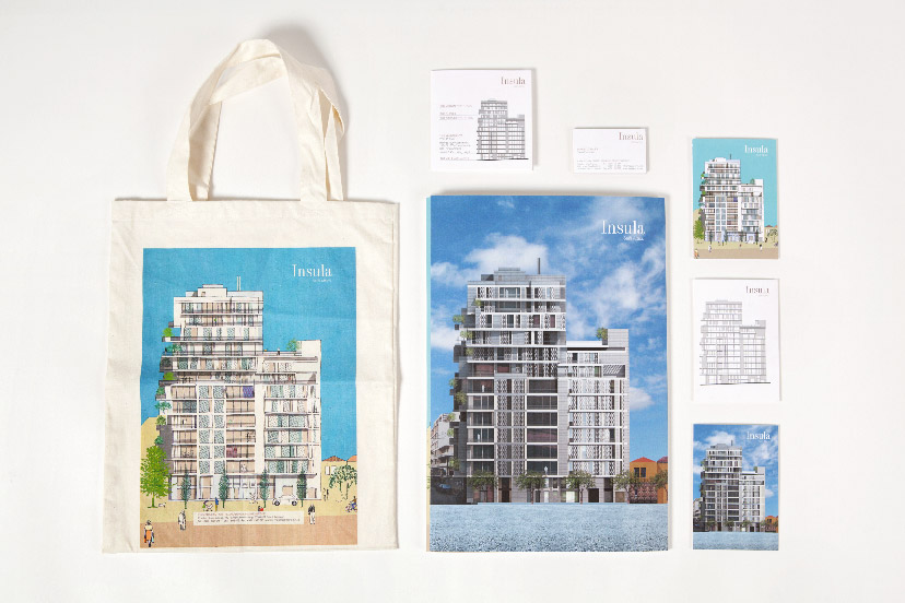
Insula-Branded items
A little more intimate2011With postcards and a tote bag, the marketing items for this building go beyond the cold and calculated sales brochure. -
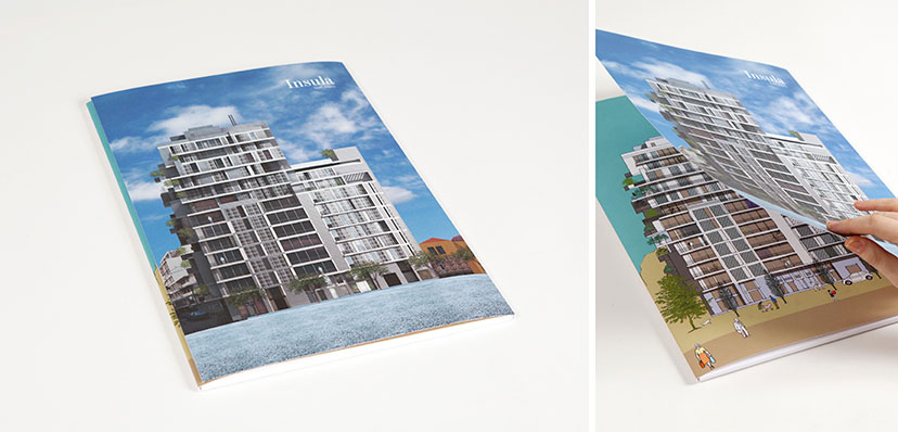
Insula-Brochure covers
Two sides of the same coin2011A double-cover system allows for the sales brochure to be tailored per potential client between the more classical 3D rendering and the less conventional illustration. -
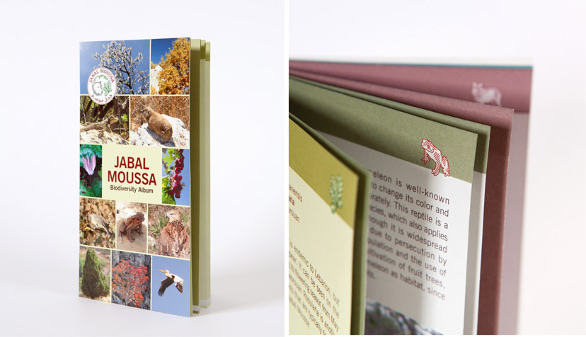
Jabal Moussa-Biodiversity booklet
The cast of characters2011No natural reserve experience is complete without a detailed inventory of the growing, moving, jumping, crawling and flying things that put the diverse in biodiversity. -
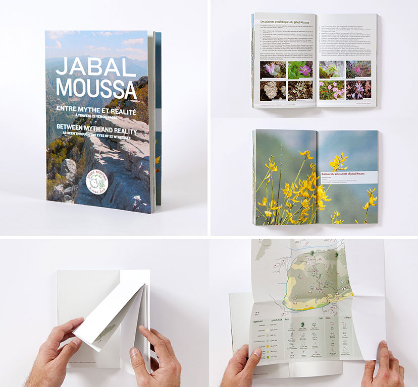
Jabal Moussa-Booklet
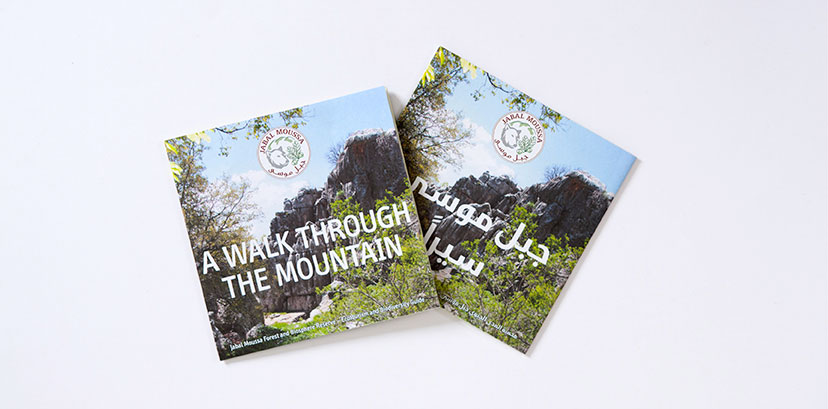
A little more information2010For the more curious, a booklet which includes shared experiences by other visitors along with the fold-out map is available. -
Jabal Moussa-Fold-out map closed
Portable guide2010The pocket-size fold-out map has two languages, English and Arabic, with each occupying a side of the folded document. -
Le comptoir-Catalogue and inside pages
Taking drinking seriously2001The recommendation for Le Comptoir’s yearly product catalog was a highly informative and professional approach that gives the amateur a chance to select like a connoisseur.Photo: Nadim Asfar -
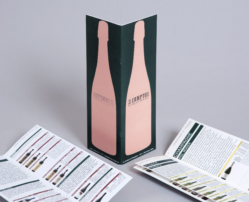
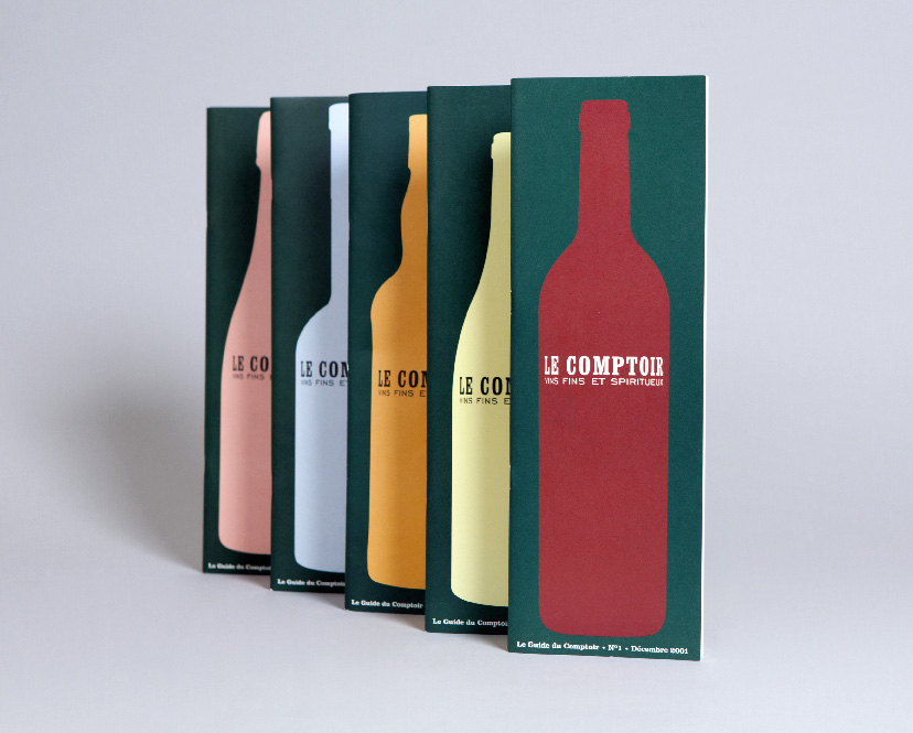
Le comptoir-Catalogue covers
Iconic shapes2001Realizing that there is a typical bottle shape associated with a type of drink – red wine, white wine, whiskey, and so on – a series of icons was born, to be used on the product catalog as it changes from one year to the next.Photo: Nadim Asfar -
Lebanon Communicating-Book cover
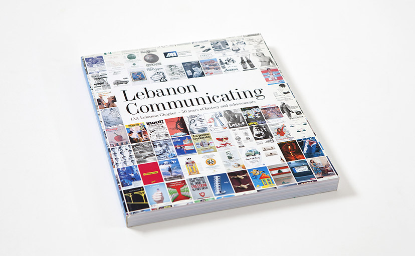
Rewind2012Regional ads across five decades tile the front cover of the IAALC publication. -
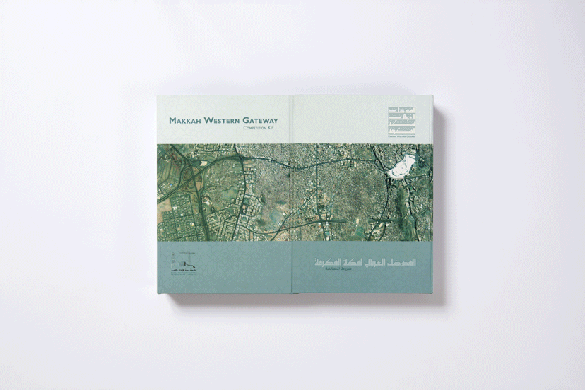
MTG-Makkah Western Gateway Competition-Box
Inside the box2002 -
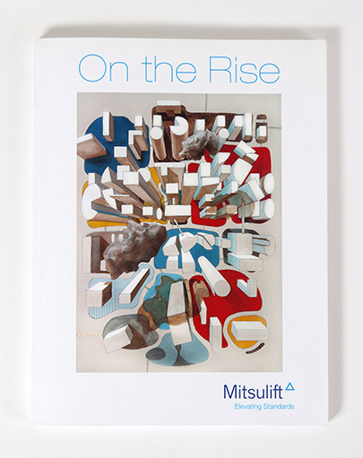
Mitsulift-Portfolio cover
Bird’s eye view2011The Mitsulift portfolio is an extensive compendium of the company works.Cover image: Painting by Joe Kesrouani -
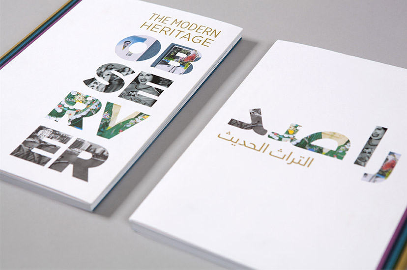
MoHO-Observer 01
To each their language2013MoHo’s publication on documentary and archiving projects by the network members gets separate Arabic and English versions; each of the covers receives a language-appropriate compositional arrangement, retaining the concept of “peeking through the observer” while avoiding language adaptation mimicry. -
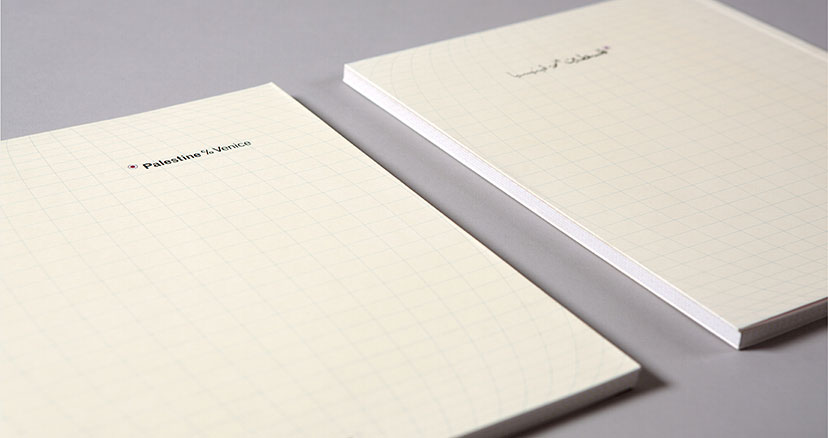
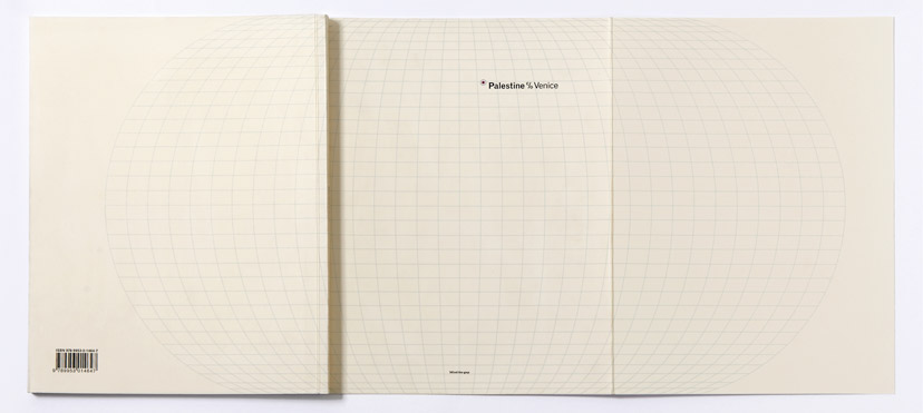
Palestine c/o Venice-Covers
Worlds apart2009The English and Arabic versions of the exhibition catalogue are designed as separate documents. -
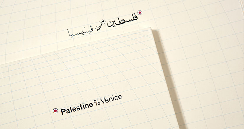
Palestine c/o Venice-Covers close up
Back to the map2009The Arabic name is set in the style of calligraphy often found on traditional Arabic maps. -
Palestine c/o Venice-Open cover
The big picture2009It’s only when the catalogue cover is fully open, flaps and all, that the whole globe appears and the (mis)location of Palestine can become apparent. -
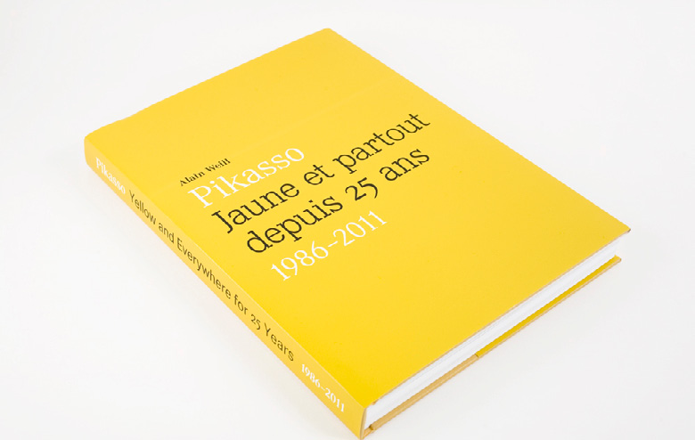
Pikasso-25 year book cover
Rejoicing in yellow2012A book cover design that literally plays out its title. -
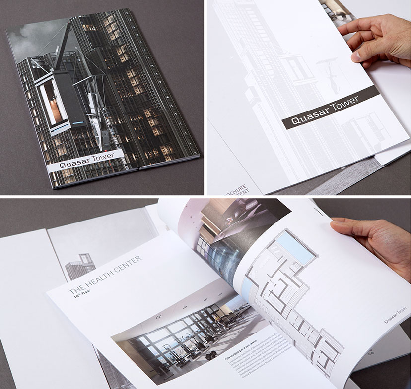
Quasar Tower-Brochure
Inside and out2014 -
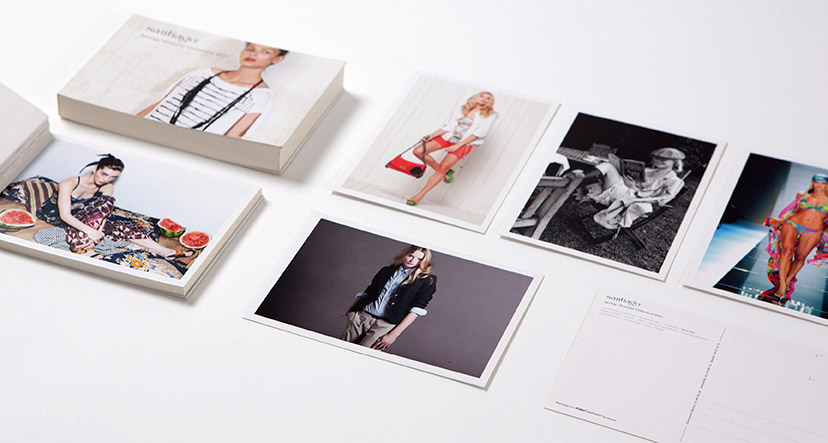
Santiago-Postcard catalog
Pic(k)s2011For the Spring/Summer 2011 collection, the booklet acts as a set of detachable postcards. -
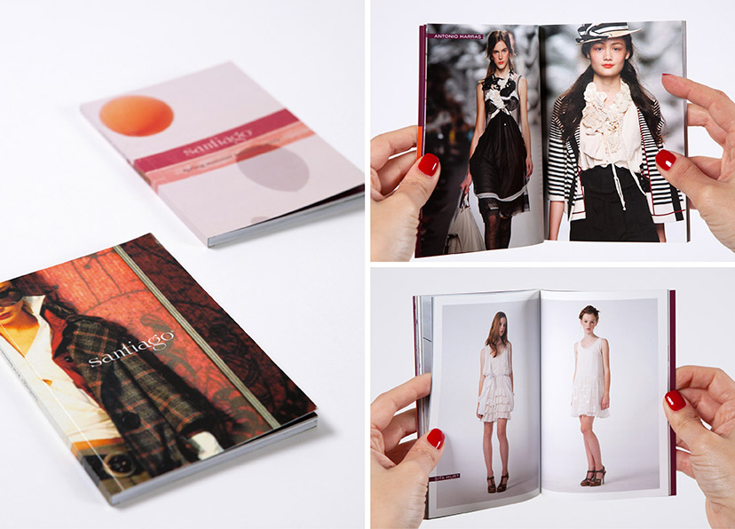
Santiago-Catalogs
Looks2009 - 2010The 2010 Fall/Winter and Spring/Summer collections are each presented in a handy booklet organized by brand. -
Semsom-Branded items 02
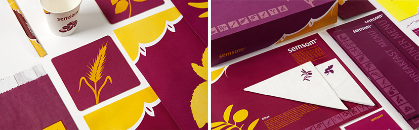
Flavour essentials2008The illustrations in this visual housestyle are of core ingredients – herbs and seeds – from the Lebanese cuisine, applied with many variations from a discreet low-contrast set on the side of the menu covers, to small icons on napkins and individual central images on coasters and traymats. -
Shawarmer-Menu new logo revealer
Out with the old2008Peeling the previous logo and slogan off the menu cover reveals the new ones, along with a message about the revisited identity. -
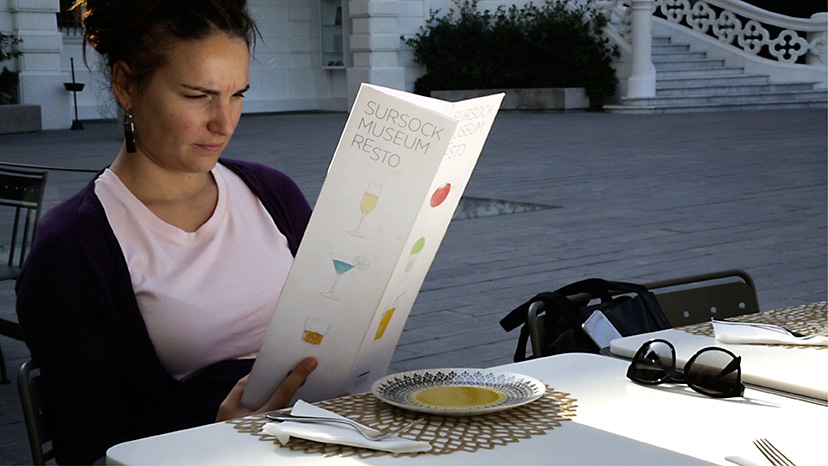
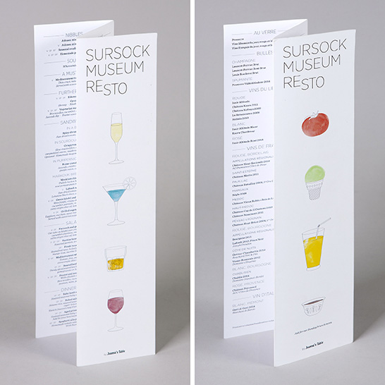
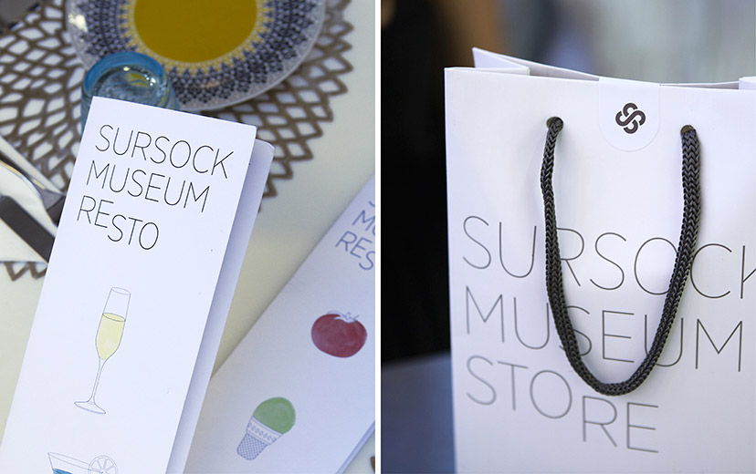
MTG-Sursock museum-Resto menu
Good things inside2016 -
MTG-Sursock museum-Resto menu covers
Eat me, drink me2016 -
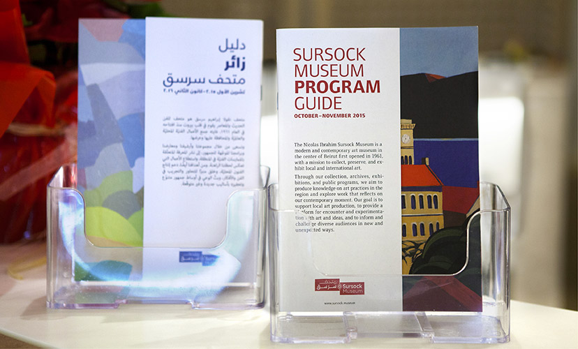
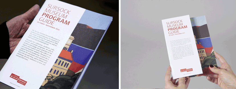
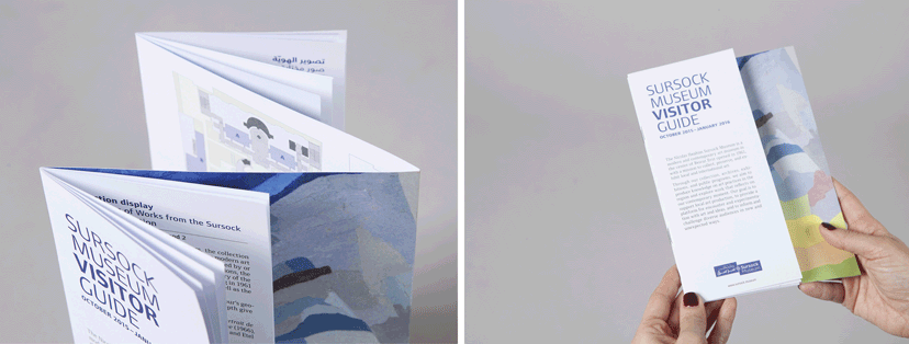
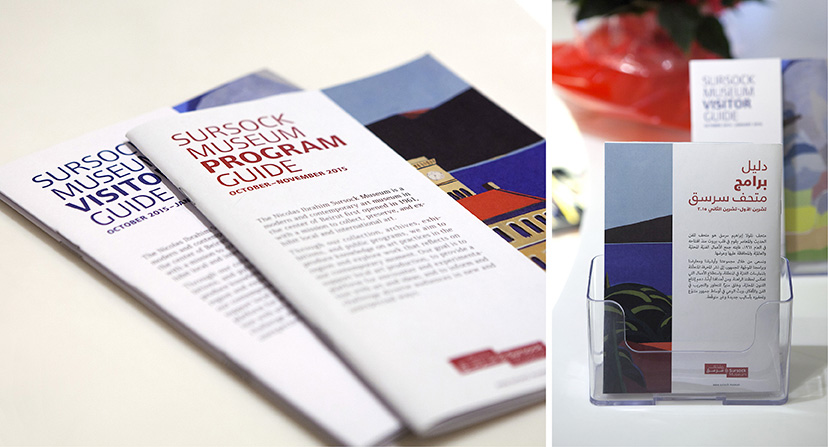
MTG-Sursock museum-Guides covers
Visiting essentials10-2015The first Museum visitor and program guides use for their covers “Mount Tamalpais”, 1985 by Etel Adnan and “Untiled”, 1999 by Hussein Madi respectively. -
MTG-Sursock museum-Program guide
The cut10-2015The Museum program guide’s two covers – a side for English and the other for Arabic – have an overlay revealing only part of the cover art work which extends across both. -
MTG-Sursock museum-Visitor guide
The fold10-2015The Museum visitor guide includes a central fold containing the Museum plan on the inside, and on the outside the cover art work continues across the Arabic and English double cover, partly hidden by the guide pages themselves. -
Sursock Museum-Program and visitor guides
Handheld2015Sursock’s visitor and program guides are the essential printables for planning the visit and carrying it through. -
Sursock Museum-Resto Store details
Goods and goodies2015 - 2016The typographic signatures of Resto and Store are complemented by illustrations and Sursock Museum’s emblem-as-token respectively. -
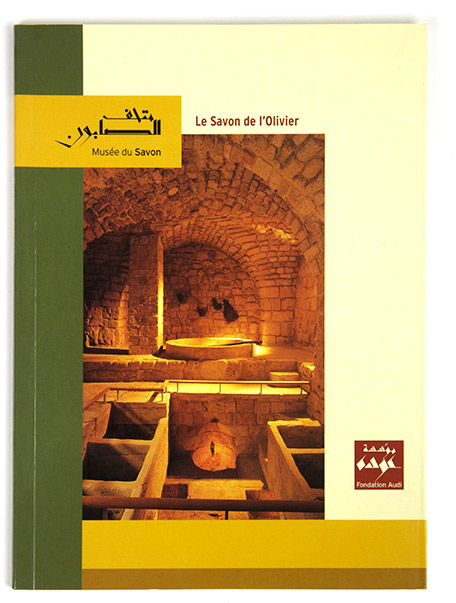
The Soap Museum-Book cover
A guiding reference2003The Soap Museum book on olive oil soap is a reference document but also a guide for the visitors of the museum. -
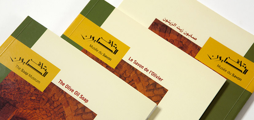
The Soap Museum-Book three covers
Language disjuncture2003Keeping each language to its own document avoids an overly crowded book and gives the visitor/reader their choice of preference. -
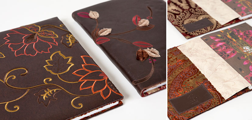
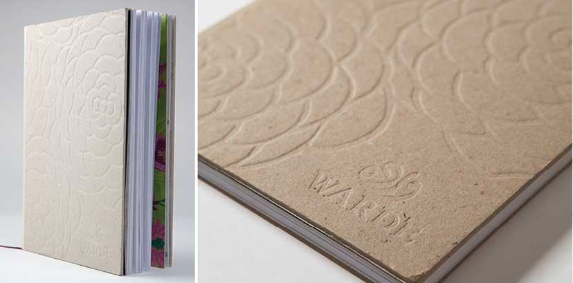
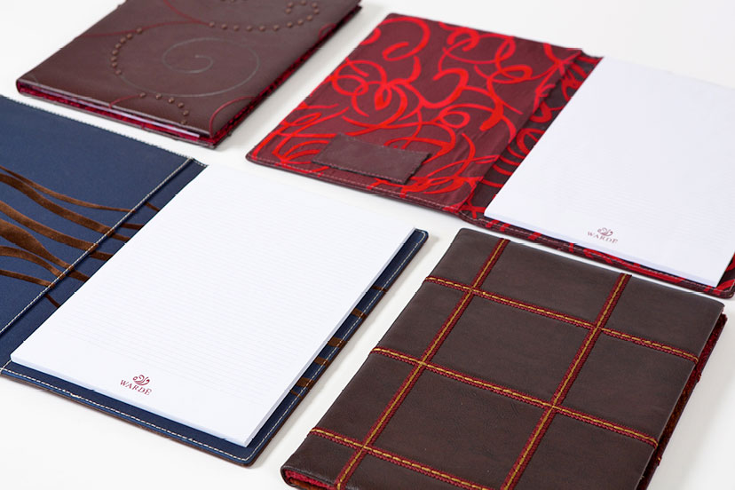
MTG-Wardé-Greetings-Planner covers
Choice of dress2008 -
MTG-Wardé-Greetings-Bustan 02
Compositions2008 -
MTG-Wardé-Greetings-Tactile cover
Tactility2007 -
MTG-Wardé-Greetings-Notepads
Choice of dress2006 -
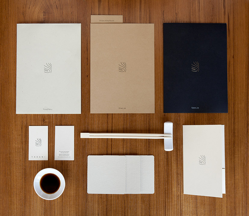
Yabani-Branded items
Pure and simple2014A changing paper scheme delivers just the right amount of nuances. -
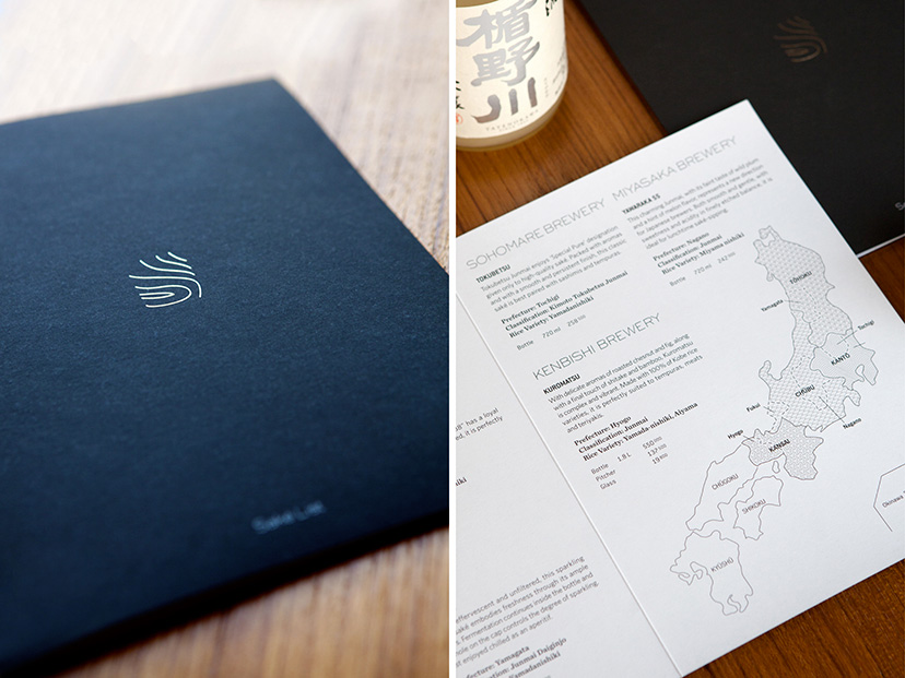
Yabani-Saké menu
For saké’s sake2014The drop of shiny silver on the cover is the first clue to how seriously the establishment takes its saké; prepare to be schooled. -
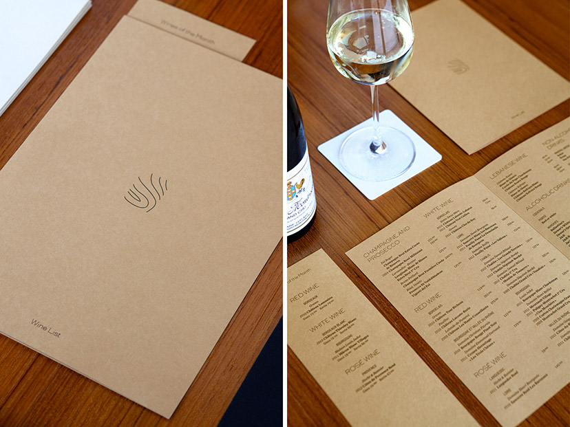
Yabani-Wine list
Earthy tones2014The wine list gets the warmest of the three paper shades. -
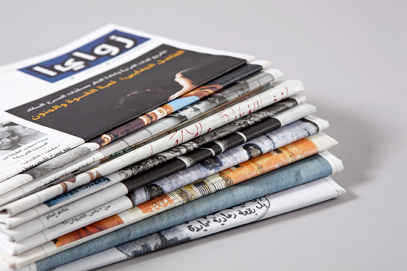
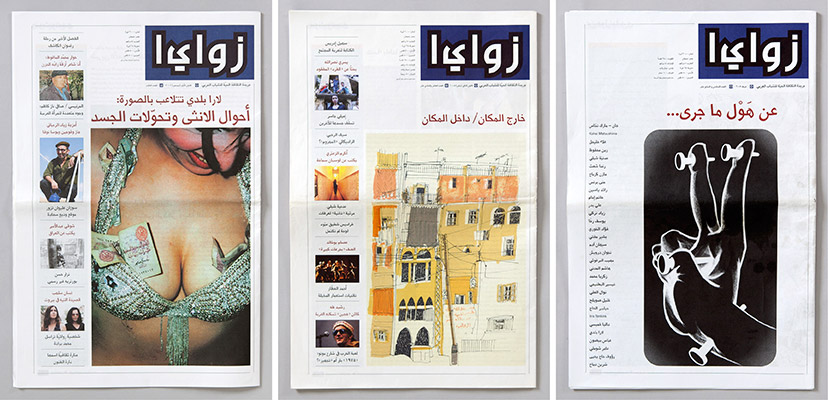
Zawaya-Issue covers 01
In-frequency2001 – 2007Since some of the publications were released as dual issues, 11 publications of a total of 18 issues were designed. -
Zawaya-Issue covers 02
Judging by the cover2001 – 2007One of the common attributes to Zawaya’s covers is the striking image each of them boasts. Be it a photograph or an illustration, the cover images do not conform to one aesthetic and always manage to be loud, assertive, and sometimes even controversial. -
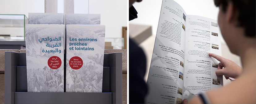
MTG-Regards sur Beyrouth-Captions booklet
Further reading10-2015The densely loaded Regards sur Beyrouth exhibition is supplemented with booklets with a listing of works and extended captions per section. For each, the French and Arabic covers complete the image, the same one used on the corresponding section banner.