At a time when “casualizing” local cuisine was quite the trend, Semsom was one of the many restaurant concepts on the scene proposing to tame down the often slow-paced and course-abundant traditional Lebanese food experience. Differentiation is usually challenging in a current of similar tendencies. But Semsom’s whimsical take on some classic dishes inspired a slightly pop aesthetic, and the interesting set of letters its Arabic name contains allowed for an uncommon bilingual treatment, both of which contributed to a striking and memorable visual scheme.
-
Semsom-Logo and calligraphy
Based on calligraphic variations, the Arabic script in this bilingual identity becomes a graphic device that neatly corners itself in a square alongside the Latin name for the logo, but is free enough to allow some compositional independence for each of the languages.
Calligraphy: in collaboration with artist Samir Sayegh
-
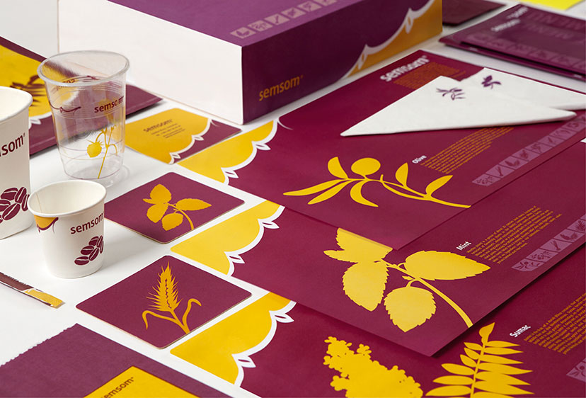
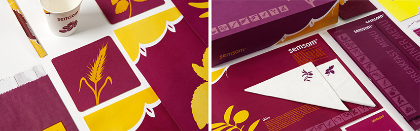
Semsom-Branded items 01
Along with the pictorial scheme, the calligraphic corner device travelling across the tops, bottoms and sides of applications is a major recognition element in this identity.
-
Semsom-Branded items 02
The illustrations in this visual housestyle are of core ingredients – herbs and seeds – from the Lebanese cuisine, applied with many variations from a discreet low-contrast set on the side of the menu covers, to small icons on napkins and individual central images on coasters and traymats.