Santiago started as a small jeans and sportswear store in Kaslik, Lebanon at the onset of the 80s. Thirty years later, it had grown into a multi-brand high-end fashion boutique with two outlets, with a third one planned for the swanky Beirut Central District. To say that a rebranding was needed would be an understatement: not only did the previous identity misrepresent the new status of the fashion retailer, it was also a stylistic reminder that, well, it’s not the 80s anymore. As part of a large scale reworking of Santiago’s mother-brand as well as its siblings, the fashion boutique’s identity received a makeover to coincide with the opening of its new outlet, in and of itself an of-the-day statement piece in store design.
-
Santiago-Logo before and after
The much needed revisiting of the Santiago mark resulted in a more age-appropriate signature, so to speak: a simple logotype, elegant, feminine, peculiar, and with a little cherry on top.
-
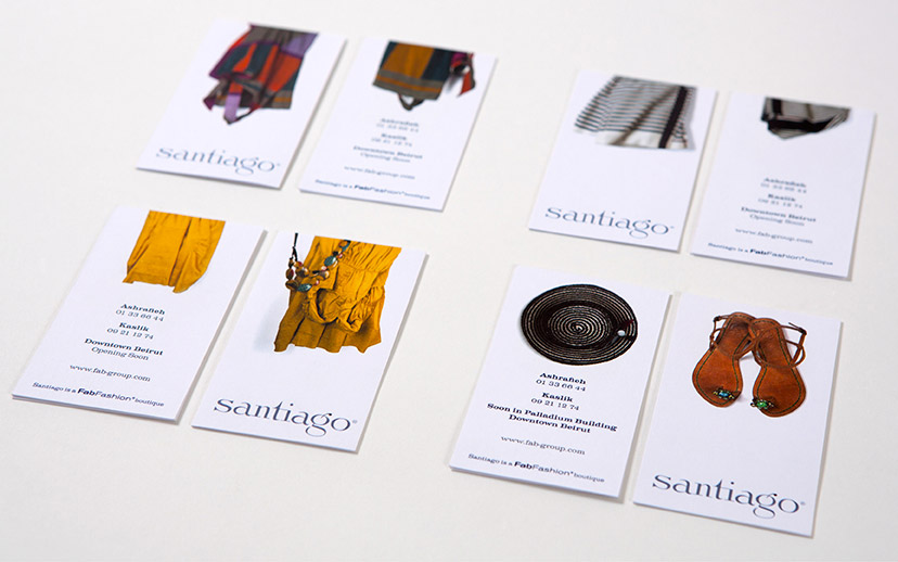
Santiago-Business cards
To bring the fashion into the forefront, the business cards are designed to feature selections from the current collection, which would keep changing from one season to the next.
-
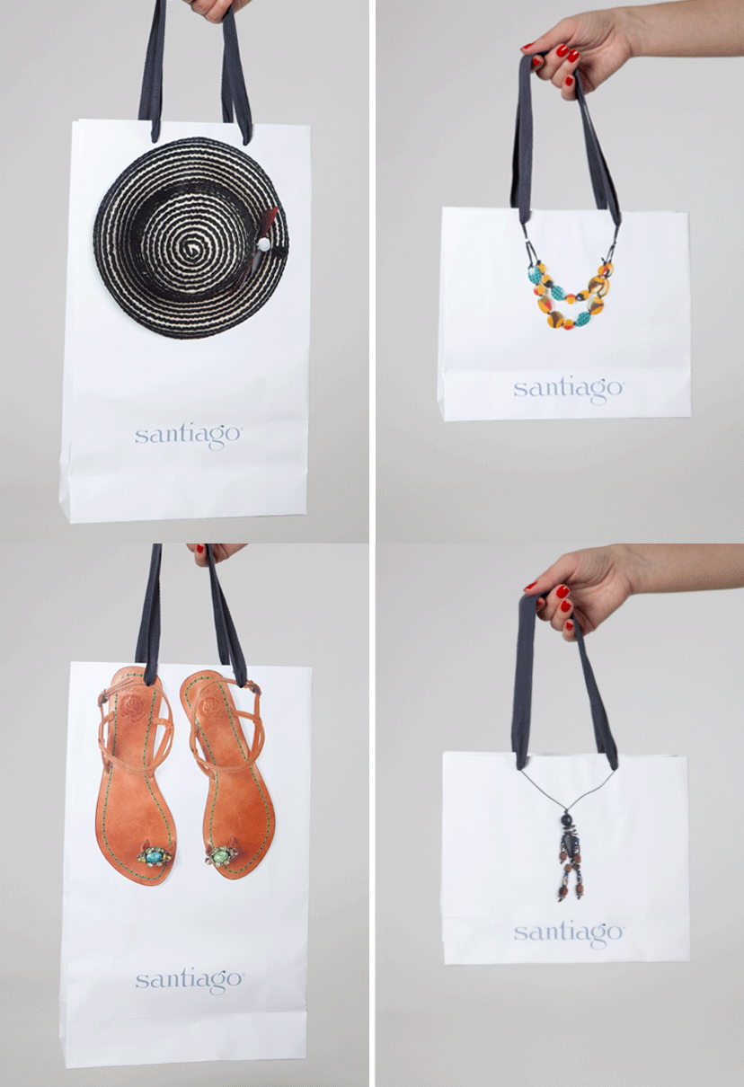
Santiago-Main bags
The shopping bags follow the idea of seasonal items, reproduced to scale on the differently sized bags.
-
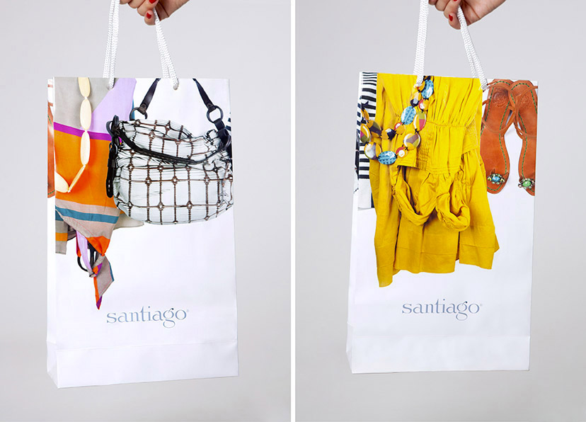
Santiago-Sale bag
A special sale period bag is designed, bringing together all the seasonal items featured in the identity scheme.
-
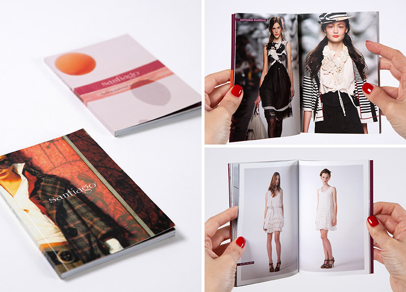
Santiago-Catalogs
The 2010 Fall/Winter and Spring/Summer collections are each presented in a handy booklet organized by brand.
-
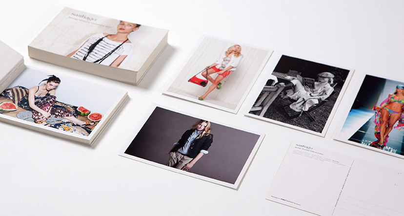
Santiago-Postcard catalog
For the Spring/Summer 2011 collection, the booklet acts as a set of detachable postcards.
-
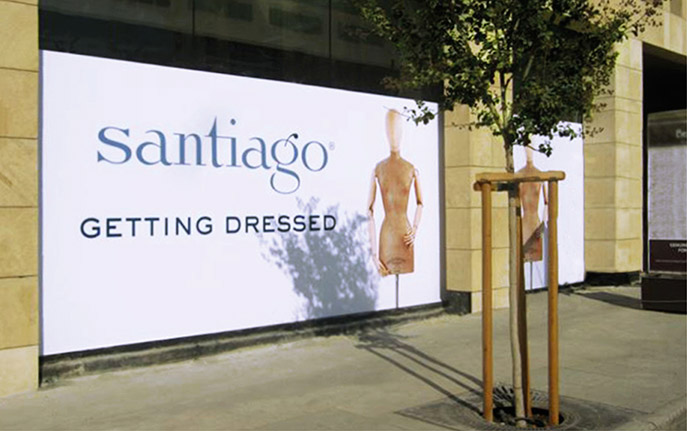
Santiago-Opening teaser
A slightly flirtatious message conceals the works on the new store.
-
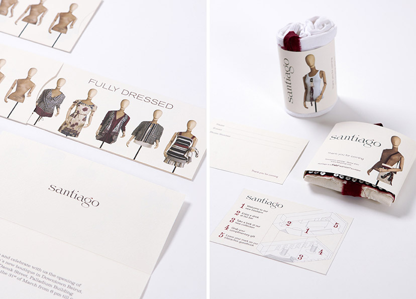
Santiago-Opening material
The full message is revealed with the invite to the opening, for which specially packaged clothing goodies are prepared as giveaways.
-
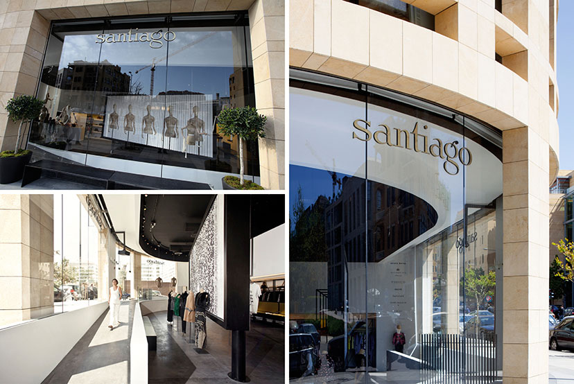
Santiago-Store and sign
A simple sign identifies the boutique on the outside, but the main attraction is a tri-face prism billboard on the inside – part of the store design scheme by apractice studio – which takes on a set of alternating visuals and acts as a backdrop to the window display. For the store opening, the theme of the naked mannequins is maintained.
Top left photo: apractice studio. Lower left photo: Marco Piranelli
-
Santiago-Ads
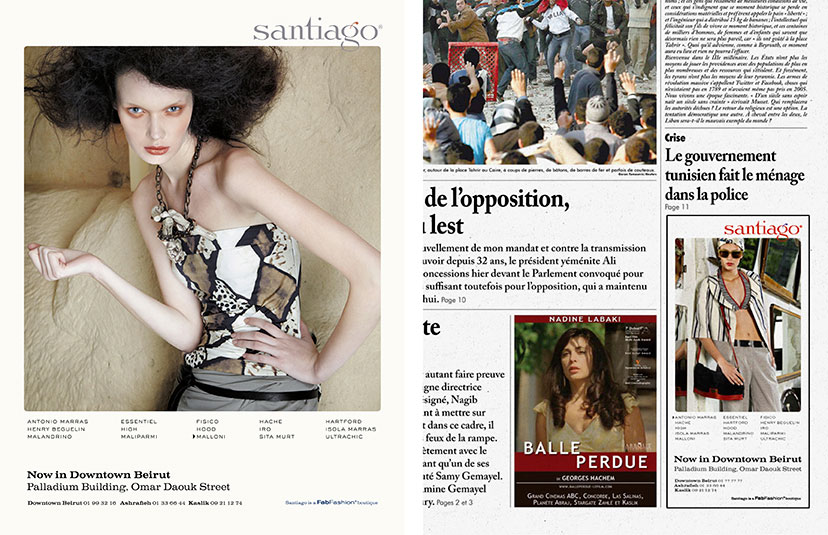
Magazine and daily press ads for Santiago include a list of the brands represented at the boutique, with a highlight on the one featured in the image.


