-
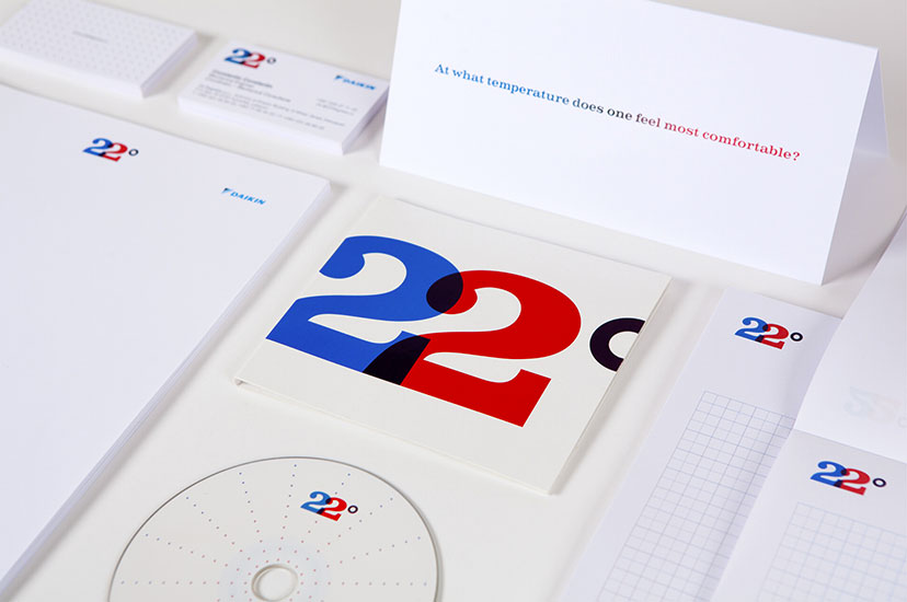
22 Degrees-Stationery
No catch-222010A simple question launches this identity which puts an end to the game of hot-and-cold. -
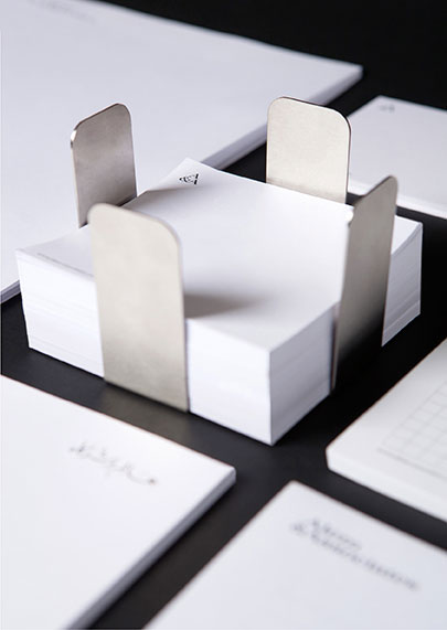
A&A-Notepad holder
A little customization2010A stainless steel notepad holder is designed as a fitting object for the slick premises. -
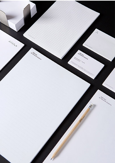
A&A-Stationery
Fit for a lawyer2010Serious, coherent, sharp… exactly what you’d expect from your legal representation. -
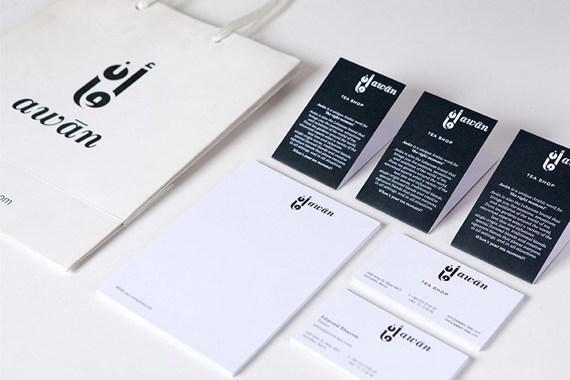
Awan-Bag and stationery
Toned down2009A more somber look is adopted for general applications. -
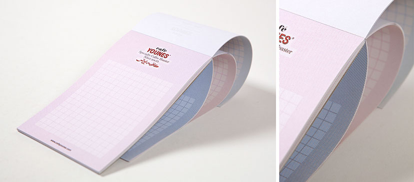
Café Younes-Notepad
Lending color to note-taking2010The CMYK hatching grid is used to give a change of tone with each new page. -
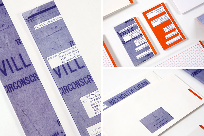
Chekerdjian Estates-Stationery details
Studied crops1995The revealed sections of the Beirut map play a different role on each application: spelling out the word “ville” on the letterheads and business cards, and using the image of “Beyrouth – Liban” as a continuation of the return address on the envelope, which also curiously reproduces a part of the map key. -
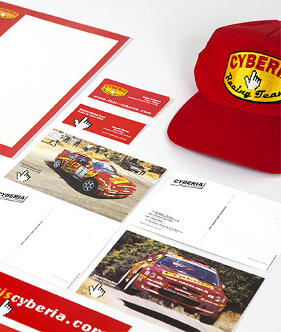
Cyberia-CRT items 02
For the fans1999 – 2009A number of Racing Team memorabilia was developed for the rally events. -
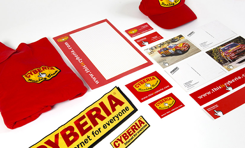
Cyberia-CRT items 01
The link to speed2000A sponsorship of a Lebanese rally competitor produced quite a few fun little nuggets. -
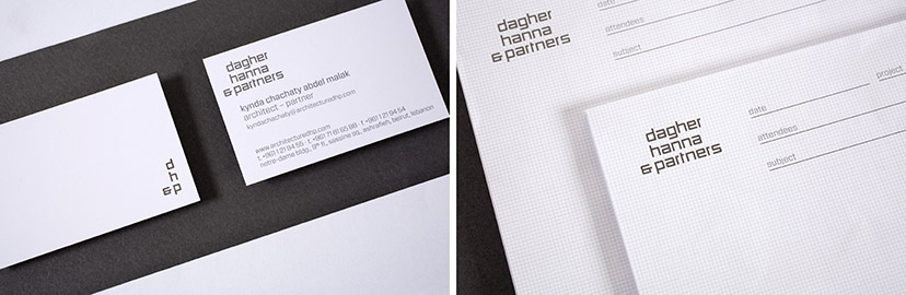
Dagher Hanna & Partners-Stationary 02
Falling into place2011Between the corner device initialism and the perfectly matched grids and typography, the visual elements of the DHP identity are all about sensible organization. -
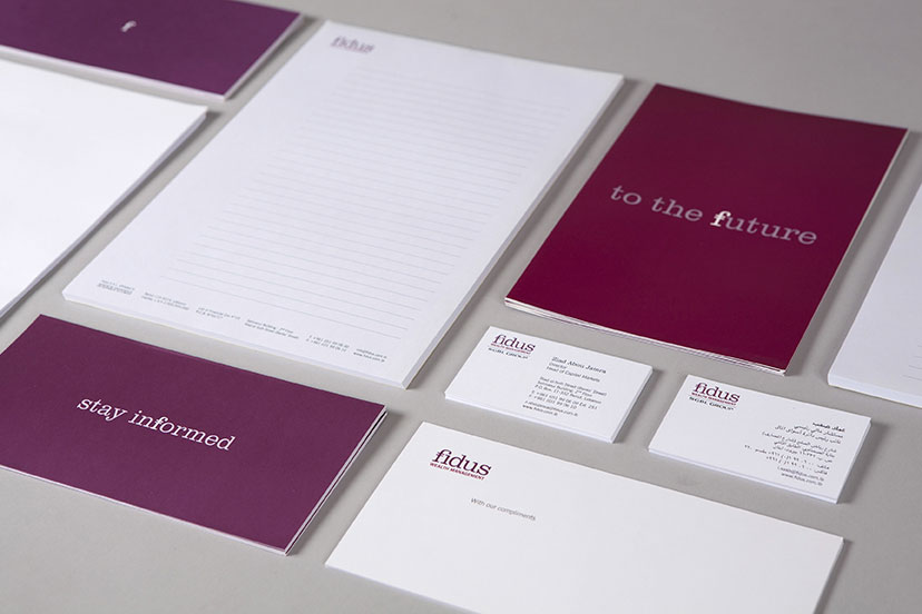
Fidus-Stationery
A rosy outlook2006 – 2009For the corporate image, the cold colors of finance are discarded, and a scheme more fitting for the optimistic messages takes its place. -
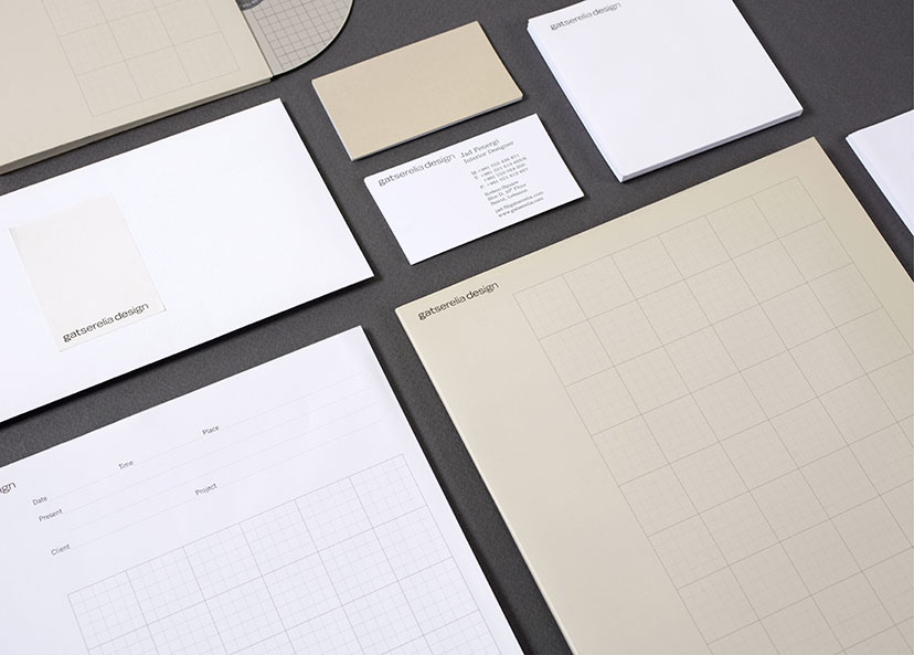
Gatserelia Design-Stationery 01
A few shades of grey2006Whites, warm greys and grid line variations constitute the elements of Gatserelia’s understated identity. -
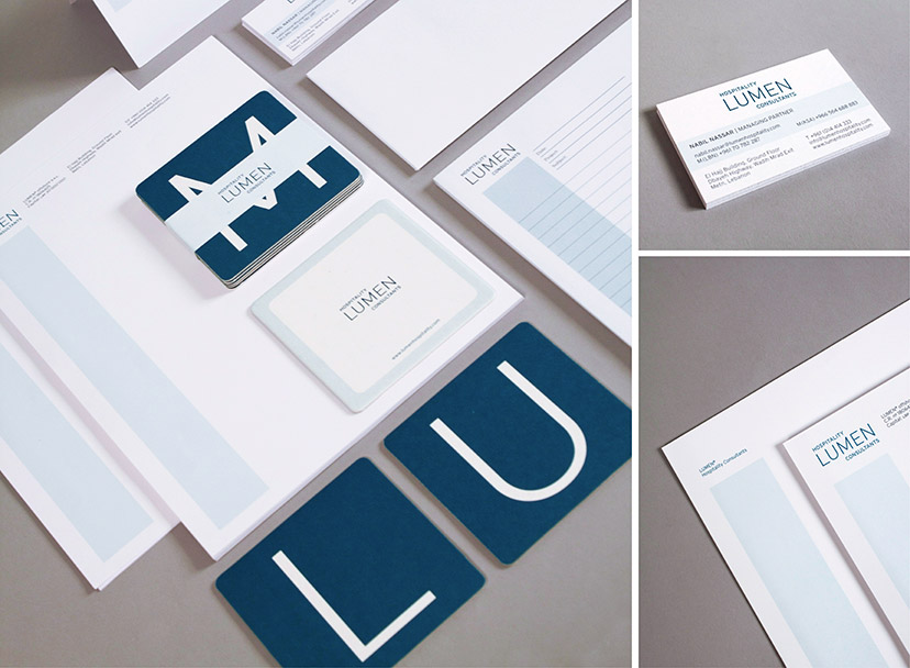
Lumen Hospitality Consultants-Coasters and stationery
Work and play2013As a little reference to the hospitality industry, a coaster set was designed as a giveaway, alleviating some of the seriousness of the corporate image. These hardworking guys do have a drink every once in a while. They are in the hospitality industry after all. -
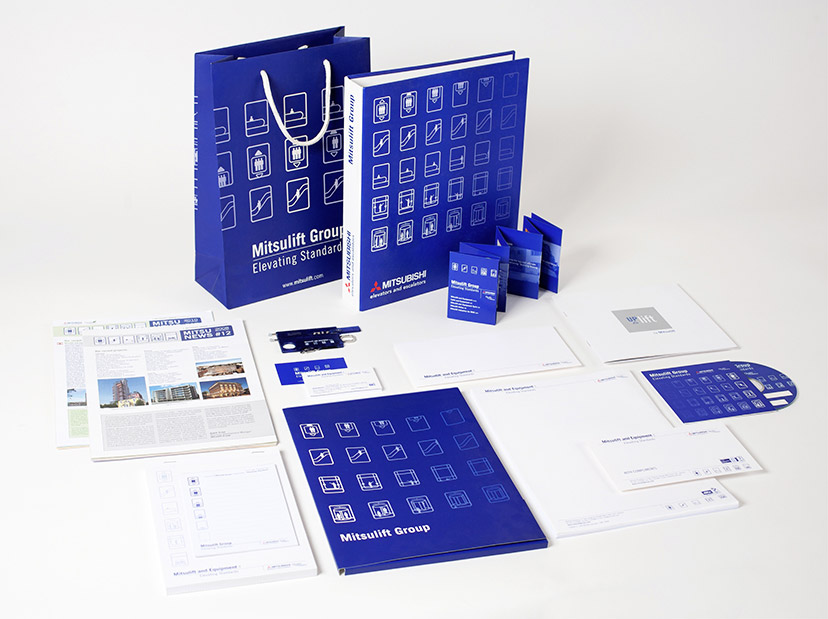
Mitsulift-Branded items previous id
Picto-centered1999 - 2009Patterned, animated, or simply arranged on a line, the Mitsulift pictograms are pretty much what the initial identity is all about. -
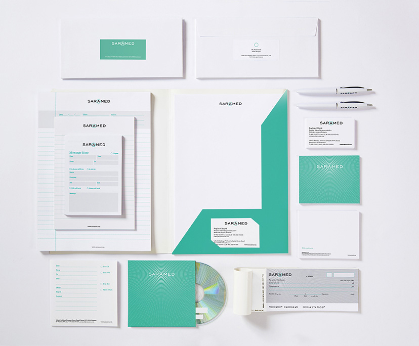
Saramed-Stationery
Sterile yet potent2014Clearly, the health and pharma visual code of whites and cool colors is not something to be recklessly messed with, but a particular shade of blue-green and a striking circular pattern derived from the letter framing provides this identity scheme with its differentiating attributes. -
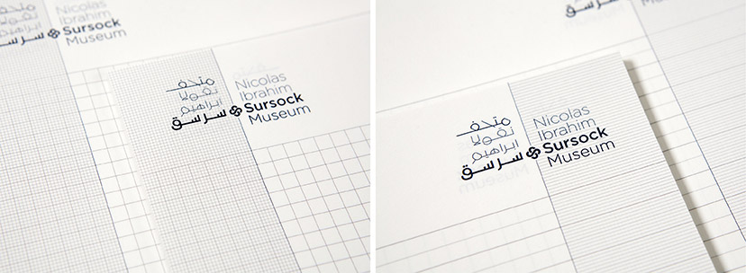
MTG-Sursock museum-notepads
Taking note04-2015Surock’s back-to-back notepads pay attention to the difference between the conventionally ruled Arabic note book and the gridded English one. -
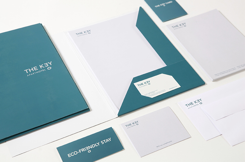
The Key -MTG stationnery
E2016The combination of a serene teal and a sans serif font evokes a sense of ease and comfort while still retaining a corporate image. -
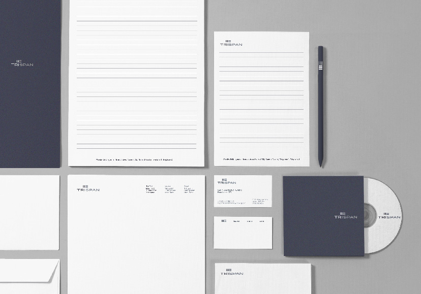
TriSpan-Stationery 01
Sleek, smart, and straightforward2015 -
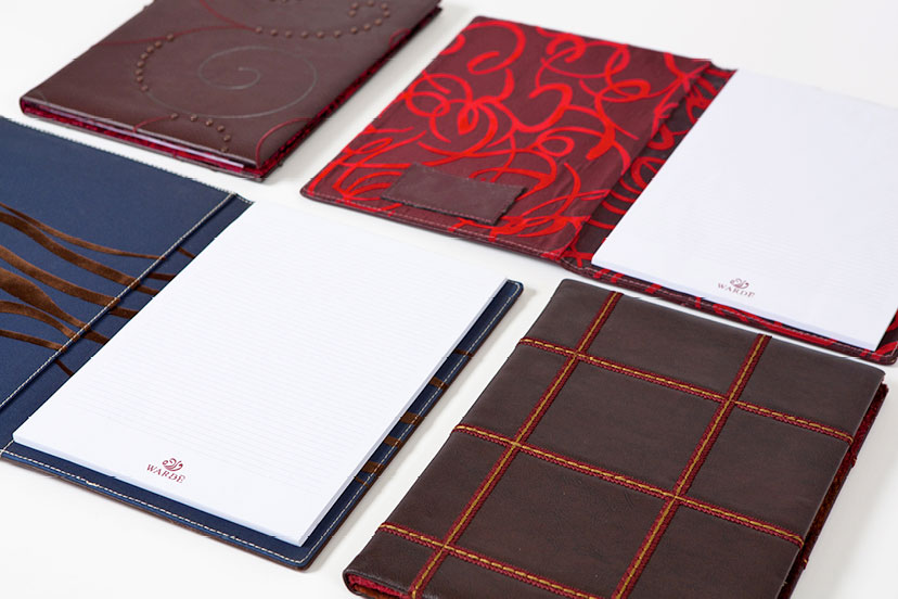
MTG-Wardé-Greetings-Notepads
Choice of dress2006