The Fidus design brief was particularly interesting in that the team at the wealth management firm were clear about how they differentiate themselves within their sector of operation. Communicating these values and approaches, these distinctions, called for an exciting scenario in which the verbal played as pivotal a role as the visual. The key lies in the letter F, which is treated as a made-up currency symbol with the simple breaking of the horizontal F bar into two thinner ones, and made to stand for Fidus no matter what word, phrase or sentence it falls in. A straightforward typographic element becomes the focal point of a communication design scheme capable of efficiently delivering the variety of messages needed. Effective in its simplicity, this graphic device continuously fulfills two simultaneous roles: the token of a corporate mark, and the driver of a corporate message.
-
Fidus-Logo
The made-up currency sign places the brand within its sector and becomes the core identity element.
-
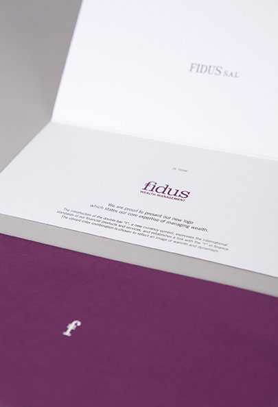
Fidus-New identity card
The almost absent previous identity gets a new face, and an equally memorable new wink.
-
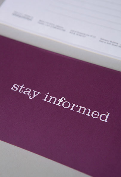
Fidus-Website launch card
An engaging message is adopted for the website launch.
-
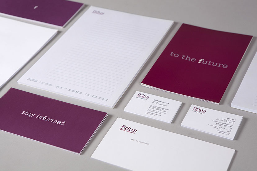
Fidus-Stationery
For the corporate image, the cold colors of finance are discarded, and a scheme more fitting for the optimistic messages takes its place.
-
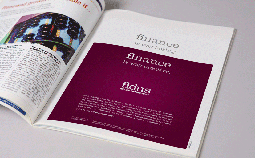
Fidus-Magazine ads
The graphic and verbal mechanism effectively undoes common negative assumptions about wealth management.
-
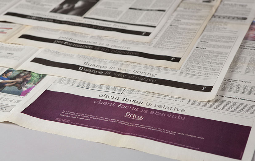
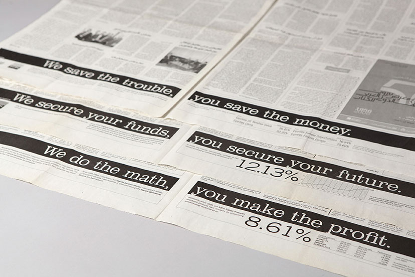
Fidus-Newspaper ads
Teasing through the pages
The newspaper adaptation of the magazine ads collapses the messages together as stepping stones to the final revealer.
-
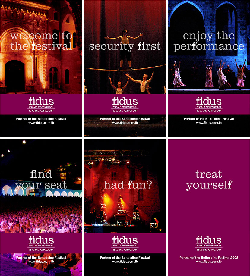
Fidus-Beiteddine banners
Walking through the festival
The on-site banners for the sponsorship of the Beiteddine Festival take the idea of being location-specific to a whole new level, with messages tailored for each situation along the path of the audience from getting frisked at the entrance to leaving with an opinion about the show.
-
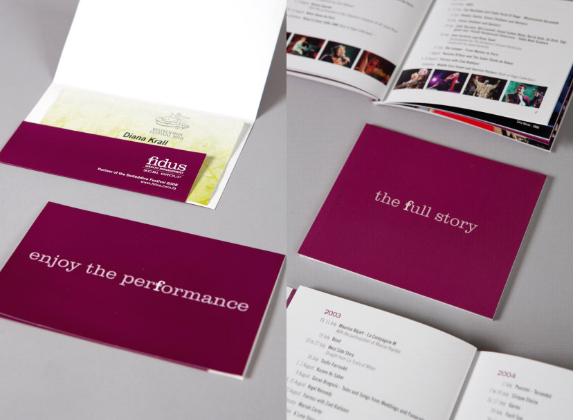
Fidus-Beiteddine material
The Beiteddine sponsorship comes complete with invitations to the show and a program booklet compiling the full history of the festival's line-ups since its inception.
-
Fidus-Film festival animation
Celebrating film the F way
Opening all screenings of the Beirut International Film Festival, the typographic animation consistently received the first applause of the night.
-
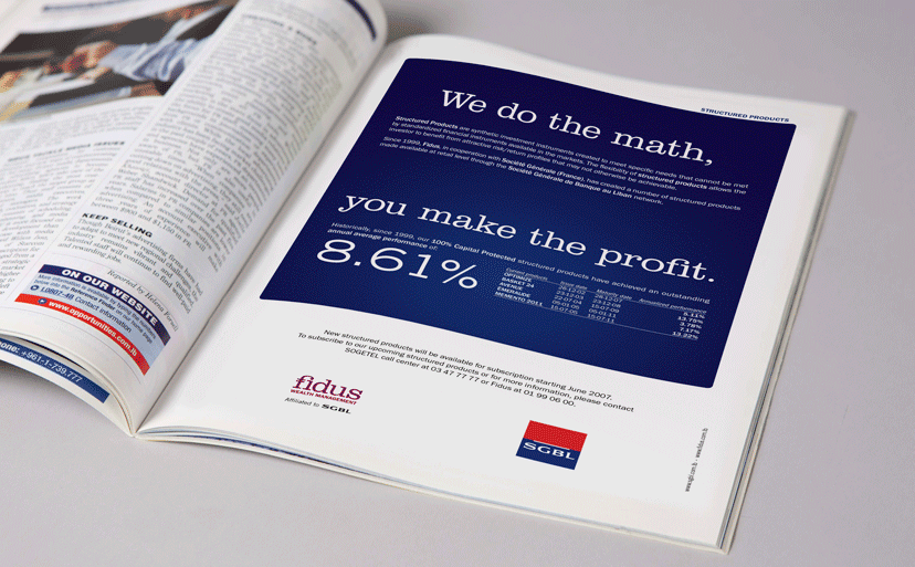
Fidus-SGBL magazine ads
The blue color might not be part of the identity, but it’s a small thing to give to SGBL, the co-communicator, when the approach, copy and compositional framework are all very much your own.
-
Fidus-SGBL newspaper ads
The joint campaign follows in the footsteps of a previous Fidus newspaper communication, appearing on multiple pages to enrich both message and impact.