-
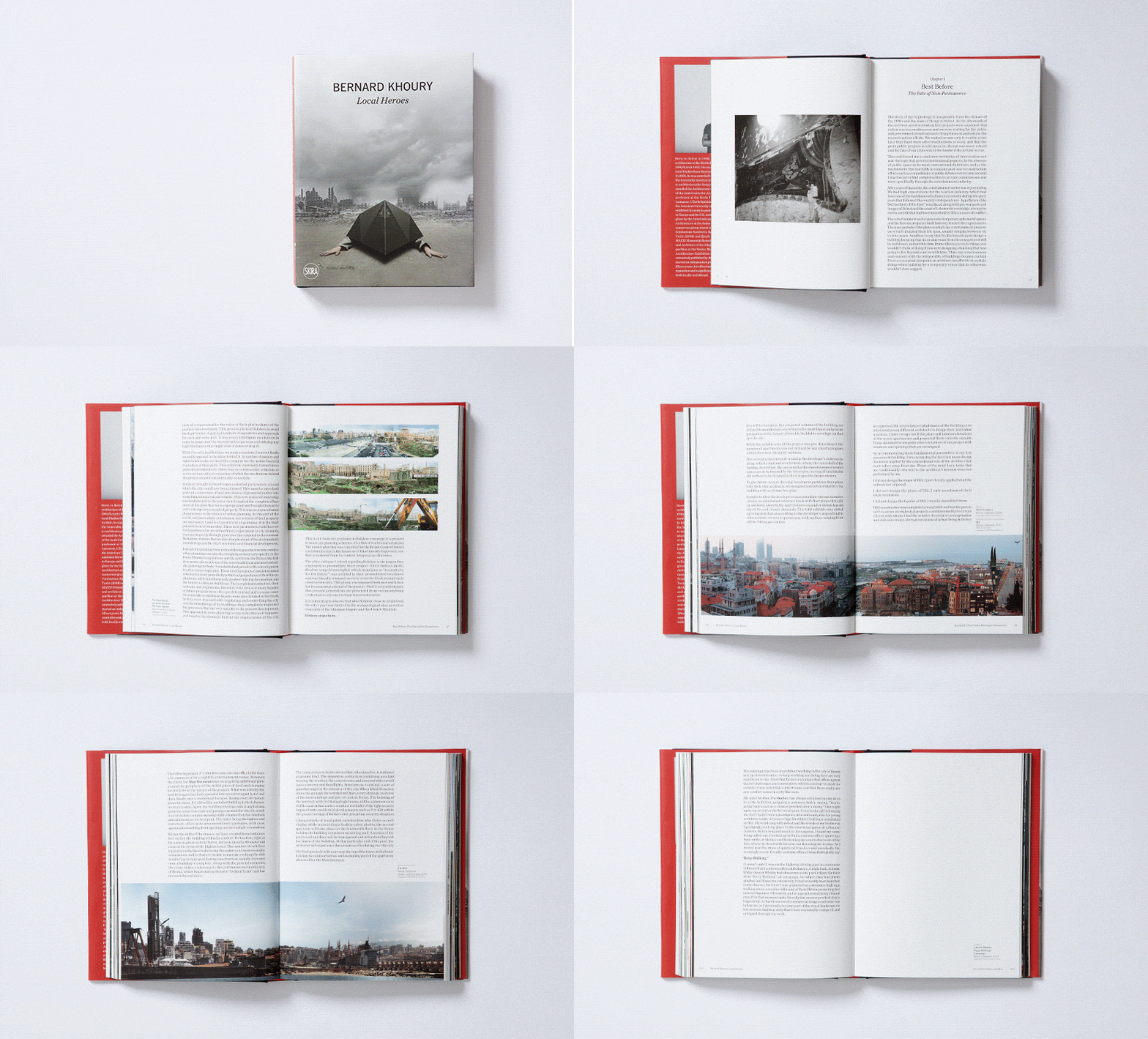
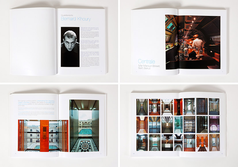
Bernard Khoury-Book pages 01
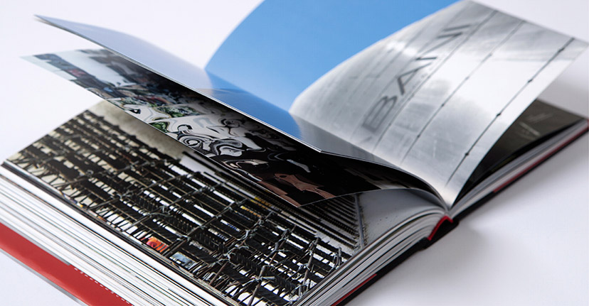
See More Of Bernard KhourySee More Of Bernard KhouryTurning a page2015The first part of “Local Heroes” is essentially a story of return, set in the consistently hopeful and deceptive post-war Beirut everyone seems to be incapable of leaving behind. -
Bernard Khoury-Book pages 02
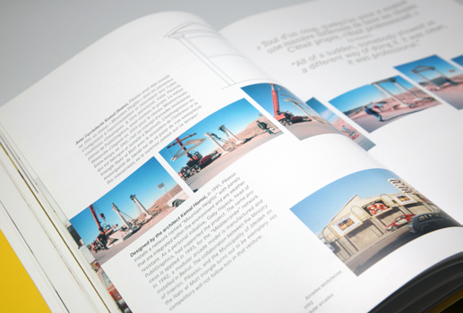
See More Of Bernard KhourySee More Of Bernard KhouryA page turner2015The second part of “Local Heroes” is a more classical project-by-project exposé, albeit informed by the narrative that precedes it. -
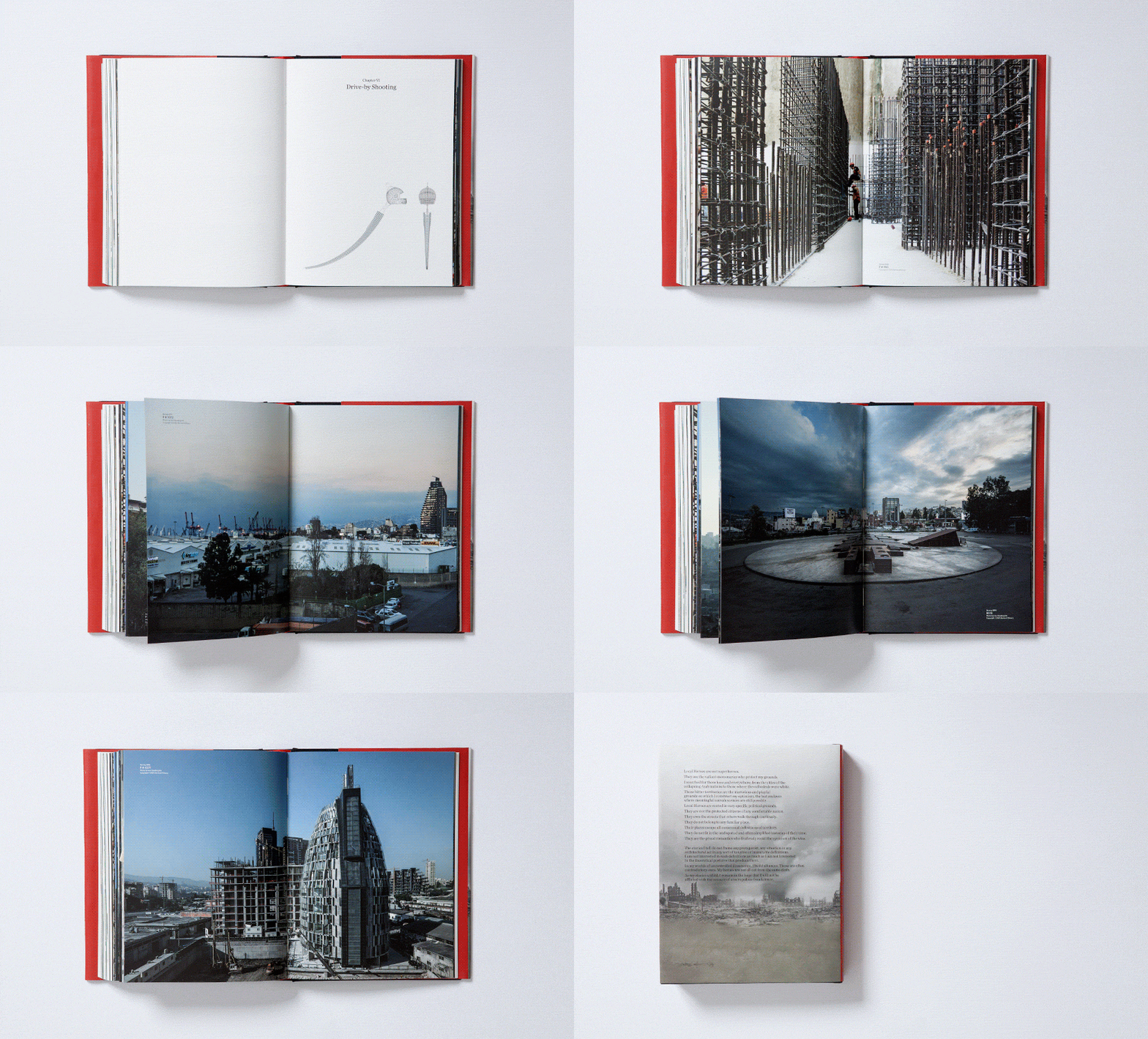
Bernard Khoury-Image spreads
See More Of Bernard KhourySee More Of Bernard KhouryThe big picture2015Across the landscape of texts and images, enough room is given for certain moments of full-page exposure. -
Bernard Khoury-Type details
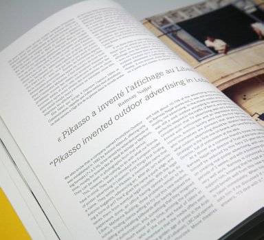
See More Of Bernard KhourySee More Of Bernard KhouryHanging on every word2015With a narrative component as well as a more technically architectural one, typographic nuances come well into play. -
Boghossian Genève-Stationery and Brochure
See More Of Boghossian Genève -
Café Younes-Menus 02
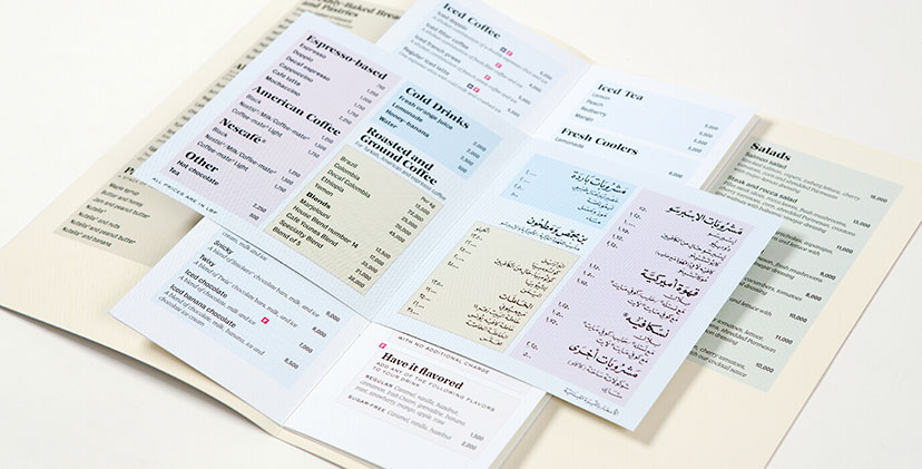
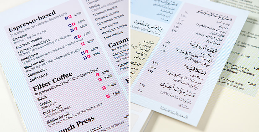
See More Of Café YounesSee More Of Café YounesWebs of color2010The CMYK grid lines – a main element of the Younes housetyle – are used to organize the menu sections and code it along the way. -
Café Younes-Coffee brochure details
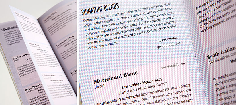
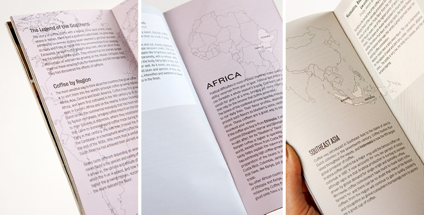
See More Of Café YounesSee More Of Café YounesCoffee profiling2010The signature blends section breaks down the brew into its different attributes and introduces the professional lingo to the public. -
Café Younes-Coffee brochure inside pages
See More Of Café YounesSee More Of Café YounesWhere on earth2010The country section traces coffee bean origins and introduces a color-coding system based on the different continents and sub-continents. -
Café Younes-Menus 03
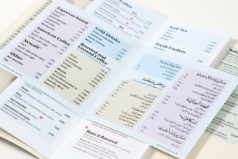
See More Of Café YounesSee More Of Café YounesCalligraphy all the way2010The Arabic adaptation of the coffee menu for the Aley branch resorts to a fully hand-calligraphed content, from the titles and descriptions to the prices and fine print. -
Café Younes-Menus 01
See More Of Café YounesSee More Of Café YounesWebs of color2010The CMYK grid lines – a main element of the Younes housetyle – are used to organize the menu sections and code it along the way. -
Cherry on the rooftop-Menu
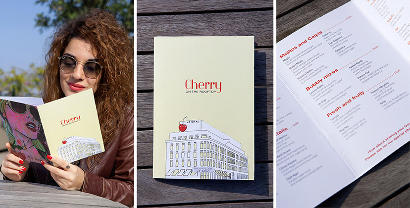
See More Of Cherry on the rooftopSee More Of Cherry on the rooftopWith a cherry on top2011An illustration of a literal “cherry on top” was used as a pointer to the location of the lounge in the hotel. -
Febrik-Participants page
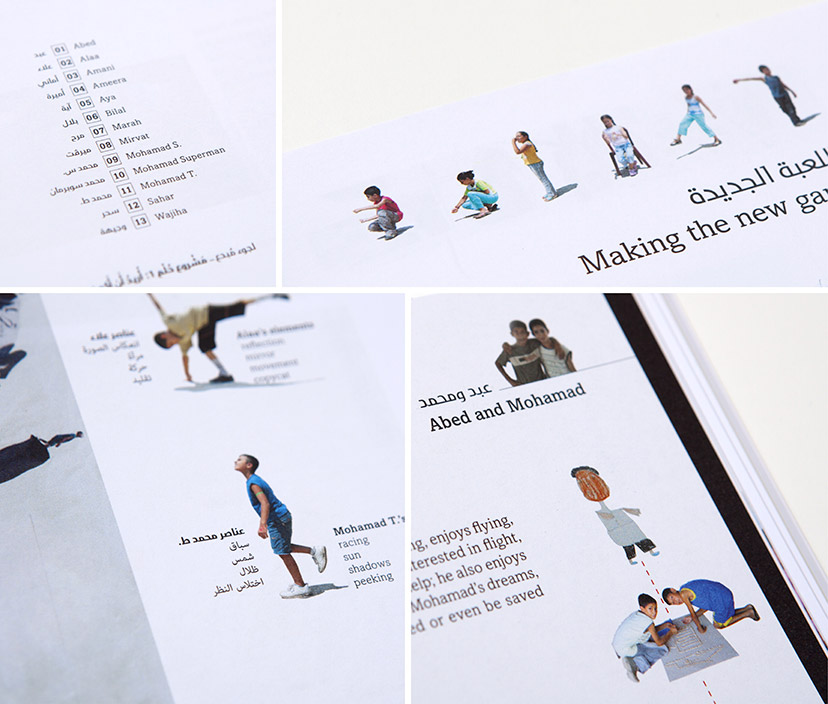
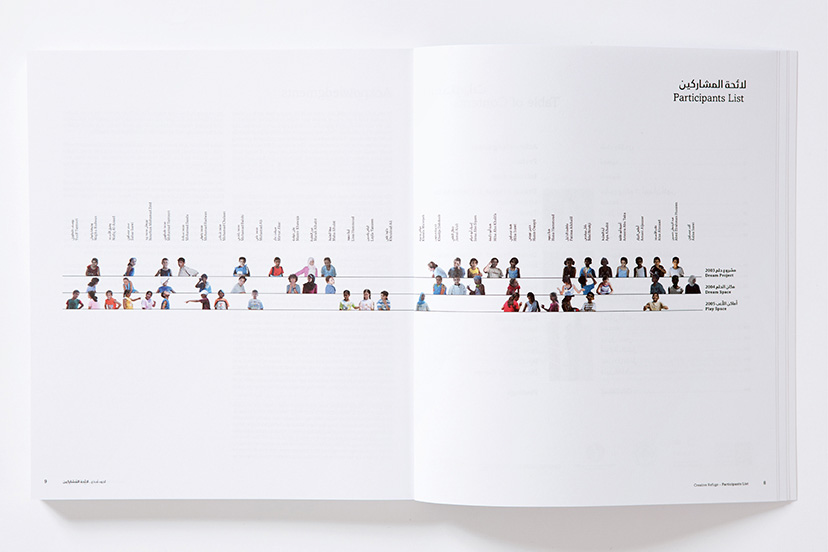
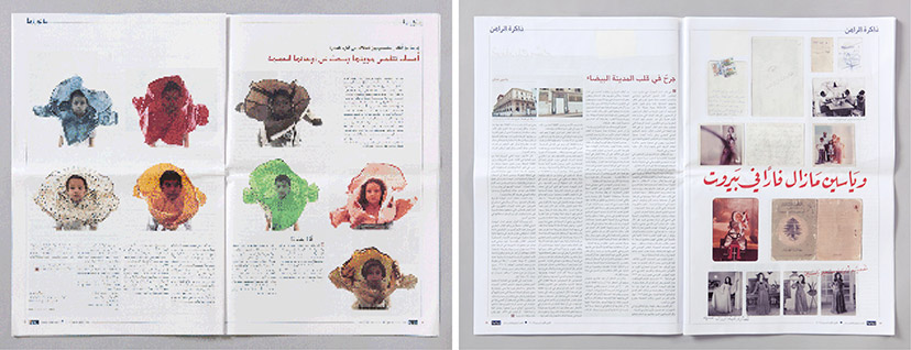
See More Of FebrikSee More Of FebrikLittle creatures2014The stars of “Creative Refuge” are clearly the children of the camp. In this chart at the beginning of the book, they are arranged across the three workshops represented by the three lines, giving a reading of the one, two and three-timers, as well as the total number of children per workshop. -
Febrik-Spread 01
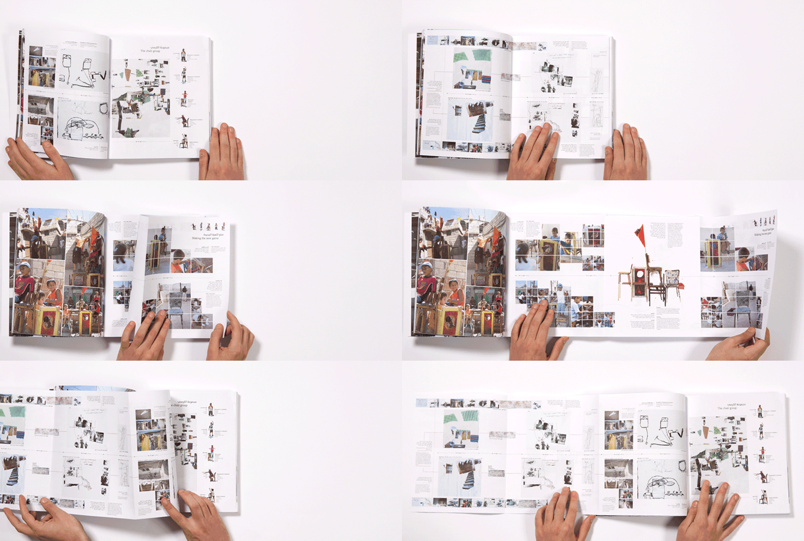
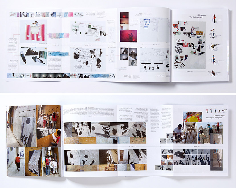
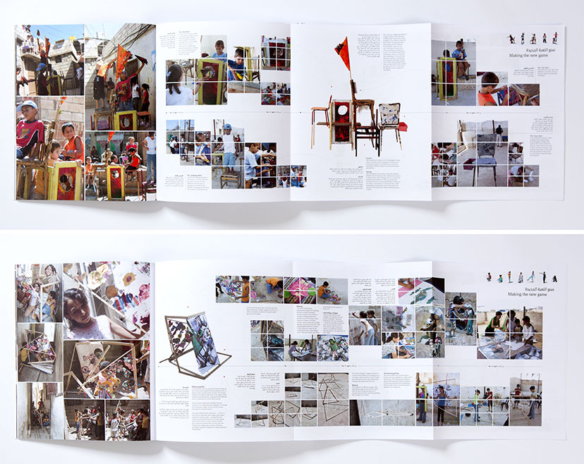
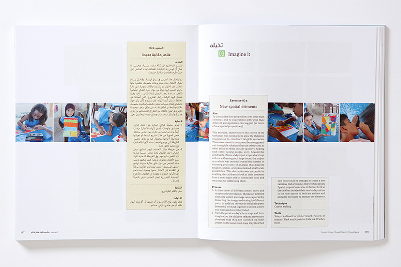
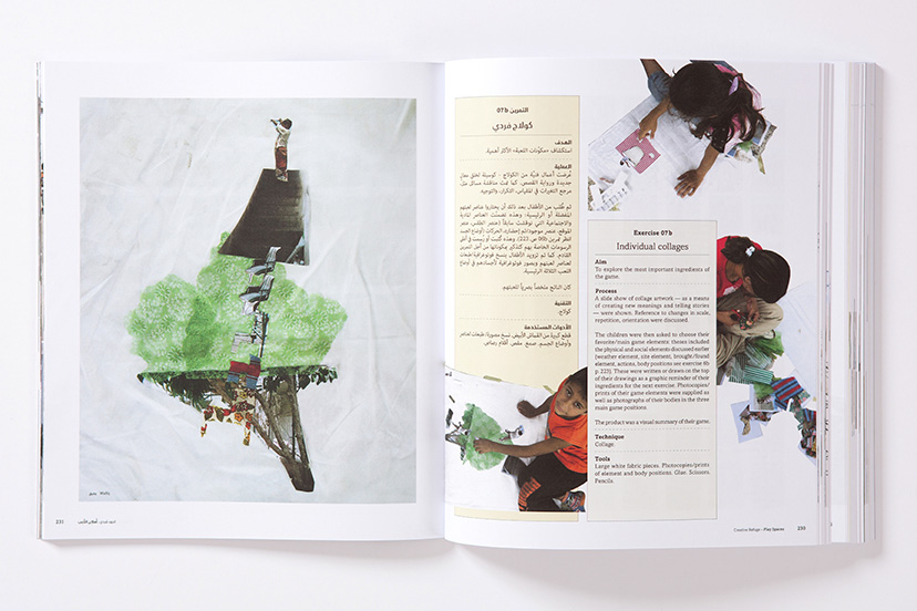
See More Of FebrikSee More Of FebrikOrderly dynamism2014The educational manual part of the book has fixed elements for each exercise: number and bilingual title, and a kind of a technical step-by-step chart in each of the two languages. These consistent items interact flexibly with the images and introduce a particular fluidity and movement to each spread. -
Homeworks-Chapter breaks
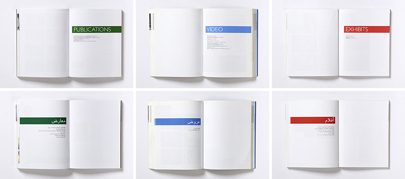
See More Of Home WorksSee More Of Home WorksClear-cut2002 – 2005The chapters in the books are divided by discipline, and the section breaks take on the main color of the year/edition. -
Homeworks-English and Arabic pages
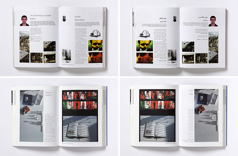
See More Of Home WorksSee More Of Home Works(Almost) identical twins2002 – 2005All pages in the book are faithfully reproduced in both languages down to the smallest detail. -
Homeworks-Layout variations
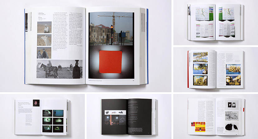
See More Of Home WorksSee More Of Home WorksCompositional diversity2002 – 2005The changing nature of each project and the many configurations of the featured works required a flexible grid and resulted in an array of layout variations. -
Indigo on the roof-Menu
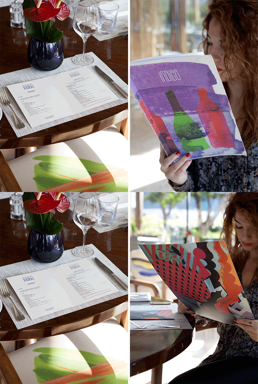
See More Of Indigo on the roofSee More Of Indigo on the roofA touch of paint here and there2011The breakfast, lunch/dinner, and wine menus all maintain the same typographic layout but are each designed with a different art piece for the cover. -
Le comptoir-Catalogue and inside pages
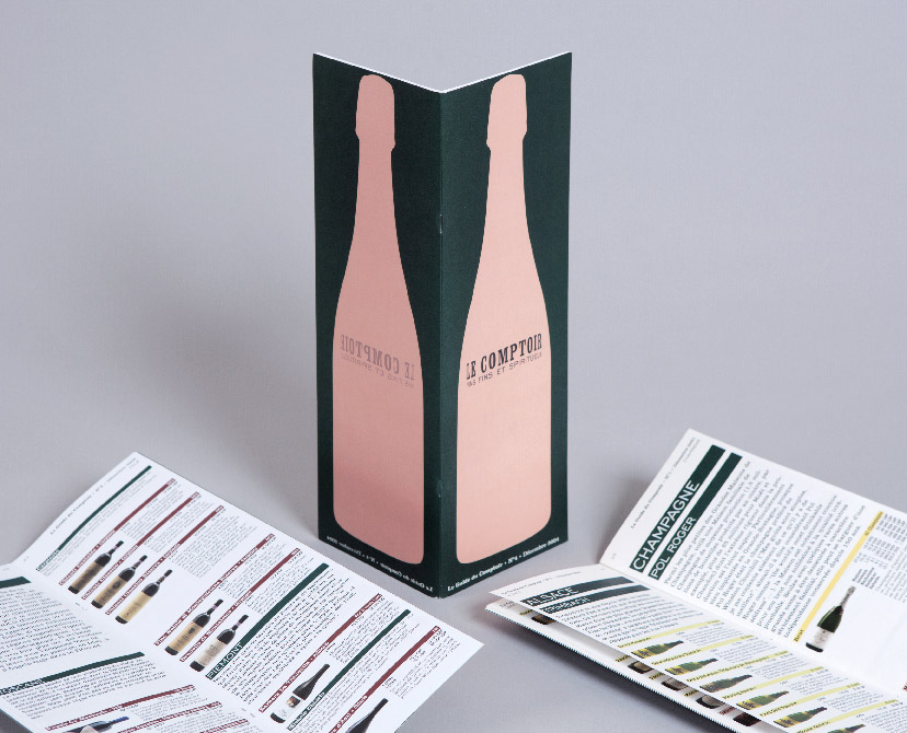
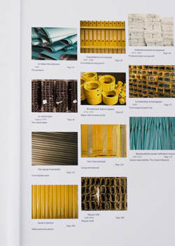
See More Of Le ComptoirSee More Of Le ComptoirTaking drinking seriously2001The recommendation for Le Comptoir’s yearly product catalog was a highly informative and professional approach that gives the amateur a chance to select like a connoisseur.Photo: Nadim Asfar -
Lebanon Communicating-inside pages 02
See More Of Lebanon CommunicatingSee More Of Lebanon CommunicatingFast forward2012The beginning of each chapter is defined by a page in full color and a brief synopsis concerning the chapters’ content.Tagged: Inside pages -
Lebanon Communicating-inside pages 03
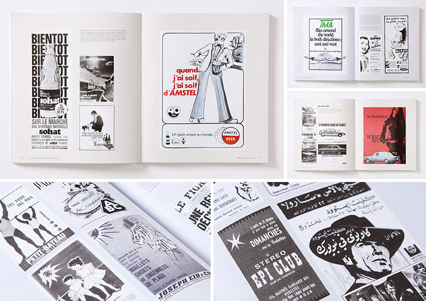
See More Of Lebanon CommunicatingSee More Of Lebanon CommunicatingPlay2012The ads splayed out on the publication’s pages take the reader on a trip through time and space and allow them a newfound way of understanding history; such as the incentives used to promote product or the evolution of the linguistic approach used to draw consumers in.Tagged: Inside pages -
Lebanon Communicating-Inside pages 01
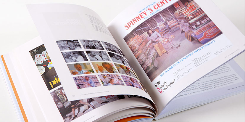
See More Of Lebanon CommunicatingSee More Of Lebanon CommunicatingPause2012Stills from T.V. commercials and printed ads with brief background stories contextualize the content and put it on a coherent timeline.Tagged: Inside pages -
MTG-Makkah Western Gateway Competition-Box open
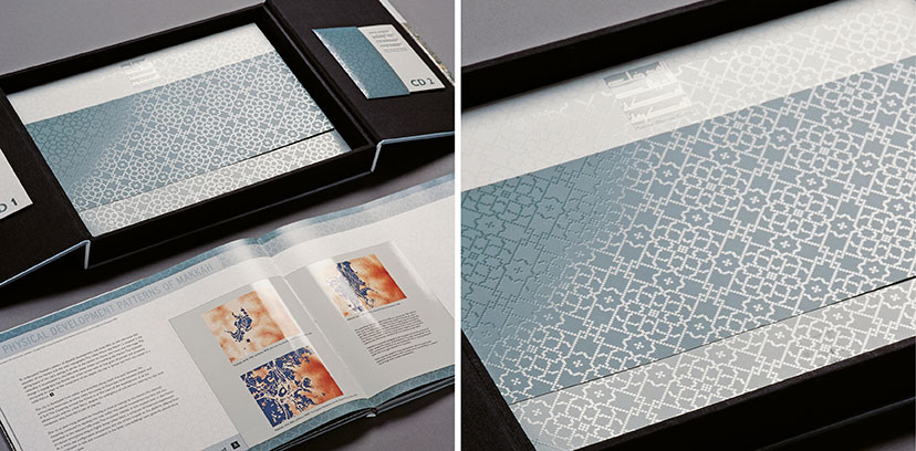
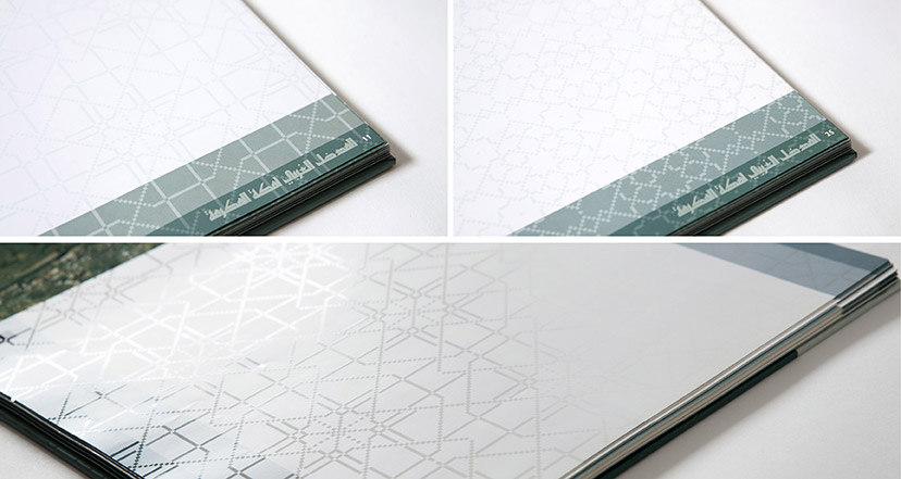
See More Of Makkah Western GatewaySee More Of Makkah Western GatewayShimmering through2002The pixel-based arabesque patterns represent a modern sense of tradition and, when reproduced in spot UV varnish, provide the object with an unmistakable richness.Photo: Nadim Asfar -
MTG-Makkah Western Gateway Competition-Inside spread
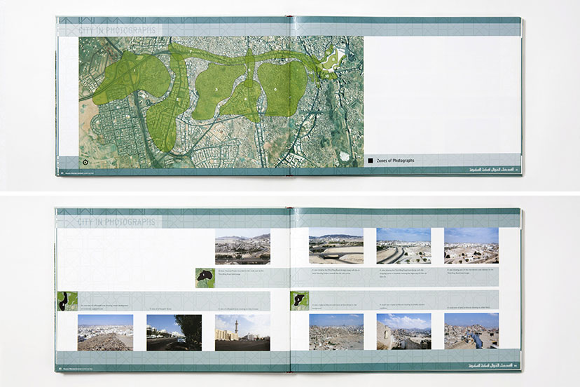
See More Of Makkah Western GatewaySee More Of Makkah Western GatewayThe informative picture2002Most of the competition brief content necessitated inventive ways to clearly elucidate information about the urban context. -
MTG-Makkah Western Gateway Competition-Patterns
See More Of Makkah Western Gateway -
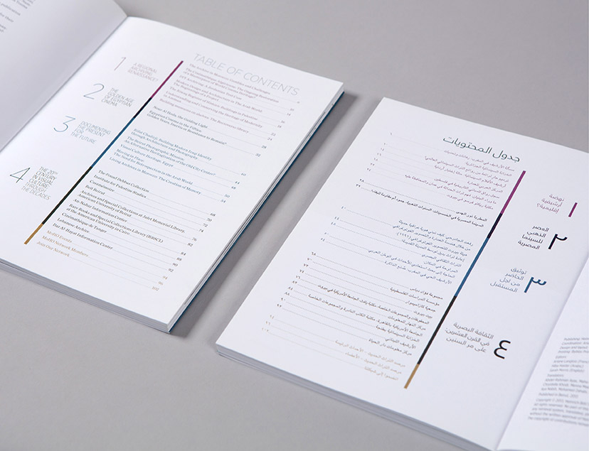
MoHO-Observer 03
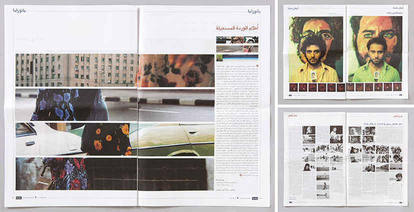
See More Of MoHO - Modern Heritage ObservatorySee More Of MoHO - Modern Heritage ObservatorySlicing through content2013A simple contents page introduces the extended color scheme to code the different sections of the publication. -
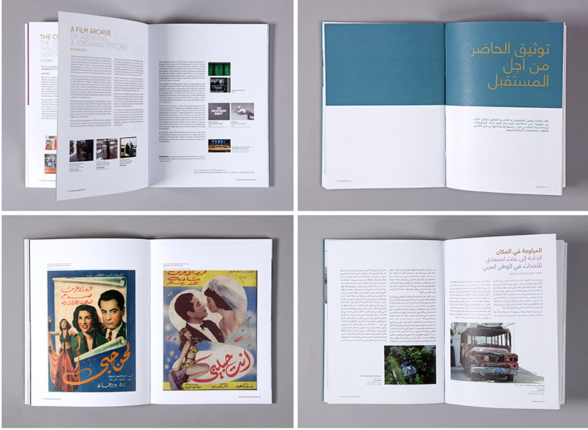
MoHO-Observer 04
See More Of MoHO - Modern Heritage ObservatorySee More Of MoHO - Modern Heritage ObservatoryClarity in structure2013The same simple layout structure is adopted for both the Arabic and English versions of the publication, with photographically illustrated essays, archival reproductions and bold section breaks. -
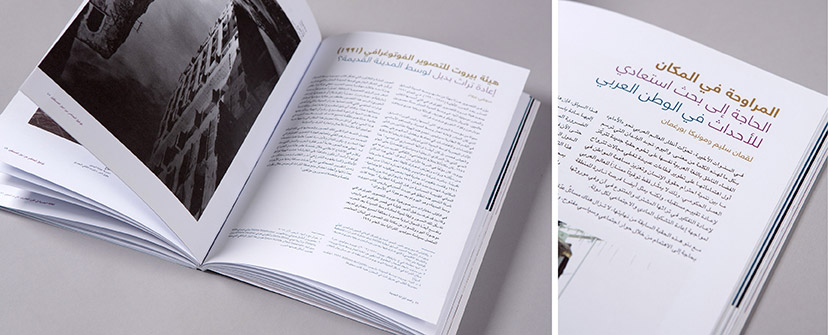
MoHO-Observer 05
See More Of MoHO - Modern Heritage ObservatorySee More Of MoHO - Modern Heritage ObservatoryTinted highlights2013The color gamut is put to further use in the publication, assisting in distinguishing text elements and introducing emphasis. -
MoHO-Observer 06
See More Of MoHO - Modern Heritage ObservatorySee More Of MoHO - Modern Heritage ObservatoryThe time of the archive2013Drawing from projects across the region, one section of the publication constructs a timeline of archival artifacts going back to the early 1900s. -
Palestine c/o Venice-Inside pages 01
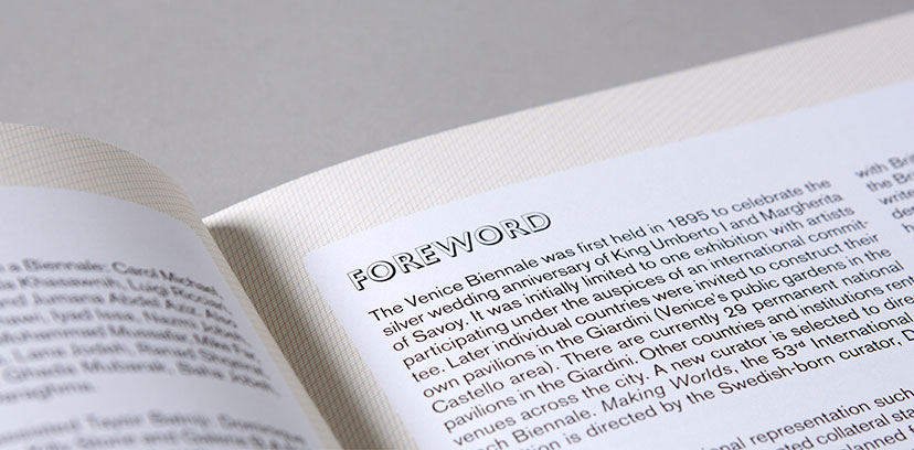
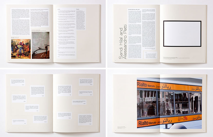
See More Of Palestine c/o VeniceSee More Of Palestine c/o VeniceLine by line2009Following the cartographic visual language, the background of the catalogue’s inside pages was composed of cyan, magenta and yellow lines, mimicking the offset printing process to achieve the desired beige hue. -
Palestine c/o Venice-Inside pages 02
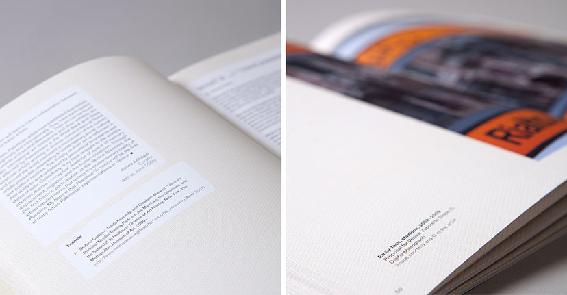
See More Of Palestine c/o VeniceSee More Of Palestine c/o VeniceText territories2009Captions in the exhibition catalogue arrange themselves freely alongside the images, while articles and endnotes get framed in round-corner boxes, alluding to the generally organic forms of land masses on a map. -
Palestine c/o Venice-Inside pages 03
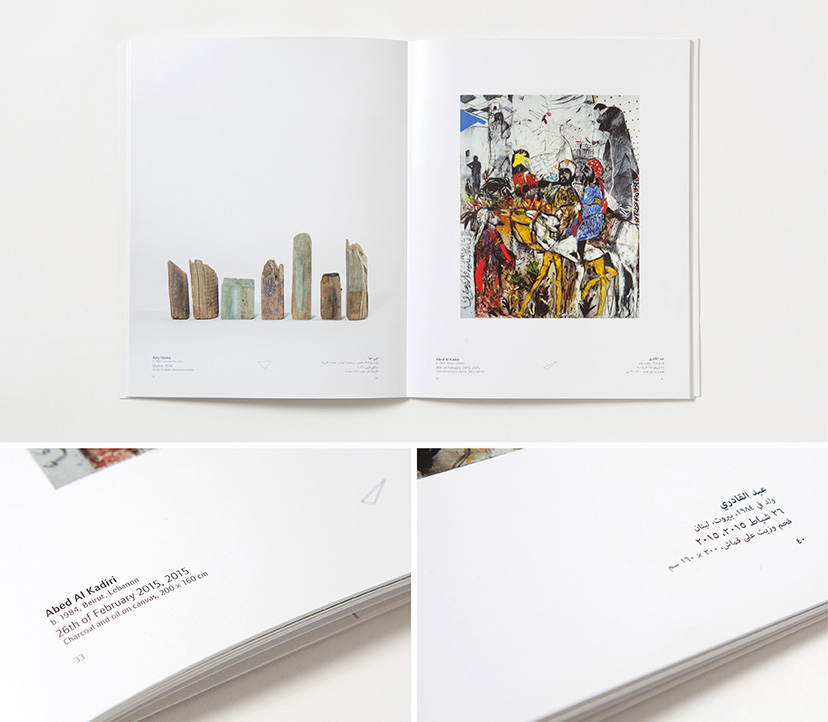
See More Of Palestine c/o VeniceSee More Of Palestine c/o VeniceThe artist first2009The text hierarchy makes the artist name the most prominent in the catalogue. -
Palestine c/o Venice-Inside pages 04
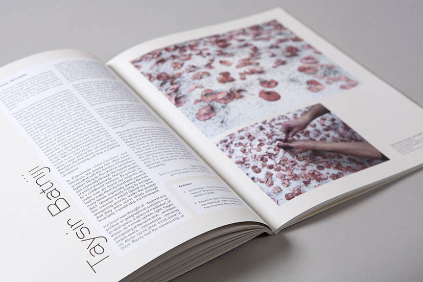
See More Of Palestine c/o VeniceSee More Of Palestine c/o VeniceLayout moves2009The catalogues’ inside pages vary between structure and rhythm. -
MTG-Sursock museum-Resto menu covers
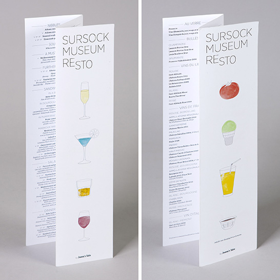
See More Of Sursock Museum -
MTG-Sursock museum-Program guide
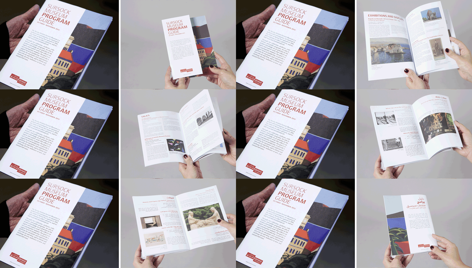
See More Of Sursock MuseumSee More Of Sursock MuseumThe cut10-2015The Museum program guide’s two covers – a side for English and the other for Arabic – have an overlay revealing only part of the cover art work which extends across both. -
MTG-Sursock museum-Visitor guide
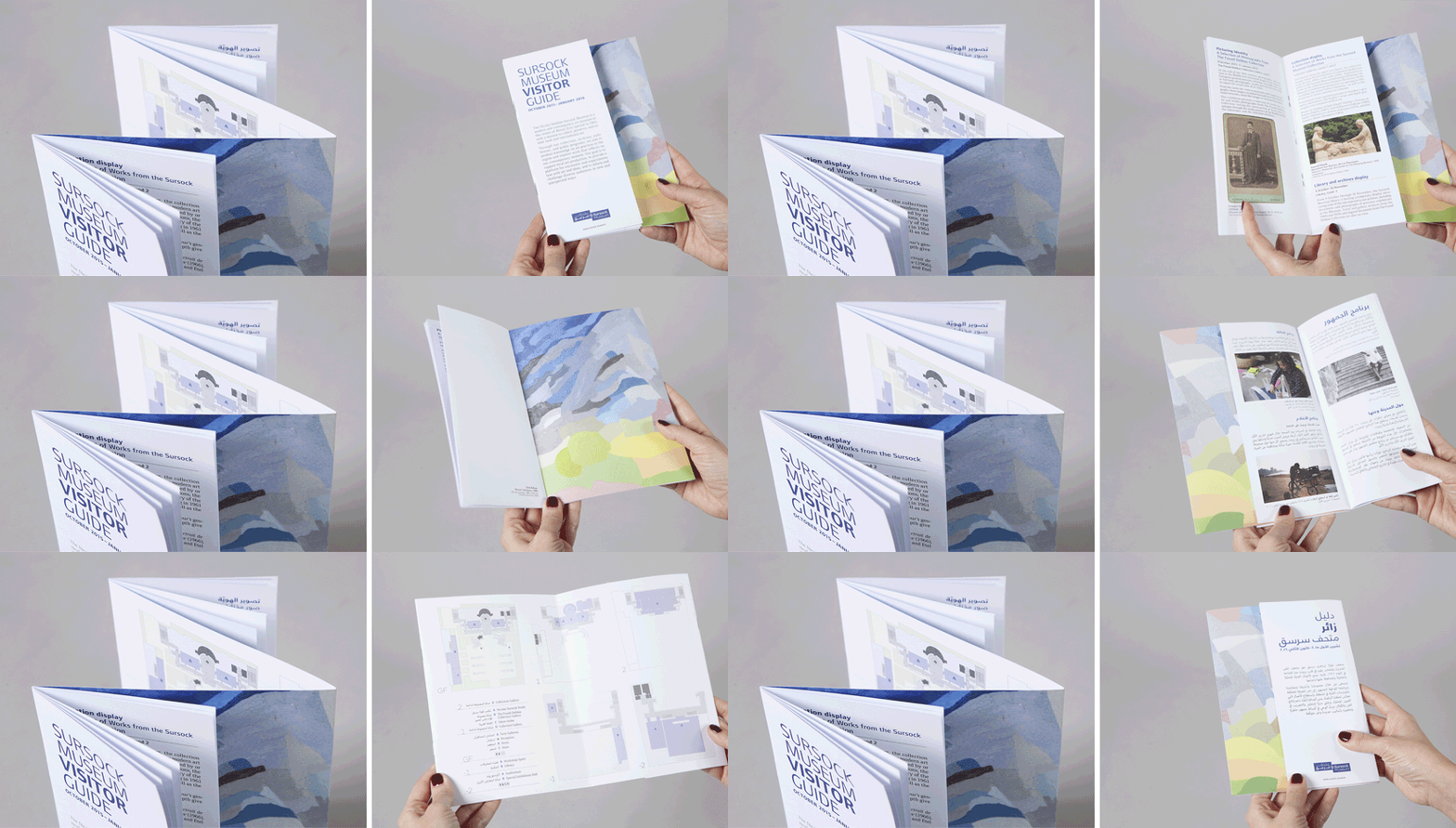
See More Of Sursock MuseumSee More Of Sursock MuseumThe fold10-2015The Museum visitor guide includes a central fold containing the Museum plan on the inside, and on the outside the cover art work continues across the Arabic and English double cover, partly hidden by the guide pages themselves. -
The Soap Museum-Book inside pages
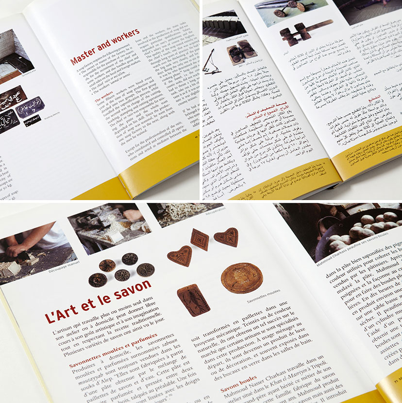
See More Of The Soap MuseumSee More Of The Soap MuseumRich and informative2003“The Olive Oil Soap” book is a celebration of the craft and the valuable archives of the town of Saida and the Audi family. -
MTG-Wardé-Greetings-Planner inside 01
See More Of Wardé -
MTG-Wardé-Greetings-Planner inside 02
See More Of Wardé -
MTG-Wardé-Greetings-Planner inside 03
See More Of Wardé -
MTG-Wardé-Greetings-Planner inside 04
See More Of Wardé -
Yabani-Previous menu and building
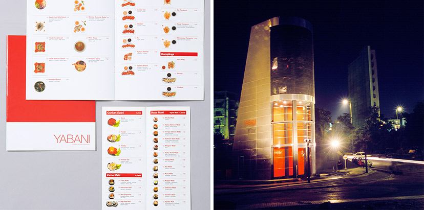
See More Of YabaniSee More Of YabaniThe way things were2002Our photographic intervention on Yabani’s previous menus started a wave of copycatting as the sushi restaurant industry realized the benefits of familiarizing the customer with the product, especially at the time when the offering was new to the Lebanese scene. With the move from the original location – a building designed by architect Bernard Khoury – and the decision to rebrand, just as we were the first to include the food photography, we were also the first to take it away.Food photography: Michel Esta – Building photography: Joseph Chartouni -
Zawaya-Inside pages 01
See More Of ZawayaSee More Of ZawayaStorytelling grids2001 – 2007The layouts of different articles are always worked in close negotiation with the content. An overview of the spreads reveals the effectiveness of the publication’s versatile compositions.Tagged: Inside pages -
Zawaya-Inside pages 02
See More Of ZawayaSee More Of ZawayaGrid-breaking stories2001 – 2007The grid/text/image relationship is crucial to bringing forth the main idea behind every article.Tagged: Inside pages -
Zawaya-Section titles
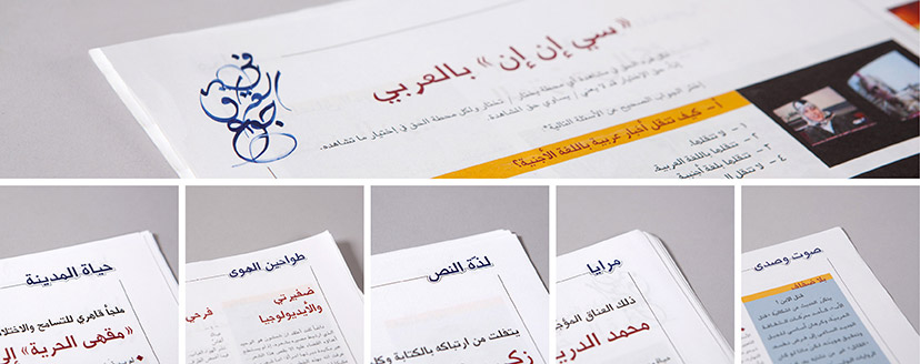
See More Of ZawayaSee More Of ZawayaA verbal visual language2001 – 2007Zawaya’s tailored section titles are given a uniform treatment and are sometimes complemented by an issue-specific graphic device.Tagged: Inside pages -
MTG-Salon d'Automne-Catalogue 03
See More Of ‘32nd Salon d’Automne’ exhibitionSee More Of ‘32nd Salon d’Automne’ exhibitionRead both ways2016The catalog is read from right to left in Arabic, and the other way around in English, each with its own page numbering direction. -
MTG-Regards sur Beyrouth-Captions booklet
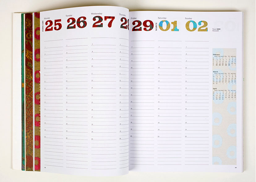
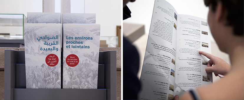
See More Of ‘Regards sur Beyrouth’ exhibitionSee More Of ‘Regards sur Beyrouth’ exhibitionFurther reading10-2015The densely loaded Regards sur Beyrouth exhibition is supplemented with booklets with a listing of works and extended captions per section. For each, the French and Arabic covers complete the image, the same one used on the corresponding section banner.
Unless otherwise stated, all texts, images and audio-visual material are copyright © Mind the gap – Beirut

