-
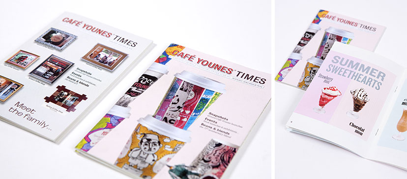
Café Younes-Newsletter
What’s happenin’2013A pocket sized newsletter keeps the visitors up to date with the going-ons of the coffee shop. -
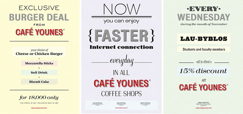
Café Younes-Posters
The things we say2012It might be a case of “how many fonts can you fit in one poster”, true, but the playfulness of typefaces and backgrounds on these frequently changing messages results in an attention-calling vibrancy inside the coffee shop. -
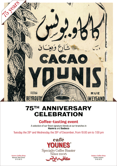
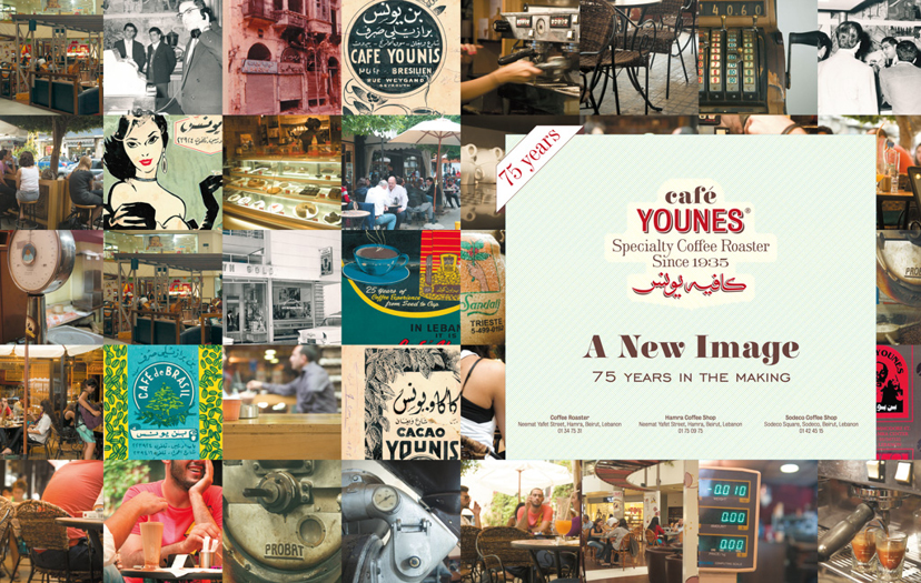
Café Younes-75 years posters
Uncovering the archive2010A series of posters for the 75th anniversary celebration introduces the public to the Younes archive, one that – at least for a period of time – would take center stage. -
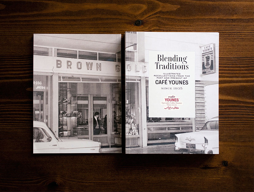
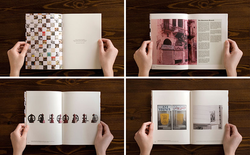
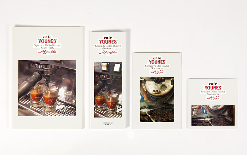
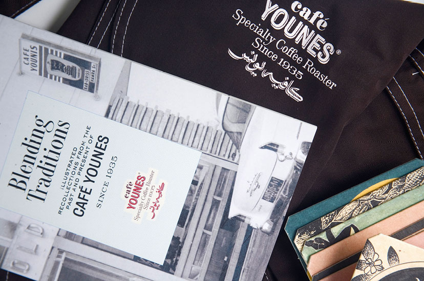
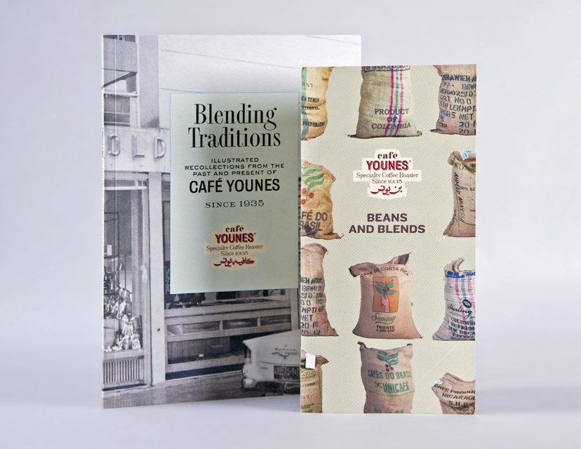
Café Younes-History book front and back
A new chapter2010The history booklet was the perfect document to celebrate the 75 years of the establishment, a record that marks a defining moment in Younes’s development. -
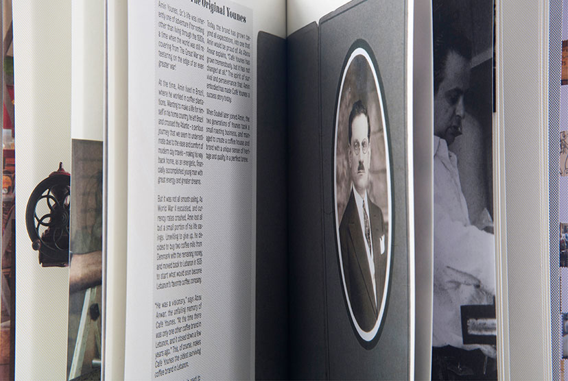
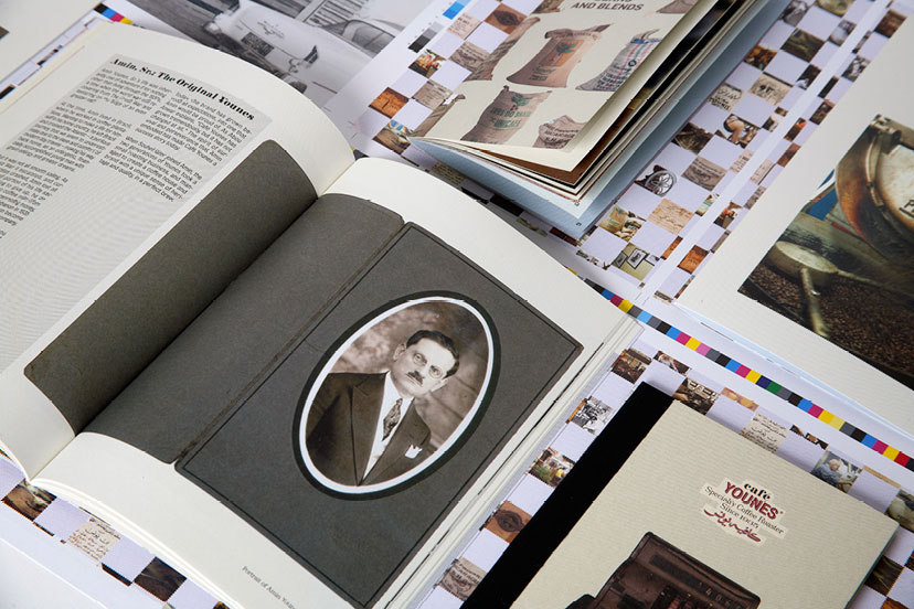
Café Younes-History book inside pages 01
An establishment’s memoir2010A collection of anecdotes, archives, objects and testimonials expose the intimate details of the Younes story. -
Café Younes-History book inside pages 02
Across generations2010 -
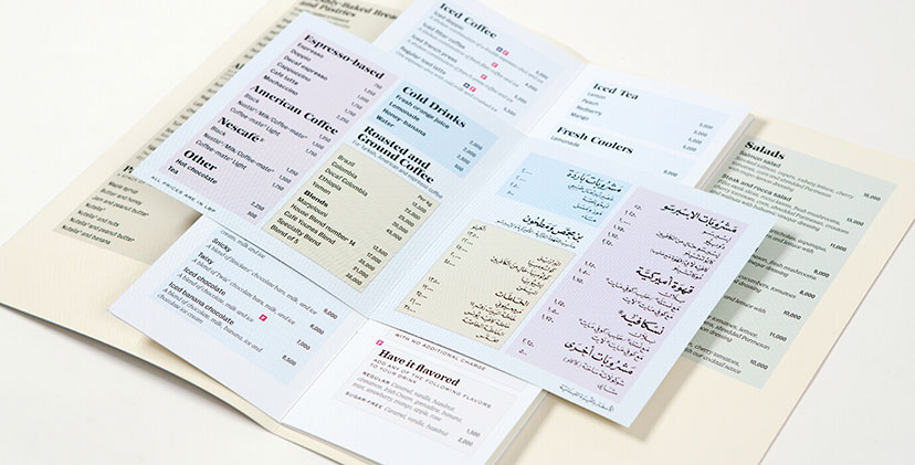
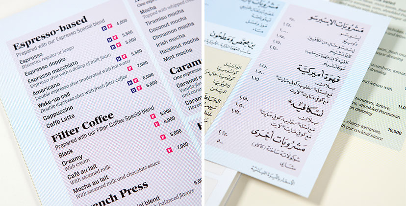
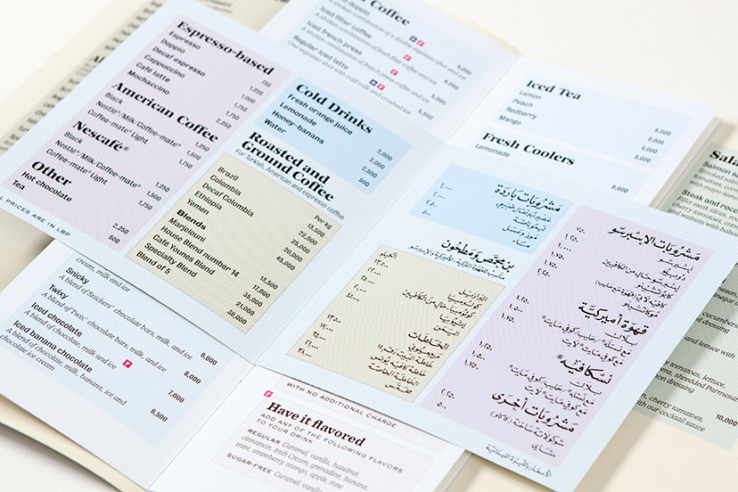
Café Younes-Menus 02
Webs of color2010The CMYK grid lines – a main element of the Younes housetyle – are used to organize the menu sections and code it along the way. -
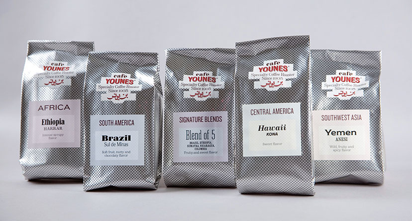
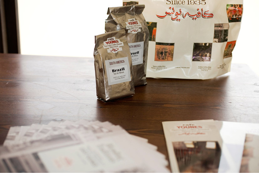
Café Younes-Coffee packs 01
A family of strangers2010 -
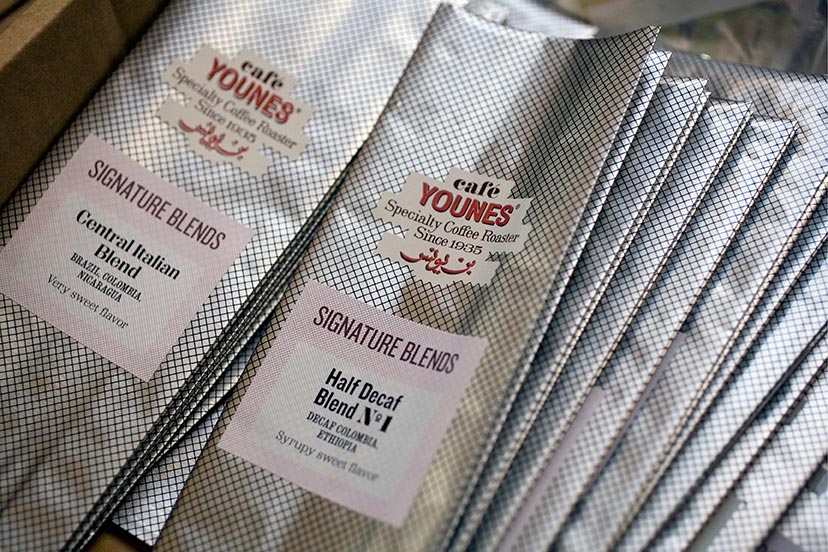
Café Younes-Coffee packs 02
Packaging economics2010For all things practical, the coffee labels are stuck-to-order on a generic aluminum bag, hatched without disguising its material properties. -
Café Younes-Branded items 03
Tone and detail2010Ultimately, the CMYK hatched separation makes for tonal variations, fine detail and a tactile resonance. -
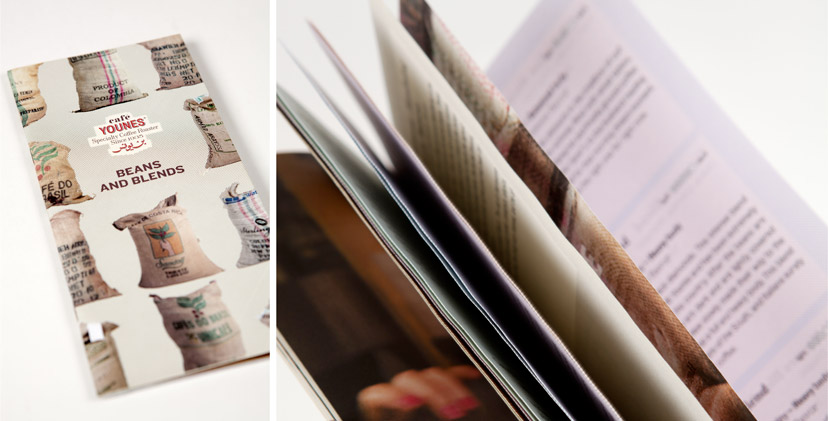
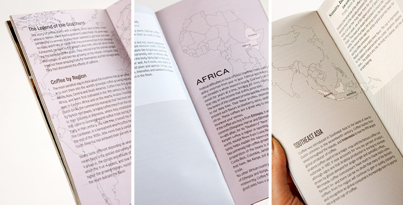
Café Younes-Coffee brochure cover
All about coffee2010The proposed coffee product catalog lists the beans and blends, but also explains grain origins, preparation methods and grading systems, making it a coffee reference document above everything else. -
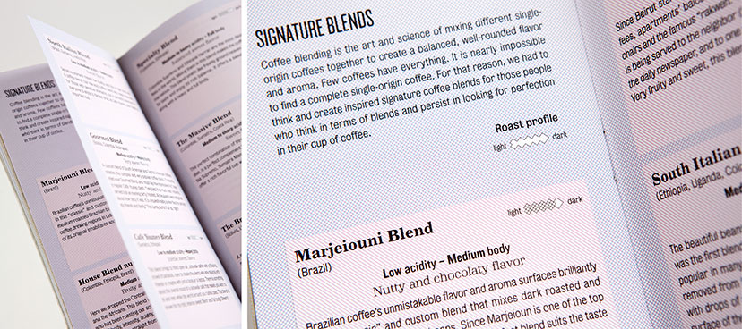
Café Younes-Coffee brochure details
Coffee profiling2010The signature blends section breaks down the brew into its different attributes and introduces the professional lingo to the public. -
Café Younes-Coffee brochure inside pages
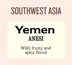
Where on earth2010The country section traces coffee bean origins and introduces a color-coding system based on the different continents and sub-continents. -
Café Younes-Coffee labes
To each their own2010Color-coded and treated with a personalized typographic attire each, the coffee labels acquire a uniqueness while adhering to the general scheme. -
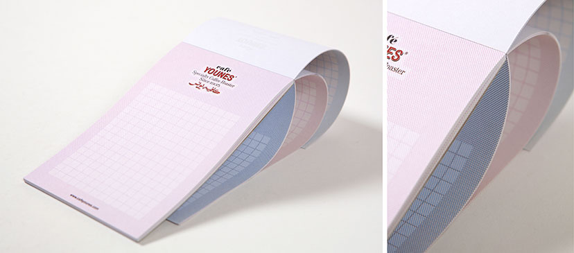
Café Younes-Notepad
Lending color to note-taking2010The CMYK hatching grid is used to give a change of tone with each new page. -
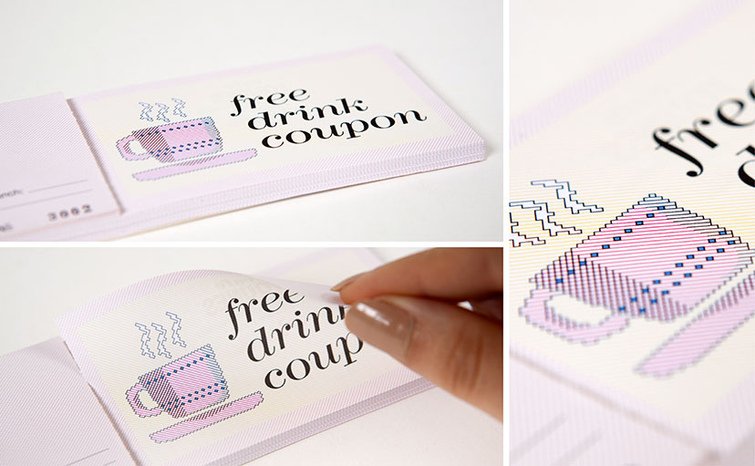
Café Younes-Free drink coupon
Staying on the line2010The diagonal hatching grid becomes a canvas for custom illustrations – a sort of 1-bit drawing at 45 degrees – down to the little details of shading and ornamentation. -
Café Younes-A new image ad
Change has come2010To announce the new branding on the occasion of Younes’s 75th anniversary, this double-page ad brings together snapshots from the past and present and gives a glimpse into the future of the new identity. -
Café Younes-Logo before and after
So long old man2010The American commercial graphic mark with its framed portrait and ribbon element was replaced by an emphasis on typographic detail, history, a variable color scheme and a calligraphic element that switches between the two types of Younes outlets: coffee roaster and coffee shop. -
Café Younes-Menu covers
The hero on the cover2010The artisanal coffee and its careful preparation – pinnacles of what Younes is all about – are front-page news on the menu, so to speak. -
Café Younes-Menus 03
Calligraphy all the way2010The Arabic adaptation of the coffee menu for the Aley branch resorts to a fully hand-calligraphed content, from the titles and descriptions to the prices and fine print. -
Café Younes-Printed items
Pictures and frames2010The integration of photography into the scheme takes place on many fronts and in many ways – framed, masked, patterned or simply reproduced – adding to the dynamism of the identity. -
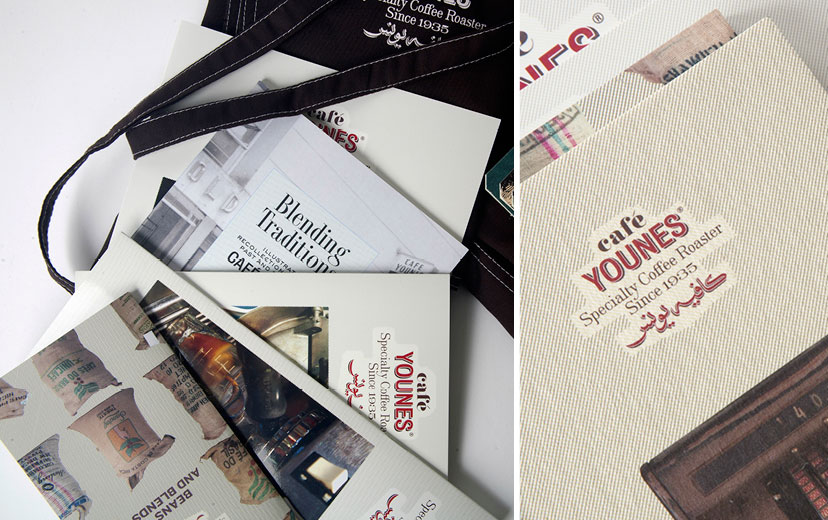
Café Younes-Branded items 02
Pick me up2010The Younes identity extends onto retail amenities: packages and shopping bags for the coffee product range. -
Café Younes-Menus 01
Webs of color2010The CMYK grid lines – a main element of the Younes housetyle – are used to organize the menu sections and code it along the way. -
Café Younes-Branded items 01
Dynamic, variable, adaptable2010The Younes identity is antipodal to the model of the “uniquely recognizable color”, “uniquely recognizable typeface”, “uniquely recognizable image”, and so on. Instead, consistency is established by way of basic visual, tactile and verbal elements coming together intricately. -
Café Younes-History book and coffee brochure
The extra mile2010The conception and creation of communication, marketing and operational tools – such as this history booklet and coffee product catalog for Café Younes – pushes the scope of branding recommendations beyond the typical identity scheme. -
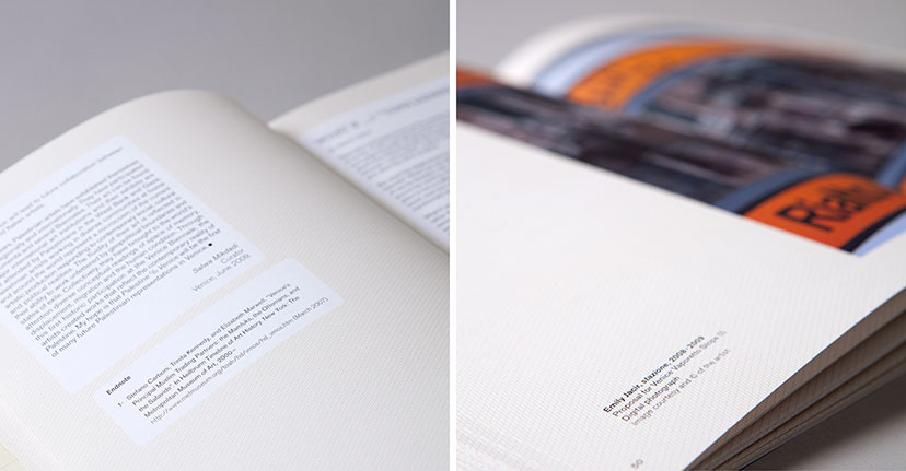
Palestine c/o Venice-Inside pages 01
Line by line2009Following the cartographic visual language, the background of the catalogue’s inside pages was composed of cyan, magenta and yellow lines, mimicking the offset printing process to achieve the desired beige hue. -
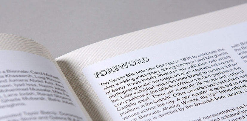
Palestine c/o Venice-Inside pages 02
Text territories2009Captions in the exhibition catalogue arrange themselves freely alongside the images, while articles and endnotes get framed in round-corner boxes, alluding to the generally organic forms of land masses on a map.