-
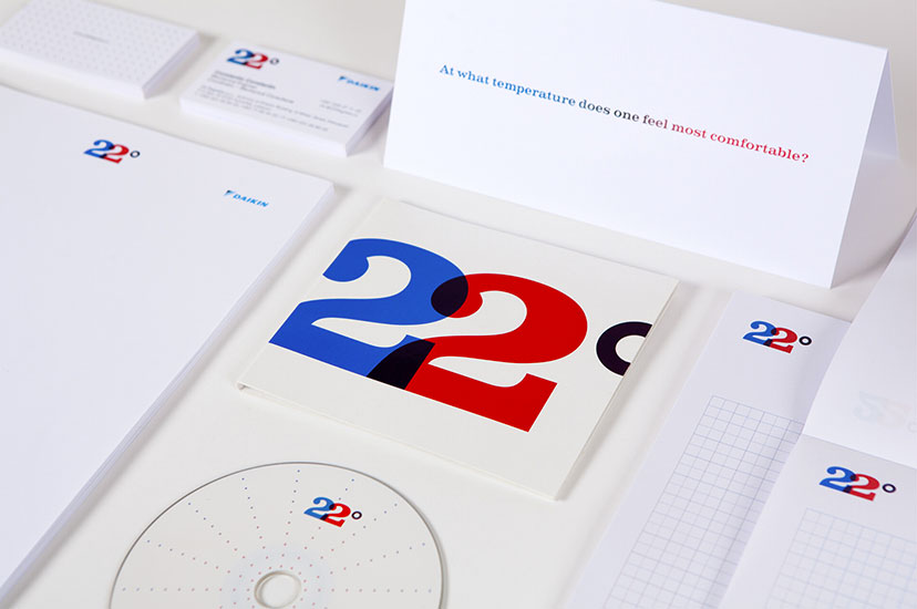
22 Degrees-Stationery
No catch-222010A simple question launches this identity which puts an end to the game of hot-and-cold. -
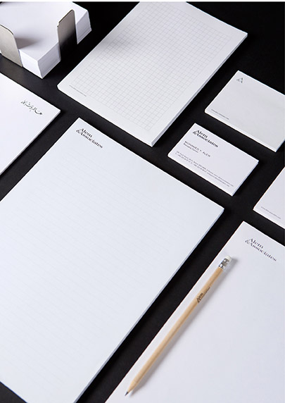
A&A-Stationery
Fit for a lawyer2010Serious, coherent, sharp… exactly what you’d expect from your legal representation. -
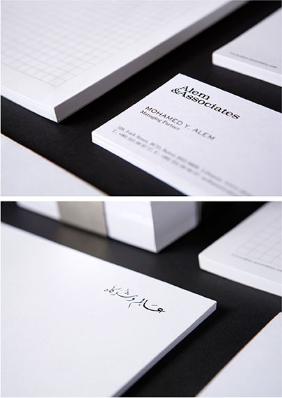
A&A-Stationery details
A drop of Arabic2010Despite the all-English identity, the name has to feature at least once in the native language, and look as delicate while it’s at it. -
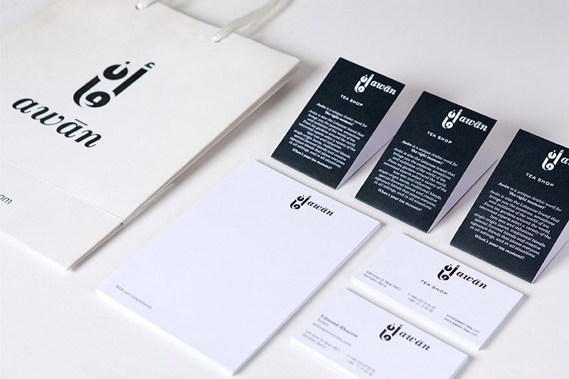
Awan-Bag and stationery
Toned down2009A more somber look is adopted for general applications. -
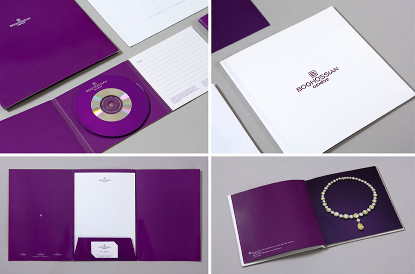
Boghossian Genève-Stationery and Brochure
Precious minimalism2006 -
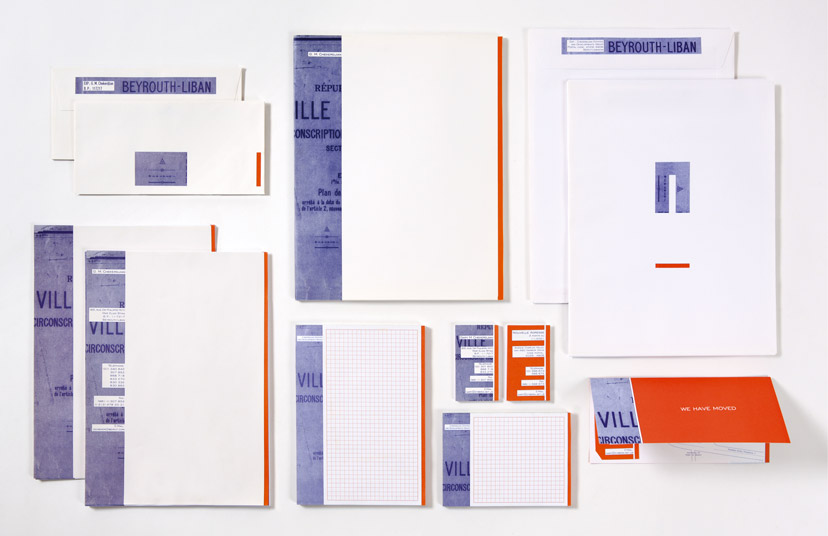
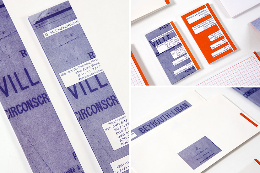
Chekerdjian Estates-Stationery
Calculated collages1995The identity scheme marries a cut-and-paste aesthetic with an attention to consistency. -
Chekerdjian Estates-Stationery details
Studied crops1995The revealed sections of the Beirut map play a different role on each application: spelling out the word “ville” on the letterheads and business cards, and using the image of “Beyrouth – Liban” as a continuation of the return address on the envelope, which also curiously reproduces a part of the map key. -
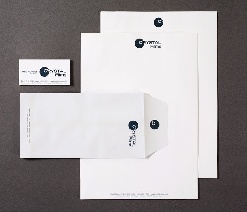
Crystal Films-Stationery
Words or letters1999The application of the Crystal Films mark shows how the CF circular element can be self-sufficient. -
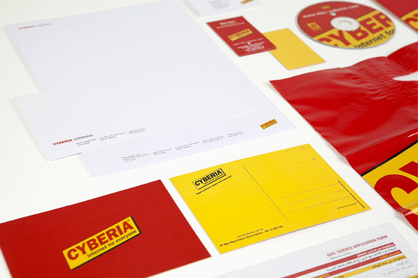
Cyberia-Branded items 01
Corporate varieties1998 – 2003Cyberia’s mark can sit quietly in the corner as it can equally take center stage or even explode beyond its frame. -
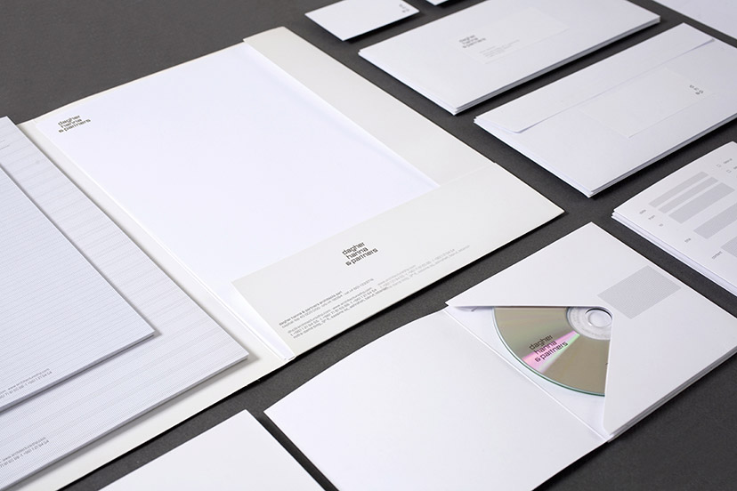
Dagher Hanna & Partners-Stationary 01
Less is more2011The clarity and simplicity of the DHP identity perfectly mirrors the architects’ design philosophy. -
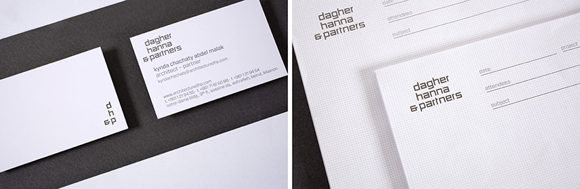
Dagher Hanna & Partners-Stationary 02
Falling into place2011Between the corner device initialism and the perfectly matched grids and typography, the visual elements of the DHP identity are all about sensible organization. -
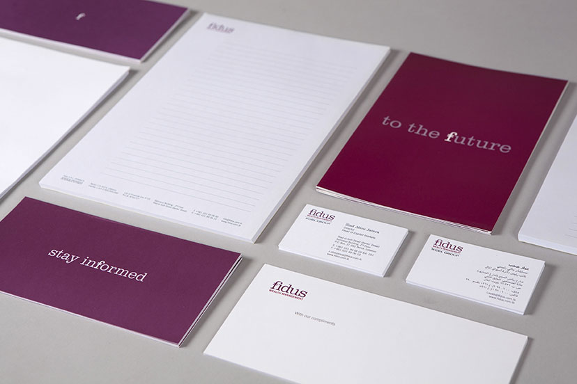
Fidus-Stationery
A rosy outlook2006 – 2009For the corporate image, the cold colors of finance are discarded, and a scheme more fitting for the optimistic messages takes its place. -
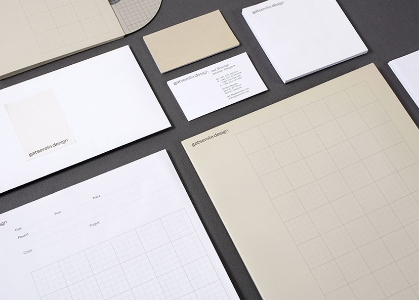
Gatserelia Design-Stationery 01
A few shades of grey2006Whites, warm greys and grid line variations constitute the elements of Gatserelia’s understated identity. -
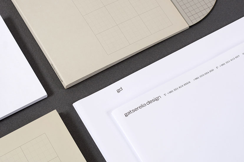
Gatserelia Design-Stationery 02
Marking the page2006Used here on the letterhead following page, the same-weight initials are isolated and act as a clean and straightforward alternative mark. -
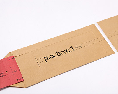
La Galerie Semaan-Invitation
Slide1995Fortunate to own P.O. Box nº 1, La Galerie Semaan’s envelope design had to bring that to the forefront. -
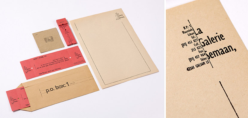
La Galerie Semaan-Stationery
Some ink1995The letterpressed stationery composed for La Galerie Semaan abides by the idea of containment that the logo so strongly demonstrates throughout its applications. -
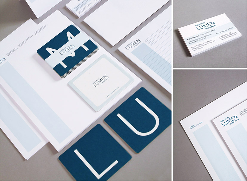
Lumen Hospitality Consultants-Coasters and stationery
Work and play2013As a little reference to the hospitality industry, a coaster set was designed as a giveaway, alleviating some of the seriousness of the corporate image. These hardworking guys do have a drink every once in a while. They are in the hospitality industry after all. -
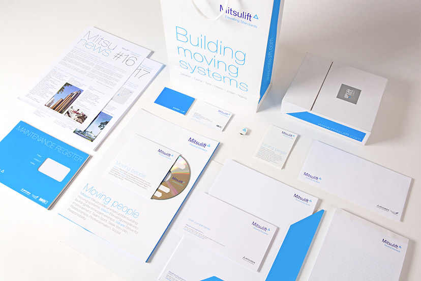
Mitsulift-Branded items 01 new id
Blue blood2011The new Mitsulift identity maintains a poise and composure worthy of the company legacy. -
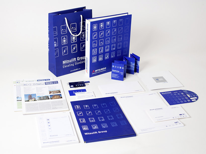
Mitsulift-Branded items previous id
Picto-centered1999 - 2009Patterned, animated, or simply arranged on a line, the Mitsulift pictograms are pretty much what the initial identity is all about. -
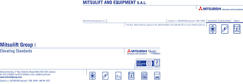
Mitsulift-Header and footer
Organized identification1999 - 2009The main scheme of dark blue – an age-old favorite with corporations – enables Misubishi’s three red diamonds to jump out on corporate applications such as forms and letterheads. Originally only three icons were included alongside the Lebanon-specific company name and the rest of the information. Later, this compositional structure brought in all six product-specific pictograms, as well as affiliation and accreditation marks, and the tagline we recently developed sitting neatly under the international company name. -
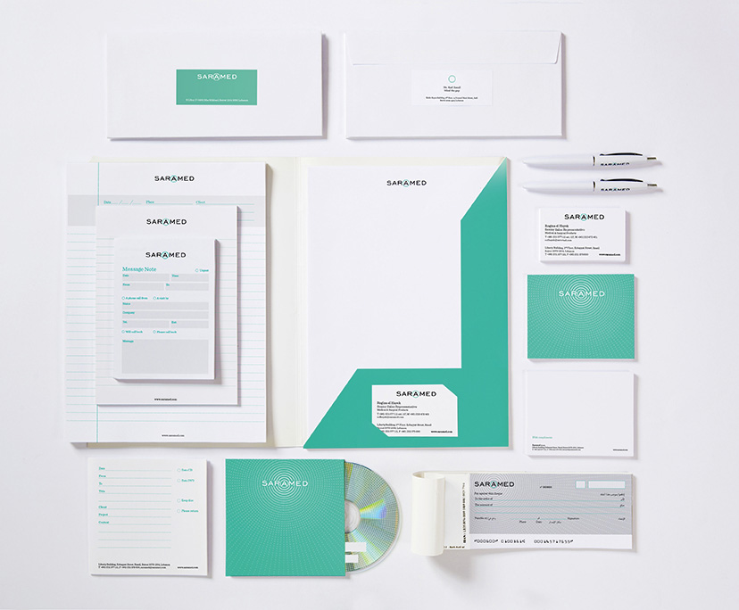
Saramed-Stationery
Sterile yet potent2014Clearly, the health and pharma visual code of whites and cool colors is not something to be recklessly messed with, but a particular shade of blue-green and a striking circular pattern derived from the letter framing provides this identity scheme with its differentiating attributes. -
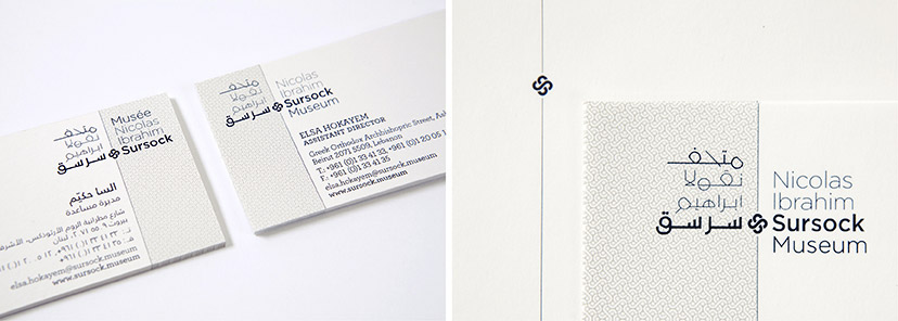
MTG-Sursock museum-stationery details
Rose without the prick10-2014 – 04-2015Fixed on the margin line, the Sursock floral emblem can appear on its own as an identity token, and is the basic module for the pattern construction. -
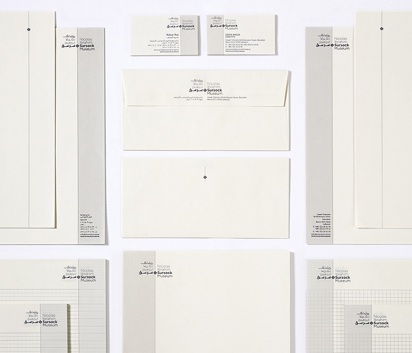
MTG-Sursock museum-stationery
Working margins05-2015The margins, alternating between left and right on the Sursock Museum stationery, indicate the alternation between Arabic and Latin scripts that flow in opposite directions. -
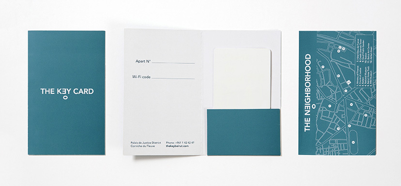
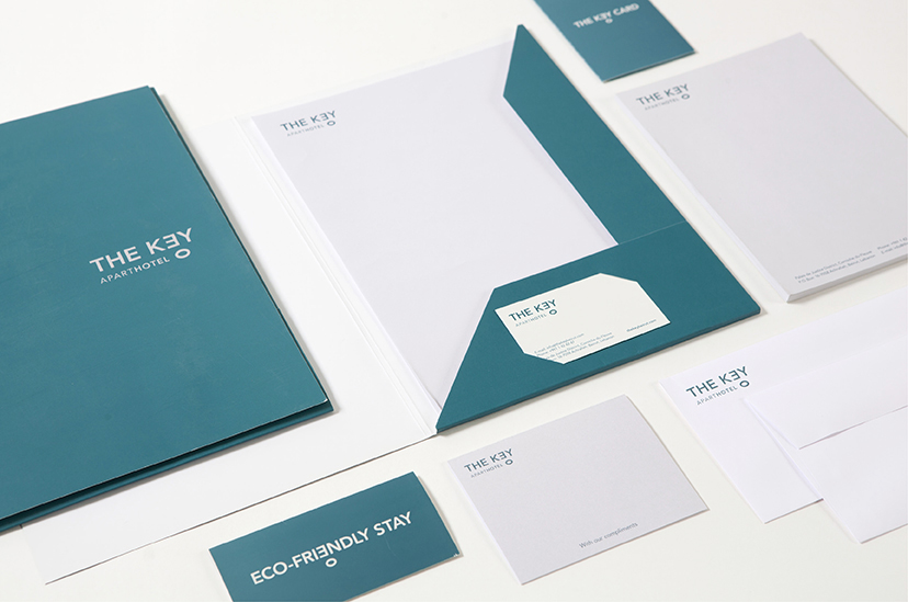
The Key -MTG Key card sleeve
A key to stay with a map to wander2016 -
The Key -MTG stationnery
E2016The combination of a serene teal and a sans serif font evokes a sense of ease and comfort while still retaining a corporate image. -
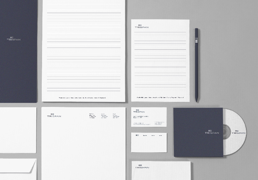
TriSpan-Stationery 01
Sleek, smart, and straightforward2015 -
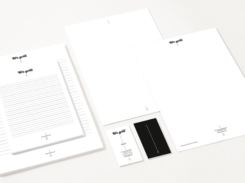
We grill-Stationery
Text-skewering stationery2006As seen throughout We grill’s identity, the skewered logo is also the main element of the stationery.