-
Audi Foundation-Soap Museum logo on image
All soap2004The Soap Museum logo completes the set of Audi Foundation marks.Calligraphy: in collaboration with artist Samir Sayegh – Photography: Photo Raffi -
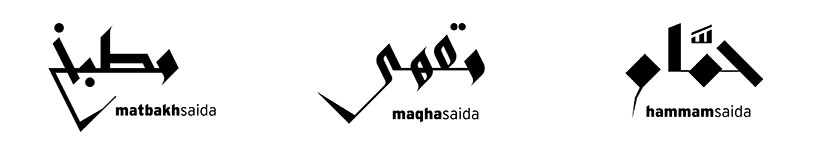
Audi Foundation-Hammam Maqha Matbakh logos
Three marks, one spirit2001 – 2002Audi Foundation’s sub-marks are equally authored and memorable, and are united by their edgy forms and common Latin signature.Calligraphy: in collaboration with artist Samir Sayegh -
Audi Foundation-Logo
Authored signatures2001The unique style of the calligraphy strikes a balance between traditional and contemporary formal qualities.Calligraphy: in collaboration with artist Samir Sayegh -
Audi Foundation-Logo calligraphy
Original calligraphy construction by artist Samir Sayegh2001Calligraphy: in collaboration with artist Samir Sayegh -
Awan-Logo
Tea and time2009The name in Arabic, one of the language’s many uniquely nuanced words for the concept of time, becomes the central calligraphic emblem in this visual identity. -
Biomass-At home
Keeping track2013At home, the completely transparent strip on the bags becomes a cue for “need to go shopping”. -
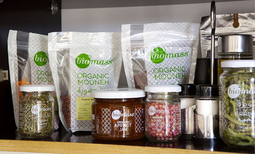
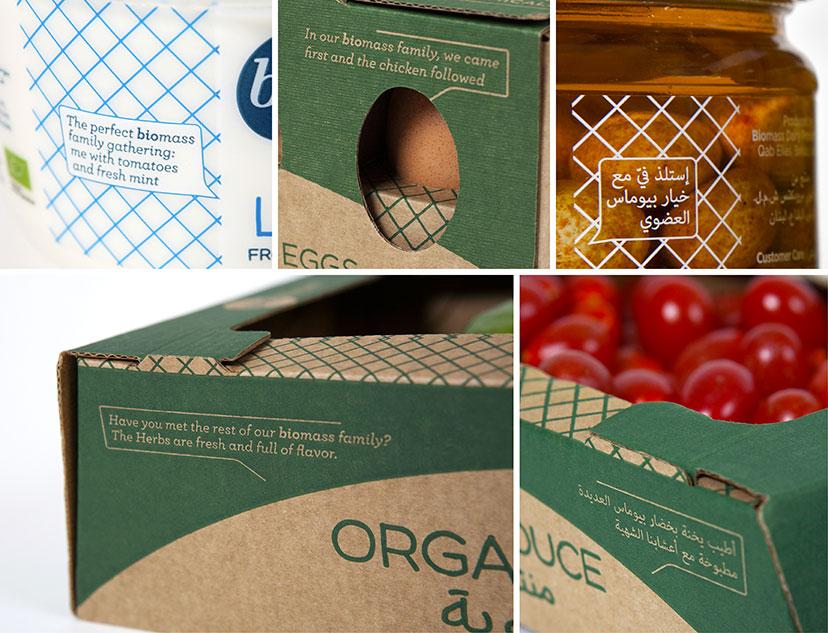
Biomass-Bag, box, jar
Look this way, talk this way2012 – 2013Visual and verbal elements unify the material and container-varied product lines. -
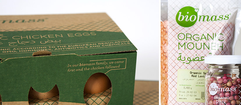
Biomass-Close ups
What you see is what you get2012 – 2013Honestly showcasing the product is a Biomass must. -
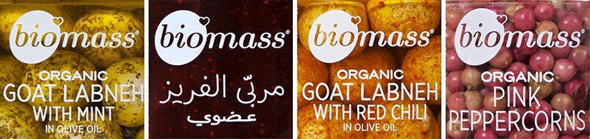
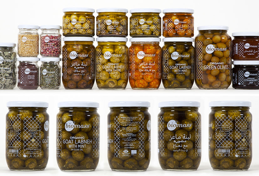
Biomass-Jars
On the surface2013The single color Biomass jars use every bit of the container surface for a fully bilingual set of information. -
Biomass-Talkies
Having things to say2013All Biomass packages will introduce you to some other member of the Biomass family, benefitting from the popularity of some products to draw attention to others. -
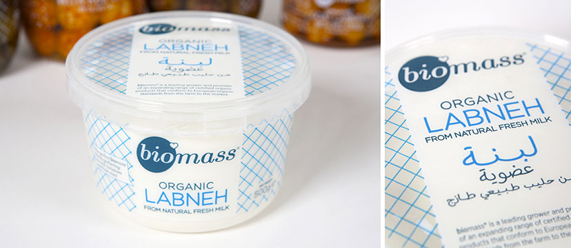
Biomass-Dairy
In the code2013Following product color conventions, the Biomass dairy line is the only one to diverge from the green and white color scheme. -
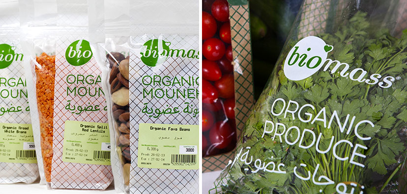
Biomass-Bags
In the bag2012The bagged products from biomass have a generic package with differentiating stickers and a clear exposure of contents. -
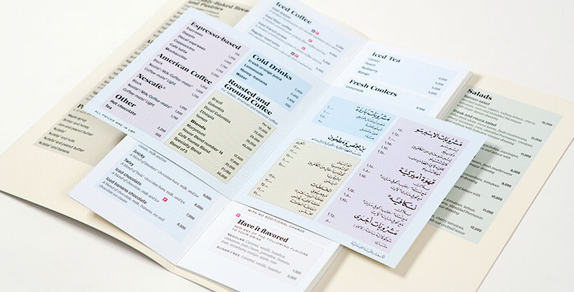
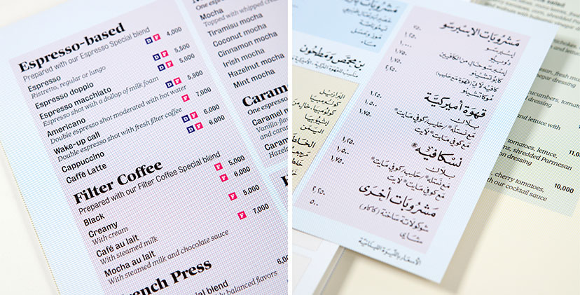
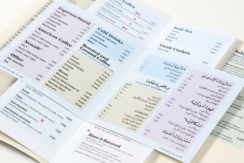
Café Younes-Menus 02
Webs of color2010The CMYK grid lines – a main element of the Younes housetyle – are used to organize the menu sections and code it along the way. -
Café Younes-Logo before and after
So long old man2010The American commercial graphic mark with its framed portrait and ribbon element was replaced by an emphasis on typographic detail, history, a variable color scheme and a calligraphic element that switches between the two types of Younes outlets: coffee roaster and coffee shop. -
Café Younes-Menus 03
Calligraphy all the way2010The Arabic adaptation of the coffee menu for the Aley branch resorts to a fully hand-calligraphed content, from the titles and descriptions to the prices and fine print. -
Café Younes-Menus 01
Webs of color2010The CMYK grid lines – a main element of the Younes housetyle – are used to organize the menu sections and code it along the way. -
Café Younes-Logo
Fully loaded2010Although carefully composed into a single graphic device, the logo letterforms hold quite a few referential details: classical style variations, shadow treatments of hand-painted signs, a delicately made-up ligature and a calligraphy based on the original. -
Corniche1999-Full map
Macro picture1999The full map, based on a scanned and treated cadastral, locates the projects and provides additional information about each. -
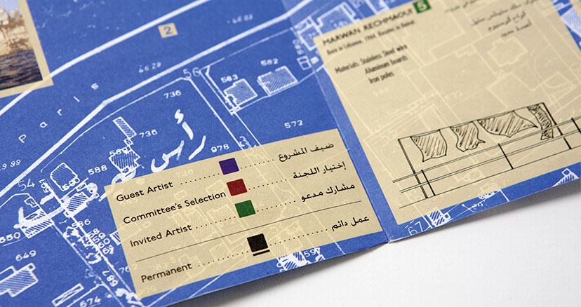
Corniche1999-Map detail
Micro detail1999The status and permanence of the featured art projects are coded in the map legend. -
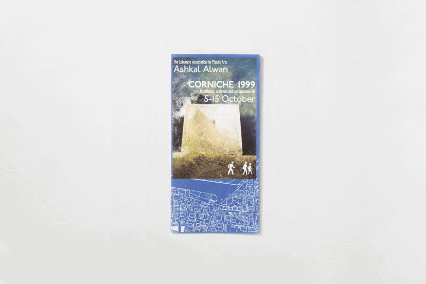
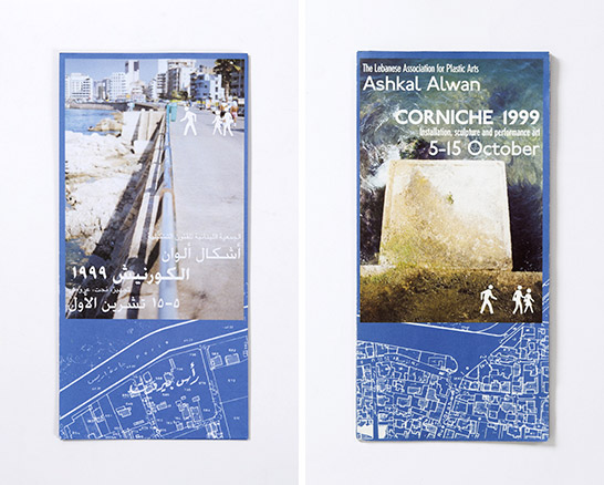
Corniche1999-Two covers
Viewpoints1999The two covers of the Corniche pamphlet are each reserved for a language, and while the Arabic gazes at the city scape, the English stares down at the sea. -
Febrik-Children closeups
The play pieces2014Every once in a while, the kids make an appearance in one way or another. -
Febrik-Cover
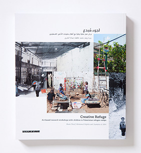
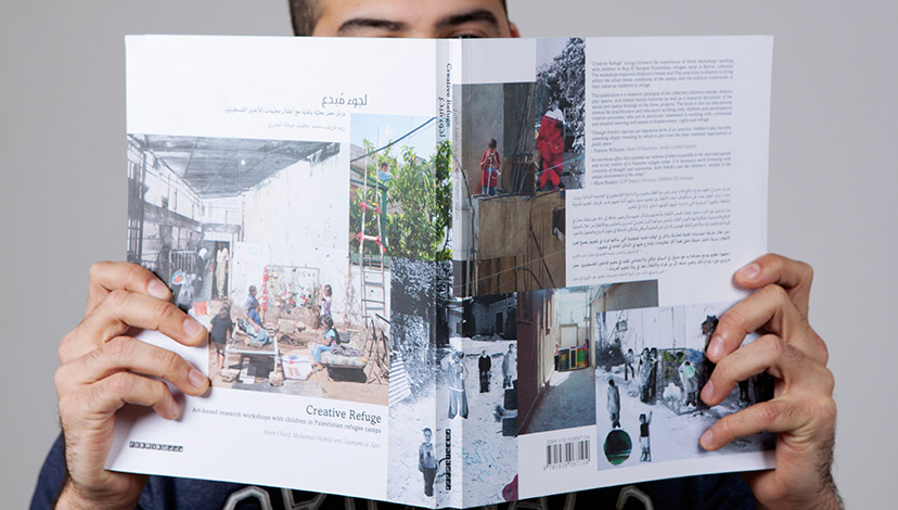
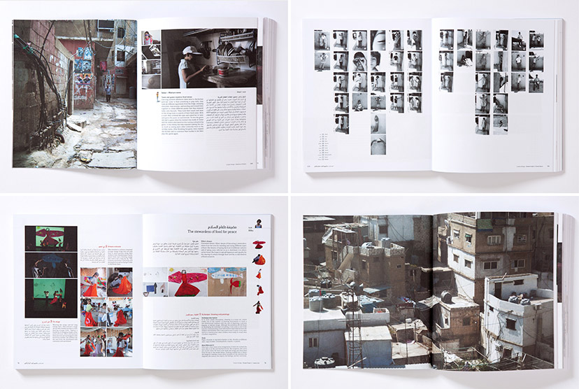
A collage of imaginations2014The “Creative Refuge” cover brings forward the coming together of children’s inventions and interventions. -
Febrik-Cover and back cover
Constructed reality2014The continuation of the collage onto the back cover reveals an extended made-up world, where the space of the camp becomes the sum of bits and pieces of works by the participating children. -
Febrik-Foldouts 1
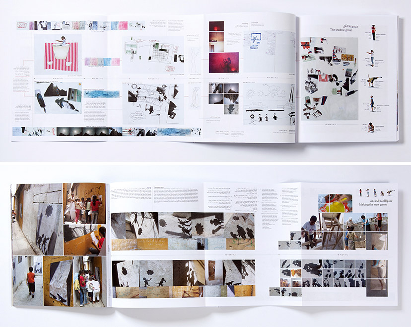
Spreading out2014At the end of its third chapter, the book proposes an aggregate and condensed reading of the workshop, presented within an extension of the book spread into poster-like fully illustrated diagrams. -
Febrik-Foldouts 2
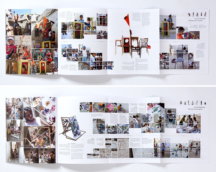
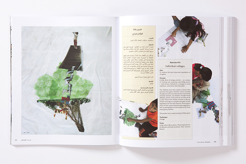
Two at a time2014The double-sided book extensions follow two children through a timeline of their individual and group works, culminating in an elaborate game tested in the context of the camp. -
Febrik-Foldouts 3
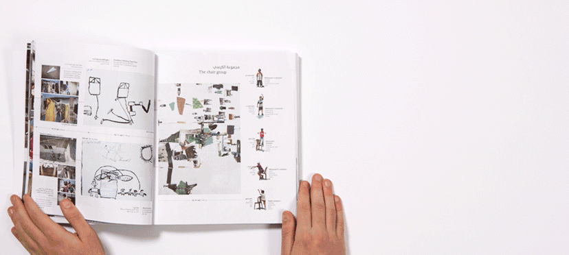
Diagrammatic narratives2014The spread out pages tell the stories of the final play items created by the children, where sometimes four chairs converged into one or three separate processes led to a single object. -
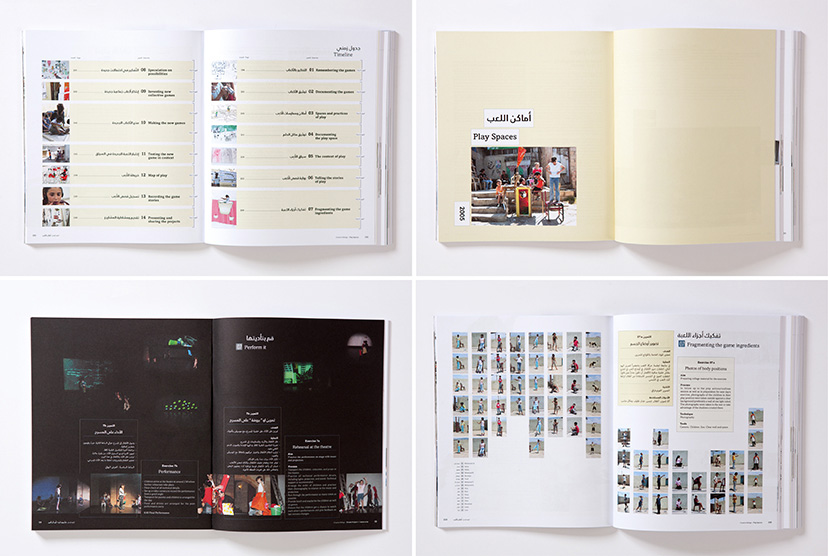
Febrik-Layout variations 01
Layout diversity2014The open chapter breaks, timelined contents pages, gridded thumbnail spreads, and darkened performance sections, are just a few of the eclectic layout treatments in the book. -
Febrik-Layout variations 02
Photo-variety2014With an image library containing everything from work reproductions and participants’ photos to process and space documentation, the book layout structures had to be equally diversified. -
Febrik-Opening note
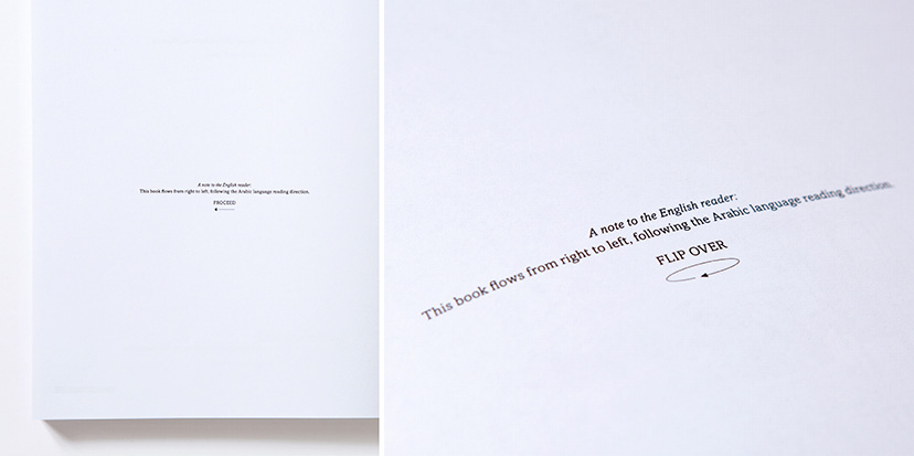
Follow my lead2014The book privileges the Arabic reading direction and prepares the English reader on both ends of the publication. -
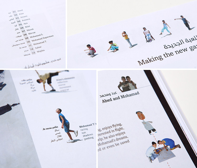
Febrik-Participants page
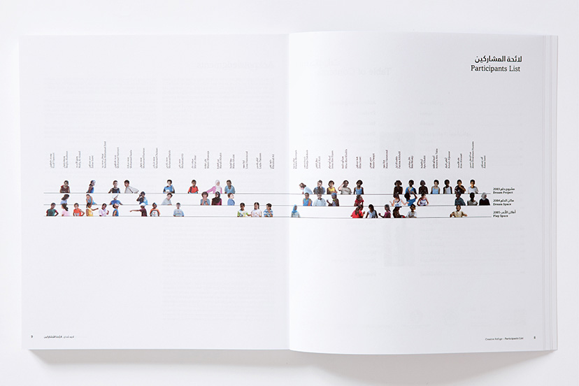
Little creatures2014The stars of “Creative Refuge” are clearly the children of the camp. In this chart at the beginning of the book, they are arranged across the three workshops represented by the three lines, giving a reading of the one, two and three-timers, as well as the total number of children per workshop. -
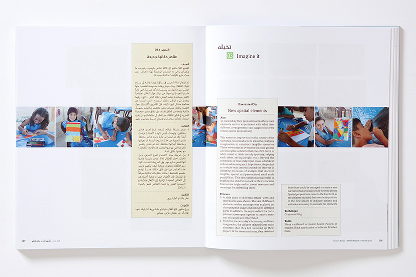
Febrik-Spread 01
Orderly dynamism2014The educational manual part of the book has fixed elements for each exercise: number and bilingual title, and a kind of a technical step-by-step chart in each of the two languages. These consistent items interact flexibly with the images and introduce a particular fluidity and movement to each spread. -
Febrik-Spread 02
Spatial compositions2014Certain pages of “Creative Refuge” use the text-image relationship to play with depth, viewpoint and perspective. -
Hammam-Logo on image
Soap and stone2007The traditional architectural features shine in the Hammam store and set the appropriate mood for tourists and local visitors alike.Calligraphy: in collaboration with artist Samir Sayegh – Photography: Elie Semaan -
Hammam-Logo
Authored signatures2001The unique style of the calligraphy strikes a balance between traditional and contemporary formal qualities.Calligraphy: in collaboration with artist Samir Sayegh -
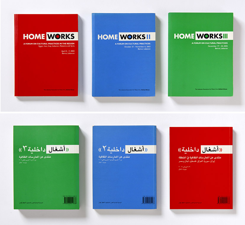
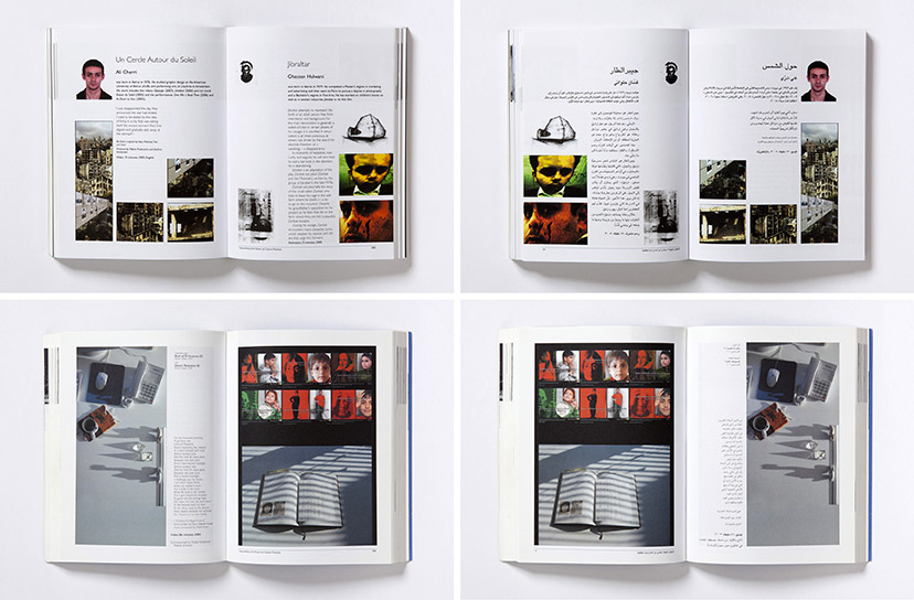
Homeworks-Book covers
Back to back2002 – 2005Each Home Works publication is bilingual with two operational covers, with the Arabic and English sections, which flow in opposite directions, meeting at the center of the book. -
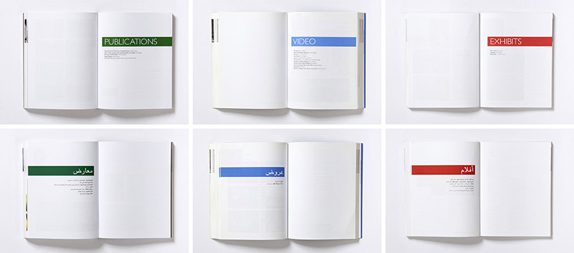
Homeworks-Chapter breaks
Clear-cut2002 – 2005The chapters in the books are divided by discipline, and the section breaks take on the main color of the year/edition. -
Homeworks-English and Arabic pages
(Almost) identical twins2002 – 2005All pages in the book are faithfully reproduced in both languages down to the smallest detail. -
Jabal Moussa-Fold-out map closed
Portable guide2010The pocket-size fold-out map has two languages, English and Arabic, with each occupying a side of the folded document. -
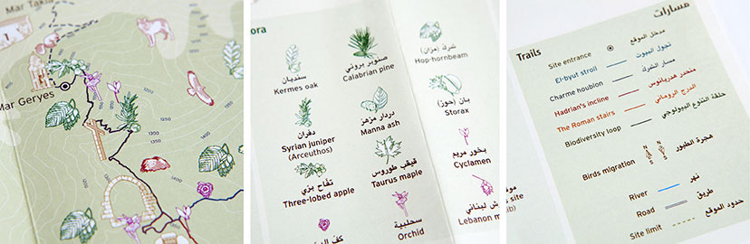
Jabal Moussa-Fold-out map details
Reading the map2010The map’s micro-level exposes the intricacy of the hatching treatment, and the key allows for the different codes to come together and paint a detailed and rich picture of the natural experience. -
Jabal Moussa-Logo before and after
Oak and wolf mountain2010The association’s previous logo – a circular device with an abstraction of the mountain, its top predator and most characteristic plant – was retained, but lifted to include a custom-drawn Arabic name and introduce the type and graphic treatments of the new identity scheme. -
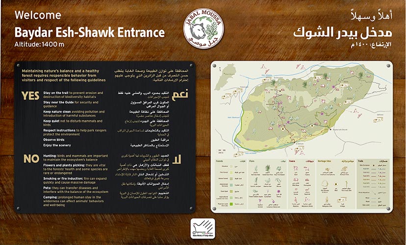
Jabal Moussa-Signage 01
Layers and layering2010As this entrance panel shows, the Jabal Moussa signage system incorporates pre-painted and printed aluminum sheets as well as engraved and color-filled brass plates, stud-screwed on engraved wood structures resulting in a hierarchy of information, a distinctive object design and a composite material scheme. -
Jabal Moussa-Signage 02
Non-alienating alien2010In context, the signs are not meant to blend into the environment, but to rather stand out as an honest, non-invasive, addition to the site. -
Jabal Moussa-Signage 03
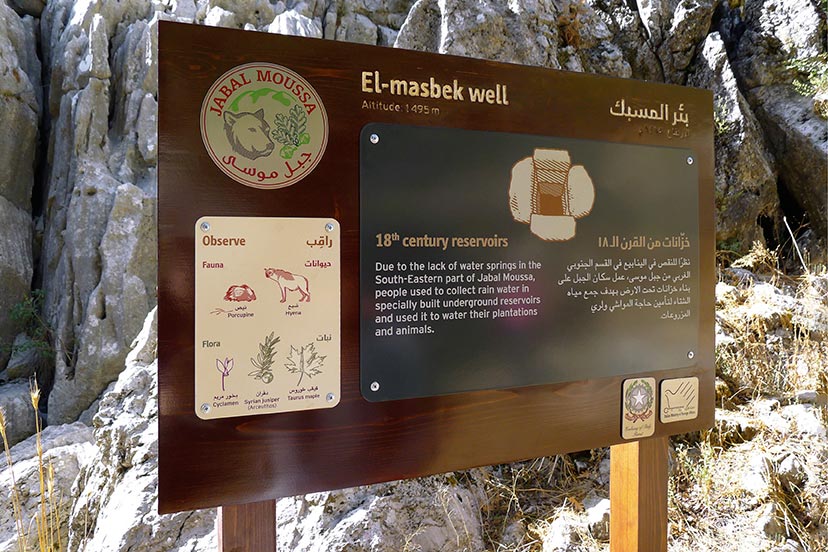
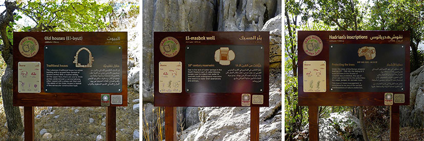
Watch and learn2010The material scheme is consistent across sign types; these identification signs use it to tell you where you are, what you need to know and what else to keep an eye out for. -
Jabal Moussa-Signage 04
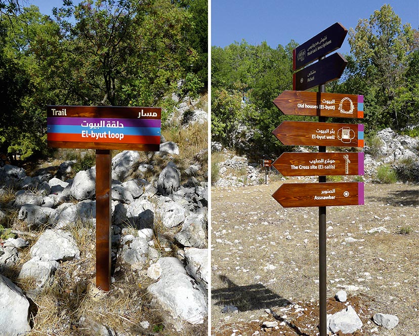
Paths of discovery2010The directional signs are classically configured, with the inclusion of the trail color codes found in the fold-out map. -
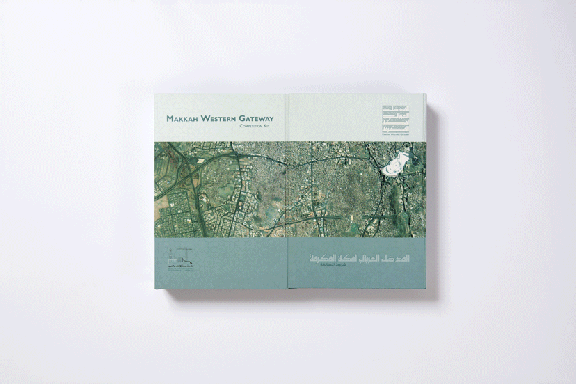
MTG-Makkah Western Gateway Competition-Box
Inside the box2002 -
MTG-Makkah Western Gateway Competition-Logo
Tightly packed2002The counter-form-free calligraphy based on a square grid was developed in collaboration with artist calligrapher Samir Sayegh. -
Matbakh and Maqha-Maqha logo on image
Where it’s served2007Calligraphy: in collaboration with artist Samir Sayegh – Photography: Elie Semaan -
Matbakh and Maqha-Logos
Authored signatures2001Samir Sayegh’s unique style of the calligraphy strikes a balance between traditional and contemporary formal qualities. -
Matbakh and Maqha-Matbakh logo on image
Where it’s made2001Calligraphy: in collaboration with artist Samir Sayegh – Photography: Elie Semaan -
MoHO-Logo
Come together2013In addition to the clear focus on the acronym as a concise memorable name with a particular capitalization (Mo for Modern), this bilingual mark configures the two languages where, even when flowing upwards, the Arabic reading is mainly driven by its natural right-to-left direction. -
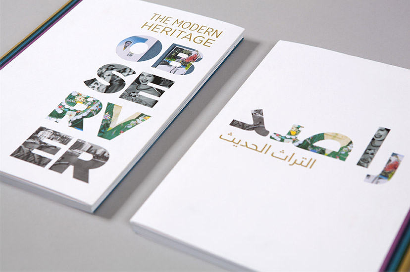
MoHO-Observer 01
To each their language2013MoHo’s publication on documentary and archiving projects by the network members gets separate Arabic and English versions; each of the covers receives a language-appropriate compositional arrangement, retaining the concept of “peeking through the observer” while avoiding language adaptation mimicry. -
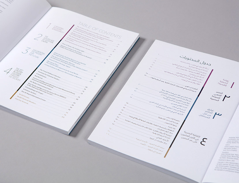
MoHO-Observer 03
Slicing through content2013A simple contents page introduces the extended color scheme to code the different sections of the publication. -
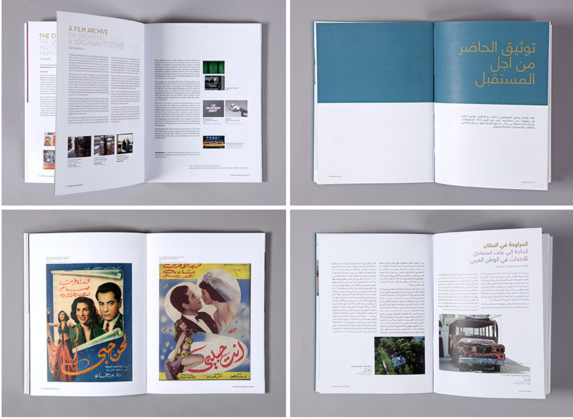
MoHO-Observer 04
Clarity in structure2013The same simple layout structure is adopted for both the Arabic and English versions of the publication, with photographically illustrated essays, archival reproductions and bold section breaks. -
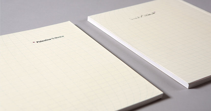
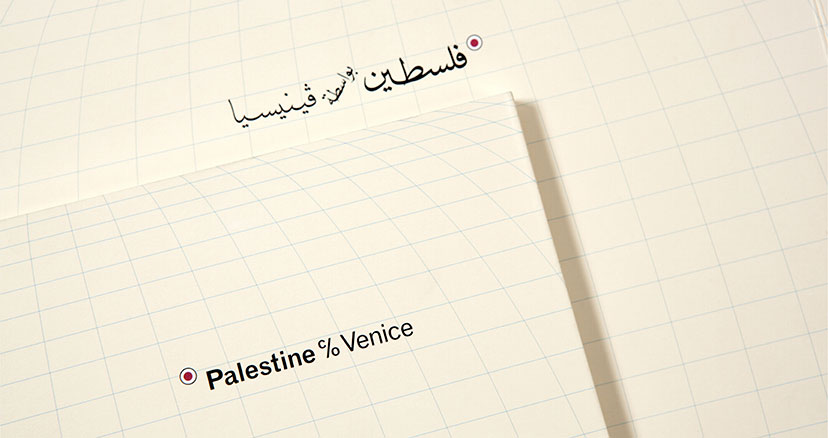
Palestine c/o Venice-Covers
Worlds apart2009The English and Arabic versions of the exhibition catalogue are designed as separate documents. -
Palestine c/o Venice-Covers close up
Back to the map2009The Arabic name is set in the style of calligraphy often found on traditional Arabic maps. -
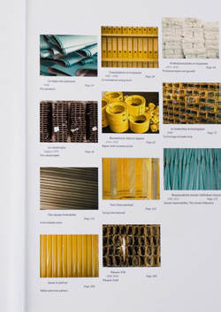
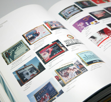
Pikasso-25 year book contents page
Looking closer2012Close-ups of materials from the outdoor media industry, one per chapter. -
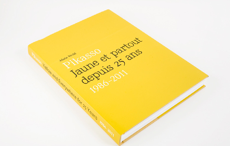
Pikasso-25 year book cover
Rejoicing in yellow2012A book cover design that literally plays out its title. -
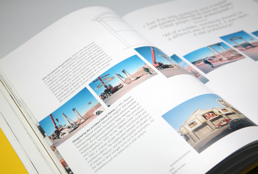
Pikasso-25 year book spread 01
Image narratives2012Photo sequences are used to illustrate processes of work. -
Pikasso-25 year book spread 02
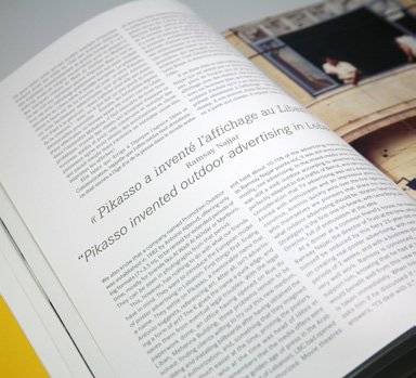
One and the other2012The two languages shift in position and style. -
Pikasso-25 year book spread 03
Escalating time-line2012A dynamic structure for an overview through time. -
Pikasso-25 year book spread 04
Shifting backdrops2012The photographic arrangements present a variety of visual relationships with the overlaid type. -
Semsom-Logo and calligraphy
Cutting corners2008Based on calligraphic variations, the Arabic script in this bilingual identity becomes a graphic device that neatly corners itself in a square alongside the Latin name for the logo, but is free enough to allow some compositional independence for each of the languages.Calligraphy: in collaboration with artist Samir Sayegh -
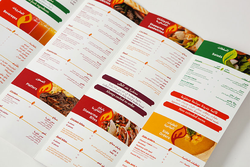
Shawarmer-Menu inside
Leaf, drop, flame2008In addition to color and photographic representation, the menu uses a consistently shaped graphic element that changes treatment to indicate the different sections. -
Shawarmer-Sandwich logos
Mark your favorite2008As marks in their own regard, each specialty item at Shawarmer is given a display font and its corresponding Arabic adaptation. -
Shawarmer-Bilingual logo with tagline
Added value2007With the revisited identity, the existing tagline, “All you want”, is literally extended. -
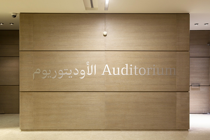
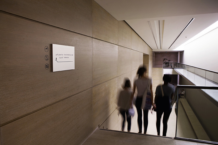
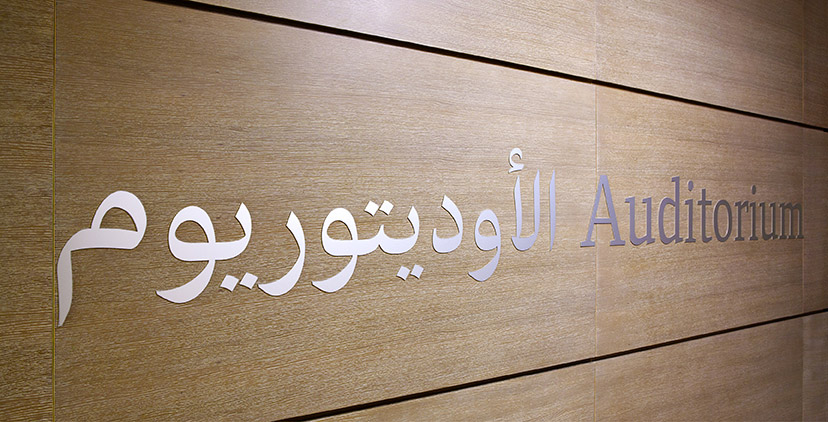
MTG-Sursock Museum-Auditorium identification sign
Destination reached2015 - 2016Large and perfectly centered within the wood panels, the identification signs for the main facilities command their share of attention. -
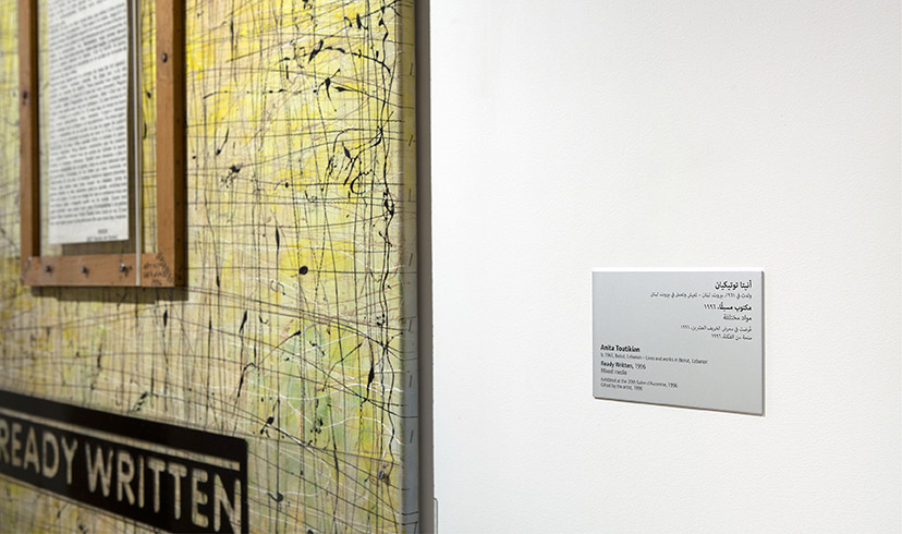
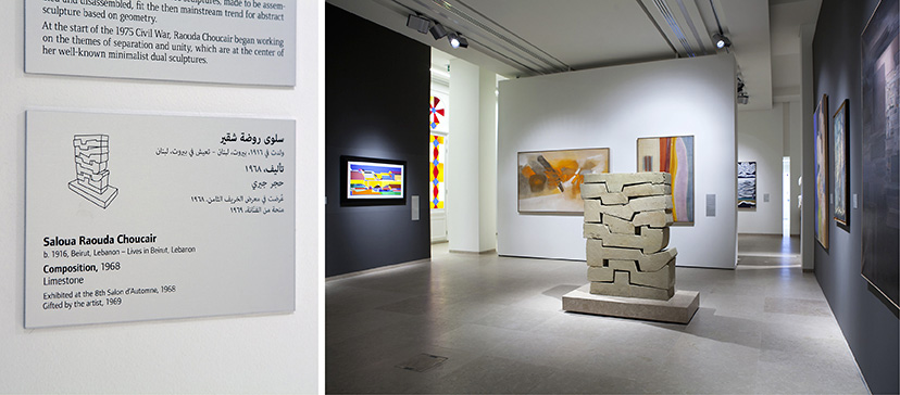
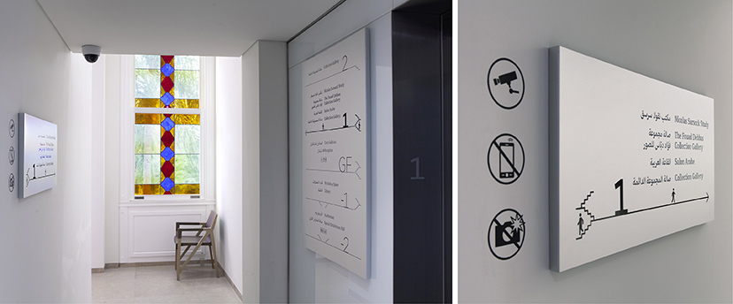
MTG-Sursock museum-Collection display caption
Keeping the link2015 - 2016The Collection Display captions are set on the same iodized aluminum used for the Museum signage system. -
MTG-Sursock museum-Collection display dark wall text
Reversed out10-2015The exhibition space alternates between white and dark grey walls. -
MTG-Sursock museum-Collection display illustrated caption
Center stage10-2015For free standing pieces, and to avoid a guessing game, an illustration is included with the caption. -
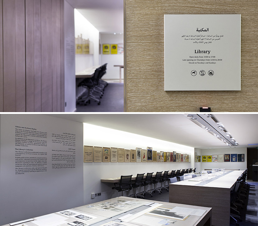
MTG-Sursock museum-Collection display library
From the archive10-2015The Collection Display extends into the Museum library with posters, original photographs and other archival documents. -
MTG-Sursock museum-Collection display poster
On the poster10-2015“Hommage au tapis volant”, a 1965 painting by Aref el Rayess, was chosen as the main visual for the Collection Display exhibition. -
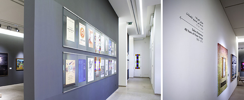
MTG-Sursock museum-Collection display posters wall
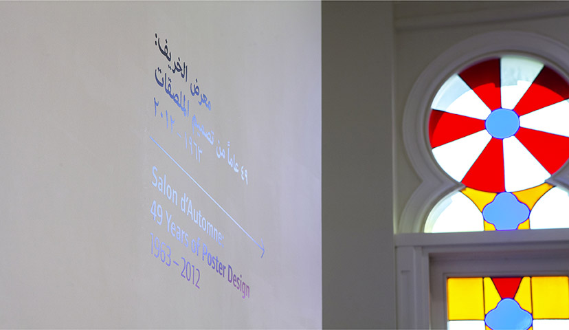
A Design history10-2015The posters of 49 years of Salon d’Automne, the previous Museum’s most regularly held exhibition, are part of the Collection Display. -
MTG-Sursock museum-Collection display signage
In a new light2015 - 2016The light from Sursock’s stained glass windows transforms something as simple as black vinyl on a white wall into a reflected spectrum. -
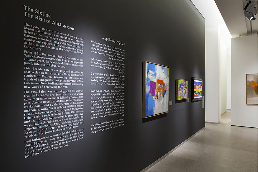
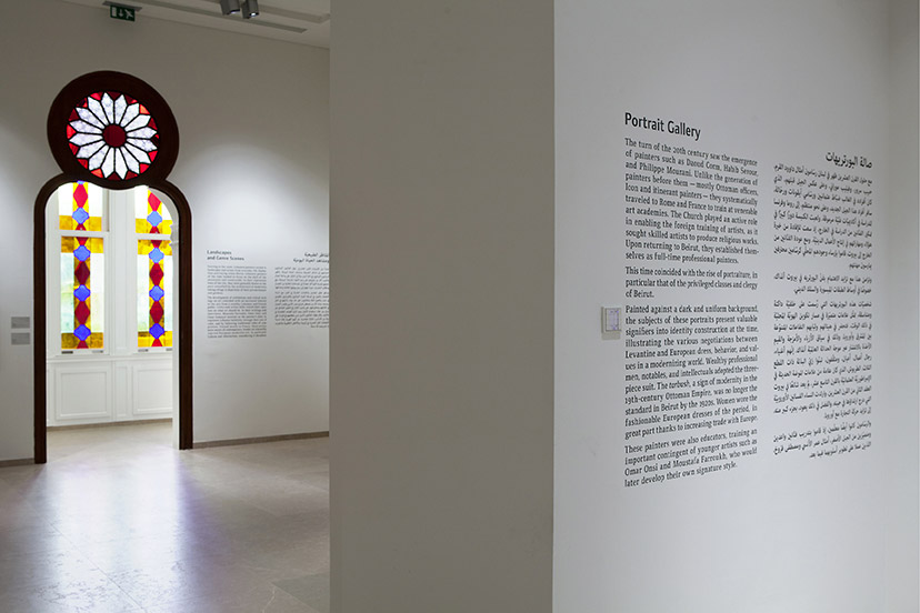
MTG-Sursock museum-Collection display wall text
On the wall2015 - 2016For the permanent collection exhibition design, the Museum’s main bilingual typographic scheme is used. -
MTG-Sursock museum-Elevator posters
The whats and the wheres10-2015On-site posters communicate on exhibitions and their respective spaces in the Museum. -
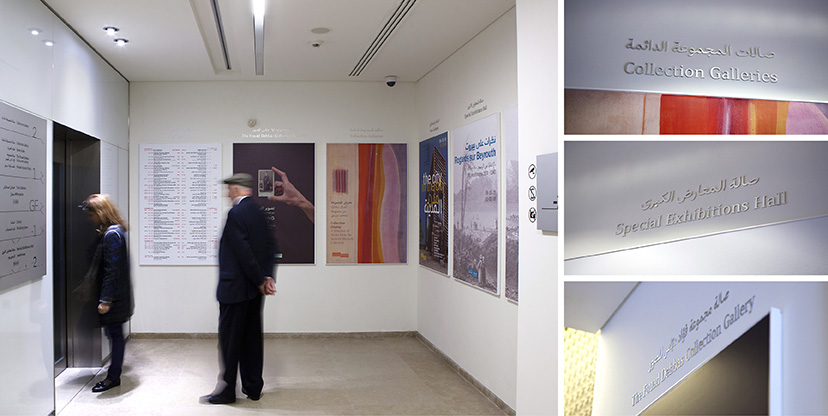
MTG-Sursock Museum-entrance signage
Double- sided2015 - 2016The floor directories on either side of the Museum’s entrance give a direct indication of the building’s main navigational routes. -
MTG-Sursock museum-Exhibitions visuals
One for all10-2015For the communication material, the Sursock signature is an adaptable version that can take on an array of visual scenarios. -
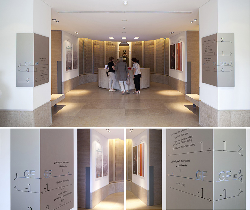
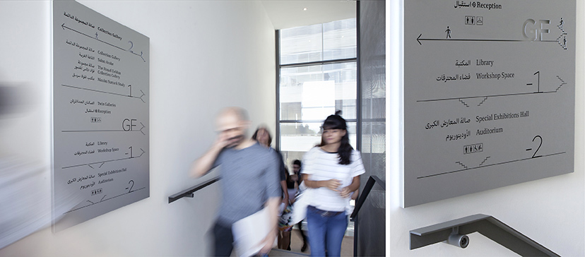
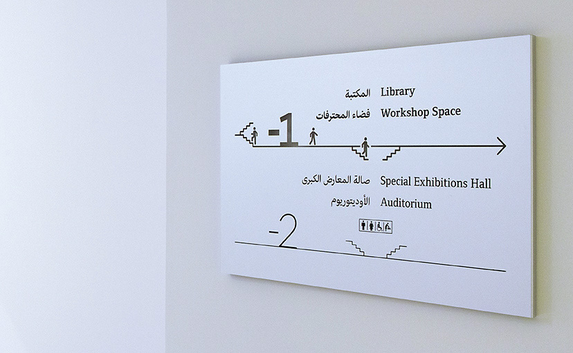
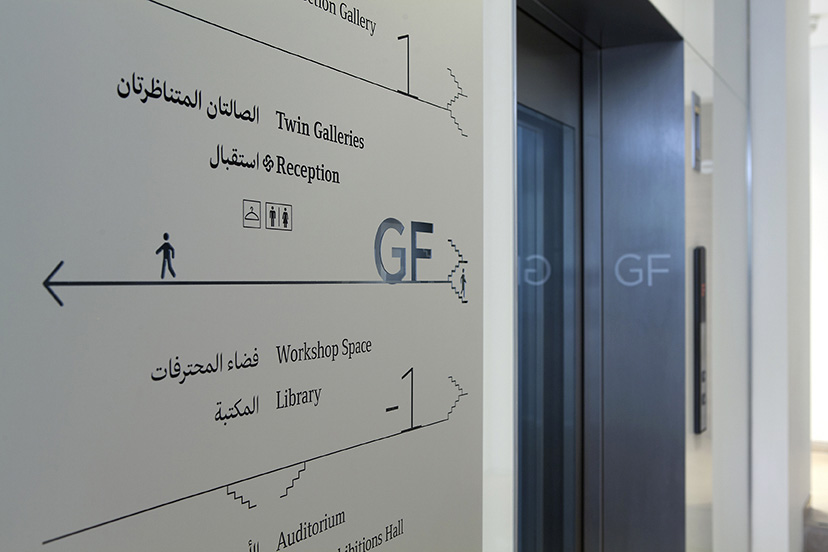
MTG-Sursock Museum-Floor signage
Upstairs downstairs2015 - 2016The floor directories, incorporating cut-outs, as well as pictographic, diagrammatic and typographic elements are Sursock Museum’s main way-finding devices. -
MTG-Sursock Museum-Floor signage detail
Micro Bits2015 - 2016The details of the Sursock signage language transform simple arrows into section diagrams with micro navigational information. -
MTG-Sursock museum-Guides covers
Visiting essentials10-2015The first Museum visitor and program guides use for their covers “Mount Tamalpais”, 1985 by Etel Adnan and “Untiled”, 1999 by Hussein Madi respectively. -
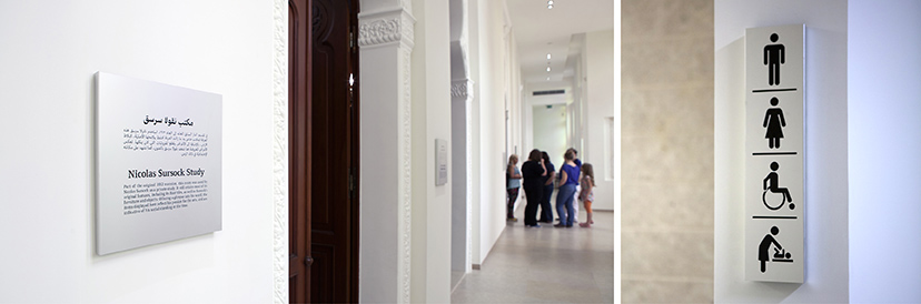
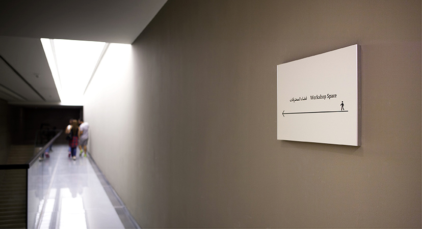
MTG-Sursock Museum-Identification signage
Space Identified2015 - 2016Identification signs range between text signs, sometimes with additional information, and straightforward pictograms. -
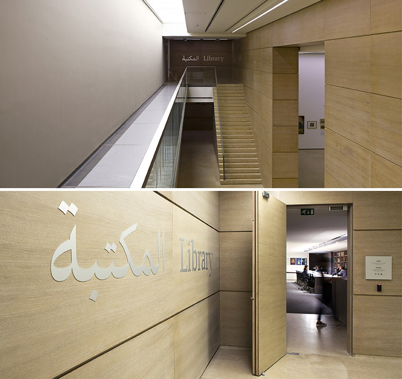
MTG-Sursock Museum-Library identification sign
Destination ahead2015 - 2016For the Museum’s main facilities, identification acquires a bigger and louder presence. -
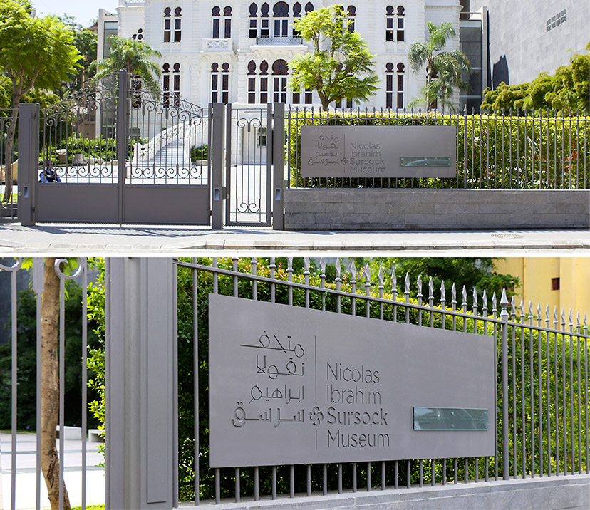
MTG-Sursock museum-main sign
Welcome back10-2015Putting up Sursock’s new institutional signature on the main sign – which blends itself into the exterior material scheme – was the primary announcement for the reopening of the Museum. -
MTG-Sursock Museum-Orientation signage1
On the go2015 - 2016 -
MTG-Sursock Museum-Orientation signage2
On the go2015 - 2016 -
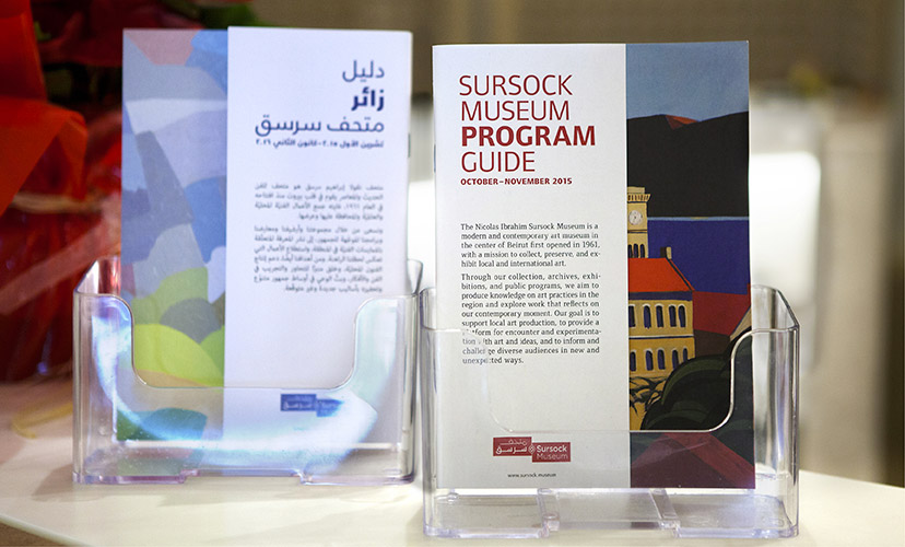
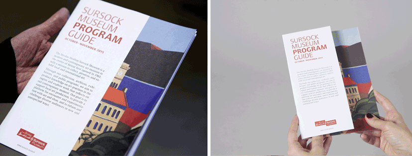
MTG-Sursock museum-Program guide
The cut10-2015The Museum program guide’s two covers – a side for English and the other for Arabic – have an overlay revealing only part of the cover art work which extends across both. -
MTG-Sursock Museum-Regulation signage
Sense and orientation2015 - 2016Vinyl regulation signage supplements the navigational component of the signage system. -
MTG-Sursock museum-stationery details
Rose without the prick10-2014 – 04-2015Fixed on the margin line, the Sursock floral emblem can appear on its own as an identity token, and is the basic module for the pattern construction. -
MTG-Sursock museum-Store poster-notebooks 02
Bilingual since ever10-2015Most of the posters from the Museum archive had French and Arabic versions. Used here as double covers of the notebooks that celebrate them, they give the user a language option and reveal some interesting calli-typographic relationships. -
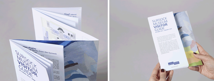
MTG-Sursock museum-Visitor guide
The fold10-2015The Museum visitor guide includes a central fold containing the Museum plan on the inside, and on the outside the cover art work continues across the Arabic and English double cover, partly hidden by the guide pages themselves. -
Sursock Museum-Auditorium sign
Change of tone2015 - 2016The anodized aluminum, used here for the Sursock larger identification signs, subtly reflects the shade of the surrounding material on which it is also mounted. -
Sursock Museum-Collection display interior
Space, text, image…2015The Sursock Museum exhibition design elements – from wall texts to art work captions – often find themselves within a mosaic of beautiful things. -
Sursock Museum-Exhibition posters
Shifting identities2015Whether permanent or temporary, each of Sursock Museum’s exhibitions acquires its own particular identifying features while remaining true to the general communication scheme. -
Sursock Museum-GF floor directory
Up, down and sideways2015 - 2016Sursock Museum’s anodized aluminum signs deploy a combination of silkscreened and cut-out treatments, as well as pictographic, diagrammatic and typographic elements that make it possible to integrate directional and identification information within a floor directory. -
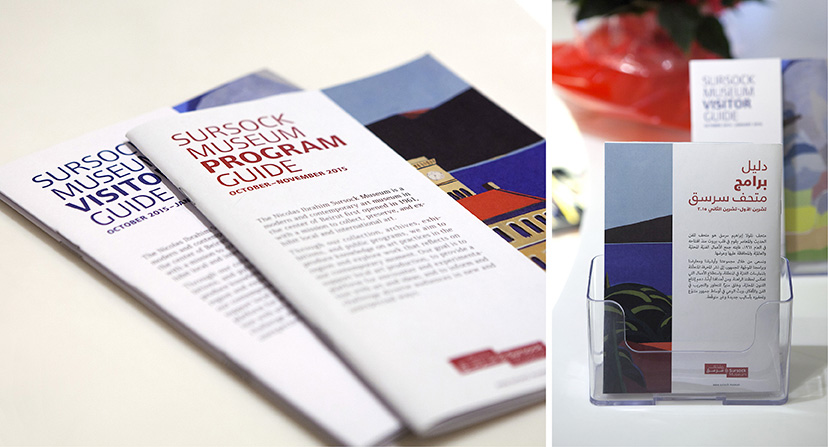
Sursock Museum-Program and visitor guides
Handheld2015Sursock’s visitor and program guides are the essential printables for planning the visit and carrying it through. -
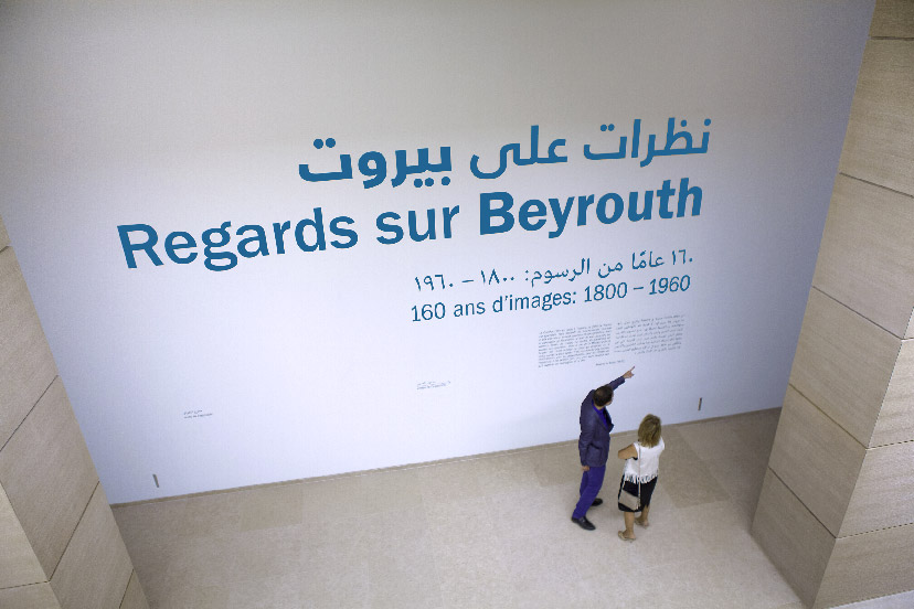
Sursock Museum-Regards sur Beirut mural
Making it big2015Sursock’s below ground Special Exhibitions Hall is the Museum’s grandest both in terms of space and the exhibitions it hosts. This particular up-down vantage point calls for an equally grand announcement. -
MTG-Sursock museum-Reopening invite
Foursome09-2015With four shows opening at once, the invitation card for the Museum reopening supplements the classical official message with a four-part detachable card. -
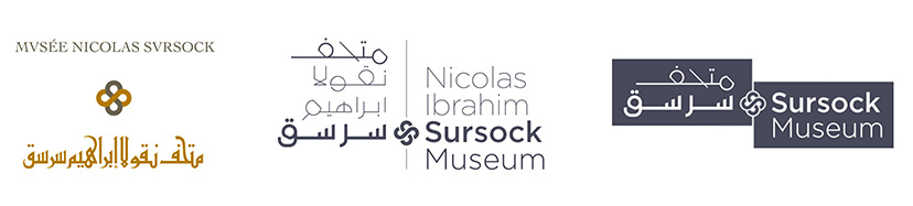
MTG-Sursock museum-all marks
Levels of formality2014 – 2015The set of Sursock marks includes a framed communication logo, an institutional logo which operates in two languages at a time, and a Museum seal as the official administrative signature. -
MTG-Sursock museum-Communication logo on images
A chameleon of sorts08-2015The Sursock Museum communication signature readily dresses up for the occasion. -
MTG-Sursock museum-Communication logo red
Communication signature08-2015 -
Sursock Museum-Communication logo grey
Late blooming2015The structure of the revisited mark for the reinvented Sursock Museum aligns the bilingual name with the central floral emblem. -
MTG-Sursock museum-official seal
Official signature05-2015The Museum seal reproduces the cherished façade of the building, simplified for the inked stamp to retain most of its detail. -
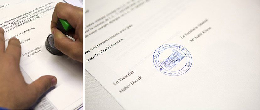
MTG-Sursock museum-official seal stamp
Approved05-2015The seal – only to be used as an inked stamp and at a specific scale – complements rather than duplicates the existing logo on the letterhead. -
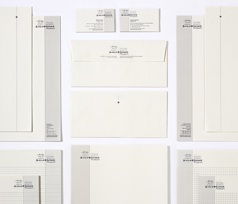
MTG-Sursock museum-stationery
Working margins05-2015The margins, alternating between left and right on the Sursock Museum stationery, indicate the alternation between Arabic and Latin scripts that flow in opposite directions. -
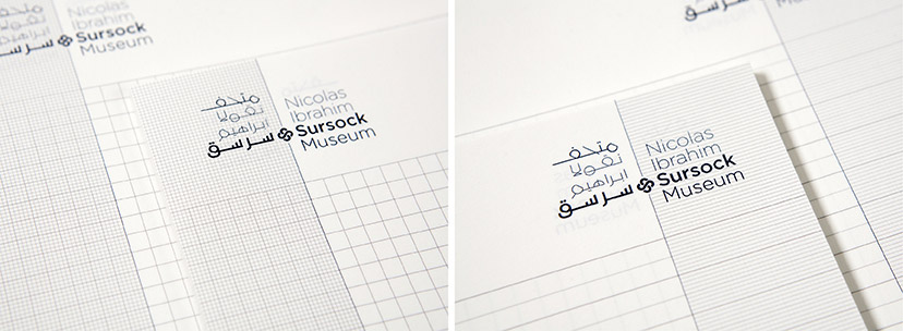
MTG-Sursock museum-notepads
Taking note04-2015Surock’s back-to-back notepads pay attention to the difference between the conventionally ruled Arabic note book and the gridded English one. -
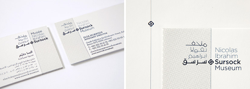
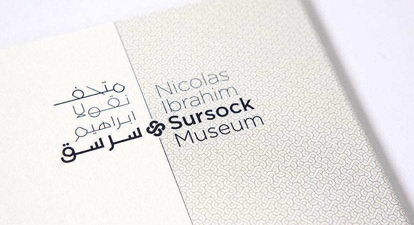
MTG-Sursock museum-Institutional logo
Institutional signature10-2014 -
MTG-Sursock museum-logos before and after
Common Thread10-2014The floral emblem from the previous Sursock Museum logo is retained, and its detail readdressed to fit the more contemporary typographic/calligraphic scheme. -
Sursock Museum-Letterhead closeup
Mind your language2014For an institution like Sursock Museum, with an audience reaching well beyond the city in which it dwells, the marriage between Arabic and English is consistently present on all levels. Here, the extension of the central line of the institutional mark and the introduction of a tightly knit pattern of the emblem provides a structural and visual distinction between the two languages. -
The Soap Museum-Book inside pages
Rich and informative2003“The Olive Oil Soap” book is a celebration of the craft and the valuable archives of the town of Saida and the Audi family. -
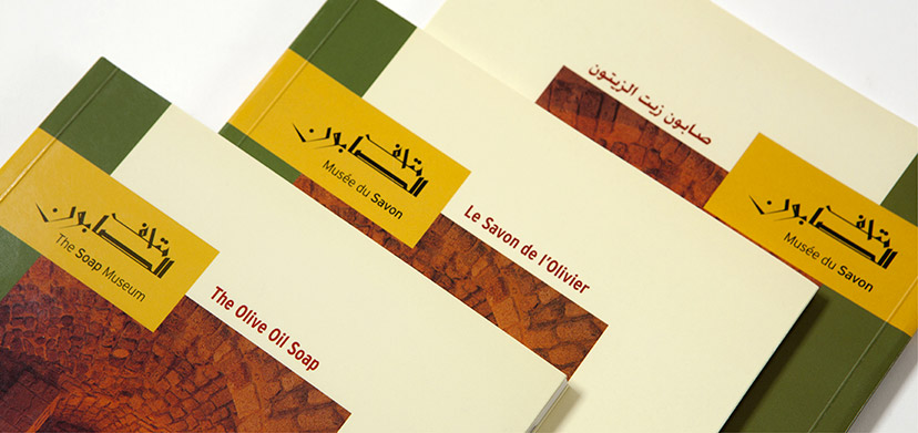
The Soap Museum-Book three covers
Language disjuncture2003Keeping each language to its own document avoids an overly crowded book and gives the visitor/reader their choice of preference. -
The Soap Museum-Logo
Authored signatures2001Samir Sayegh’s unique style of the calligraphy strikes a balance between traditional and contemporary formal qualities. -
The Soap Museum-Logo on image
A glimpse of times past2001Calligraphy: in collaboration with artist Samir Sayegh – Photography: May Arida -
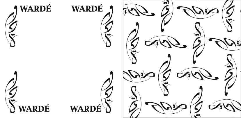
MTG-Wardé-Overview-Identity option 01
Potential identity2008Developed in collaboration with artist calligrapher Samir Sayegh, this calligraphic mark makes for a particularly intricate pattern. -
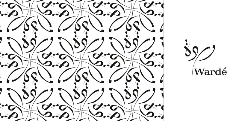
MTG-Wardé-Overview-Identity option 02
Potential identity2008Developed in collaboration with artist calligrapher Samir Sayegh, this calligraphic mark neatly acts as a dynamic corner device. -
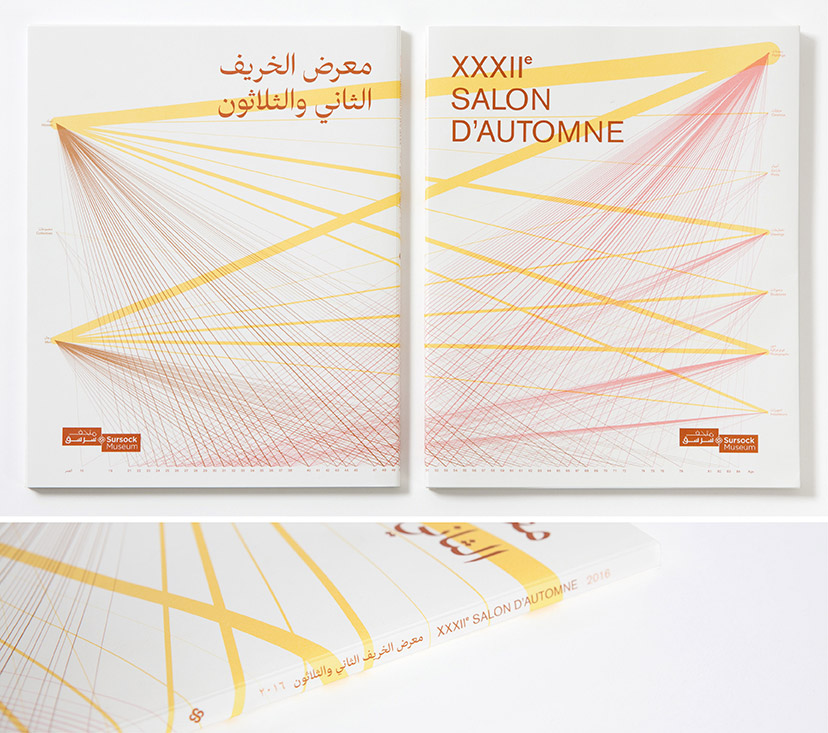
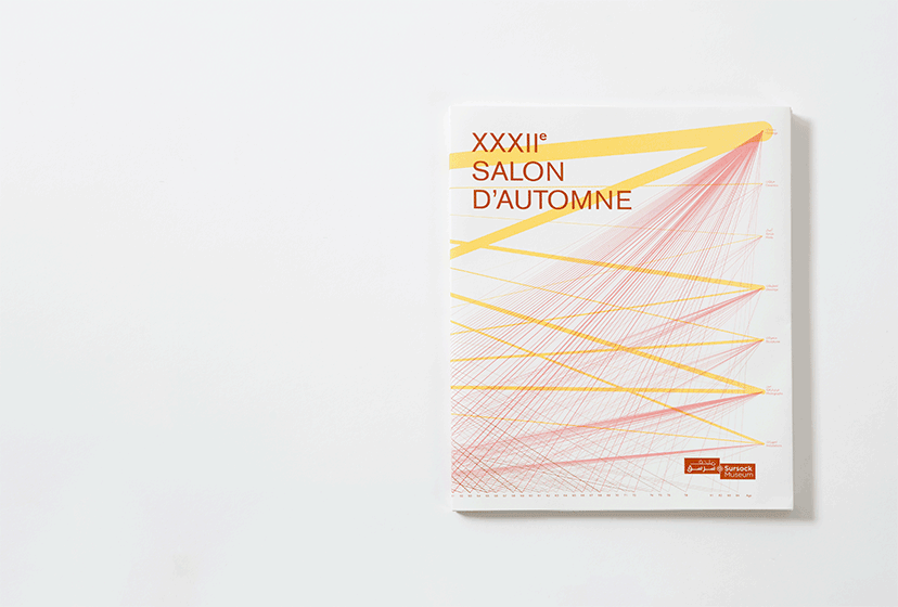
MTG-Salon d'Automne-Catalogue 01
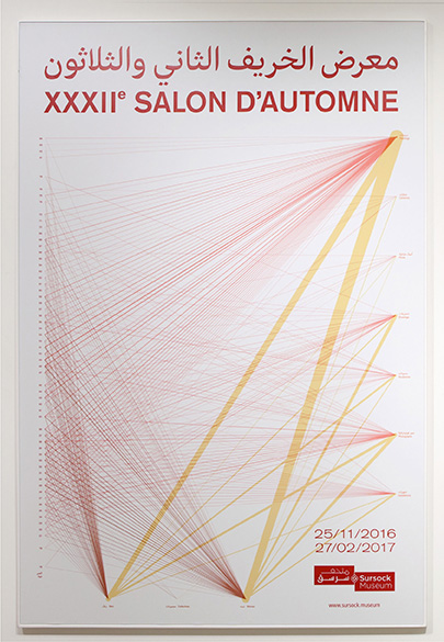
It's a wrap2016The jacket of the bilingual exhibition catalog features a landscape configuration of the line graph, which wraps around the Arabic and English covers. -
MTG-Salon d'Automne-Catalogue 02
Submitted/Exhibited2016 -
MTG-Salon d'Automne-Catalogue 03
Read both ways2016The catalog is read from right to left in Arabic, and the other way around in English, each with its own page numbering direction. -
MTG-Salon d'Automne-Event poster
A polymorphous graph2016The axes switch and the proportions morph to adapt to each application’s format. -
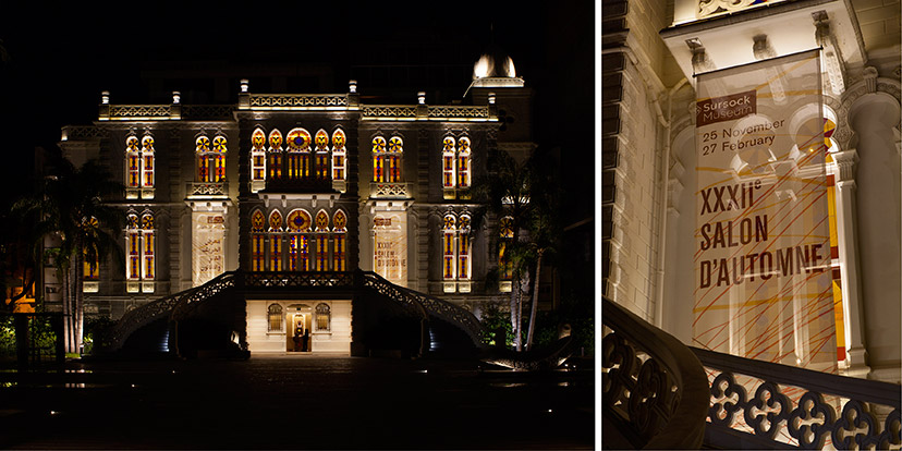
MTG-Salon d'Automne-Facade banners
Making an entrance2016 -
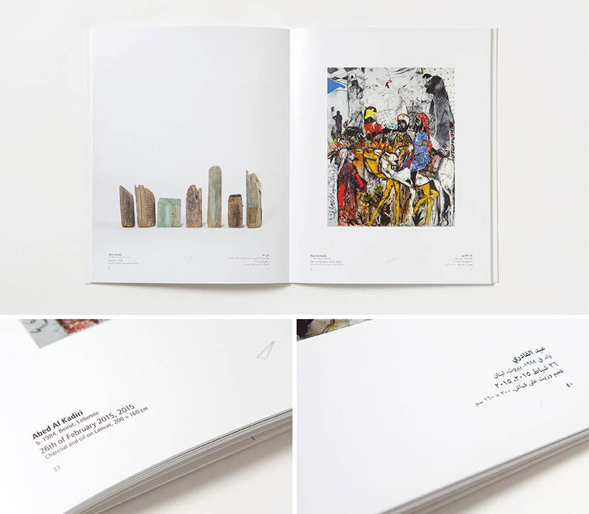
MTG-Salon d'Automne-Labels
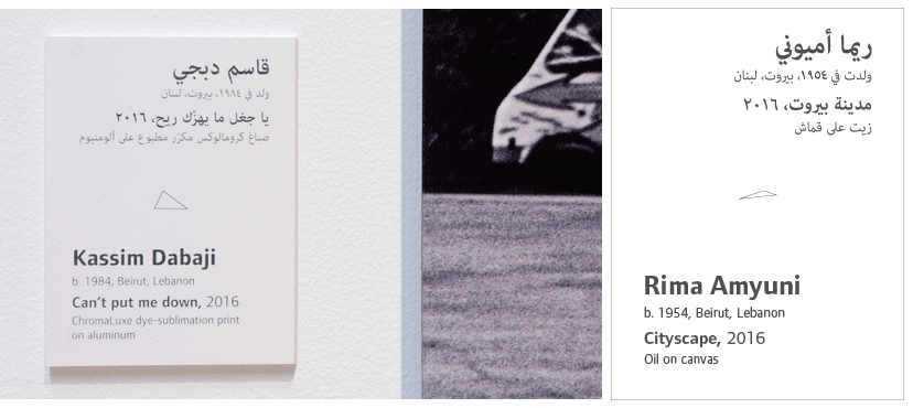
To each their own2016Each label contains a triangle that reflects the artwork’s medium and the artist’s age and gender. -
MTG-Salon d'Automne-Line graph breakdown
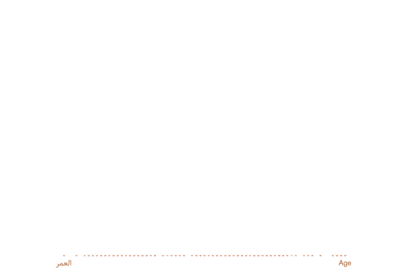
All the applicants2016A line graph maps the 350+ submitted works in relation to media, gender and age (from 21 to 82 years old). This visual lays the foundation for the rest of the exhibition’s graphic applications. -
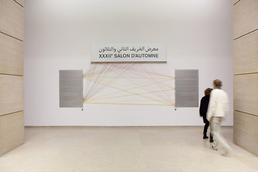
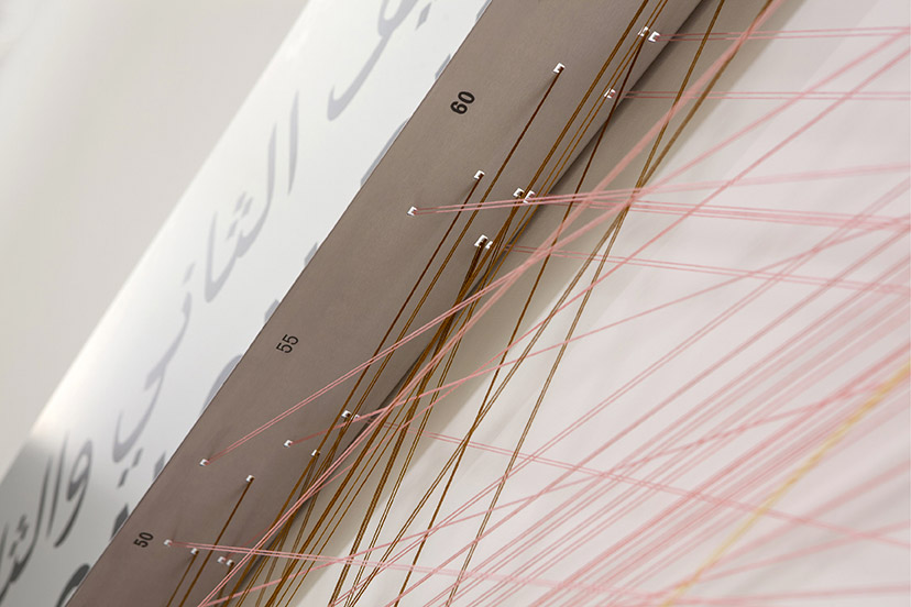
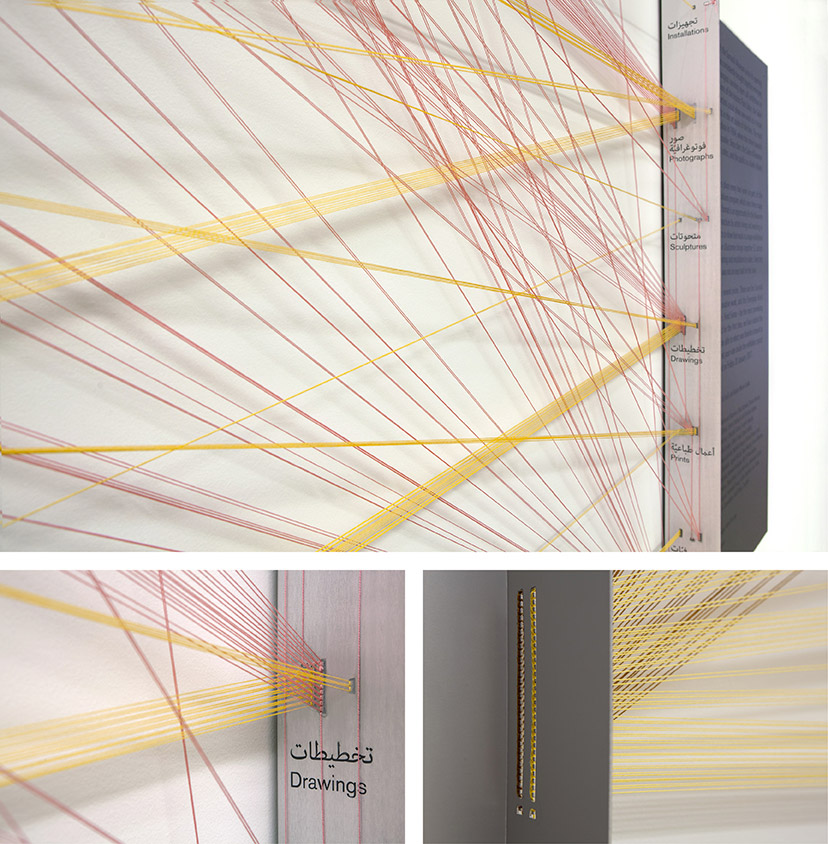
MTG-Salon d'Automne-Mural 01
The big reveal2016The line graph mapping the exhibited works takes on a physical manifestation in a string installation at the exhibiton entrance that welcomes the visitors. -
MTG-Salon d'Automne-Mural 02
-
MTG-Salon d'Automne-Mural 03
Media and gender2016 -
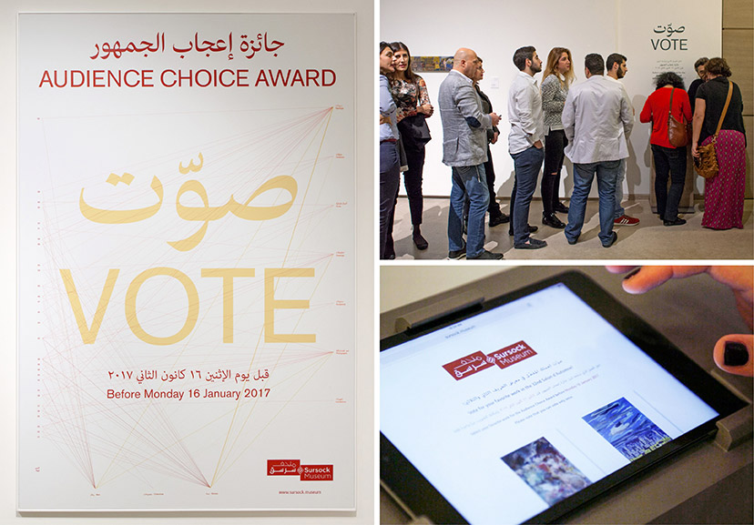
MTG-Salon d'Automne-Voting poster and station
Audience choice award2016Bottom Right Image by Nabû Productions -
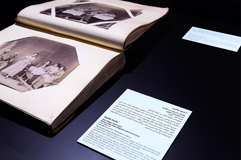
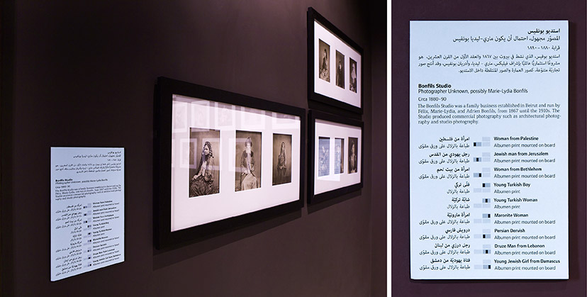
MTG-Picturing Identity-Caption
Reading material10-2015Paper with the exhibition’s green color is used as the backing for the captions which sometimes include extended information. -
MTG-Picturing Identity-Group Caption
Guiding captions10-2015In some collective captions, artifacts are easily identified with the help of placement diagrams. -
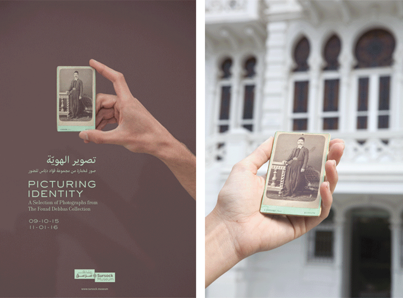
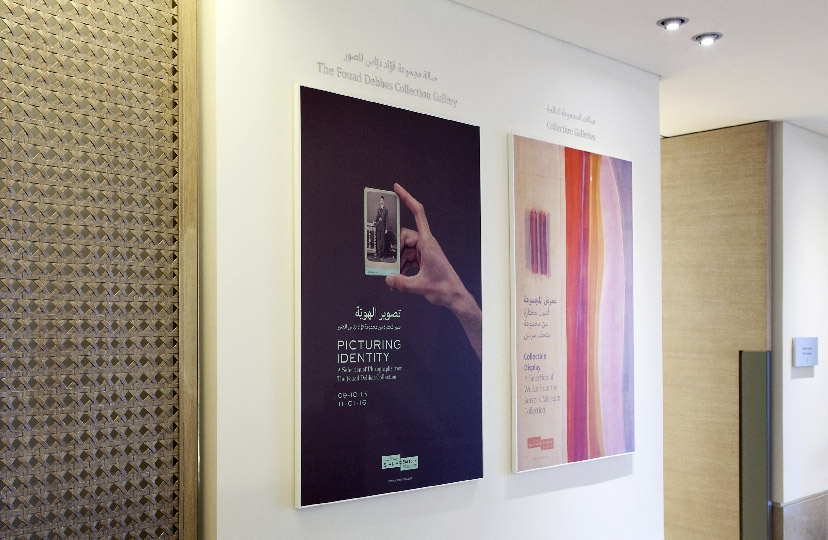
MTG-Picturing Identity-Poster
On the poster10-2015After many tests, and to express the generally smaller size of artifacts in the exhibition, this albumen mounted print from the 1890s by Georges Saboungi is handheld for the shot. The green shade is borrowed from the object to act as the exhibition’s primary color. -
MTG-Picturing Identity-Poster in context
Picture in picture10-2015The exhibition poster with its play on scale is best experienced to size and in context. -
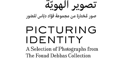
MTG-Picturing Identity-Signature
Type and Identity10-2015The Engravers Latin type scheme from the end of the 19th century makes reference to the age of the photographic collection itself. It is paired here with a contemporary Arabic type design based on the Naskh calligraphic style. -
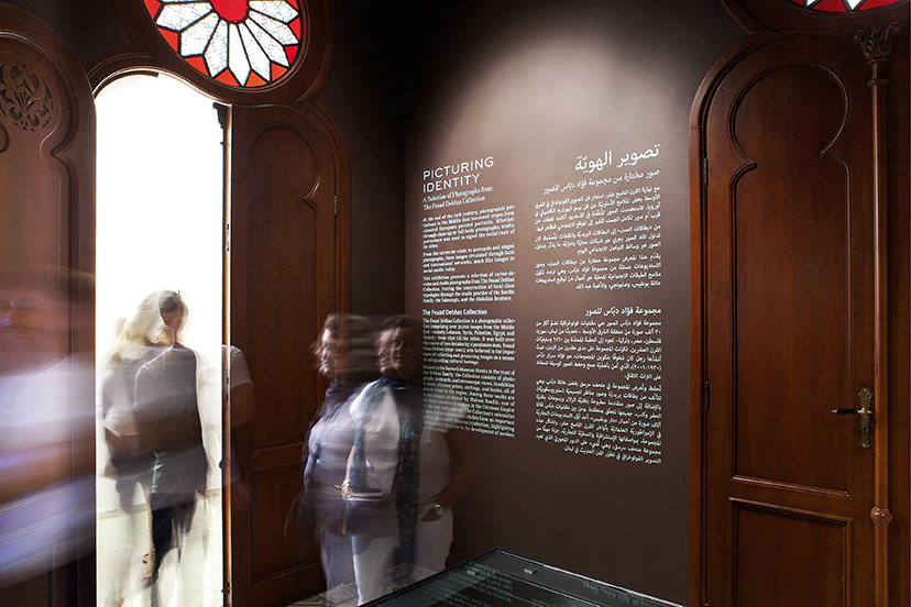
MTG-Picturing Identity-Wall text
On the wall10-2015Combined with the dark brown walls of Sursock’s Fouad Debbas Collection Gallery, the exhibition’s green shade gives a memorable color identity to the show. -
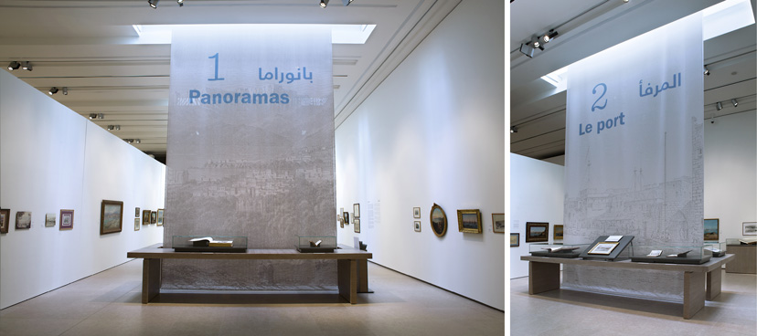
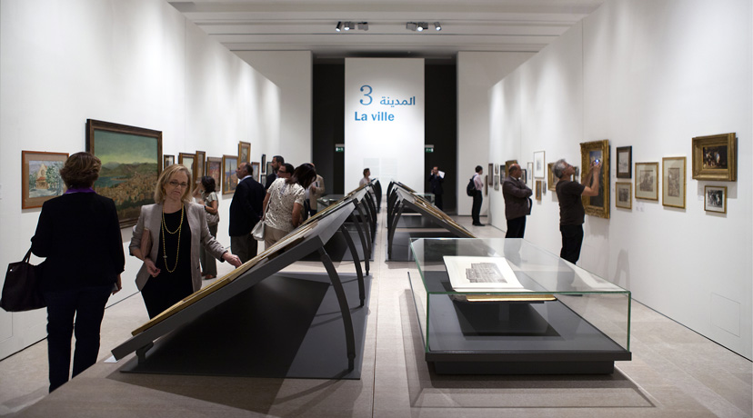
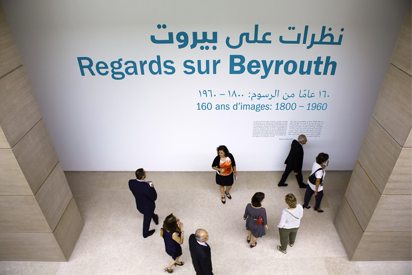
MTG-Regards sur Beyrouth-Banners 01
Under the sun10-2015Most of the banners identifying the main sections of the exhibition are strategically placed under the skylights to be bathed in natural light. The banners use a selection of engravings from the show. -
MTG-Regards sur Beyrouth-Banners 02
Focal point10-2015For some of the exhibition sections, the banners are placed at the end of line of vision. -
MTG-Regards sur Beyrouth-Captions booklet
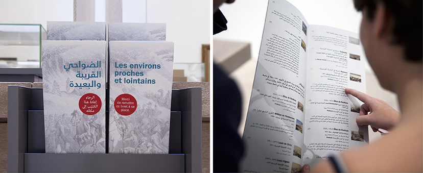
Further reading10-2015The densely loaded Regards sur Beyrouth exhibition is supplemented with booklets with a listing of works and extended captions per section. For each, the French and Arabic covers complete the image, the same one used on the corresponding section banner. -
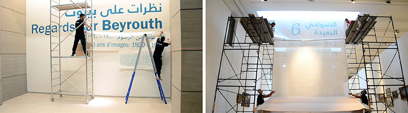
MTG-Regards sur Beyrouth-Installation
Putting it together10-2015Installing Regards sur Beyrouth’s exhibition material in Sursock’s Special Exhibitions Hall. -
MTG-Regards sur Beyrouth-Mural 01
Making it big10-2015Sursock’s below ground Special Exhibitions Hall is the Museum’s grandest both in terms of space and the exhibitions it hosts. This particular up-down vantage point calls for an equally grand announcement. -
MTG-Regards sur Beyrouth-Mural 02
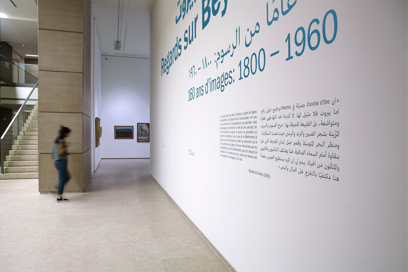
Introductory note10-2015An 1850 quote on Beirut from Maxime du Camp, set for eye-level legibility, opens the exhibition. -
MTG-Regards sur Beyrouth-Placement captions
Guiding captions10-2015For the table set-ups in the exhibition, artifacts are easily identified with the help of a simple placement diagram. -
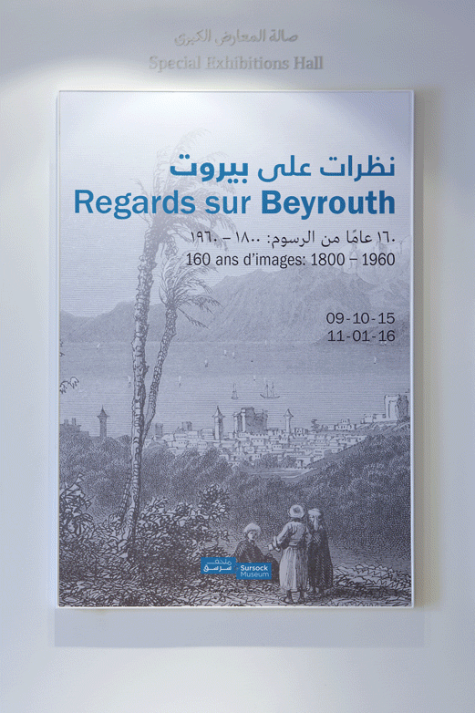
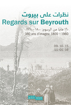
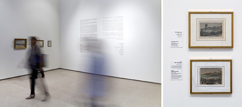
MTG-Regards sur Beyrouth-Poster
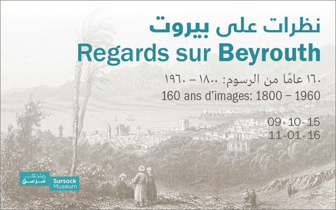
On the poster10-2015“View of Beirut”, an engraving after Karl Girardet from the third quarter of the nineteenth century, was chosen as the main visual for the Regards sur Beyrouth exhibition. -
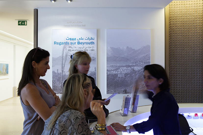
MTG-Regards sur Beyrouth-Poster lobby
Extending landscape10-2015On-site in the Museum lobby, the main exhibition in Sursock’s Special Exhibitions Hall gets a double-poster across which the main visual is spread. -
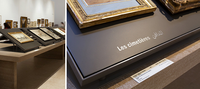
MTG-Regards sur Beyrouth-Subsections
Subsections10-2015The density of the Regards sur Beyrouth exhibition necessitates the sub-grouping of certain artifacts. -
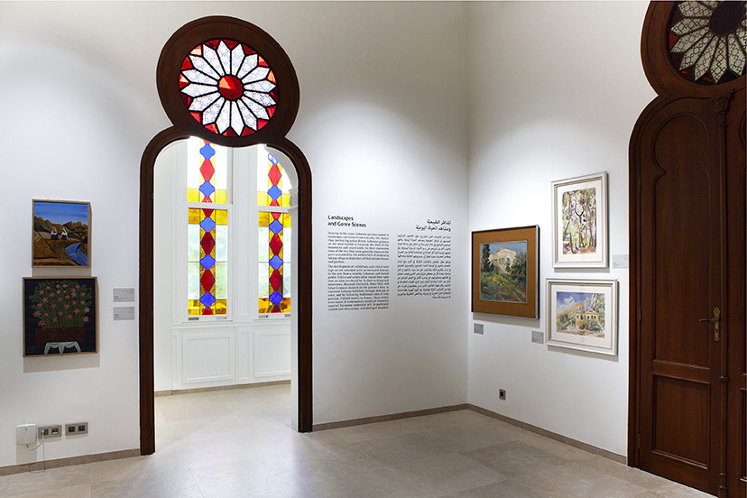
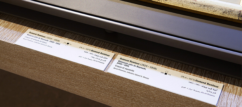
MTG-Regards sur Beyrouth-Wall texts and captions
On the wall10-2015The exhibition wall texts are a straightforward grey on the wall, and the caption labels are set on an off-white paper that matches the exact shade of the paint. -
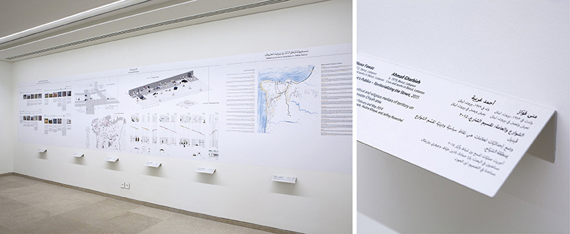
MTG-The City in the city-Bent caption
Flexible adaptations10-2015Some exhibition material required captions to be placed below the works which necessitated a particular bent backing format for easy visibility. -
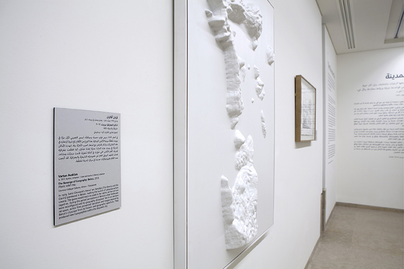
MTG-The City in the city-Caption
On the wall10-2015A neutral grey paper is chosen as the backing for the exhibition captions. -
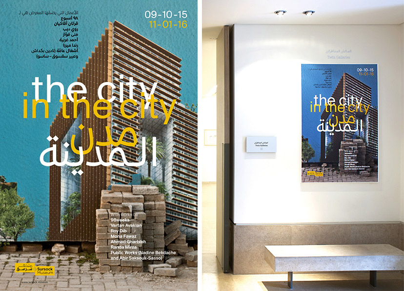
MTG-The City in the city-Poster
On the poster10-2015“The Selective Residence”, 2013, by Randa Mirza, was chosen as the main visual for the exhibition. Typographically, the poster uses a fittingly contemporary Arabic-Latin type duo designed by Pascal Zoghbi and published by the type foundry 29LT. -
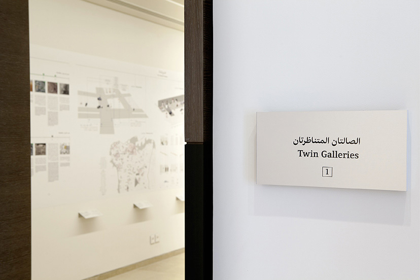
MTG-The City in the city-Twin 1
1 of 210-2015 -
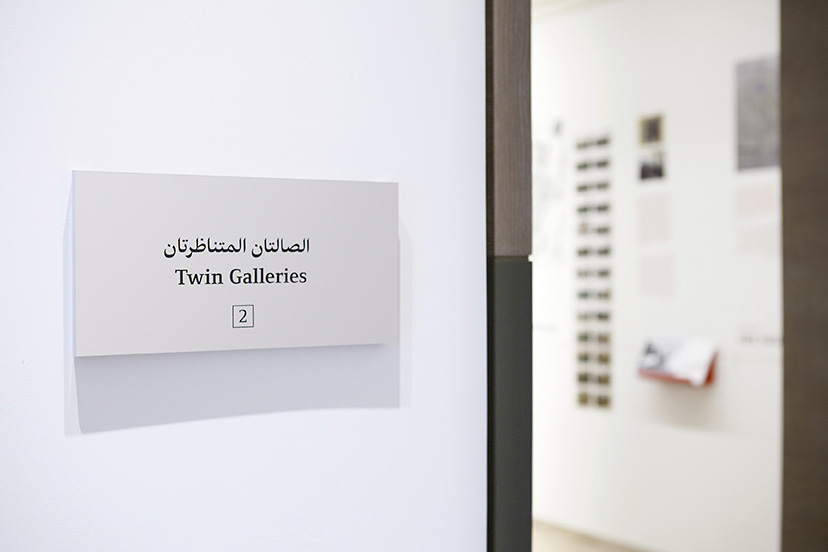
MTG-The City in the city-Twin 2
2 of 210-2015 -
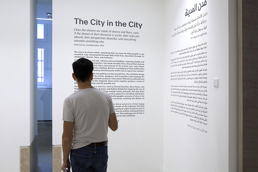
MTG-The City in the city-Wall text 01
On the wall10-2015The typographic scheme set by the exhibition’s main title travels across the rest of the exhibition design elements. -
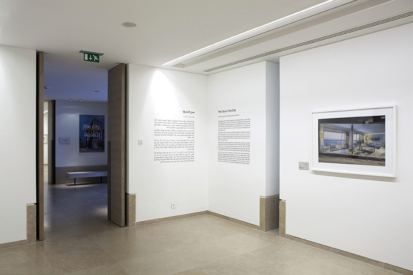
MTG-The City in the city-Wall text 02
On the wall10-2015The typographic scheme set by the exhibition’s main title travels across the rest of the exhibition design elements.