Wanting to hit the ground running with its reopening in a new exhibition space, La Galerie Semaan came to us seeking a new identity design and a communication approach. The gallery, known for its selective choice of furniture designers, sets up its showrooms in resemblance to a curated art exhibition. The identity designed for La Galerie Semaan – still in use more than twenty years later – succeeded in creating a memorable brand operating in a unique manner, for a local establishment with an unmistakable iconic status. After all, the place lends its name to the whole neighborhood, located on Beirut’s Green Line during Lebanon’s civil war.
165
-
La Galerie Semaan-Logo
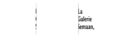
The gap that cuts through the letters is a visual representation of a space used to store curated furniture, and has a flexible communicative function where multiple elements can fill the void. The comma, a small yet striking touch, calls for an ongoing conversation.
-
La Galerie Semaan-Stationery
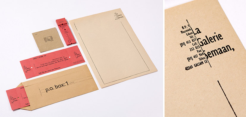
The letterpressed stationery composed for La Galerie Semaan abides by the idea of containment that the logo so strongly demonstrates throughout its applications.
-
La Galerie Semaan-Business Card
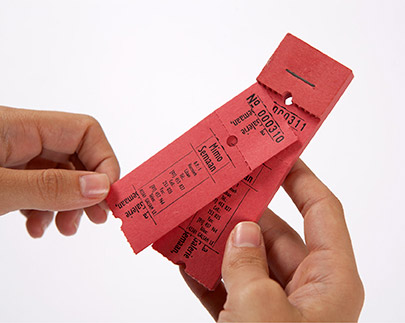
A set of numbered business cards, designed as a booklet of ticket stubs, serves as a constant invitation to the gallery.
-
La Galerie Semaan-Invitation
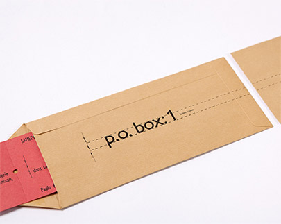
Fortunate to own P.O. Box nº 1, La Galerie Semaan’s envelope design had to bring that to the forefront.
-
La Galerie Semaan-Logo flexibility
On the left: an invitation to the reopening of the gallery at which the famous designer and architect Paolo Piva was present. The numbered invitation stated that a surprise awaited the attendees. On the right: a post-event newspaper ad announcing the winning invitation numbers of a random draw.
-
La Galerie Semaan-Newspaper ad
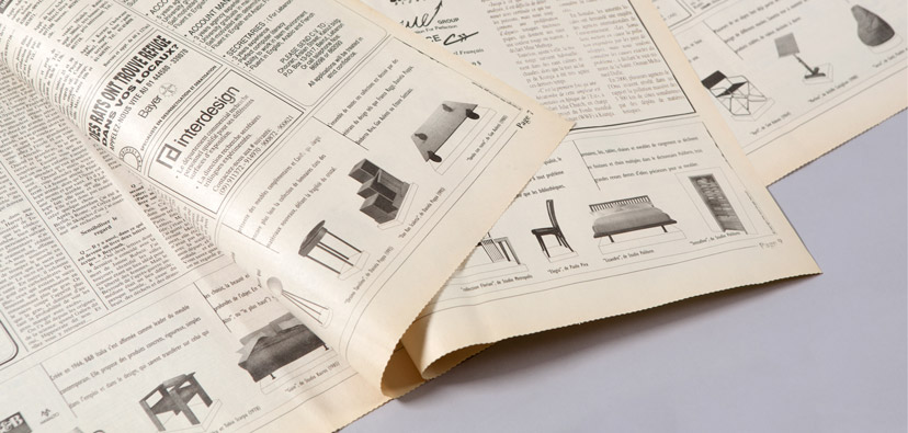
Multiple ads across the bottom of most of the newspaper pages added up to the price of a single full page, but with considerable more impact. The split logo acts as margins inside which information about the designers is placed. The photographs of the pieces – having varying perspectives as they were provided to us by the designers – were each cropped and drawn on “pedestals” to create a homogeneous look for the ad.
-
La Galerie Semaan-Magazine ads
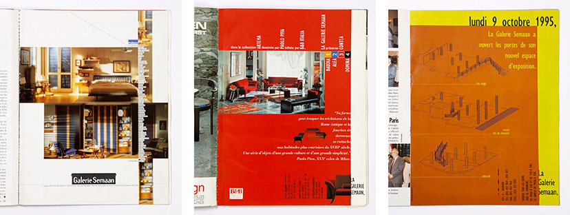
A template was created for the magazine ads before the identity was redesigned and updated. A clear margin on the right, prevalent in all the ads, made for a straightforward association to the gallery.

