La Galerie Semaan-Newspaper ad
See More Of La Galerie Semaan
See More Of La Galerie Semaan
Stretch
1994
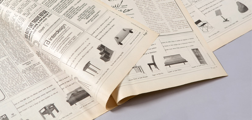
Multiple ads across the bottom of most of the newspaper pages added up to the price of a single full page, but with considerable more impact. The split logo acts as margins inside which information about the designers is placed. The photographs of the pieces – having varying perspectives as they were provided to us by the designers – were each cropped and drawn on “pedestals” to create a homogeneous look for the ad.
Unless otherwise stated, all texts, images and audio-visual material are copyright © Mind the gap – Beirut


