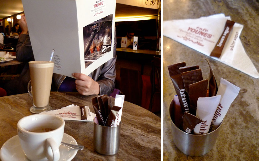
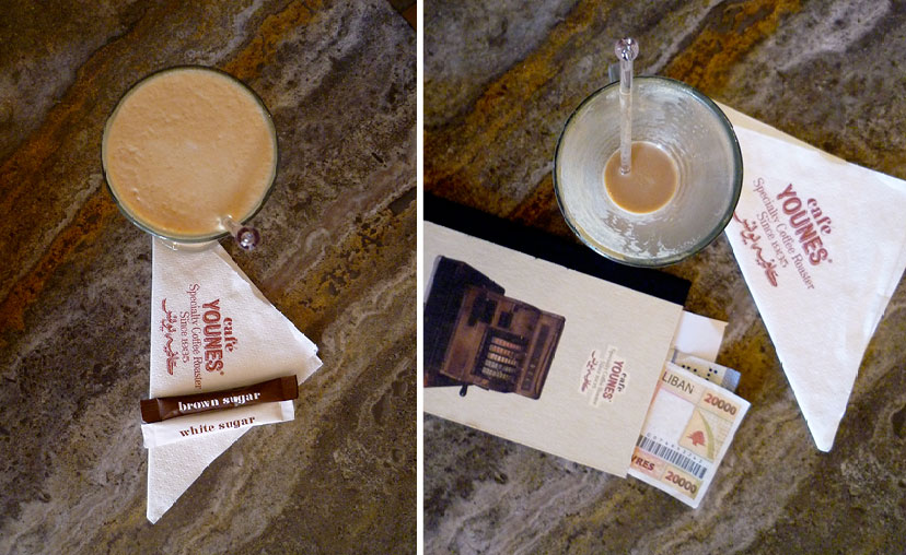
Much was happening with Café Younes when they approached us back in 2009 for a comprehensive rebranding mission. The once single-and-small iconic Hamra corner coffee shop had been expanding both in terms of product – adding food to the menu and diversifying the coffee range – as well as number of outlets. Moreover, the timing coincided with the establishment’s 75th anniversary, adding yet another detail to the complexity of the mission. Long story short, we wanted to articulate an identity built around authenticity. The drive was not fueled by a mere interest in “retro” graphics, but by a dialogue with Younes’ history through a design language: typographic gestures, subtle textures, a variable scheme of materials and delicate attention to detail. Concepts like the family business, the artisanal product, the rich heritage, and the place-bound operation resonated as identity pillars throughout the process. Amidst the wave of arbitrary appropriations of vintage styles and the trend of nostalgic reverie, Café Younes embraces its own authentic history as a positioning strategy.
-
Café Younes-Logo
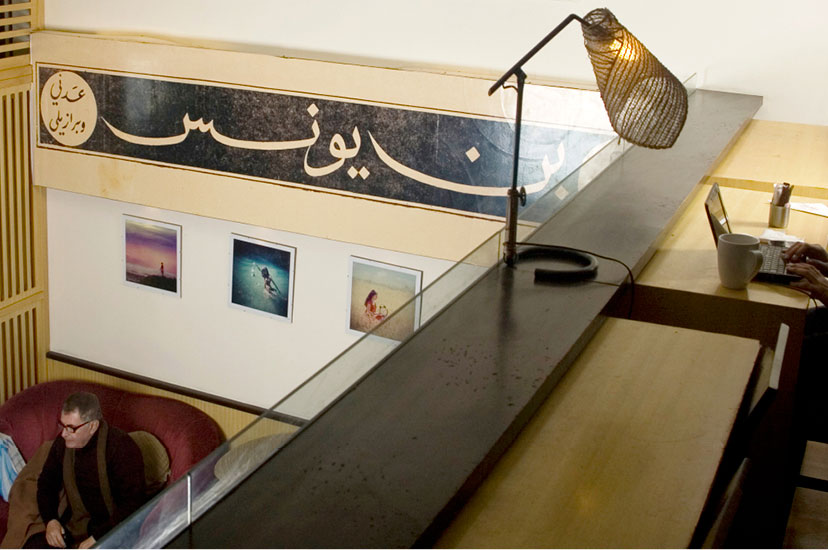
Although carefully composed into a single graphic device, the logo letterforms hold quite a few referential details: classical style variations, shadow treatments of hand-painted signs, a delicately made-up ligature and a calligraphy based on the original.
-
Café Younes-Main sign Abdel Aziz
Welcome to the neighborhood
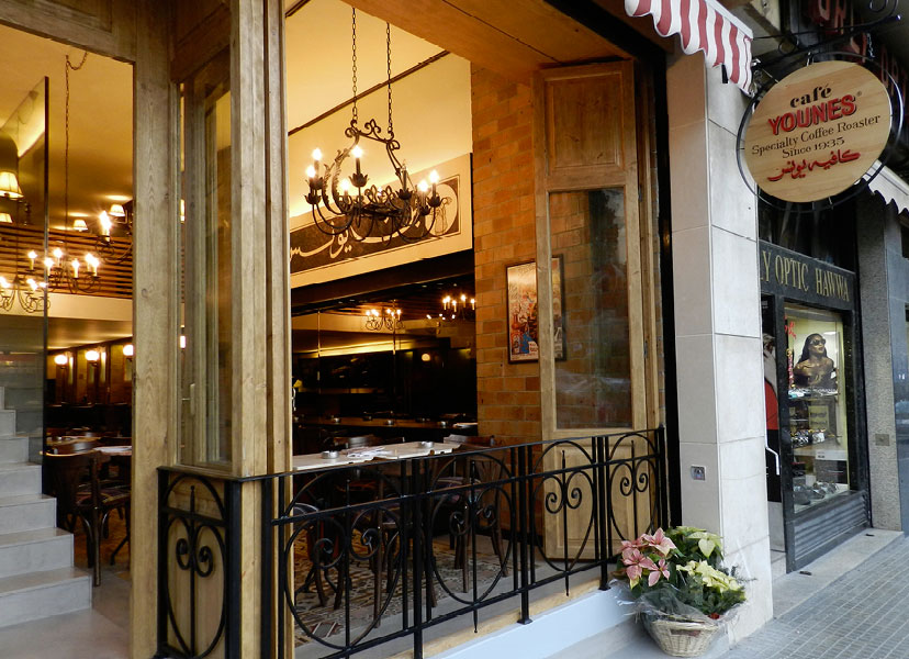
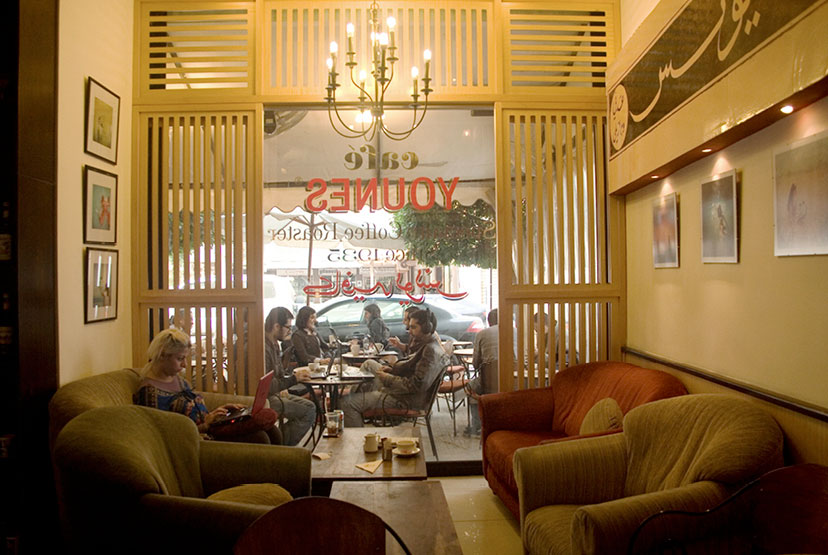
Everything about the Younes outlet in Hamra Abdel Aziz Street, from the signs and materials scheme to the lighting and openness onto the sidewalk, screams “step inside”.
-
Café Younes-Sign on glass Hamra 01
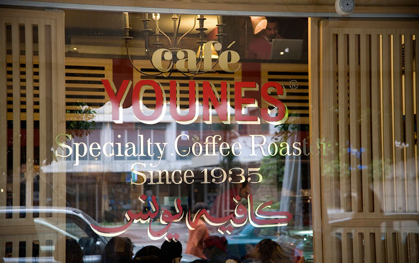
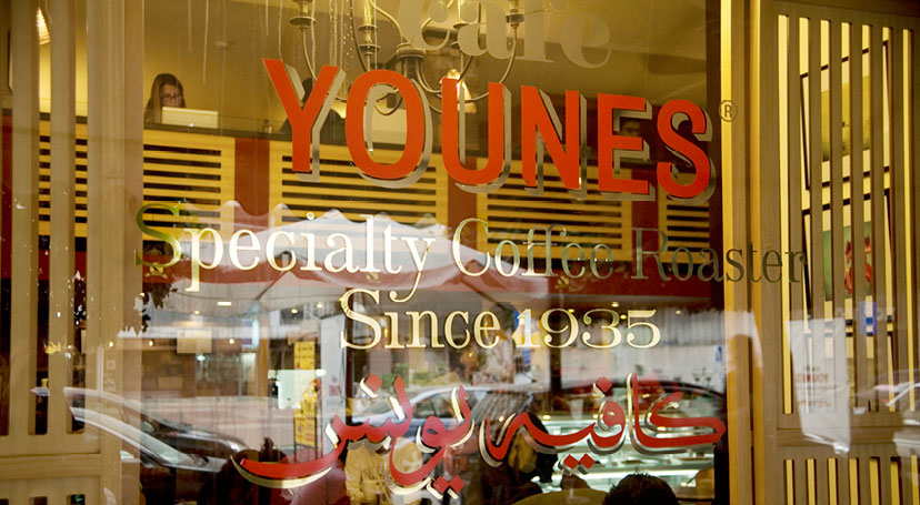
There is something effortlessly gracious and hospitable about painted signs, and although not actually painted, the signs on the glass doors and fronts of the Younes coffee shops allude to that neighborly charm.
-
Café Younes-At the coffee shop 01
-
Café Younes-At the coffee shop 02
-
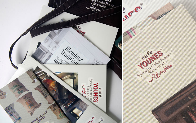
Café Younes-History book and coffee brochure
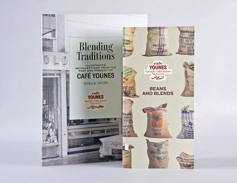
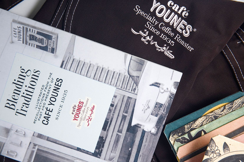
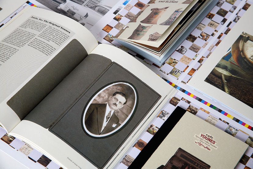
The conception and creation of communication, marketing and operational tools – such as this history booklet and coffee product catalog for Café Younes – pushes the scope of branding recommendations beyond the typical identity scheme.
-
Café Younes-Branded items 01
Dynamic, variable, adaptable
The Younes identity is antipodal to the model of the “uniquely recognizable color”, “uniquely recognizable typeface”, “uniquely recognizable image”, and so on. Instead, consistency is established by way of basic visual, tactile and verbal elements coming together intricately.
-
Café Younes-Printed items
The integration of photography into the scheme takes place on many fronts and in many ways – framed, masked, patterned or simply reproduced – adding to the dynamism of the identity.
-
Café Younes-Menus 01
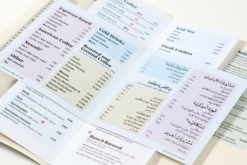
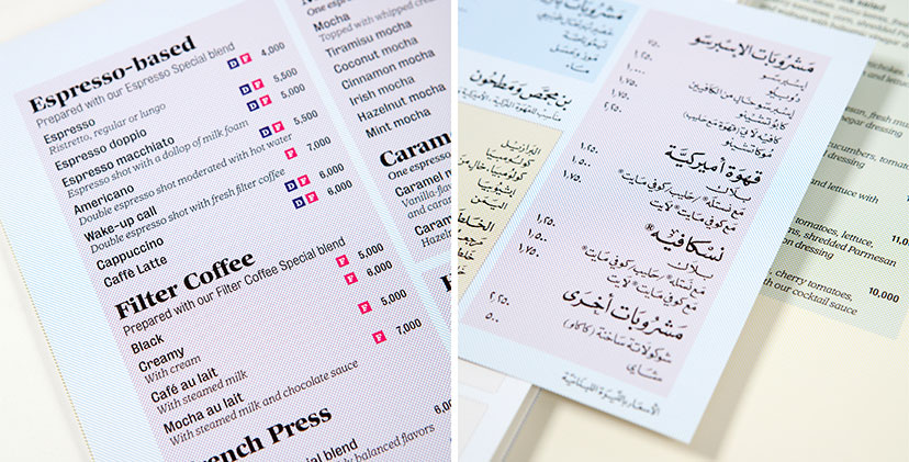
The CMYK grid lines – a main element of the Younes housetyle – are used to organize the menu sections and code it along the way.
-
Café Younes-Branded items 02
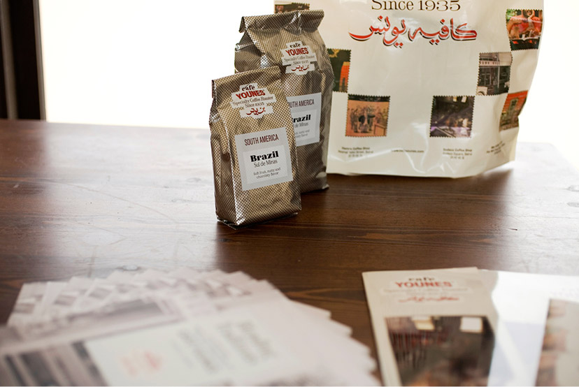
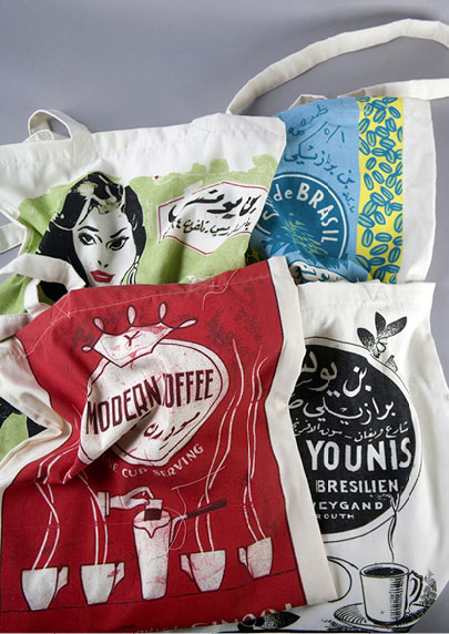
The Younes identity extends onto retail amenities: packages and shopping bags for the coffee product range.
-
Café Younes-Mugs and coasters
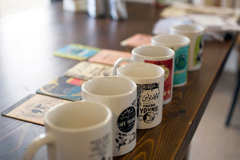
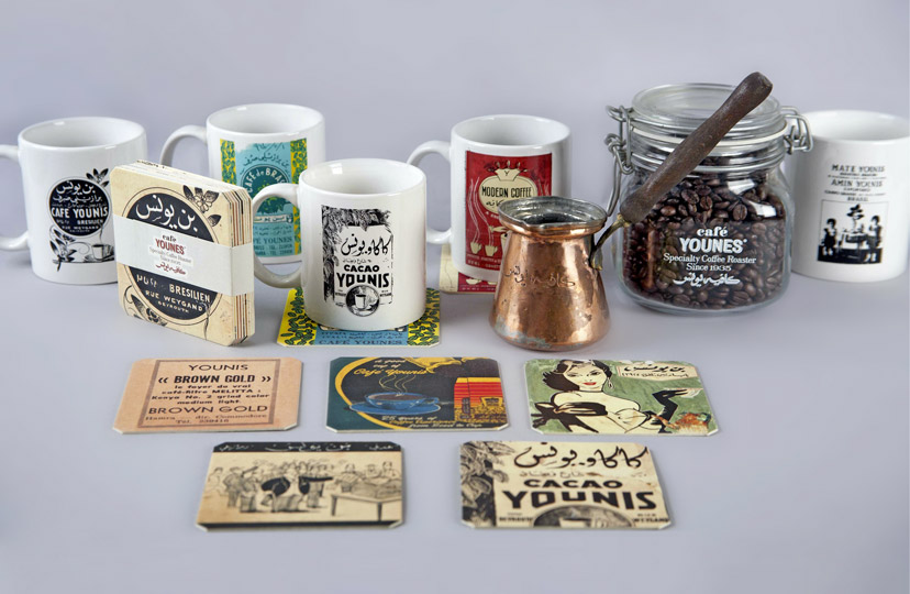
Younes merchandising embraces the establishment’s graphic archive.
At the beginning of the rebranding mission, the possibility of simply revisiting the Younes mark was entertained. It quickly became obvious, however, that the standing identity conformed too much to a design convention that was clearly at odds with locality as a conceptual direction. After all, the aim was in fact to counter the generic configuration epitomized by the American coffee shop and to focus instead on the intimate Younes experience. A typographic-calligraphic approach soon prevailed and, along with a meticulous CMYK separation treatment for the color scheme and an eclectic approach to representation styles, it set the tone for an elaborate visual system that strikes a particular balance between variation and consistency across a range of applications.
-
Café Younes-Logo before and after
The American commercial graphic mark with its framed portrait and ribbon element was replaced by an emphasis on typographic detail, history, a variable color scheme and a calligraphic element that switches between the two types of Younes outlets: coffee roaster and coffee shop.
-
Café Younes-A new image ad
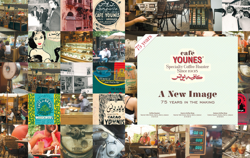
To announce the new branding on the occasion of Younes’s 75th anniversary, this double-page ad brings together snapshots from the past and present and gives a glimpse into the future of the new identity.
-
Café Younes-Menu covers
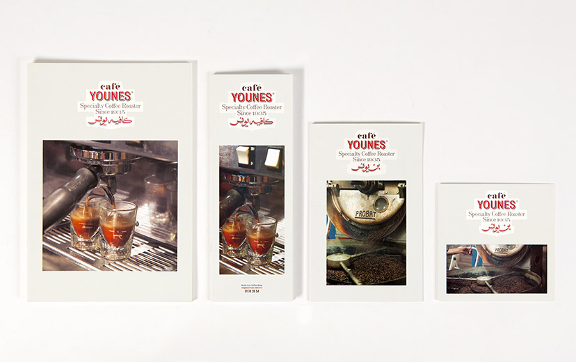
The artisanal coffee and its careful preparation – pinnacles of what Younes is all about – are front-page news on the menu, so to speak.
-
Café Younes-Menus 02
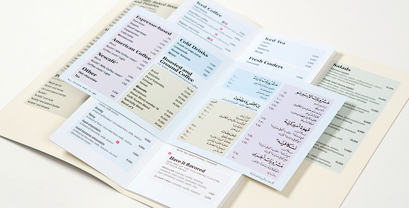
The CMYK grid lines – a main element of the Younes housetyle – are used to organize the menu sections and code it along the way.
-
Café Younes-Menus 03
The Arabic adaptation of the coffee menu for the Aley branch resorts to a fully hand-calligraphed content, from the titles and descriptions to the prices and fine print.
-
Café Younes-Notepad
Lending color to note-taking
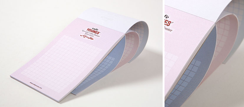
The CMYK hatching grid is used to give a change of tone with each new page.
-
Café Younes-Free drink coupon
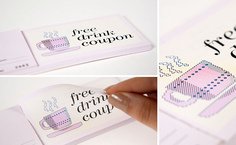
The diagonal hatching grid becomes a canvas for custom illustrations – a sort of 1-bit drawing at 45 degrees – down to the little details of shading and ornamentation.
-
Café Younes-Coffee brochure cover
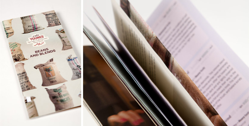
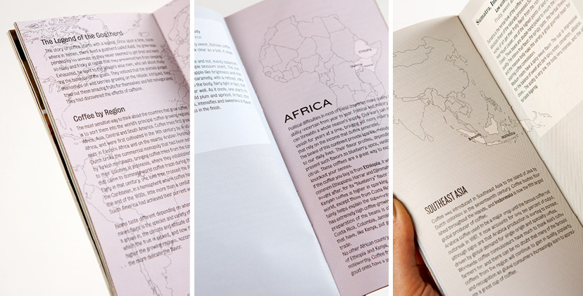
The proposed coffee product catalog lists the beans and blends, but also explains grain origins, preparation methods and grading systems, making it a coffee reference document above everything else.
-
Café Younes-Coffee brochure inside pages
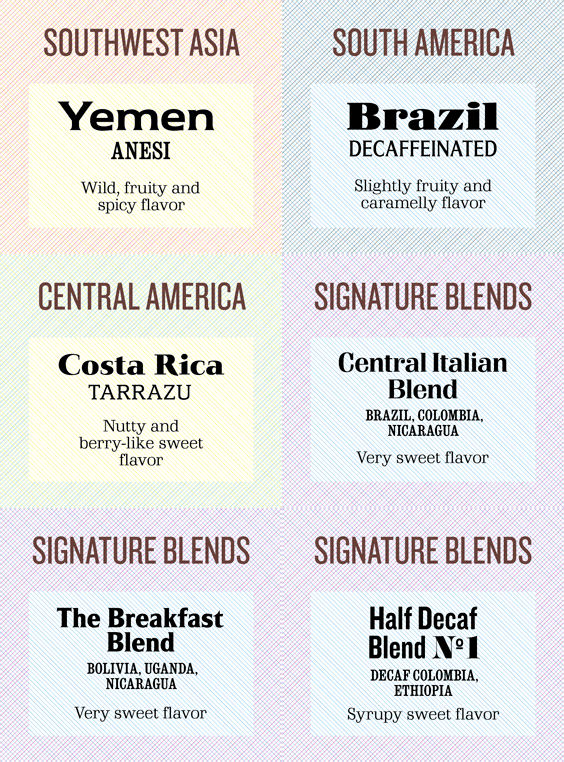
The country section traces coffee bean origins and introduces a color-coding system based on the different continents and sub-continents.
-
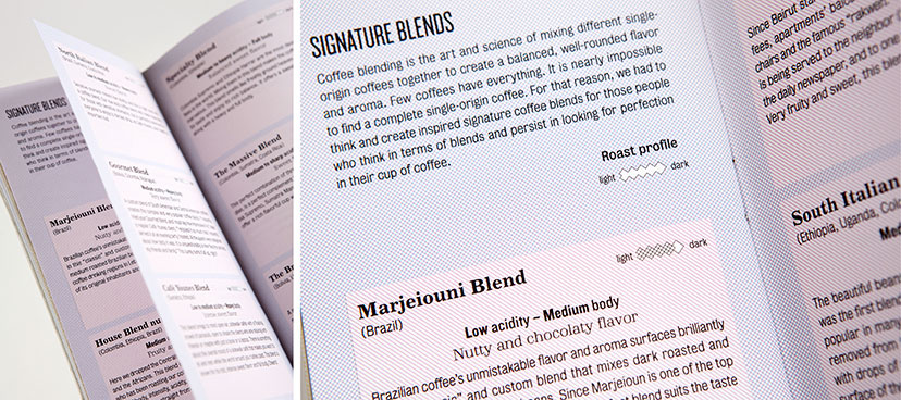
Café Younes-Coffee brochure details
The signature blends section breaks down the brew into its different attributes and introduces the professional lingo to the public.
-
Café Younes-Branded items 03
Ultimately, the CMYK hatched separation makes for tonal variations, fine detail and a tactile resonance.
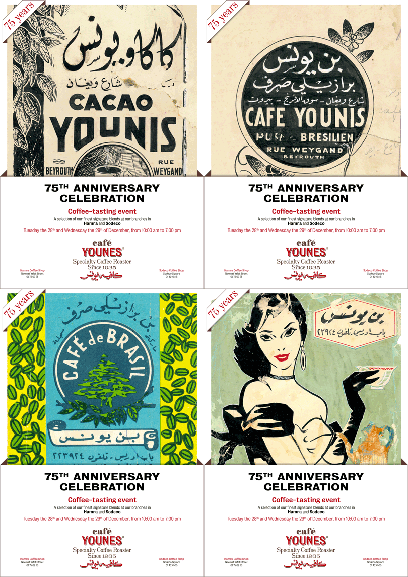
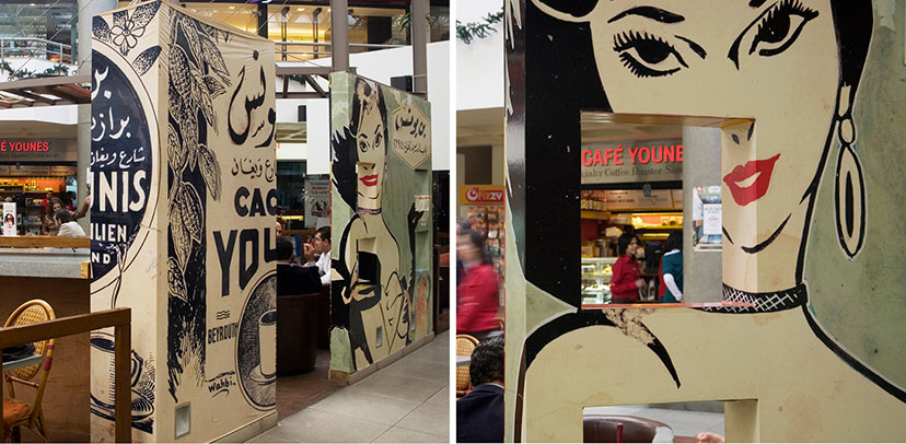
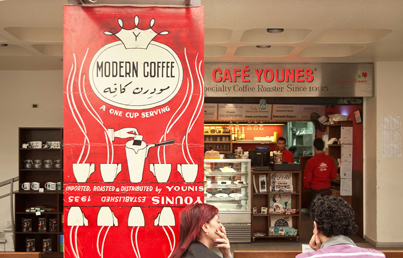
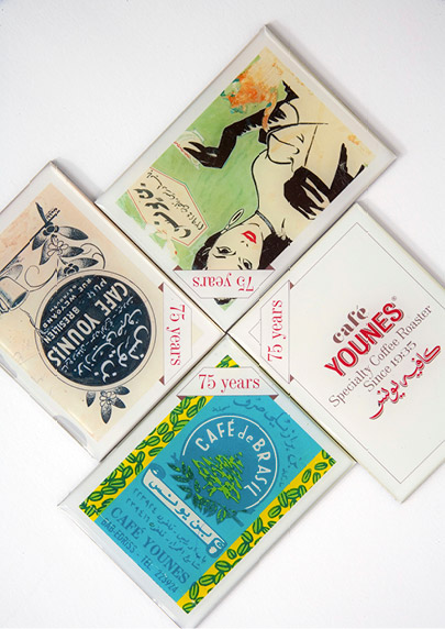
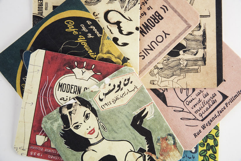
In celebration of Younes’s 75th anniversary, a “75 years” graphic was created for use on different merchandising items that celebrate the history of Café Younes. All of the reproduced visuals, printed on everything from a mug to a wall in the café, come from the establishment’s archive; they are actual old Younes advertisements, packages, posters… dug up and re-utilized to form a communication language that chaperones the re-engineering of the brand. It is precisely this authenticity that naturalizes the cultural references and shifts their value away from the nostalgic gesture. At the end of the day, there’s no risk in simply letting genuineness play out. In fact, there’s a lot to gain.
-
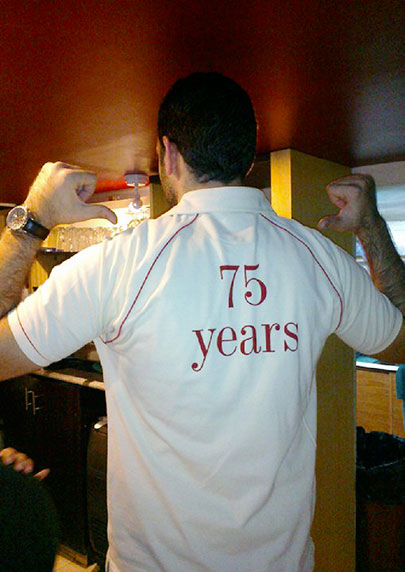
Café Younes-75 years polo
A special polo shirt was designed for the staff to wear during the period of the 75th anniversary celebrations.
-
Café Younes-75 years posters
A series of posters for the 75th anniversary celebration introduces the public to the Younes archive, one that – at least for a period of time – would take center stage.
-
Café Younes-75 years space branding 02
The graphic archive is explosively celebrated, wrapping itself around the walls of the coffee shop, down to the little corners.
-
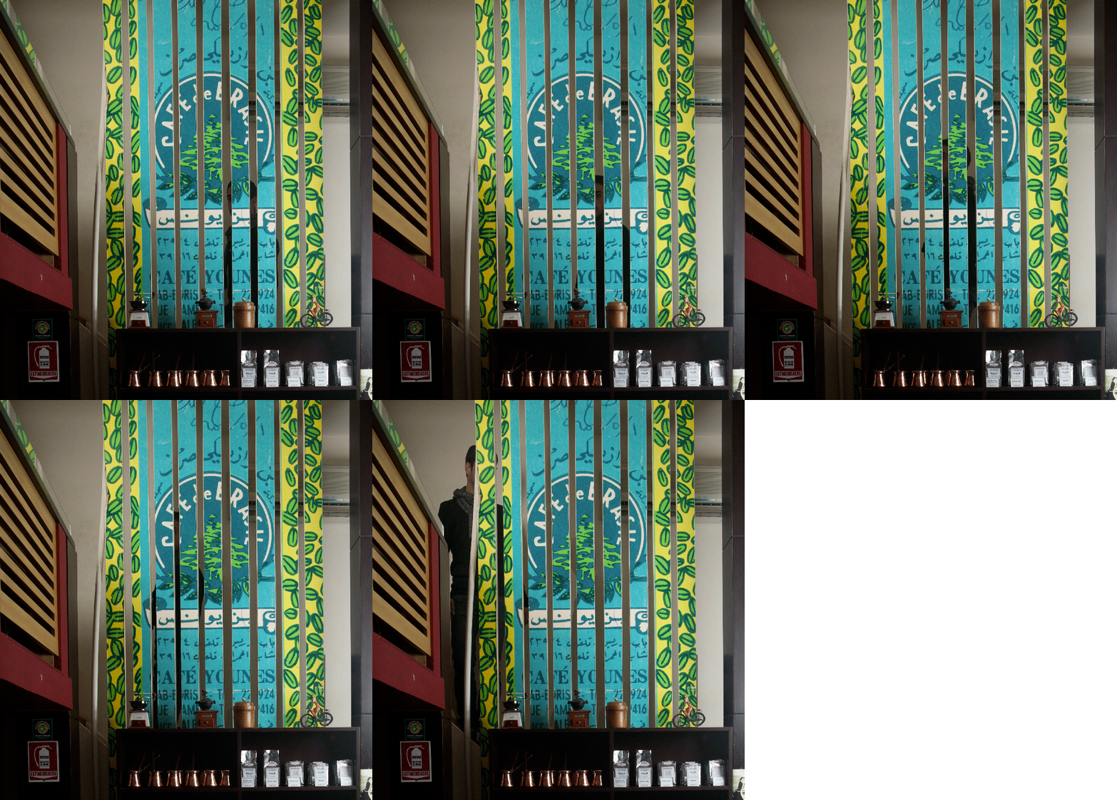
Café Younes-75 years space branding 03
In certain instances, the archival graphic – all graceful with its period charm – acts as a spatial and visual separator.
-
Café Younes-75 years space branding 01
Through the archive, literally
Some features of the coffee shop had to be adapted to, with intriguing results.
-
Café Younes-Merchandizing 01
Collectible reproductions
In addition to a couple of utensils and containers, most of the Younes merchandizing is centered around the visual archive.
-
-
Café Younes-Fridge magnets
-
Café Younes-Merchandizing 02
-
Café Younes-Coasters
It didn’t take long for some of the archive reproductions to become synonymous with the Younes brand; the lady with Art Deco flair and striking features is of particular popularity.
-
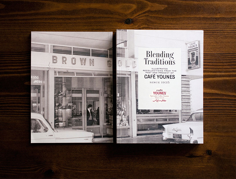
Café Younes-History book front and back
The history booklet was the perfect document to celebrate the 75 years of the establishment, a record that marks a defining moment in Younes’s development.
-
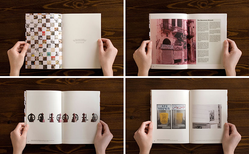
Café Younes-History book inside pages 01
An establishment’s memoir
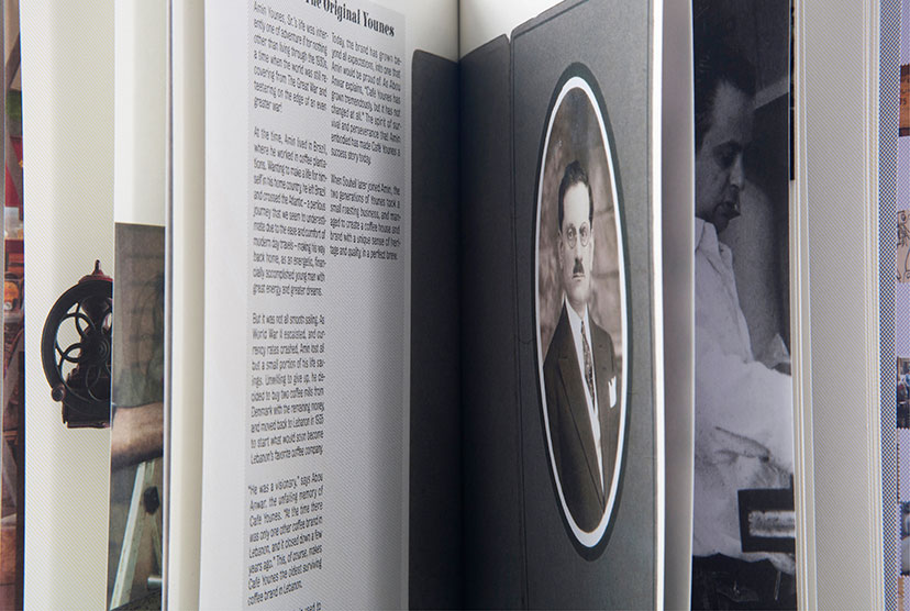
A collection of anecdotes, archives, objects and testimonials expose the intimate details of the Younes story.
-
Café Younes-History book inside pages 02
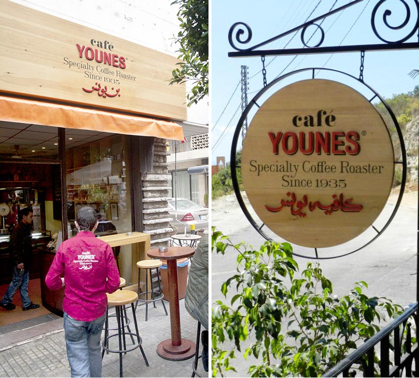
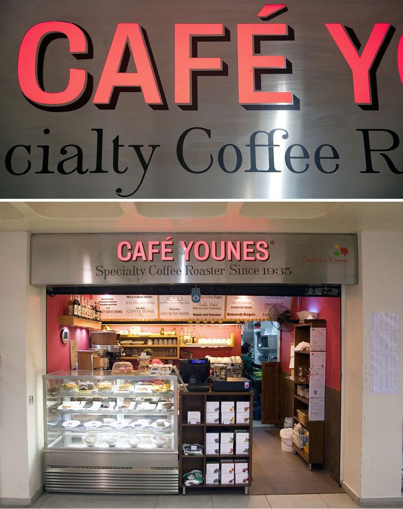
At the time of the mission, Café Younes was in the middle of expanding into multiple outlets with different spatial scenarios. In order to address this complexity, a variable signage materials scheme was adopted to tailor each outlet’s signs to the space in which they are found. Wooden hanging signs blend nicely in the urban neighborhood, stainless steel light boxes stand out in an indoor mall, and gold vinyl ornaments glass surfaces in reference to classical sign painting practices. With engraved zinc interior signage, a history wall of collected old frames and an archival explosion on the coffee shop walls, the Café Younes spatial treatments are some of its most recognizable identity markers.
-
Café Younes-Sign on glass Hamra 02
Using gold leaf in sign painting is not practiced in Lebanon and our research yielded no real leads. Not willing to give up our fascination with the effect, we resorted to a vinyl alternative, and it delivered brilliantly.
-
Café Younes-Hamra interior 01
-
Café Younes-Hamra wood sign
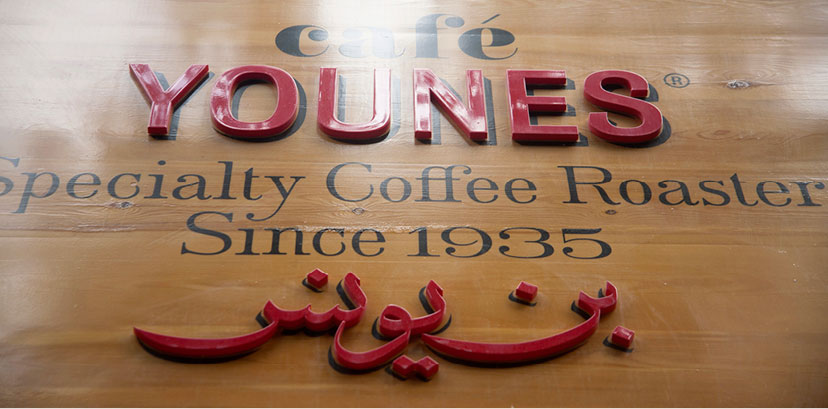
A combination of printing as well as mounting cut-out shapes on the wood surface make for a dimensional interpretation of the Younes logo.
-
Café Younes-Hamra and Byblos wood signs
A combination of signage formats address the needs of each outlet for maximum visibility.
-
Café Younes-Sodeco metal sign
Younes signage adapts to the indoor space of the mall with a more industrial materials scheme.
-
Café Younes-Sodeco menu board
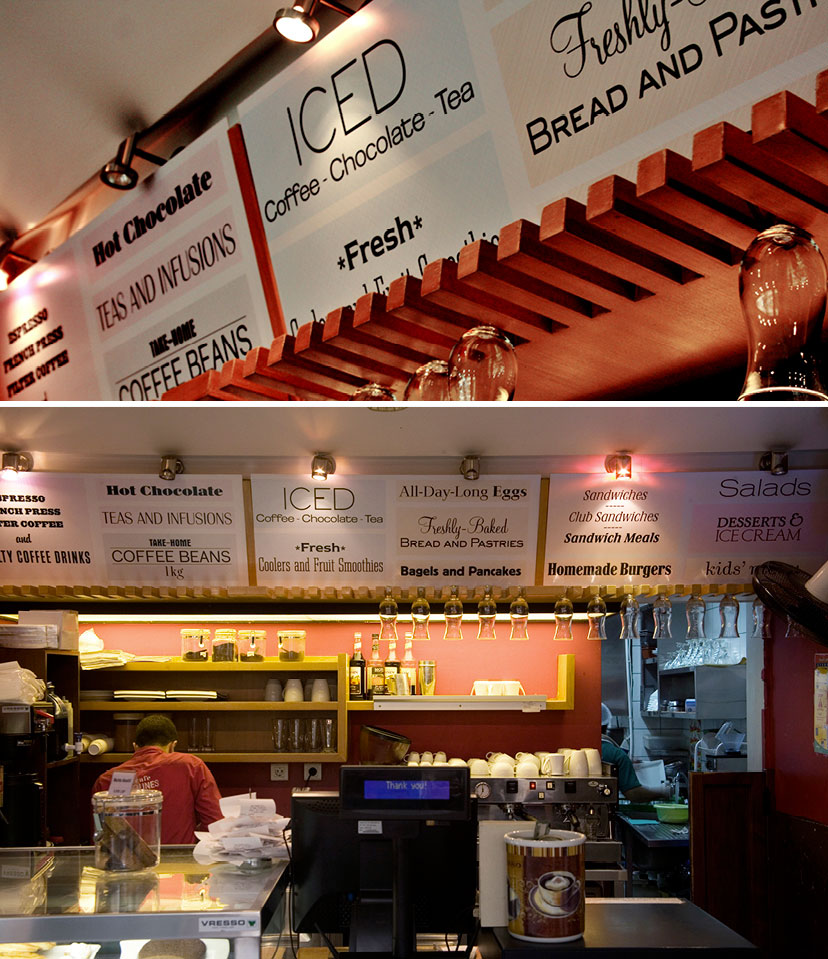
For the mall outlet, a menu board sums up the goodies on offer through a playful approach to referential typography.
-
Café Younes-Hamra interior 02
A more sober presence of the Younes visual archive remains post the 75th-anniversary celebration.
-
Café Younes-Internal signage
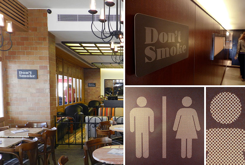
The Younes hatching treatment is translated onto the interior signage by engraving on thin zinc plates. It is worth noting here that prior to the smoking ban of 2012, there was another sign in some other corner saying: “smoke”.
-
Café Younes-Byblos history wall
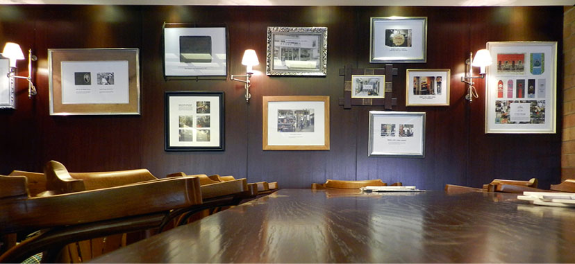
With an irregular arrangement and a variety of frames reminiscent of family portraits in a domestic setting, the history wall marks landmark episodes in the establishments’s past and is one of Younes’s fixed spatial features.
-
Café Younes-Abdel Aziz tiles and vinyl
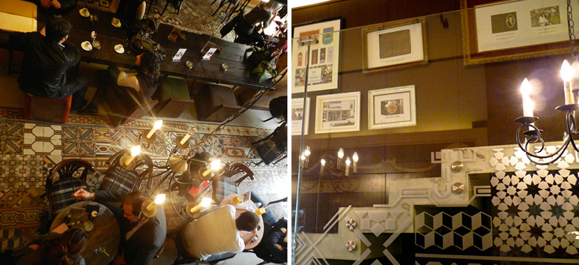
The vividness of the Younes space is the result of a tight rapport between graphics and interiors. The interior glass vinyl treatment clearly responds to the signature floor with its random geometric tiles and outlines the staircase along which framed fragments from Younes’s history lead the way.
The prime focus of Café Younes is, naturally, the coffee. Yes you can a grab a bite at the café, or take it home with you, but it is the artisanal roasting, careful brewing and meticulous preparation of a wide range of single-origin beans and signature blends that ultimately take center stage. The packaging of this prized product for home consumption was to reflect all those qualities, and simultaneously create a system of identification that, in its utilization of the basic identity components, makes it easier for the customer to decipher among the seriously wide range of choices.
-
Café Younes-Coffee labes
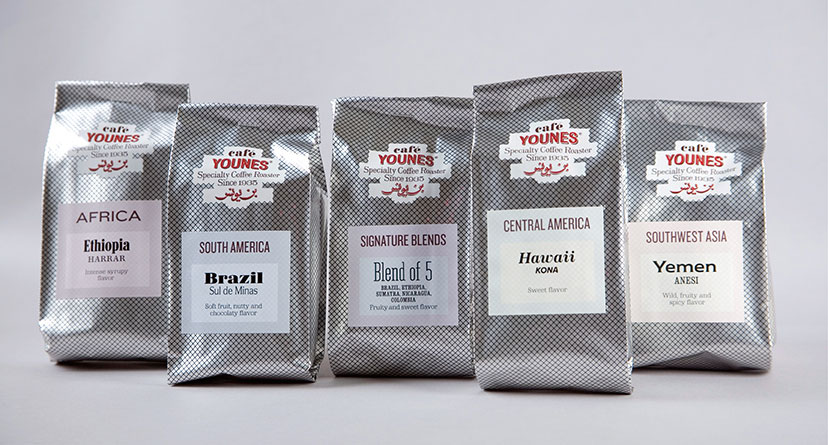
Color-coded and treated with a personalized typographic attire each, the coffee labels acquire a uniqueness while adhering to the general scheme.
-
Café Younes-Coffee packs 01
-
Café Younes-Coffee packs 02
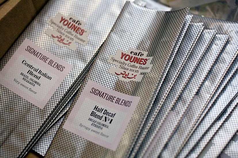
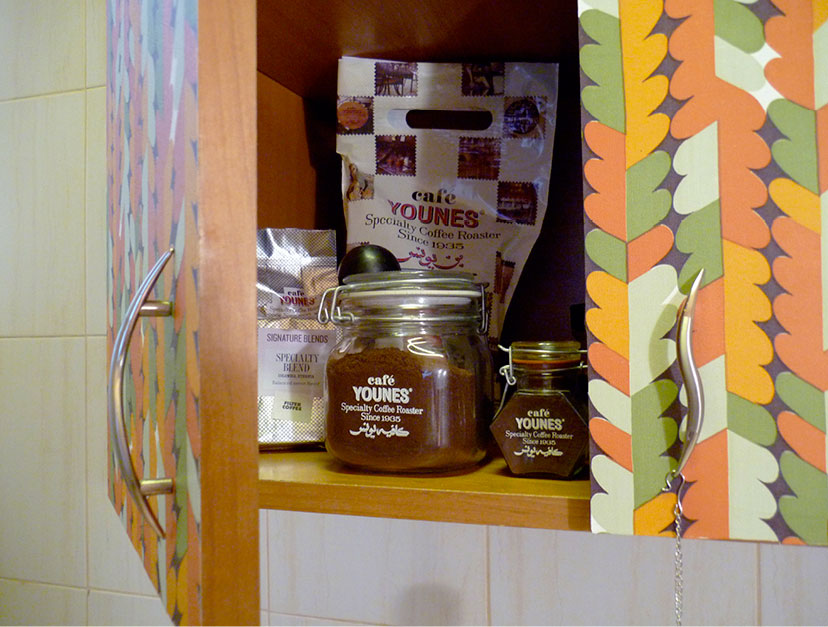
For all things practical, the coffee labels are stuck-to-order on a generic aluminum bag, hatched without disguising its material properties.
-
Café Younes-Delivery packaging
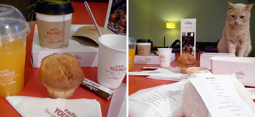
In the spirit of simplicity, familiarity and convention, the food delivery packaging is nothing more than straightforward interventions on the basic paper bag, basic paper cup, and so forth.
-
Being a very active enterprise, particularly while opening new outlets and diversifying the offering, Café Younes’ communication needs were many. These messages presented us with a chance to extend the visual and typographic identity onto a variety of formats, solidifying the playfulness of the house-style and the richness of its eclectic scheme.
-
Café Younes-Posters
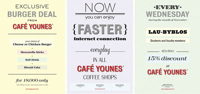
It might be a case of “how many fonts can you fit in one poster”, true, but the playfulness of typefaces and backgrounds on these frequently changing messages results in an attention-calling vibrancy inside the coffee shop.
-
Café Younes-Table tents
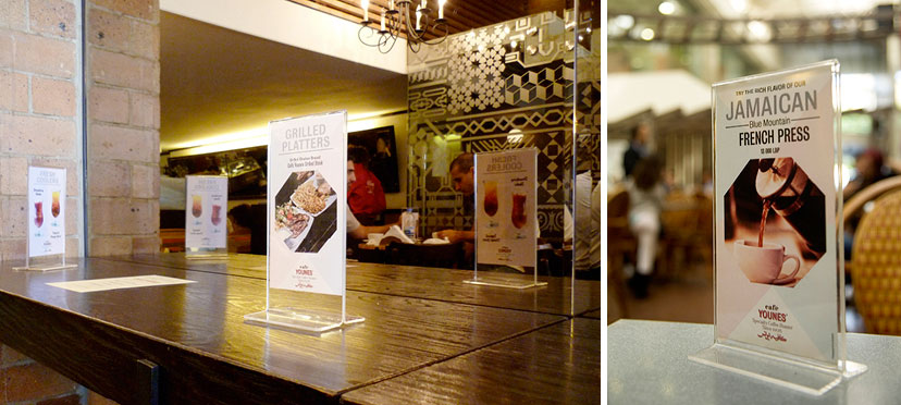
Close-range communication
-
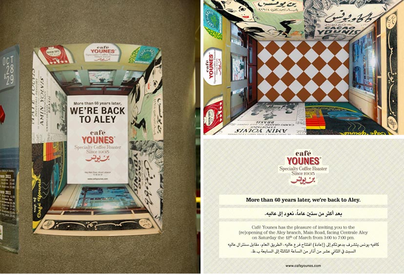
Café Younes-Aley poster and invitation
For the opening of Café Younes in Aley, a clever simulation of the wall graphics in the small outlet by our production officer was so popular, it became the event’s main visual for both the poster and invitation card.
-
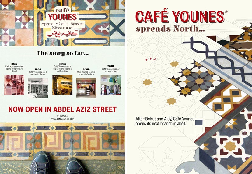
Café Younes-Opening posters
The signature tiles of the Abdel Aziz outlet was an appropriate visual for the opening of the flagship branch. And it literally spread onto the Jbeil opening which took place shortly after.
-
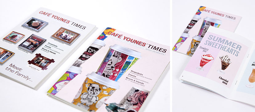
Café Younes-Newsletter
A pocket sized newsletter keeps the visitors up to date with the going-ons of the coffee shop.

