-
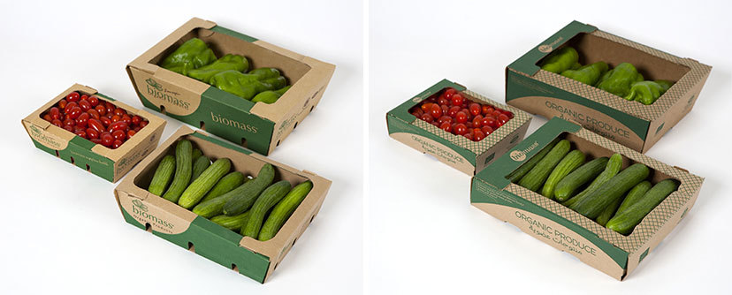
Biomass-Veg box before and after
Literal shifts2013The previous Biomass fresh fruit and vegetable packs were more or less retained, but were subjected to a slight but significant form adjustment (see Packaging section for details). -
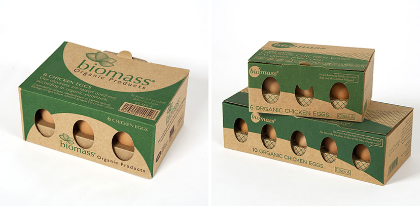
Biomass-Egg box before and after
Keeping what works2013The previous Biomass half-dozen egg pack worked pretty well and needed nothing more than a new identity treatment, as well as a dozen-egg partner. -
Biomass-Logo before and after
Change of heart2012Other than its somewhat expected symbolism, the previous Biomass logo suffered from production limitations due to the emblem’s treatment and did not clearly carry the “organic” idea in its basic name. The redesigned mark addresses all that and carries a softer, more familiar, expression. -
Café Younes-Logo before and after
So long old man2010The American commercial graphic mark with its framed portrait and ribbon element was replaced by an emphasis on typographic detail, history, a variable color scheme and a calligraphic element that switches between the two types of Younes outlets: coffee roaster and coffee shop. -
Cyberia-Logo before and after
Goodbye to techiness1998The previous Cyberia logo, designed by Huda Smitshuijzen Abifares, was a well designed in-the-code mark that simply didn’t fit the new positioning. -
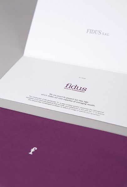
Fidus-New identity card
Undoing the undistictive2006The almost absent previous identity gets a new face, and an equally memorable new wink. -
Jabal Moussa-Logo before and after
Oak and wolf mountain2010The association’s previous logo – a circular device with an abstraction of the mountain, its top predator and most characteristic plant – was retained, but lifted to include a custom-drawn Arabic name and introduce the type and graphic treatments of the new identity scheme. -
Le Gray-Bar ThreeSixty Before and After Logo
A double take2011 -
Le Gray-Cigar Lounge Before and After Logo
A double take2011 -
Le Gray-Gordon’s Cafe Before and After Logo
A double take2011 -
Le Gray-Indigo on the Rooftop Before and After Logo
A double take2011 -
Santiago-Logo before and after
Not the right decade2009The much needed revisiting of the Santiago mark resulted in a more age-appropriate signature, so to speak: a simple logotype, elegant, feminine, peculiar, and with a little cherry on top. -
Shawarmer-Menu new logo revealer
Out with the old2008Peeling the previous logo and slogan off the menu cover reveals the new ones, along with a message about the revisited identity. -
Shawarmer-Bilingual logo with tagline
Added value2007With the revisited identity, the existing tagline, “All you want”, is literally extended. -
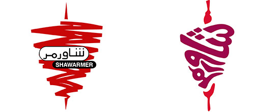
Shawarmer-Emblem before and after
From word and image to word-as-image2007The calligram – arranging the calligraphy to form a visual – creates a particularly interesting emblem that is not just more intricate but also more, well, shawarma-like. -
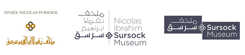
MTG-Sursock museum-logos before and after
Common Thread10-2014The floral emblem from the previous Sursock Museum logo is retained, and its detail readdressed to fit the more contemporary typographic/calligraphic scheme.