-
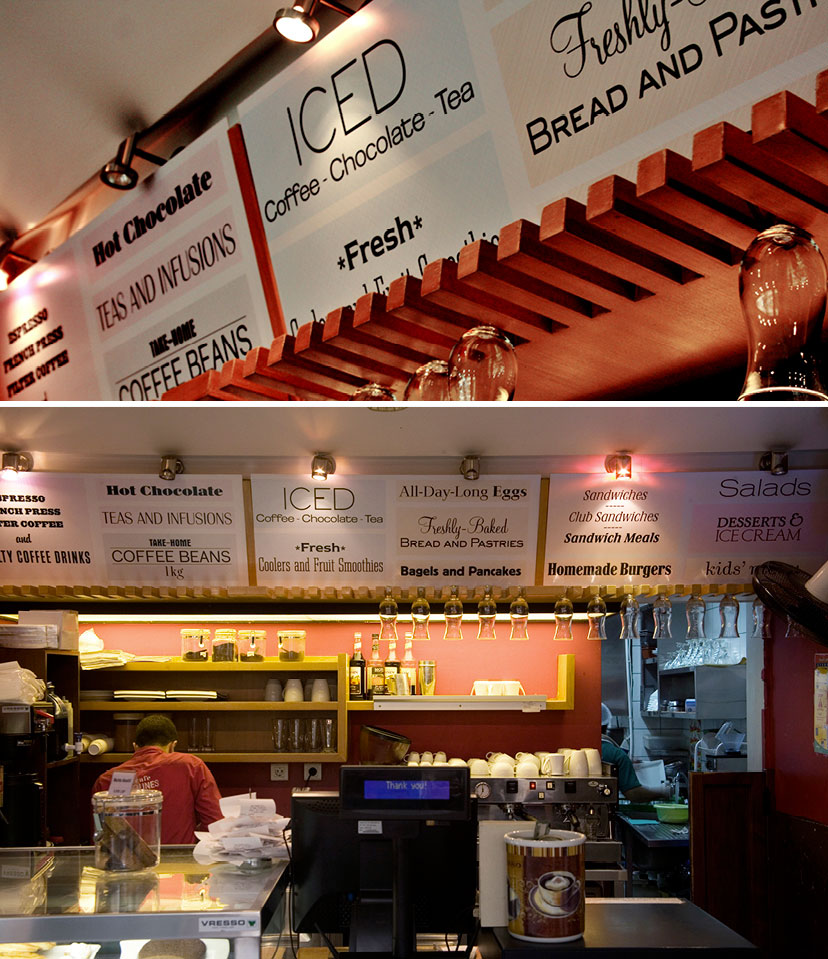
Café Younes-Sodeco menu board
Menu on board2010For the mall outlet, a menu board sums up the goodies on offer through a playful approach to referential typography. -
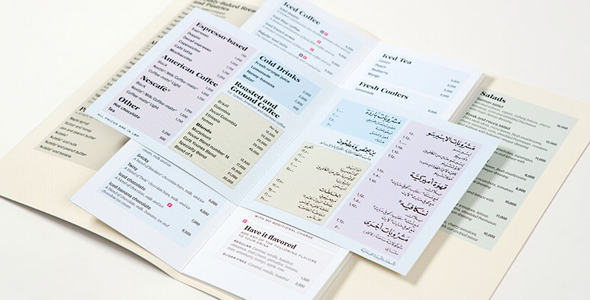
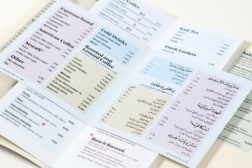
Café Younes-Menus 02
Webs of color2010The CMYK grid lines – a main element of the Younes housetyle – are used to organize the menu sections and code it along the way. -
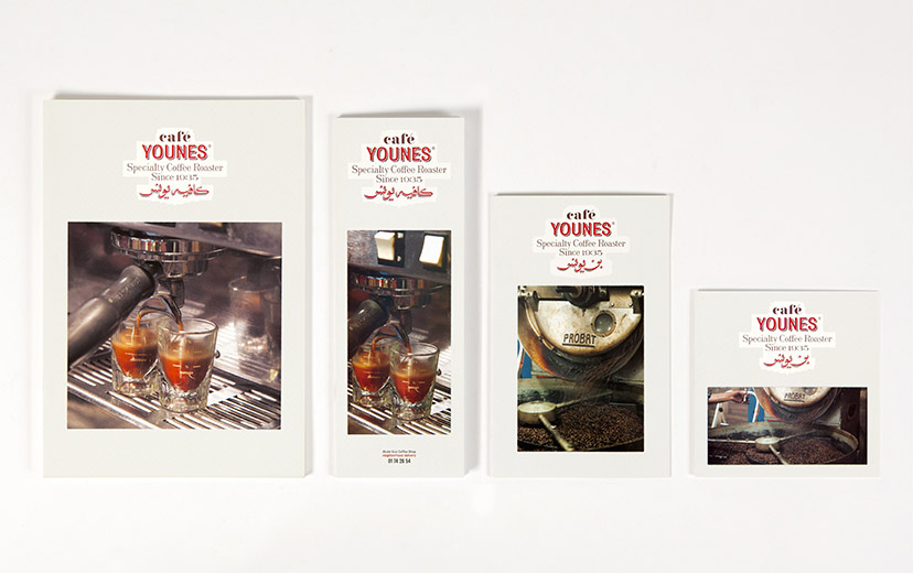
Café Younes-Menu covers
The hero on the cover2010The artisanal coffee and its careful preparation – pinnacles of what Younes is all about – are front-page news on the menu, so to speak. -
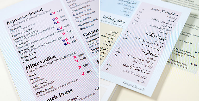
Café Younes-Menus 03
Calligraphy all the way2010The Arabic adaptation of the coffee menu for the Aley branch resorts to a fully hand-calligraphed content, from the titles and descriptions to the prices and fine print. -
Café Younes-Menus 01
Webs of color2010The CMYK grid lines – a main element of the Younes housetyle – are used to organize the menu sections and code it along the way. -
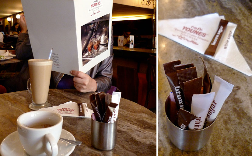
Café Younes-At the coffee shop 01
At the coffee shop2010 -
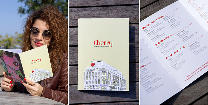
Cherry on the rooftop-Menu
With a cherry on top2011An illustration of a literal “cherry on top” was used as a pointer to the location of the lounge in the hotel. -
MTG-Gordon's Café-Dessert menu
Words of encouragement2012 -
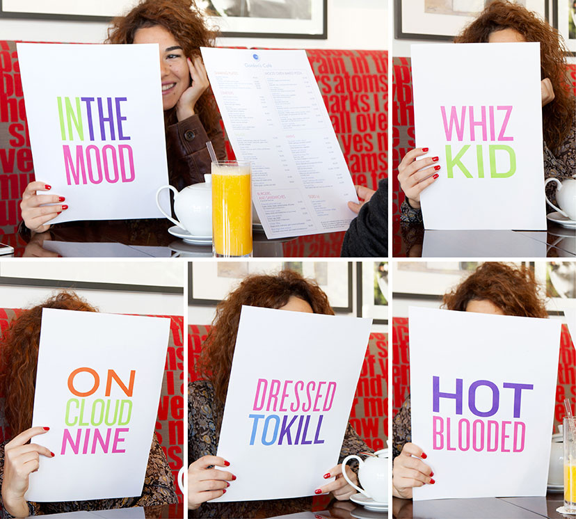
MTG-Gordon's Café-Lunch and dinner menu
(Don’t) flatter yourself2012Simple yet expressive, these menus were designed to mimic the “Name Game”. The customers can never foresee the phrase that accompanies the menu handed to them. This makes for a conversation innitiator and sets the mood for a lighthearted setting. -
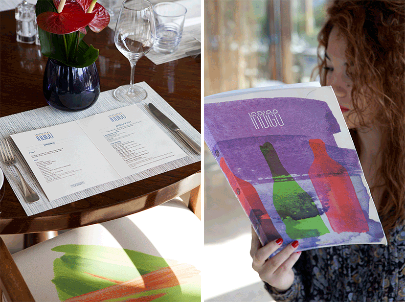
Indigo on the roof-Menu
A touch of paint here and there2011The breakfast, lunch/dinner, and wine menus all maintain the same typographic layout but are each designed with a different art piece for the cover. -
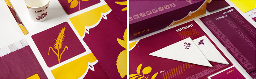
Semsom-Branded items 02
Flavour essentials2008The illustrations in this visual housestyle are of core ingredients – herbs and seeds – from the Lebanese cuisine, applied with many variations from a discreet low-contrast set on the side of the menu covers, to small icons on napkins and individual central images on coasters and traymats. -
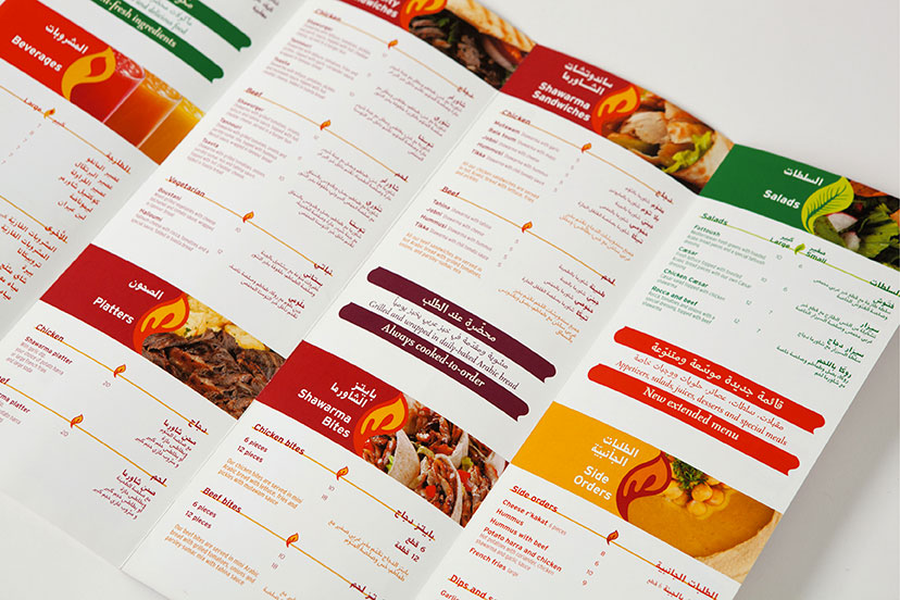
Shawarmer-Menu inside
Leaf, drop, flame2008In addition to color and photographic representation, the menu uses a consistently shaped graphic element that changes treatment to indicate the different sections. -
Shawarmer-Menu new logo revealer
Out with the old2008Peeling the previous logo and slogan off the menu cover reveals the new ones, along with a message about the revisited identity. -
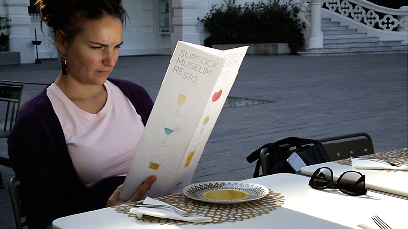
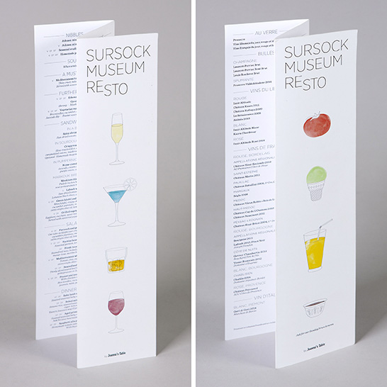
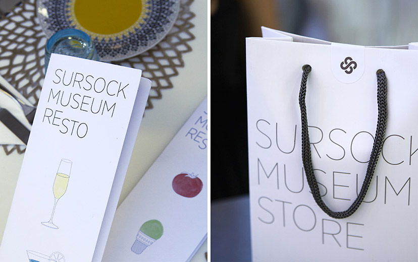
MTG-Sursock museum-Resto menu
Good things inside2016 -
MTG-Sursock museum-Resto menu covers
Eat me, drink me2016 -
Sursock Museum-Resto Store details
Goods and goodies2015 - 2016The typographic signatures of Resto and Store are complemented by illustrations and Sursock Museum’s emblem-as-token respectively. -
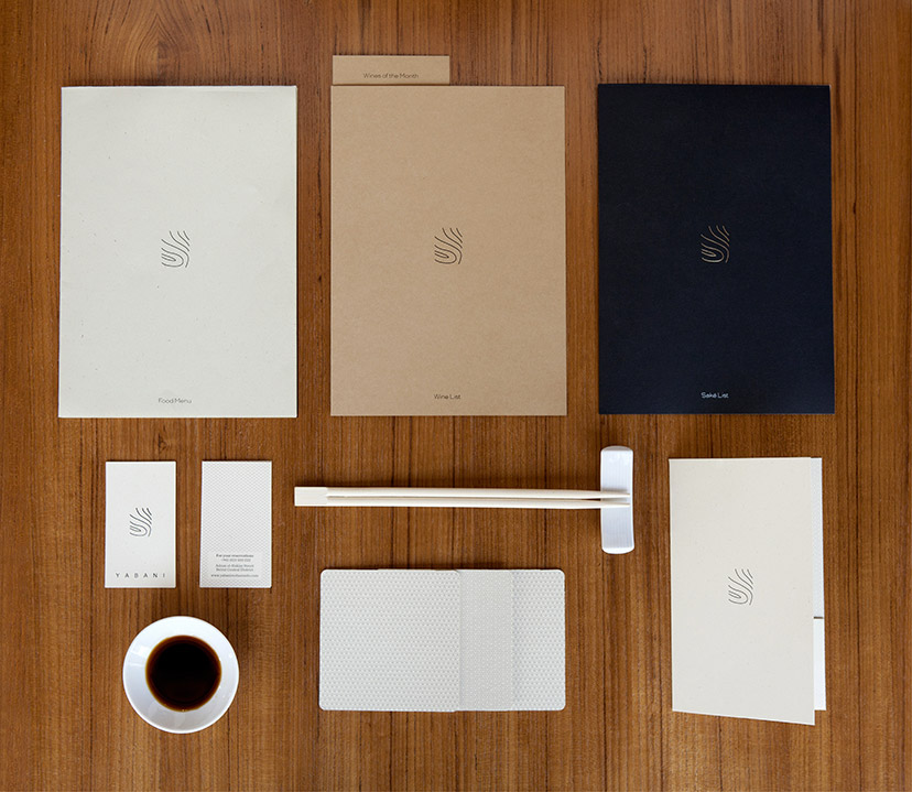
Yabani-Branded items
Pure and simple2014A changing paper scheme delivers just the right amount of nuances. -
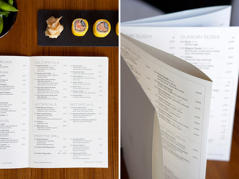
Yabani-Food menu
Origamenu2014A threadless, stapleless, glueless method using slits and folds allows for a multipage object to be formed out of a single sheet of paper. Patterns are printed on the inner folds of the menu which acquires a crafted quality. -
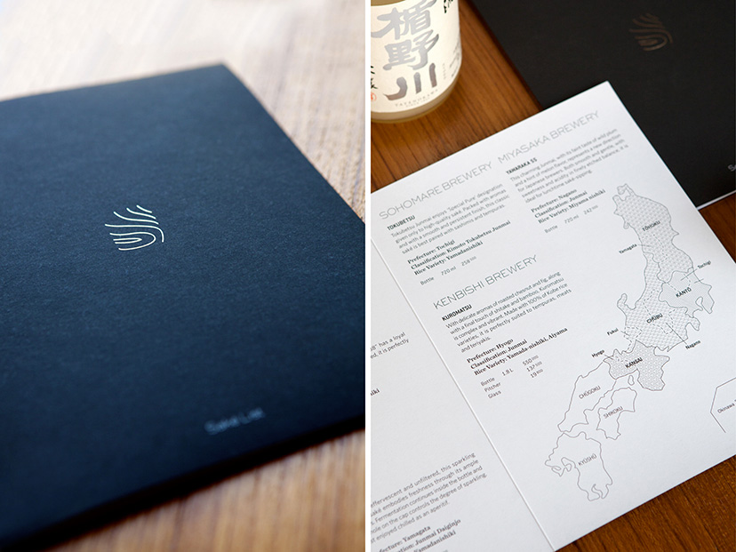
Yabani-Saké menu
For saké’s sake2014The drop of shiny silver on the cover is the first clue to how seriously the establishment takes its saké; prepare to be schooled. -
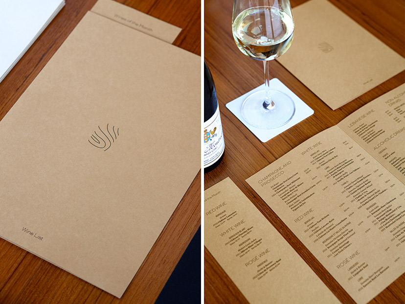
Yabani-Wine list
Earthy tones2014The wine list gets the warmest of the three paper shades. -
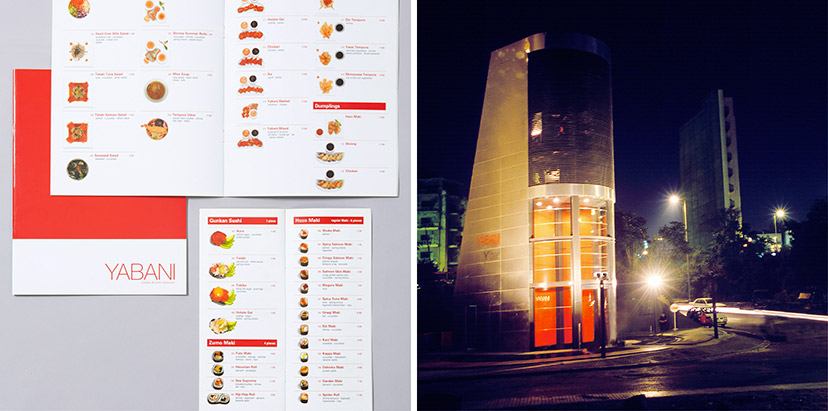
Yabani-Previous menu and building
The way things were2002Our photographic intervention on Yabani’s previous menus started a wave of copycatting as the sushi restaurant industry realized the benefits of familiarizing the customer with the product, especially at the time when the offering was new to the Lebanese scene. With the move from the original location – a building designed by architect Bernard Khoury – and the decision to rebrand, just as we were the first to include the food photography, we were also the first to take it away.Food photography: Michel Esta – Building photography: Joseph Chartouni