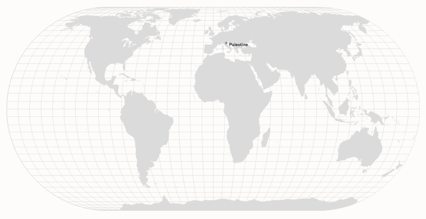
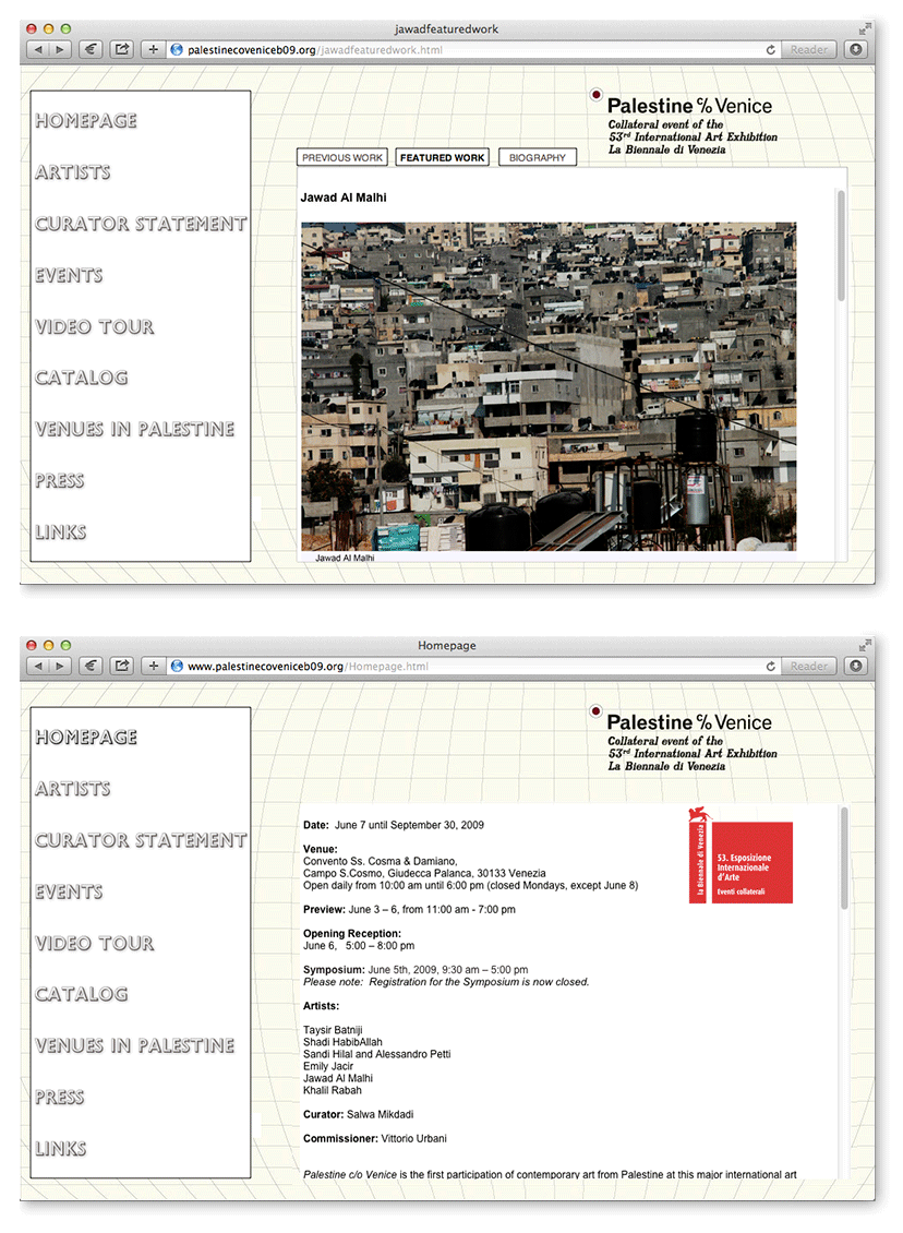
As Salwa Mikdadi puts it in her curatorial statement on the Palestine c/o Venice website, “[t]he title of the exhibition... underscores the current impermanence faced by Palestinian artists...”. The idea of place in transience is at the core of this collateral event of the Venice Biennale – collateral precisely due to its status as an exhibition without national representation. Clearly, such an intrinsic conceptual backbone was to underpin the event’s visual identity as well. By liberating ourselves from the fixity of geographic location, “Palestine” is simply transported to where Venice falls on the world map. Light lines of longitude and latitude become the subtle indicators for this “new” location as they occupy the backgrounds of applications. A variety of typefaces, hatching treatments and other elements that reference map graphics complete the cartographic language adopted for this historic participation: the first of contemporary art from Palestine at this major international art event. Duplicates of the work were simultaneously exhibited in six art institutions across Jerusalem and the West Bank.
-
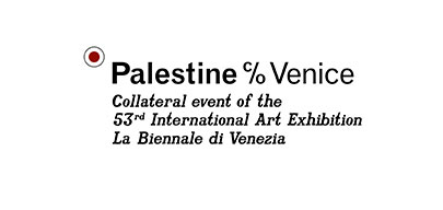
Palestine c/o Venice-Logo
The introduction of the circle enables the reading of the name-as-location, and the lengthy descriptor was required by the Biennale to avoid any confusion regarding the status of the participation.
-
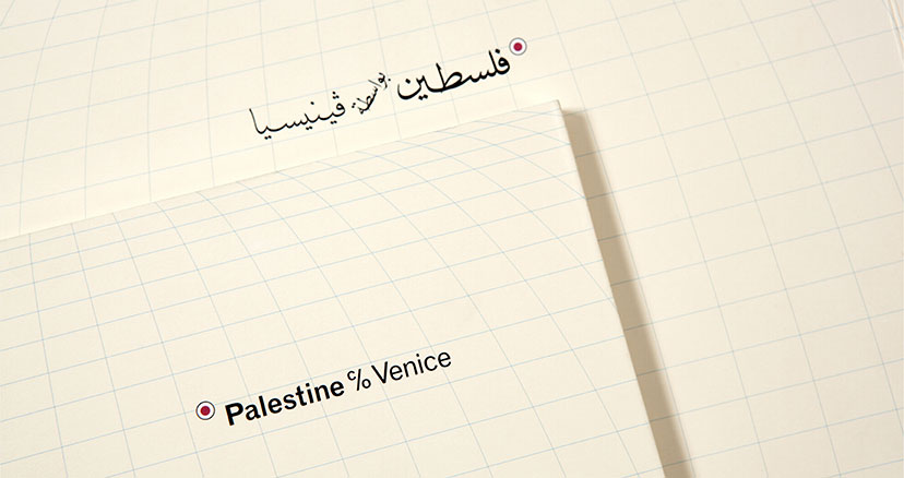
Palestine c/o Venice-Covers close up
The Arabic name is set in the style of calligraphy often found on traditional Arabic maps.
-
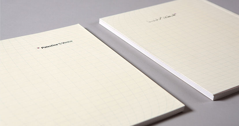
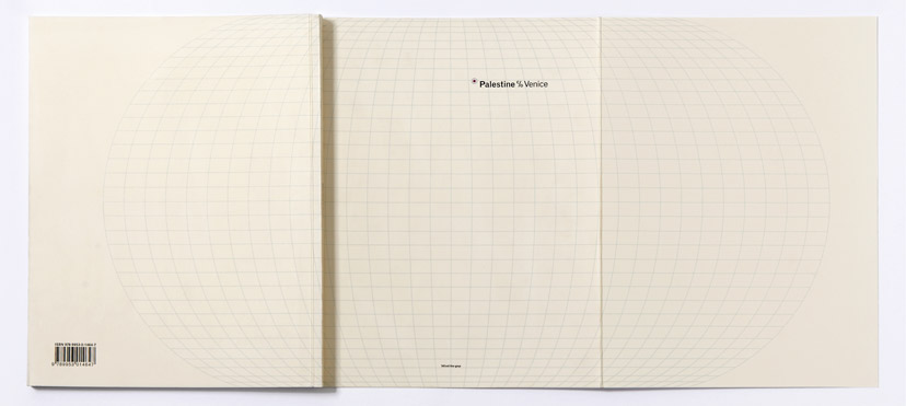
Palestine c/o Venice-Covers
The English and Arabic versions of the exhibition catalogue are designed as separate documents.
-
Palestine c/o Venice-Map
After transporting the location of Palestine to Venice, the land mass was removed making the statement as much enigmatic as it is radical.
-
Palestine c/o Venice-Open cover
It’s only when the catalogue cover is fully open, flaps and all, that the whole globe appears and the (mis)location of Palestine can become apparent.
-
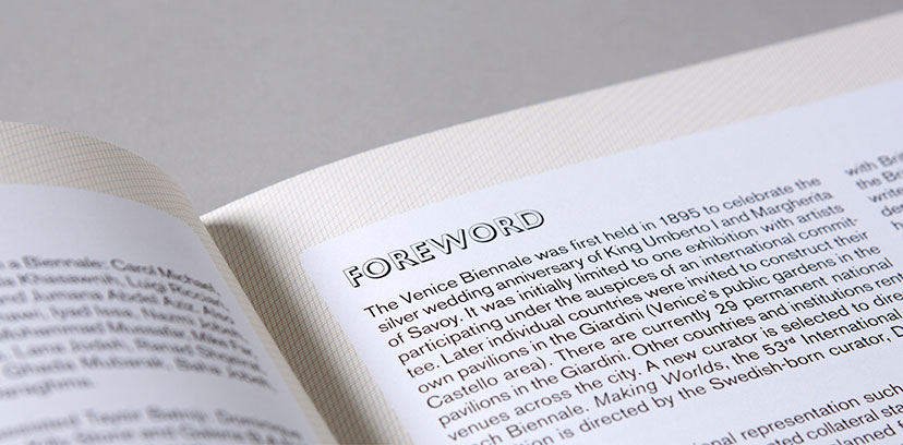
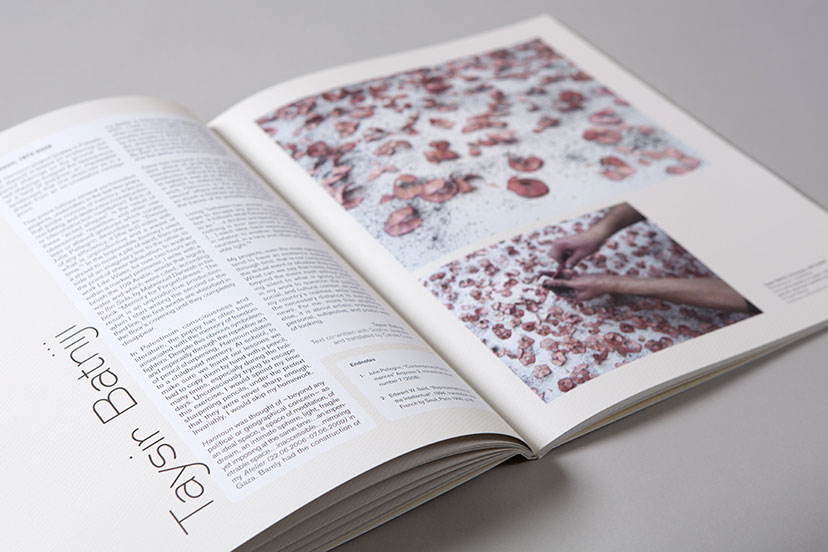
Palestine c/o Venice-Inside pages 01
Following the cartographic visual language, the background of the catalogue’s inside pages was composed of cyan, magenta and yellow lines, mimicking the offset printing process to achieve the desired beige hue.
-
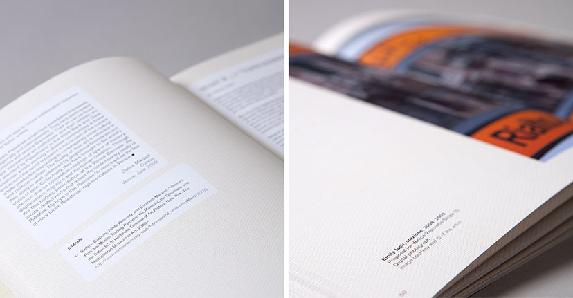
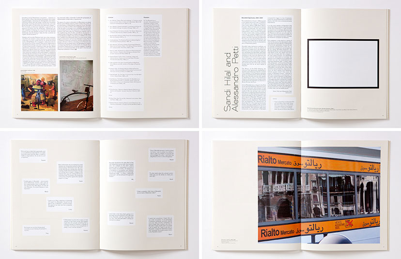
Palestine c/o Venice-Inside pages 02
Captions in the exhibition catalogue arrange themselves freely alongside the images, while articles and endnotes get framed in round-corner boxes, alluding to the generally organic forms of land masses on a map.
-
Palestine c/o Venice-Inside pages 03
The text hierarchy makes the artist name the most prominent in the catalogue.
-
Palestine c/o Venice-Inside pages 04
The catalogues’ inside pages vary between structure and rhythm.
-
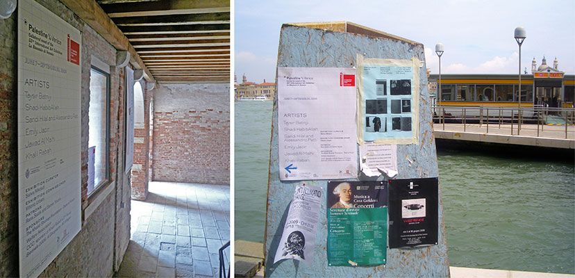
Palestine c/o Venice-Poster
In Venice, the event poster could be seen in the entrance of the exhibition venue as well as the streets of the city.
-
Palestine c/o Venice-Website

