Café Younes-Logo before and after

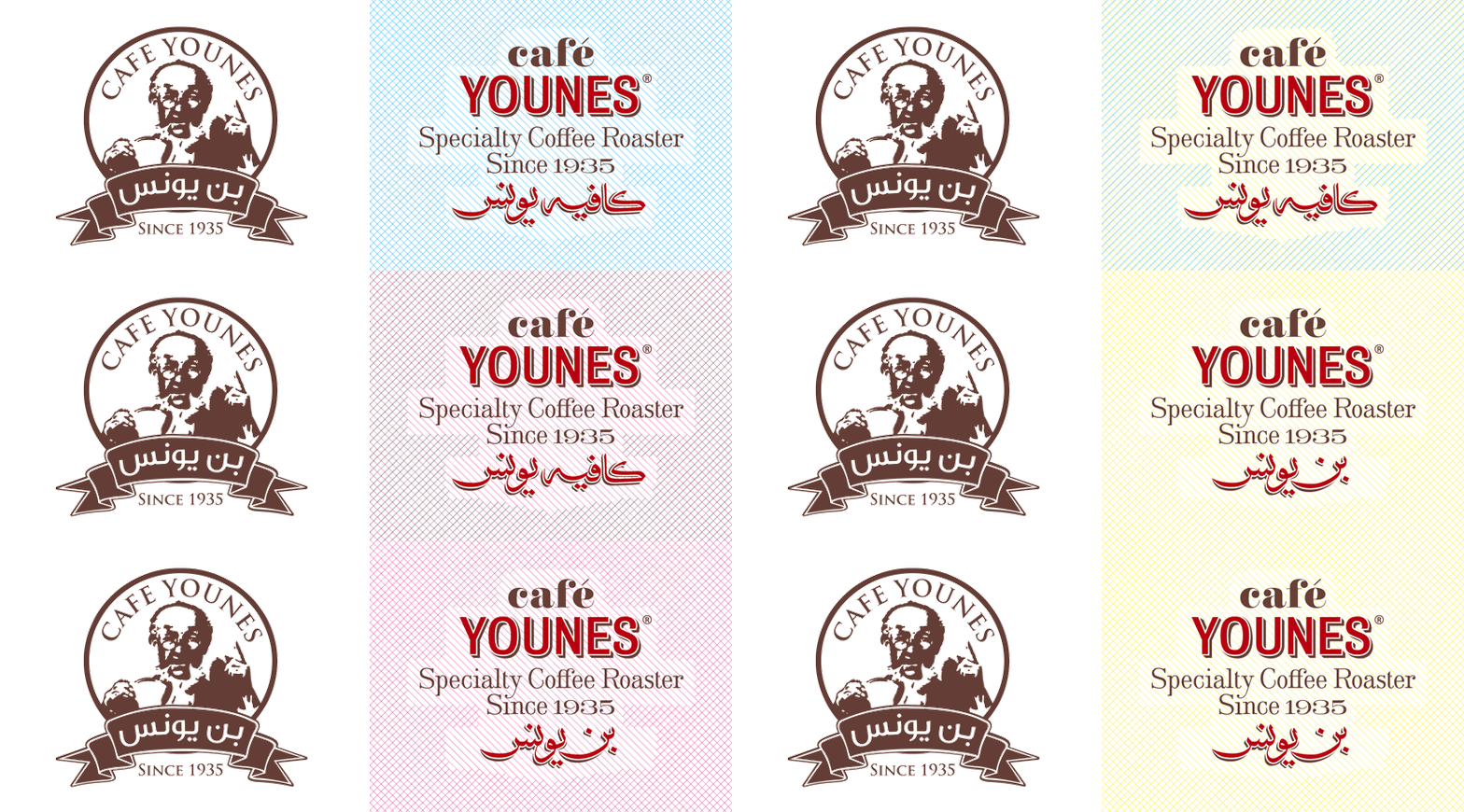
So long old man
2010
The American commercial graphic mark with its framed portrait and ribbon element was replaced by an emphasis on typographic detail, history, a variable color scheme and a calligraphic element that switches between the two types of Younes outlets: coffee roaster and coffee shop.

Café Younes-Logo

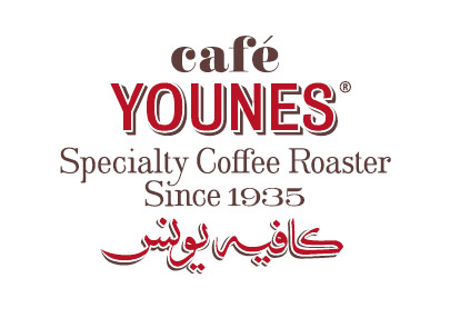
Fully loaded
2010
Although carefully composed into a single graphic device, the logo letterforms hold quite a few referential details: classical style variations, shadow treatments of hand-painted signs, a delicately made-up ligature and a calligraphy based on the original.


A&A-Logo and emblem

Total integration
2010
The A, &, and A characters are composed and tailored to fit perfectly, almost inconspicuously, in the logotype.

Fidus-Logo

A new F word
2006
The made-up currency sign places the brand within its sector and becomes the core identity element.
Subscribe to Ligature
Back to top