In 2007, a plan for opening a store specializing in furniture, lighting and design products was in the works, and we were approached to articulate its complete identity scheme beginning with the most crucial of elements: its name. The cue came from the fact that the retail space would be shared with that of another client of ours: Le Comptoir. Its own appellation, French for “The Counter”, provided the obvious direction. “Over the Counter” not only makes reference to the common expression, but it also recounts the story of its inception: being added onto (or over) Le Comptoir. The typographic pun of the logotype, the elegant intricacy of the spirograph and the warmth of the color red drove the identity home.
-
-
Over the Counter-Main sign
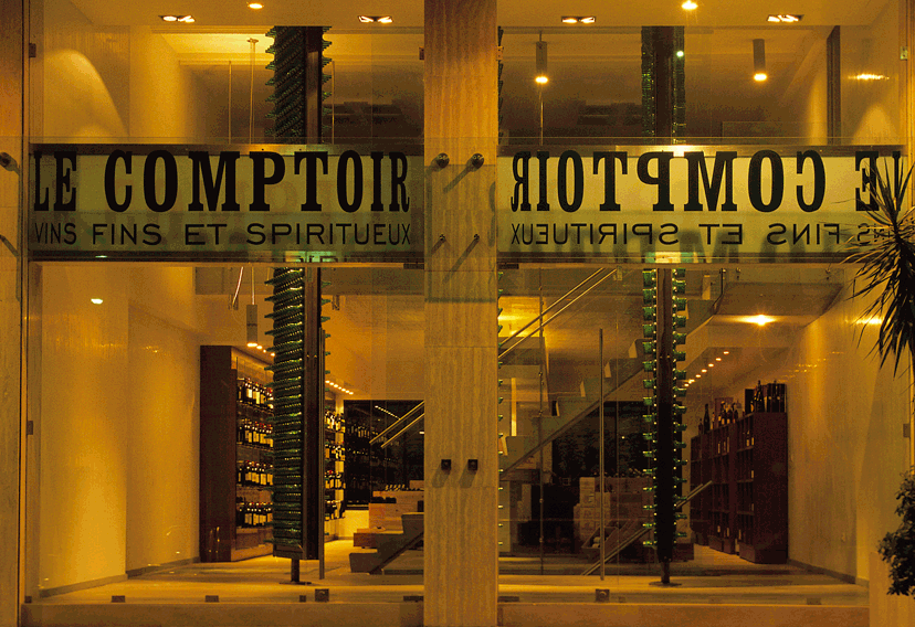
With the introduction of Over the Counter to Le Comptoir, a neon sign with both names replaced the previous one.
-
Over the Counter-Opening invitation
For the opening of Over the Counter (in Le Comptoir), oversized invitation cards, one version for each entity, were designed as high quality lithographs.
-
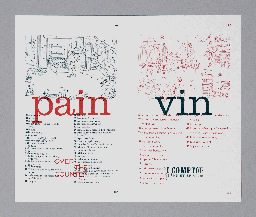
Over the Counter-Pain vin invitation
Bread and wine, no sacrament intended
For this special event of designer breads and wine tasting, the invitation makes use of these charming references from “Duden Français” visual dictionary and carefully assigns the colors in service of the common message.
-
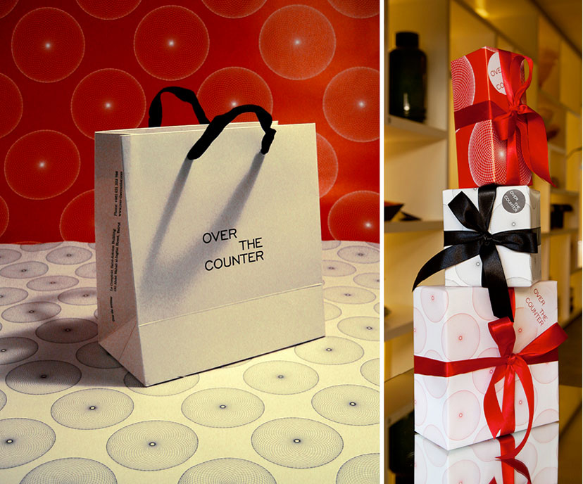
Over the Counter-Bag and wrapping papers
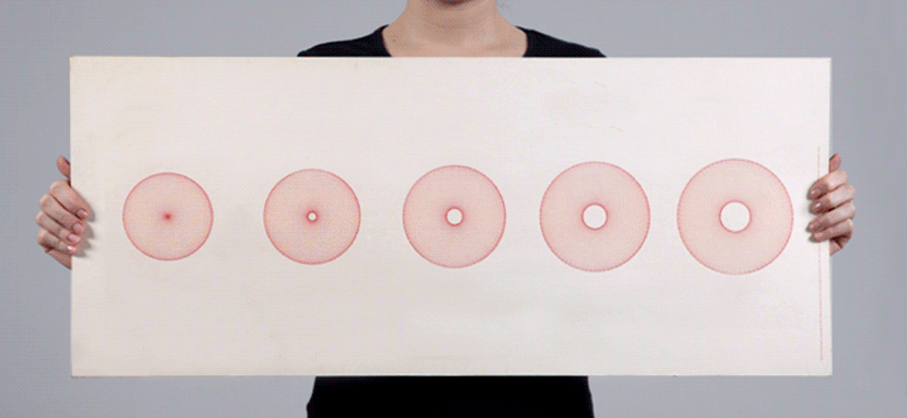
Originally invented for calculating an area delimited by curves, the spirograph’s circular motifs are as much ornament as they are science.
-
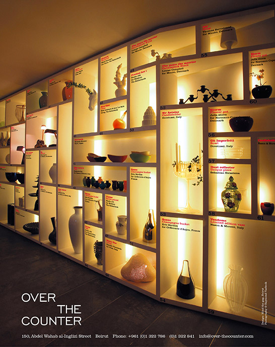
Over the Counter-Magazine ad
For this magazine ad, the perspectival integration of information about the objects provides a mini tour of the store.
Campaign photography: Raymond Yazbeck