When the retailer and distributer of fine wines and spirits was being set up back in 2000, the identity brief was simple: a sophisticated and high-end brand, free of gimmicks and overused references, and, well, French-speaking. This personality was originally met through the design of a straightforward typographic mark, a bottle-green color, and a French name and descriptor. The scheme did the job. But shortly before the first set of applications were to be sent to print, the designers felt that something was missing. Is that all there is? A last minute intervention on the logotype – mapping it on the curve of an invisible bottle – took the identity somewhere else: unique without being gimmicky, “facing you” without being “in your face”. Moreover, it put the bottle at the forefront through a subtle reference, enriching the identity scheme and retaining the understated elegance that had been intended from the get-go.
In 2007, the design store Over the Counter started sharing the premises, reconfiguring the retail space and generating some interesting opportunities for co-communication.
-
Le comptoir-Logo
The mapping of the logotype on the horizontal curve of a bottle was meticulously calculative in process, and delicately effortless in effect.
-
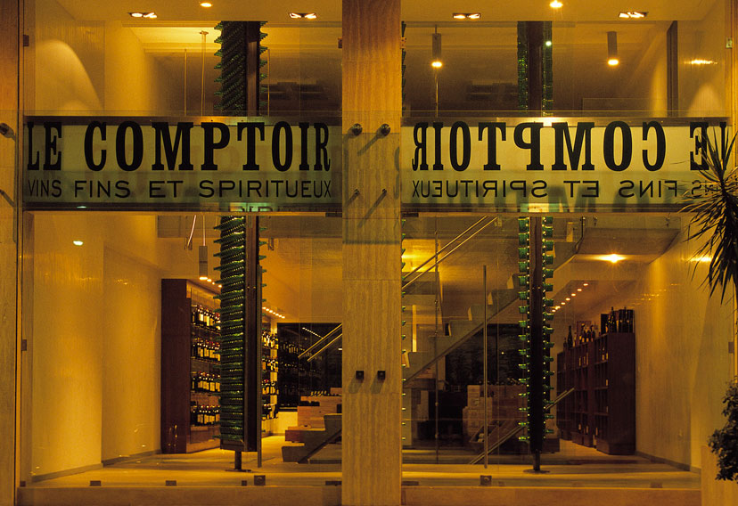
Le comptoir-Main sign
The repetition of a mirrored logo on the original main sign further emphasizes the reading of the invisible bottle, this time seen from the back.
-
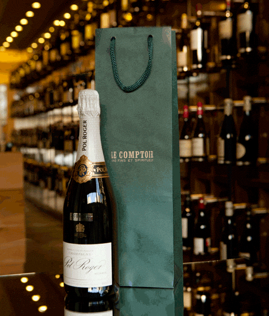
Le comptoir-Packaging
The original packaging system featured multiple configurations: paper and wood, ones and threes, and so on…
-
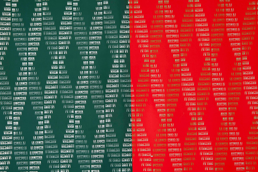
Le comptoir-Wrapping papers
Glass-green, Christmas-red
The design of the pattern for the wrapping paper did not have DNA in mind, but the double helix configuration spontaneously formed when the vertical steps simulating a rotating bottle were repeated horizontally. For Christmas, a red version was printed, with a little gold for magic.
-
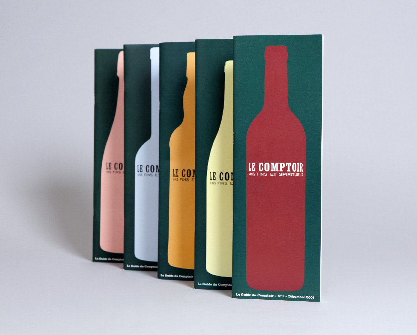
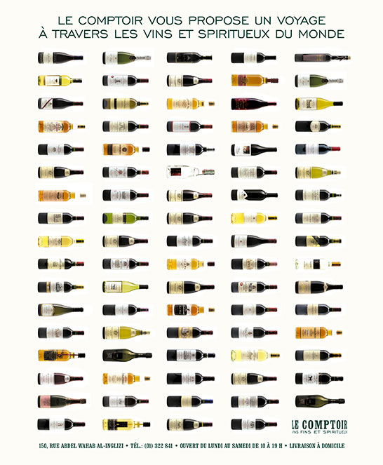
Le comptoir-Catalogue covers
Realizing that there is a typical bottle shape associated with a type of drink – red wine, white wine, whiskey, and so on – a series of icons was born, to be used on the product catalog as it changes from one year to the next.
-
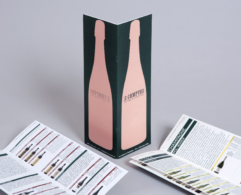
Le comptoir-Catalogue and inside pages
Taking drinking seriously
The recommendation for Le Comptoir’s yearly product catalog was a highly informative and professional approach that gives the amateur a chance to select like a connoisseur.
-
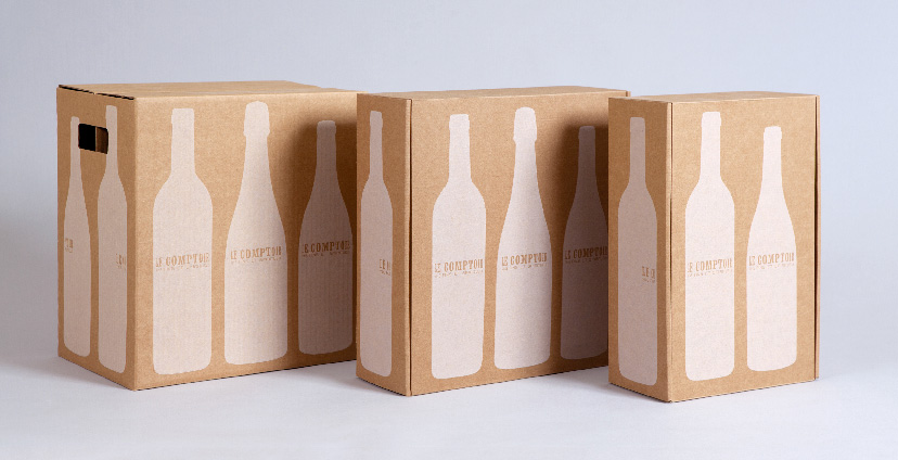
Le comptoir-Boxes closed
The revisited packaging system simplifies the scheme into a single cardboard material, a single washed-out white, and many bottle shapes.
-
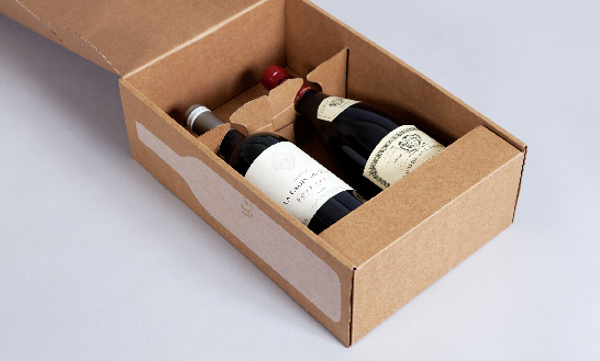
Le comptoir-Box open
The structure of the package was designed in a way where a single die-cut sheet can be stacked flat when stored, and put together without glue when assembled. In addition, the structural design allows for the box to act as an open display with bottles held firmly in place.
-
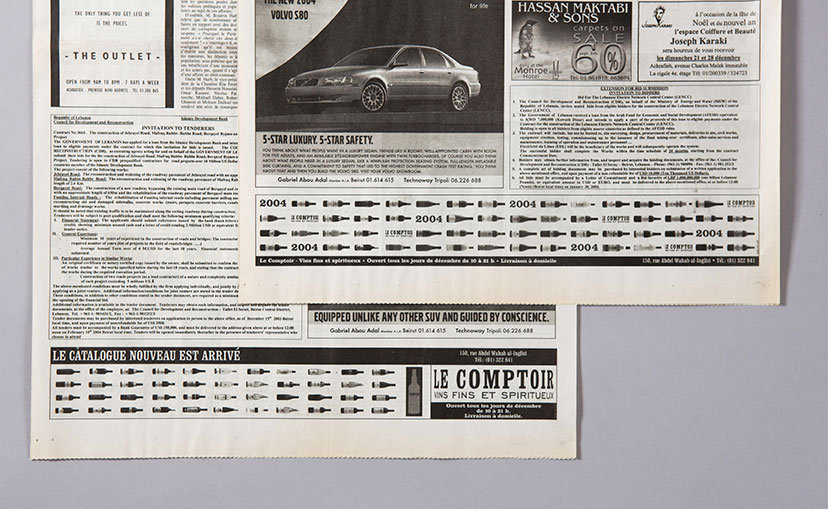
Le comptoir-Daily press ads 01
The press announcements for new selections are all about the newly arrived bottles, and for the “new catalog” message, a little spin on “Le Beaujolais nouveau est arrivé !”.
-
Le comptoir-Daily press ads 02
-
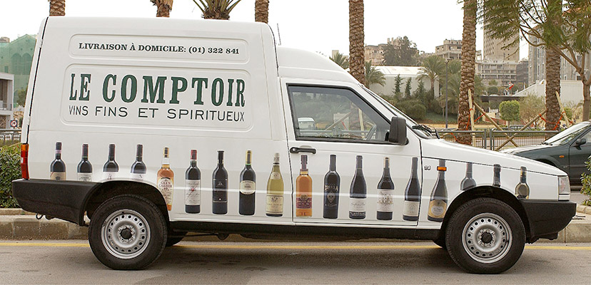
Le comptoir-Van
Not an invitation to drink and drive, obviously.