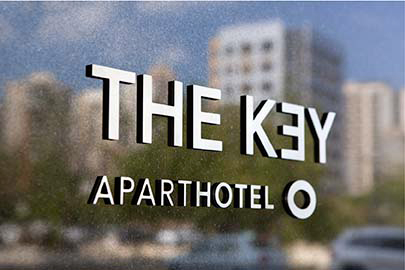
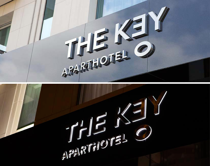
The Key is an aparthotel founded on the concept of self-sufficiency where the room offering enables an experience that resembles that of everyday life. It exudes an air of confidence and comfort in its modern setting. The graphic design approach undertaken is clean cut and straight to the point, where the identity’s application throughout the hotel’s amenities retains the logo’s minimal play on typography and integrates it in the various messages. This consistent use of the typographic icon conceived for the hotel allows it to stand-in for the logo.
-
The Key -MTG website-Signage
-
The Key- MTG-Logo
The key between the lines
-
The-Key-MTG-Sub-brands
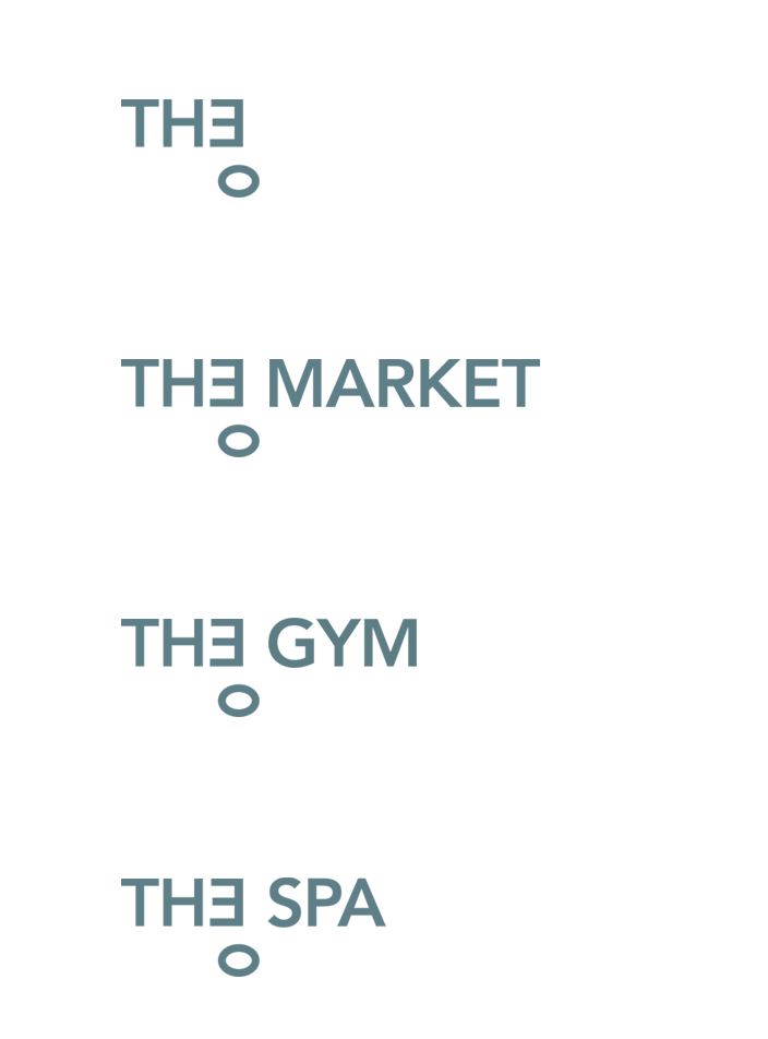
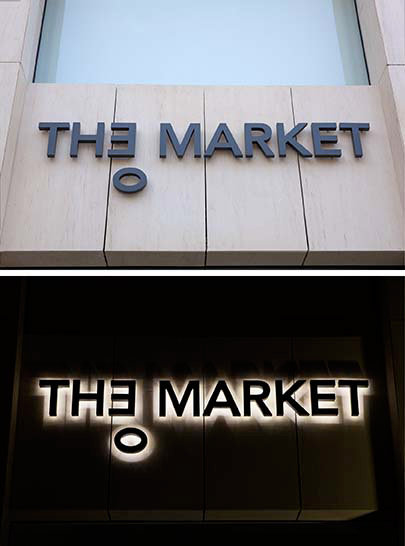
The Key’s sub-brands all sport the logotype variation devised to shorten the original name of the hotel. This allows for a witty incorporation of the main logo in its sub-brands.
-
The Key -MTG -Sign by day
-
The Key -MTG -Market sign
-
-
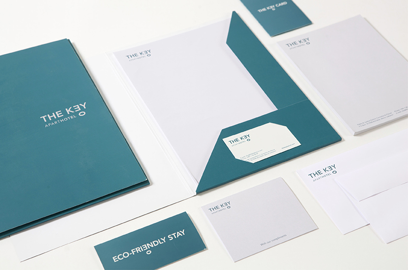
The Key -MTG stationnery
The combination of a serene teal and a sans serif font evokes a sense of ease and comfort while still retaining a corporate image.
-
The Key -MTG Key card sleeve
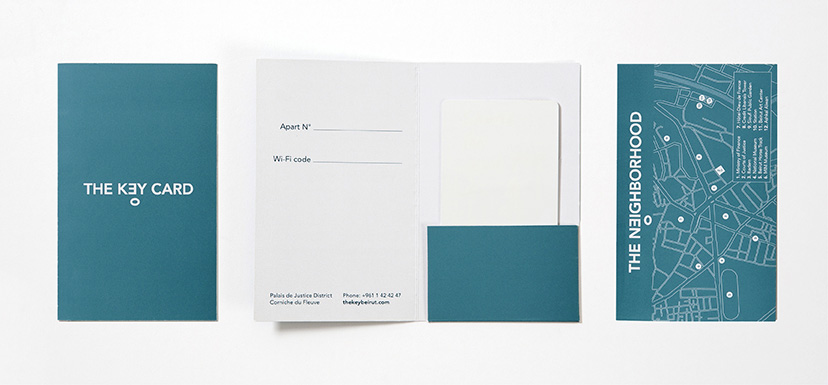
A key to stay with a map to wander
-
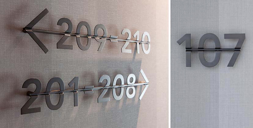
The Key -MTG room number
As per the client’s request in keeping the possibility of renovation in mind, the room-direction signs and the individual room numbers were designed on a fixed horizontal axis that takes the form of an arrow. This facilitates the ability to easily screw the sign in and out of the wall as need be.
-
The Key- MTG website-GIFS
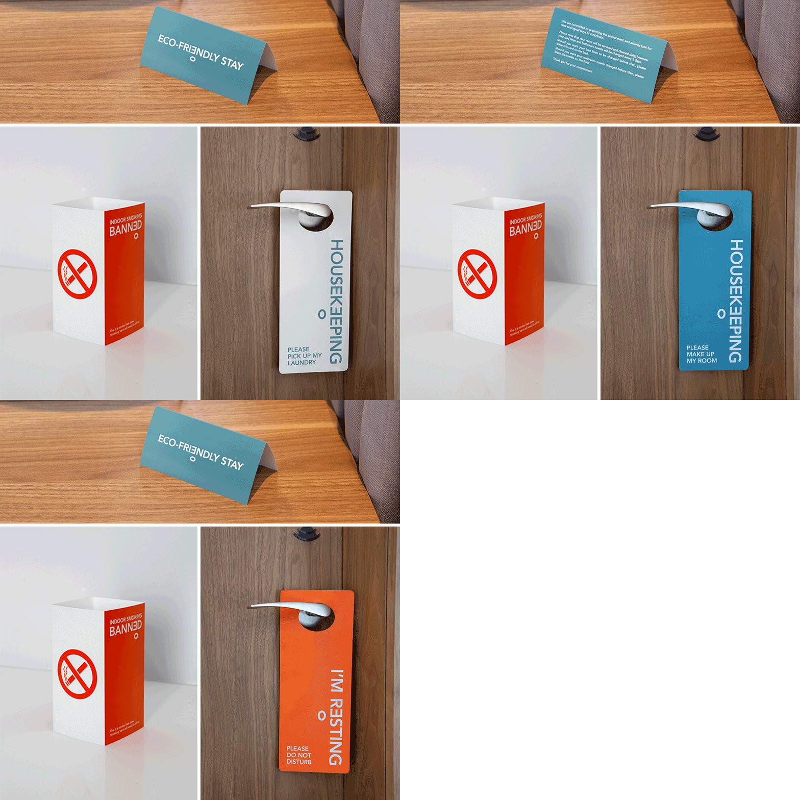
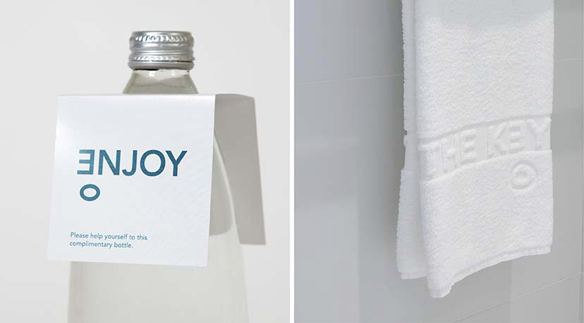
The meticulously chosen verbal language accommodates the inverted E, so much so that it almost becomes a new letter in the alphabet.
-
The Key -MTG ecofriendly stay

