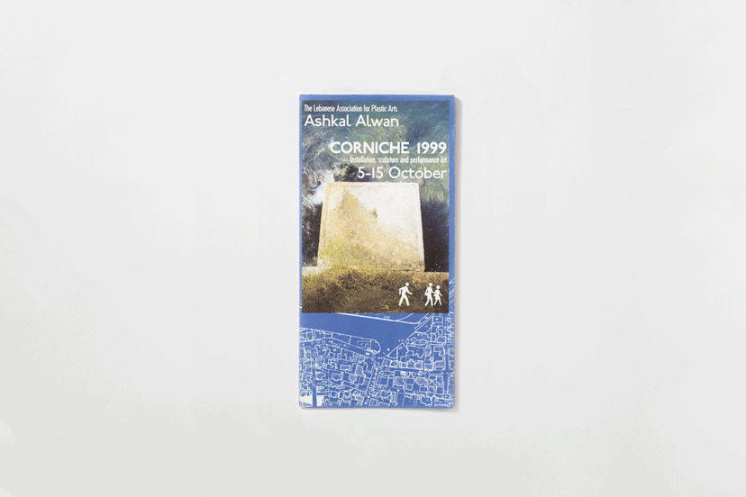
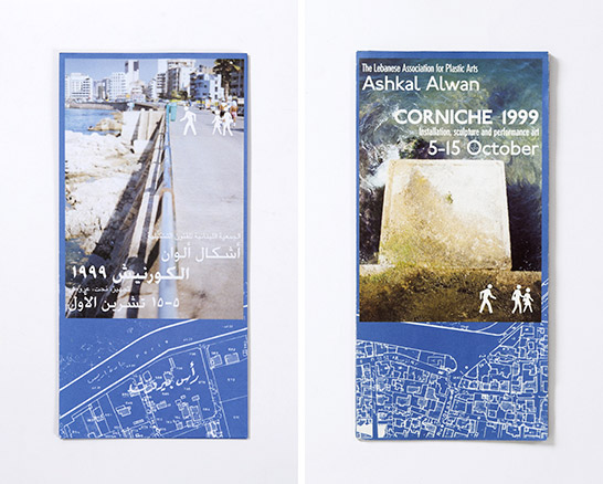
The two covers of the Corniche pamphlet are each reserved for a language, and while the Arabic gazes at the city scape, the English stares down at the sea.
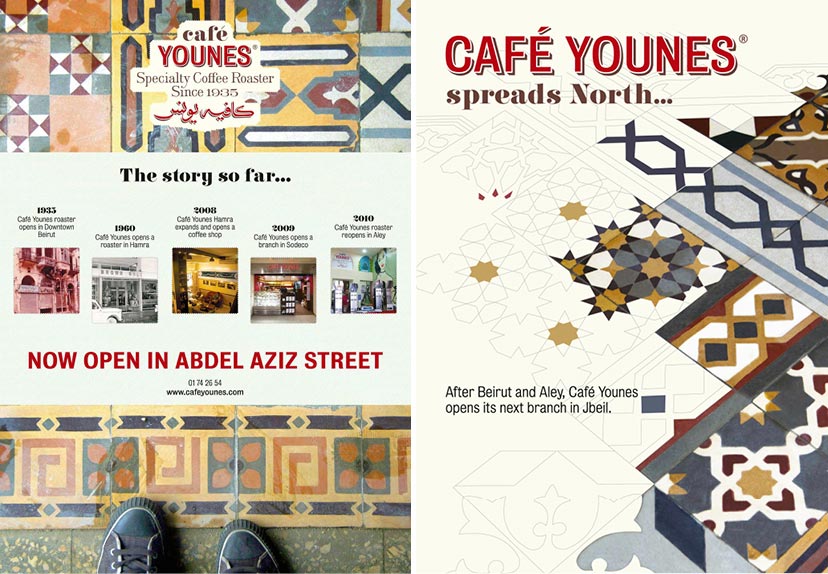
The signature tiles of the Abdel Aziz outlet was an appropriate visual for the opening of the flagship branch. And it literally spread onto the Jbeil opening which took place shortly after.
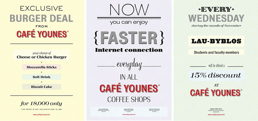
It might be a case of “how many fonts can you fit in one poster”, true, but the playfulness of typefaces and backgrounds on these frequently changing messages results in an attention-calling vibrancy inside the coffee shop.
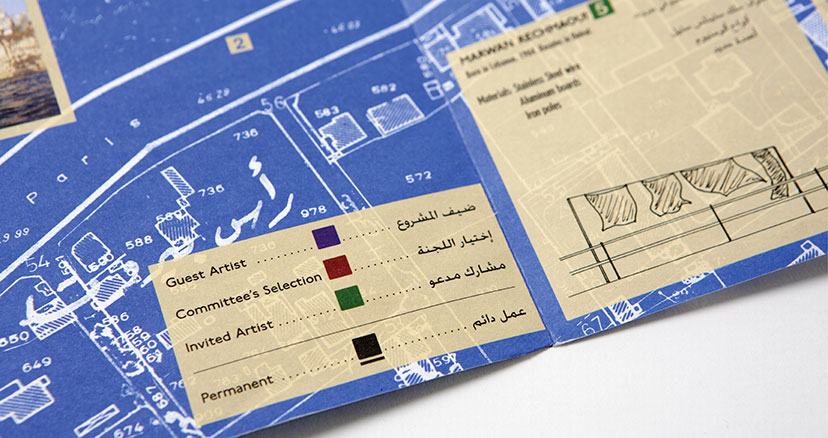
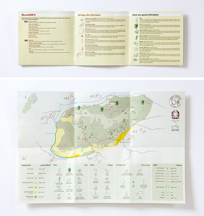
Unfolding the map reveals general information along with a detailed site map with topography, vegetal cover types, flora, fauna, heritage sites and walking trails.