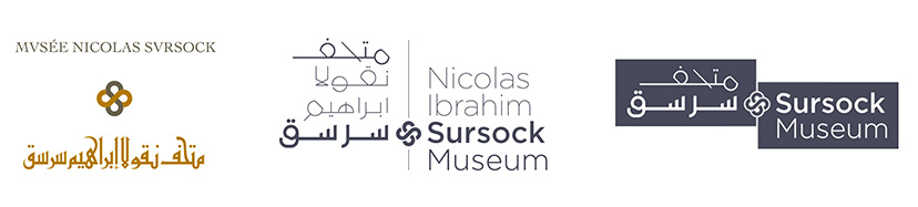
The floral emblem from the previous Sursock Museum logo is retained, and its detail readdressed to fit the more contemporary typographic/calligraphic scheme.
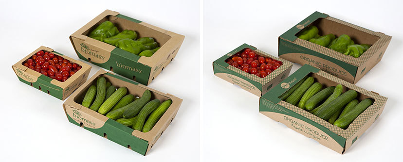
The previous Biomass fresh fruit and vegetable packs were more or less retained, but were subjected to a slight but significant form adjustment (see Packaging section for details).
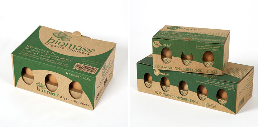
Other than its somewhat expected symbolism, the previous Biomass logo suffered from production limitations due to the emblem’s treatment and did not clearly carry the “organic” idea in its basic name. The redesigned mark addresses all that and carries a softer, more familiar, expression.
The much needed revisiting of the Santiago mark resulted in a more age-appropriate signature, so to speak: a simple logotype, elegant, feminine, peculiar, and with a little cherry on top.