The word “shawarma” comes from the Turkish word “çevirme” which means “turning”, and there’s nothing more iconic about the dish than that vertical oversized skewer on which a cone-shaped pile of meat continuously rotates. There was no question that this element – the “seekh” as we call it in Arabic – had to be retained from Shawarmer’s existing identity when the Saudi fast food chain looked to us for a rebranding. But it also had to be transformed. Integrating the calligraphy in the emblem celebrates the Arabic, enriches the symbol both in terms of meaning and form, and allows for the bilingual name to legibly manifest alongside. The identity as a whole is injected with a playfulness that fits the popularity of the dish: an explosion of icons, colors and patterns, and a slightly superfluous use of display typography. After all, if there’s a place to be unapologetically excessive, this is it.
-
Shawarmer-Bilingual logo with tagline
With the revisited identity, the existing tagline, “All you want”, is literally extended.
-
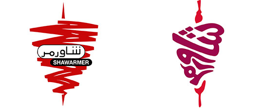
Shawarmer-Emblem before and after
From word and image to word-as-image
The calligram – arranging the calligraphy to form a visual – creates a particularly interesting emblem that is not just more intricate but also more, well, shawarma-like.
-
Shawarmer-Menu new logo revealer
Peeling the previous logo and slogan off the menu cover reveals the new ones, along with a message about the revisited identity.
-
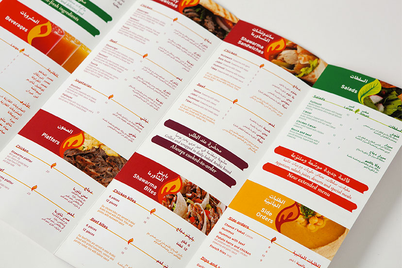
Shawarmer-Menu inside
In addition to color and photographic representation, the menu uses a consistently shaped graphic element that changes treatment to indicate the different sections.
-
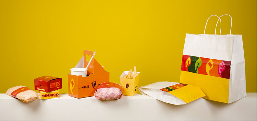
Shawarmer-Packaging 01
The Shawarmer delivery packaging invokes happiness even before the first bite.
-
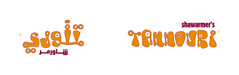
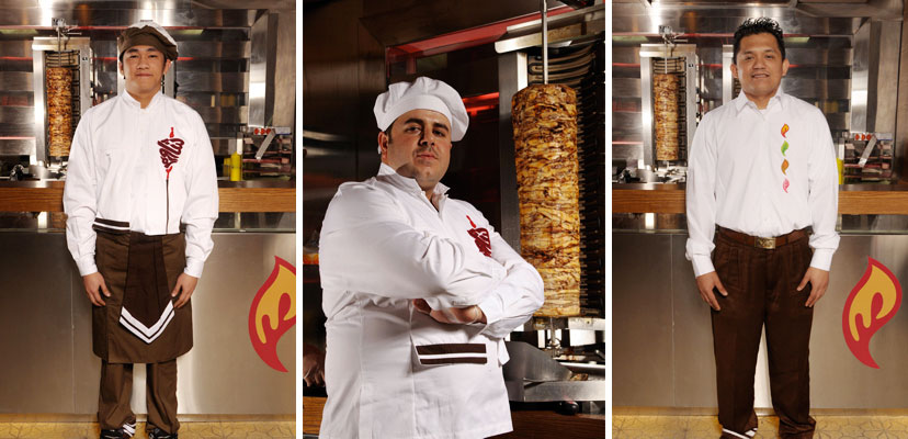
Shawarmer-Sandwich logos
As marks in their own regard, each specialty item at Shawarmer is given a display font and its corresponding Arabic adaptation.
-
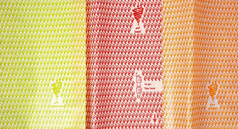
Shawarmer-Wrapping paper
The wrapping papers are distinguished by color and include a small graphic device for quick access to the reward.
-
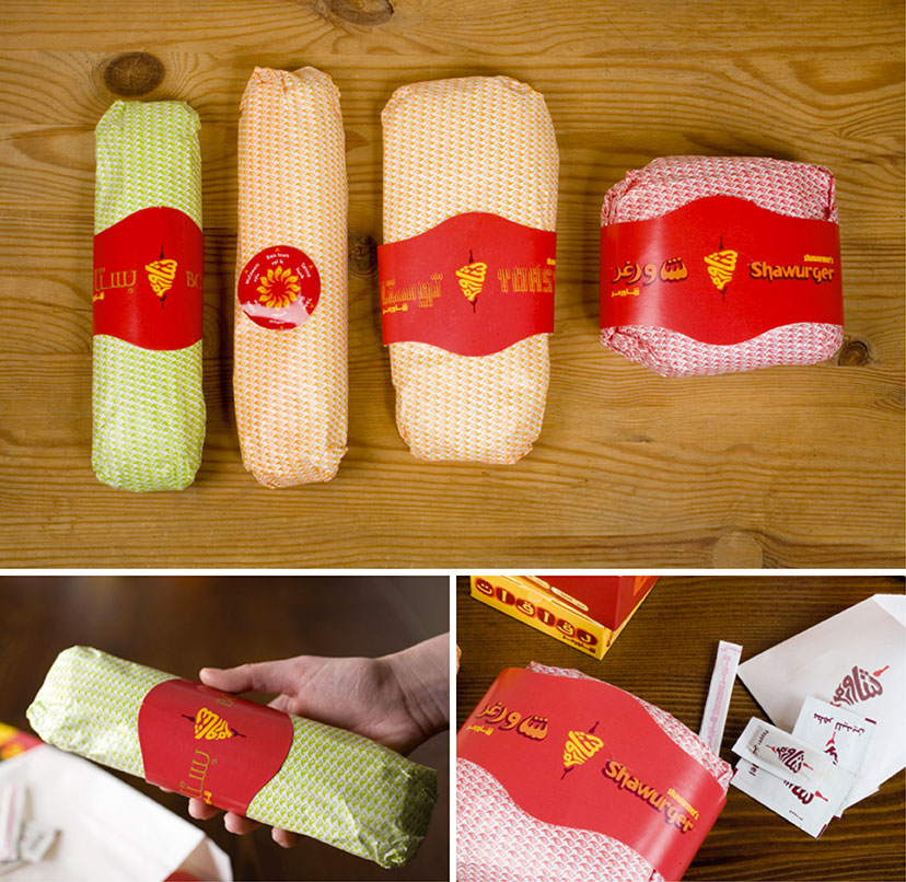
Shawarmer-Sandwich wrapping
Along with the sandwich wrapping paper color, a series of rings and stickers completes the sandwich identification system.
-
-
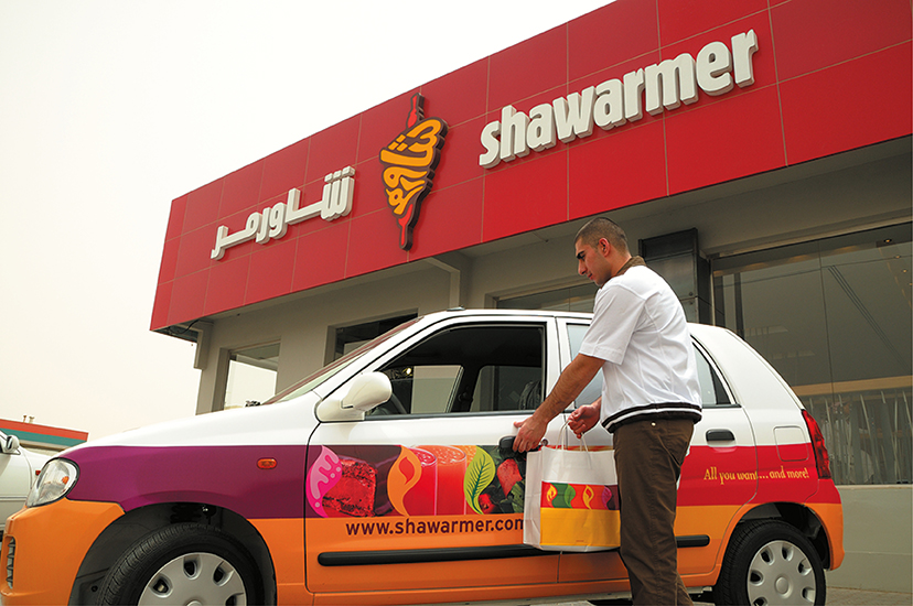
Shawarmer-Outdoor sign and delivery car
On the street or on the move, there’s really no missing the Shawarmer brand.
-
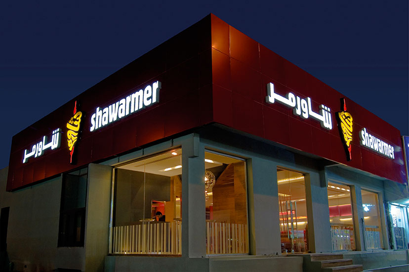
Shawarmer-Outdoor sign night
Late night snack, anyone?