Our traditional understanding of law practice in Lebanon is centered on a single lawyer rather than a group of practitioners with various specializations. In fact, the popular appellation is always law “office” and never law “firm”. This usually causes design and any other attempt at creating a corporate image to fall into a generic framework – probably fully functional and often reassuringly familiar, but generic all the same. When we were commissioned to develop this identity, a clearly new form of law practice was emerging in the country: one that A&A not only belonged to, but was also helping shape. At the heart of this understated identity, preoccupied with elegance and classical aesthetics above everything else, is a typographic mark that proposes a distinctively integrated, almost effortless relationship between the A&A emblem abbreviation and the full name logotype. Albeit subtle, it is a play that distinguishes the forward practice it represents.
-
A&A-Logo and emblem
The A, &, and A characters are composed and tailored to fit perfectly, almost inconspicuously, in the logotype.
-
A&A-Logo applications
With such a restrained identity, it’s the little things such as embossing or silkscreening that deliver the nuances.
-
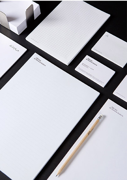
A&A-Stationery
Serious, coherent, sharp… exactly what you’d expect from your legal representation.
-
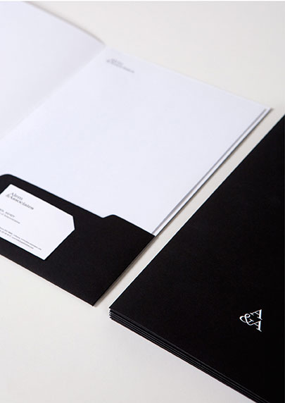
A&A-Folder
A special Sirio Black/White paper is chosen for the corporate folder, with a different finish on each side.
-
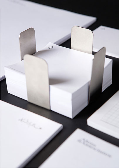
A&A-Notepad holder
A stainless steel notepad holder is designed as a fitting object for the slick premises.
-
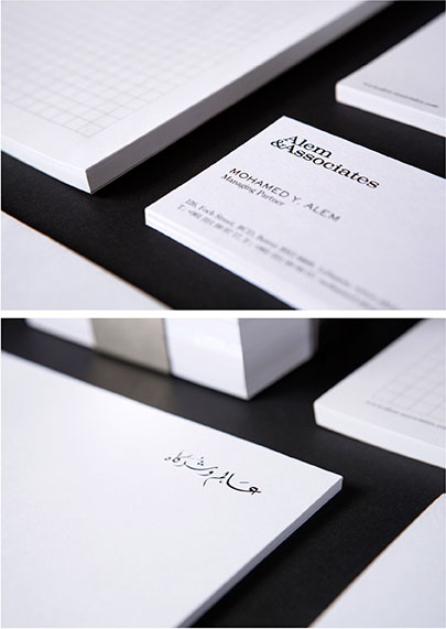
A&A-Stationery details
Despite the all-English identity, the name has to feature at least once in the native language, and look as delicate while it’s at it.
-
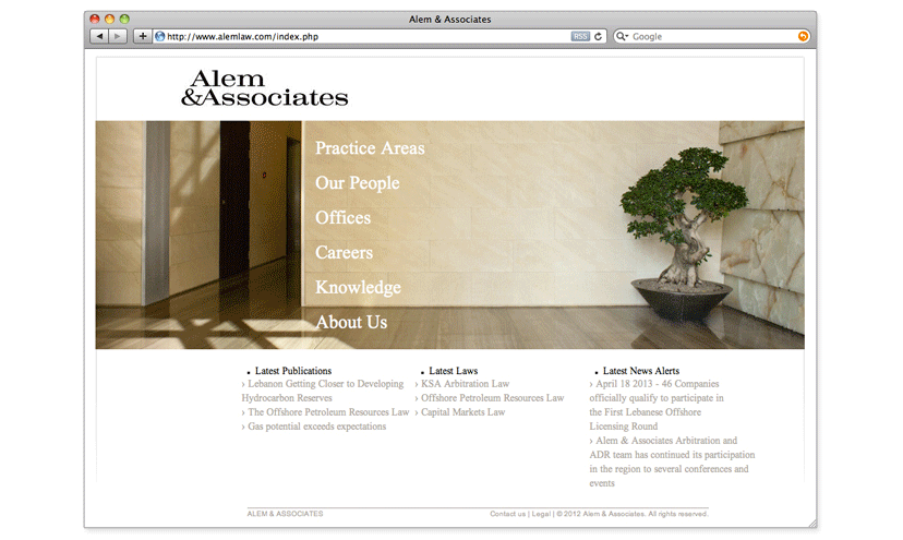
A&A-Website
With photography by Marco Pinarelli , the spatial details of the offices complement the precision and simplicity of the online information.