- Work overview
- Packaging
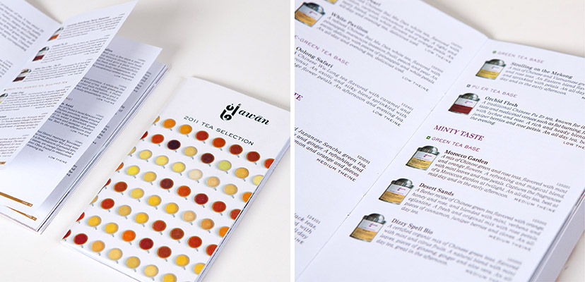
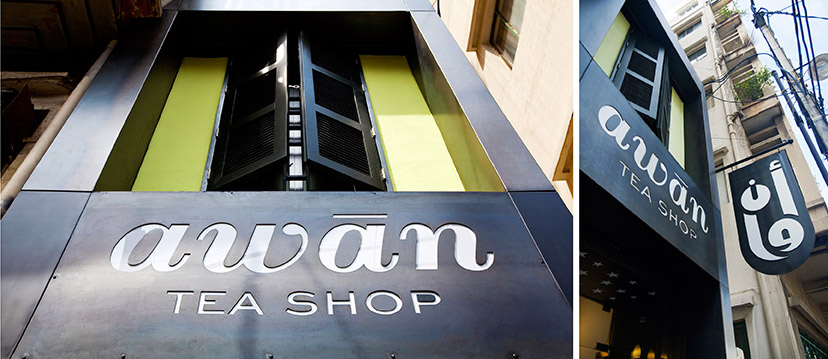
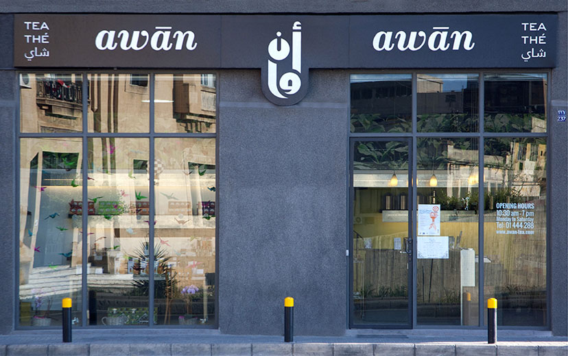
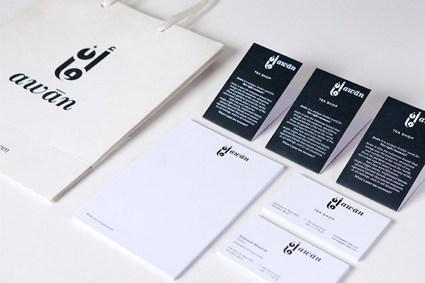
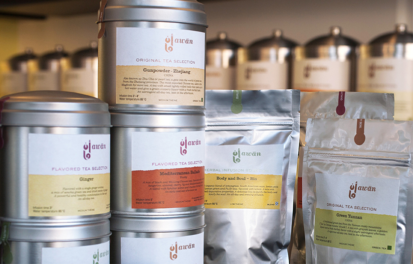
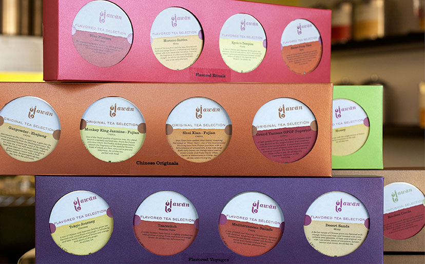
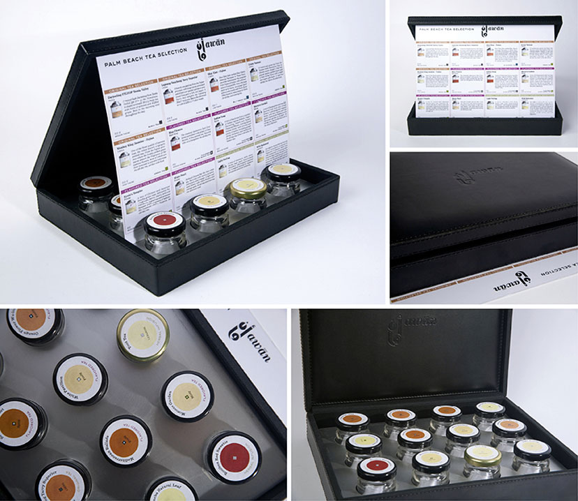
As the first specialized and comprehensive tea brand in the country, one with its own signature store, Awān needed its identity to reflect its locality, as well as the wide range of teas that are made available through a single experience. The Arabic emblem and name – meaning “the right moment,” and unique to the language – roots the brand in its setting and flirts with the relationship between tea and time. Moreover, underplaying or even avoiding any other typically tea-related ornamental or stylistic cultural references (China, India, Sri Lanka, England…) and resorting to a variety-based packaging scheme instead, delivers the desired positioning: it’s not a world, but the world of tea, with all its subtleties.
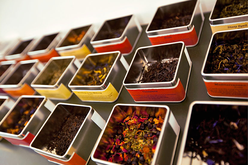
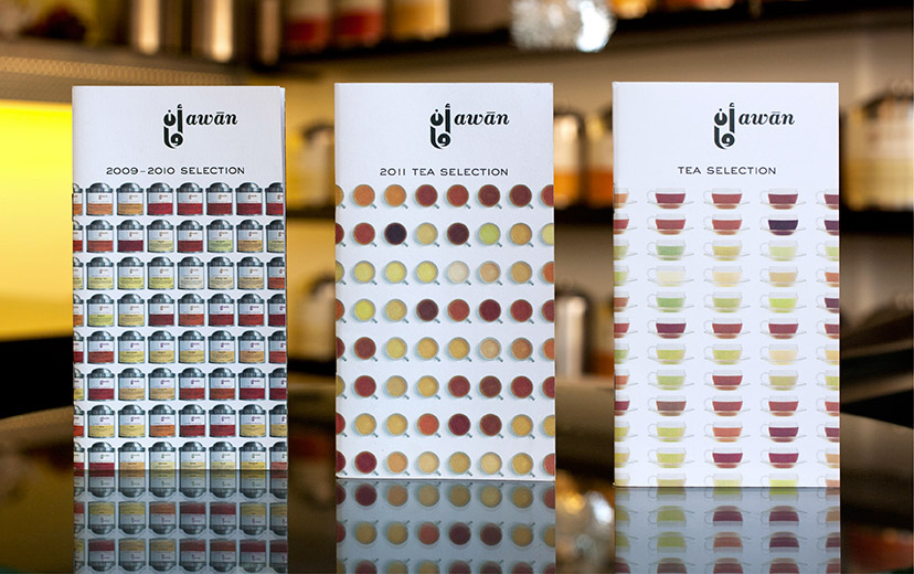
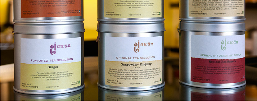
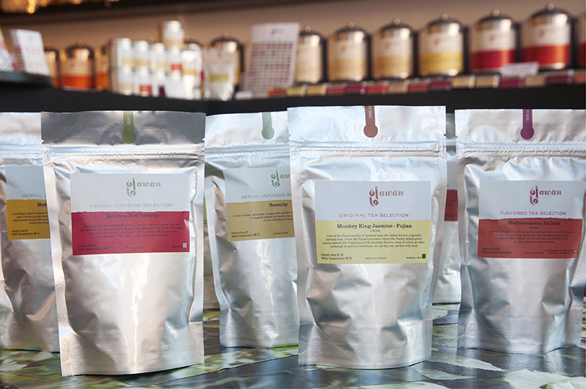
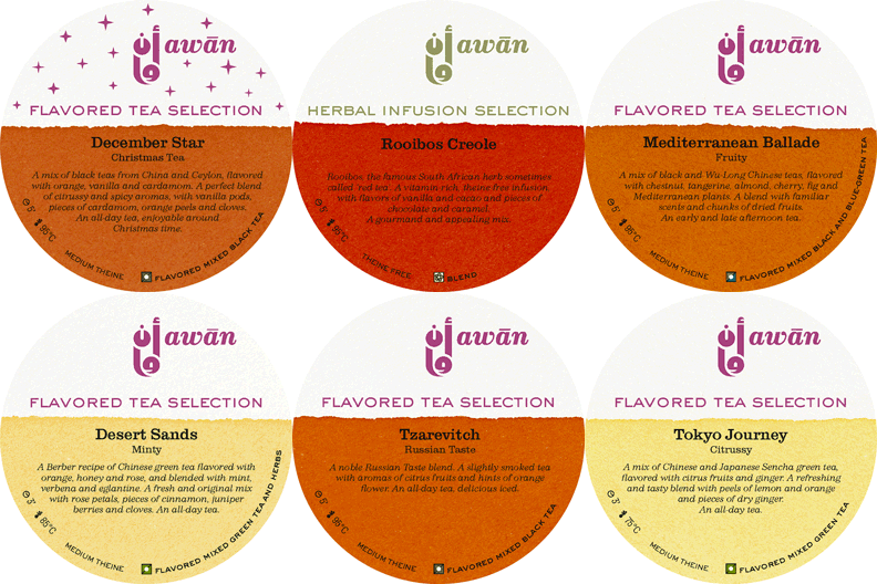
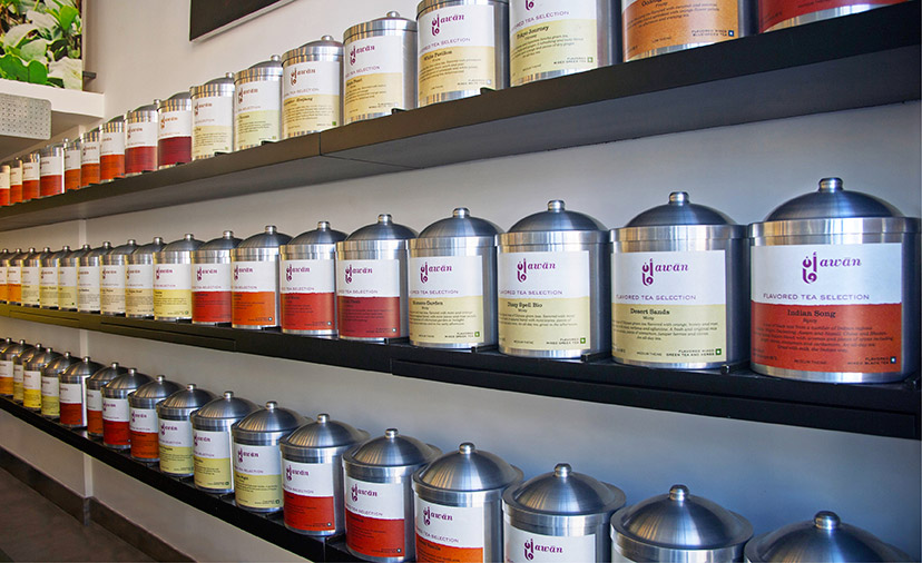
Like snowflakes, no two tea brew colors are exactly the same. This idea is what inspired the “dipping” concept that is consistent throughout the tea labels on the range of Awān packages. Not only do they hold the tea name, origin, description, category and other information, but all labels also appear to have been dipped in the actual brew of the packaged tea, offering a real glimpse of the tone that will gradually appear in the cup. This was particularly exciting since we got to brew all the teas and eventually try them, but it’s also exciting in its final result: creating a tea color gamut – a rainbow of reds and browns, greens and yellows – to vividly animate the shop and reflect the many varieties on offer.
- Work overview
- Packaging
Unless otherwise stated, all texts, images and audio-visual material are copyright © Mind the gap – Beirut

